PARADISE | PARADISE – Layered

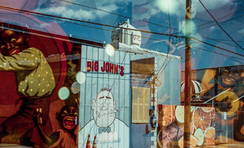
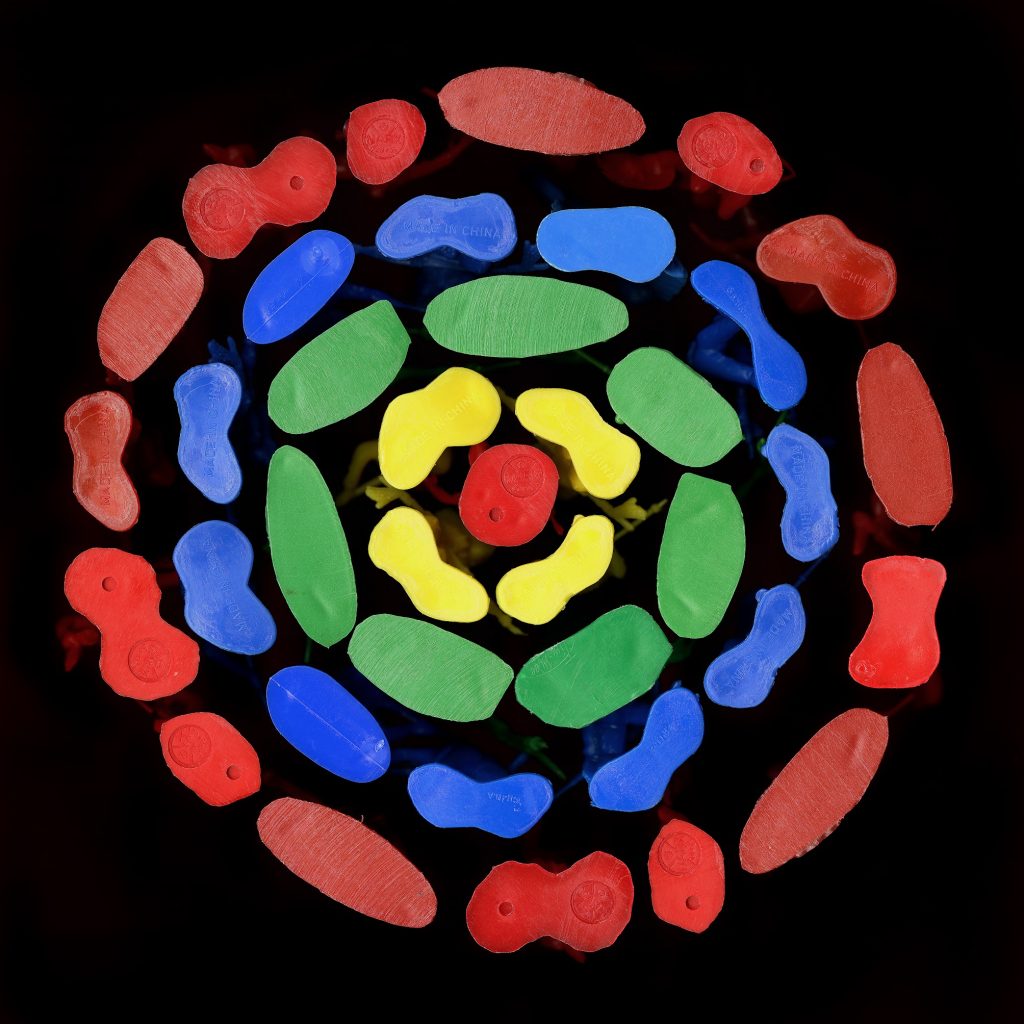
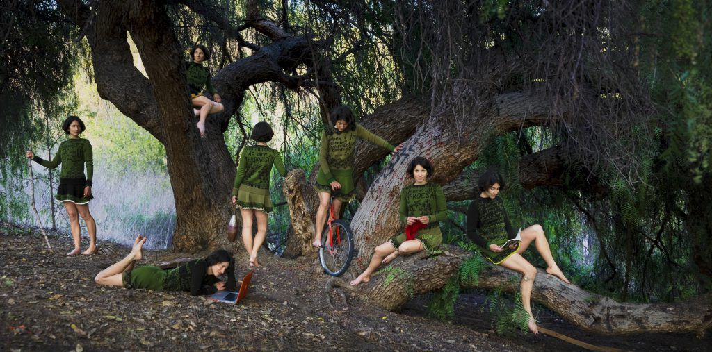
Thomas Sayers Ellis, Blackfish, Fisheye, Blackened, 2024.

PARADISE | PARADISE – Layered

St. Petersburg Month of Photography and the inaugural Photo Laureate Thomas Sayers Ellis

By Clara ten Berge

Thinking about living in Florida, the lyrics “this could be heaven or this could be hell” comes to mind. The white sandy beaches, the refreshing springs with their captivating flora and fauna, and the rich cultural landscape (as evidenced by this very website), along with the agreeably mild winters, make it a paradise you wouldn’t want to leave.

Yet, when mid-May arrives, the heat slaps you in the face and hurricane season begins, a layer is peeled back to reveal one of Florida’s many other sides.  Peel back another layer, and you uncover complicated politics, homelessness, a terrible housing market, raging late-stage capitalism, and more. Florida is a many-headed beast; while it can be paradise for some, it could be hell for others.

Thomas Sayers Ellis, the inaugural Photo Laureate of the Saint Petersburg Month of Photography (SPMOP), has spent a year walking the streets and unveiling the many stories of Tampa Bay, capturing everything from the blissful and joyful to the mundane, the painful, and the terrible.
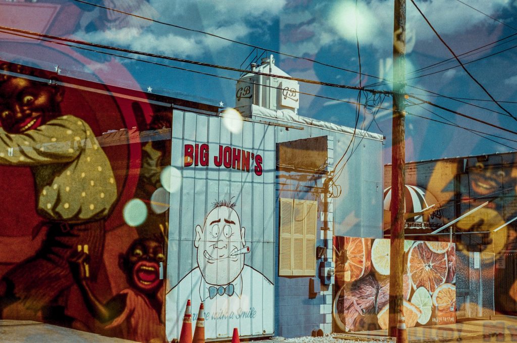
Thomas Sayers Ellis, The Critical And Response of Woke Maintenance, 2024
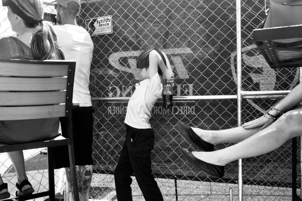
Thomas Sayers Ellis, The Coke Bomber, 2024.

With his images, he creates narratives that go beyond street photography. They are seductive, they will lure you into paradise.  They are confrontational, they will show you the fringes that make up your paradise.  His images are layered, both in the literal as in figurative sense.  They show a different dimension in paradise, a dimension that is made up of advertising, marketing and image building of what paradise should be.  But at the same time, this paradise is a construct that is only available for the happy few.
— Marieke van der Krabben, Executive Director, SPMOP
(excerpt from “‘In the Hall of Mirrors, Nothing Is as It Seems,”
foreword to Paradise ǀ Paradise -Layered)

Saint Petersburg Month of Photography

SPMOP, a non-profit founded by photography historian and curator Marieke van der Krabben and photographer Águeda Sanfiz, celebrates local Tampa Bay photography in every way possible. During the month of May, SPMOP organizes exhibitions and events, collaborating with local artists and venues such as the Florida Museum of Photographic Arts in Tampa, and the Morean Arts Center, Five Deuces Galleria, and the Museum of Motherhood in St. Petersburg.

Every year the organization will choose a Photo Laureate, who will have the honor of documenting life in Tampa Bay for a year. In May of 2023, SPMOP announced its first Photo Laureate: Thomas Sayers Ellis.  From over 35 artists, SPMOP selected five nominees whose work was exhibited at the Morean Arts Center in Saint Petersburg in May of that year. The jury was captivated by Thomas’s poignant photos that immediately grabbed the viewer’s attention. Each photograph told a unique story and invited dialogue.  The panel was convinced Thomas would be able to highlight the many stories of Tampa Bay in new and exciting ways.

It is inspiring to see an artist like Thomas in action. His dedication and enthusiasm are infectious. He is open, polite and friendly when photographing people on the streets. Since he moved to Saint Petersburg in 2016, he is not yet used to the Florida heat, but his urge to document the streets and the people overcomes this obstacle.

Now, at the end of his tenure, Thomas Sayers Ellis receives a solo exhibition at the Florida Museum of Photographic Arts (FMoPA). Opening on June 18th, the exhibition will showcase this year-long project. Using a mixture of black-and-white and color photography, digital as well as film, and accidental double exposures, Thomas has assembled an eclectic collection of images that constructs a multi-layered account of his year as SPMOP’s first Photo Laureate. An accompanying photo book with an extended collection of Thomas’s photographs and poems is currently in the making by SPMOP Executive Director Marieke van der Krabben. 
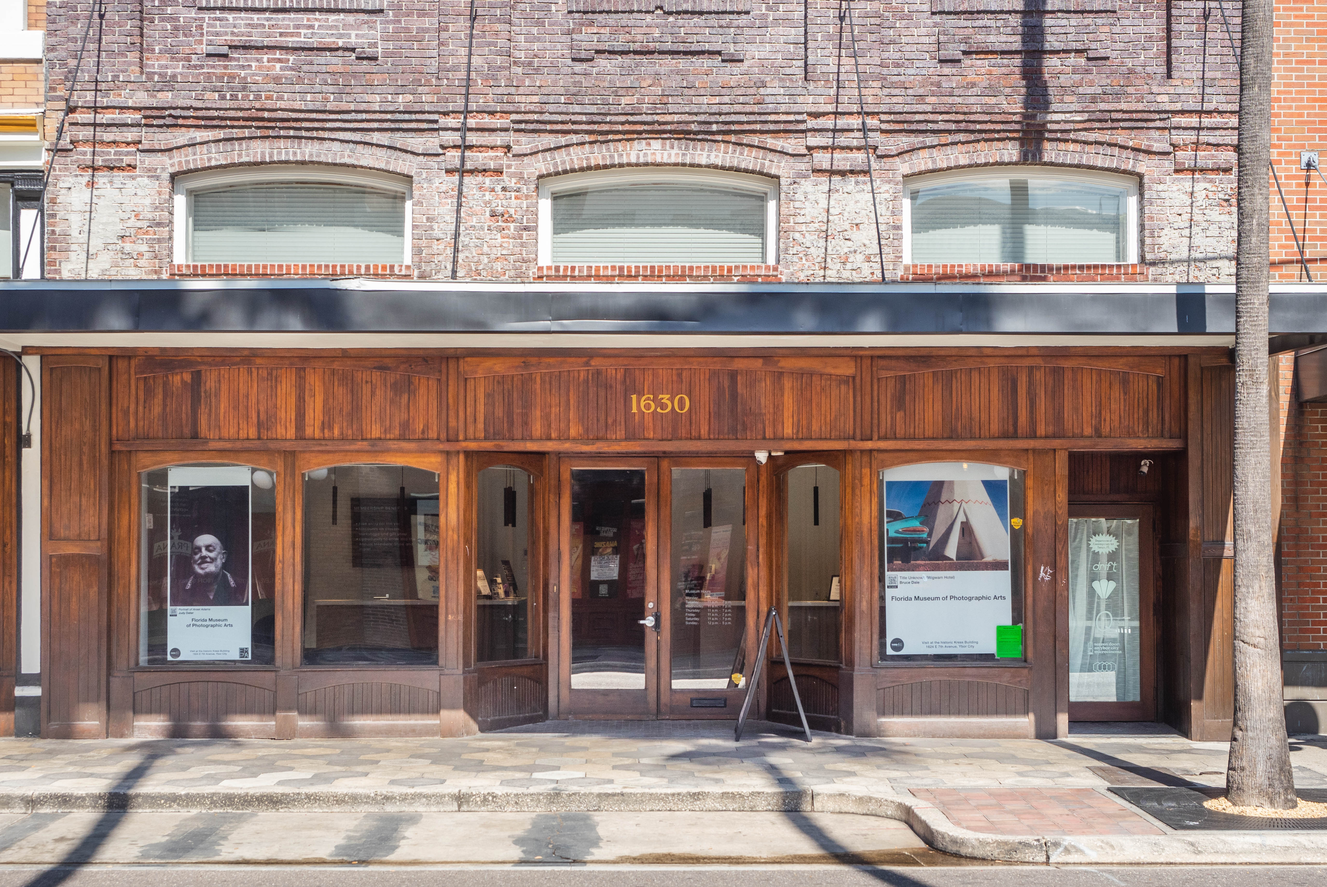
The Florida Museum of Photographic Arts on 7th Avenue in historic Ybor City, Tampa.

Florida Museum of Photographic Arts 

FMoPA’s move to Ybor City has been a game changer. The beloved Photography Museum struggled at its previous downtown Tampa location, surrounded by corporate offices and at an inconveniently high level to attract foot traffic. Since relocating to 7th Avenue, the museum enjoys the warm embrace of the vibrant arts community around it. Residing on the first floor of the historic 1928 Kress Building, the museum is part of Kress Contemporary. Kress Contemporary is the home of many art galleries, art studios and visual and performing arts organizations such as GRATUS, Tempus Projects, Screen Door Microcinema and the Tampa City Ballet.  Often on Thursdays, the museum hosts events coinciding with the art initiatives above it, feasting art lovers with double the celebrations.

What sets FMoPA apart is its combination of internationally and nationally renowned artist exhibitions, its celebration of emerging local artists, and its many community programs. This Spring they organized the phenomenal exhibition Joel Meyerowitz: Confluence, 1964-1984 and in July they will open Photo Ybor, about the history of Ybor City. Programs such as Prodigy: Storytelling through Photography and the annual Member’s Show, demonstrate FMoPA’s commitment to their community.  Not all museums offer their members and community a venue to exhibit their art, which makes stepping into a place like a gallery or museum more accessible. This layered approach in exhibitions and offerings is evidently working well; they have seen an influx of visitors since they officially reopened at the new location in September 2023. All in all, FMoPA is a worthy exhibition venue for SPMOP’s Photo Laureate.
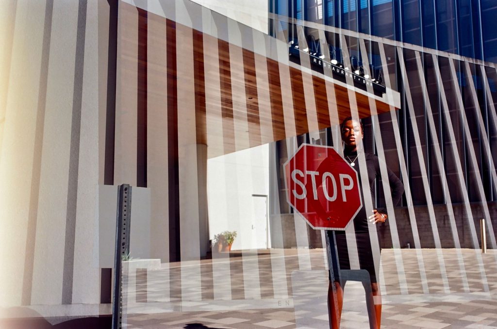
Thomas Sayers Ellis, Our Lady of Lines and Lanes, 2023

Poetry and Photography

Ellis is not only a photographer but also a published poet and a bandleader.  Since the beginning of his Photo Laureate journey, he has treated the community to bi-weekly photographic updates accompanied by his free-flowing poetry.  Even more powerful when spoken out loud, they highlight Thomas´ creativity and provide a glimpse into his intriguing musings.

Combining two art forms can make it greater than the sum of its parts. For this reason, poetry and photography are a match made in heaven! This past May, Keep St. Pete Lit! held a Poetry Open Mic at St. Petersburg’s Studio@620, featuring a special photography edition of their poetry open mic to celebrate the month of photography.  Local talent from all stages of life brought photographs that are dear to them and shared their poems, prose and spoken word.  It was beautiful to see and experience people at their most vulnerable, sharing their most inner thoughts, all cheered on by a very respectful and supportive audience. Keep St. Pete Lit! plans to invite Thomas Sayers Ellis as a featured speaker in the near future.

Thomas Sayers Ellis, The All-Star Cage Jump Wrestler, 2023

Also this past May, SPMOP presented an exhibition titled Photo Laureate 2024: the Nominees at the Morean Arts center which featured the work of the following five local artists: Christa Joyner Moody, David Moreno, Jose Ramirez, Marian Tagliarino and Ric Savid. From this impressive grouping, the torch of Photo Laureate was passed on to Ric Savid, an amazingly skilled artist who shoots mostly in film and specializes in portrait photography. 

We can all look forward to next year’s St. Petersburg Month of Photography celebration and a future public exhibition of Photo Laureate Ric Savid’s unique and exciting exploration.


About the author

Originally from the Netherlands, author Clara ten Berge has been living in Tampa for 2.5 years with her husband. In the Netherlands (Amsterdam), she worked at several museums. She has volunteered at FMoPA for a year, and is currently volunteering for SPMOP as Creative Director.

A special thank you goes out to the Gobioff Foundation for sponsoring the exhibition and to St. Petersburg Month of Photography’s entire team. 

Tom Jones: Here We Stand

An exhibition review of Tom Jones: Here We Stand

by Sabrina Hughes

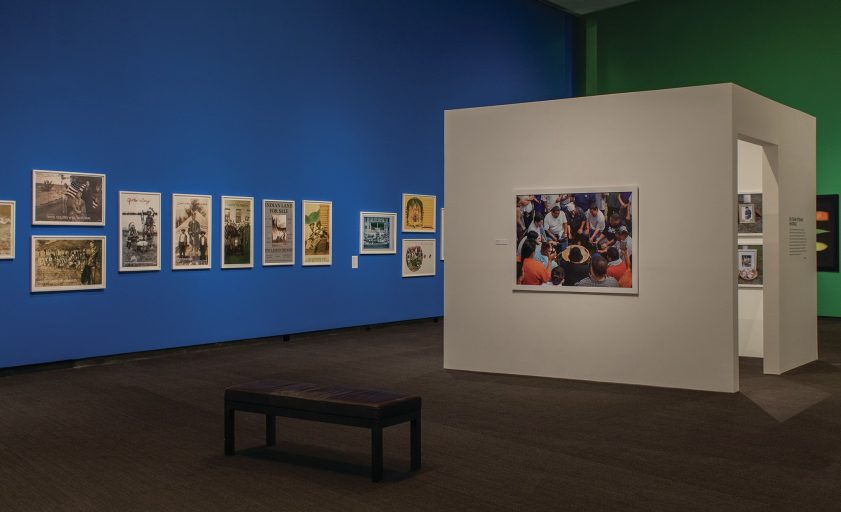
By turns witty, moving, and poignant, the exhibition Tom Jones: Here We Stand at the Museum of Fine Arts, St. Petersburg, makes a clear statement that Indigenous Nations remain connected to their past while ensuring their values are projected into the future. Tom Jones is a member of the Ho-Chunk Nation of Wisconsin. 

This is the first major retrospective of Jones’ career and features more than 100 photographic works in more than a dozen series. Tom Jones: Here We Stand originated at the Museum of Wisconsin Art in West Bend, Wisconsin. The exhibition was co-curated by Dr. Jane L. Aspinwall, Senior Curator of Photography at the MFA, and Graeme Reid, Director of Exhibitions at the Museum of Wisconsin Art. 

Here We Stand showcases Jones’ photographic vision ranging from intimate shots inside his relatives’ homes, to acerbic wit recording appropriated Native names and iconography in the American landscape, to majestic and monumental portraits with hand-beaded embellishments. 

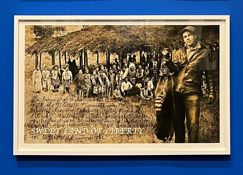
Jones’ early series Dear America pairs enlarged collaged historical vernacular photos with diegetic captions that force viewers to confront their assumptions about the Native history they may have learned. 

Tom Jones, Sweet Land of Liberty, 2002, Inkjet print and ink.
On loan from the Artist. Image credit: Bay Art Files.
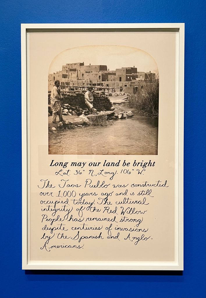
Tom Jones, Long May Our Land Be Bright, 2002 Inkjet print and ink.
On loan from the Artist. Image credit: Bay Art Files.

In the image Sweet Land of Liberty, which collages a 19th-century group portrait of Sioux with a jaunty white hunter who has harvested a raccoon, Jones has written a short summary of the largest one-day mass execution in American history–when Abraham Lincoln approved death sentences for 38 Sioux men on December 26, 1862. Jones employs a similar technique with the image Long May Our Land Be Bright, half of a 19th-century stereographic image from Taos Pueblo. In this text inscription, however, Jones celebrates that the Red Willow People of Taos Pueblo have maintained their cultural integrity despite centuries of invasions by colonizers. 

The beaded portraits in the Strong Unrelenting Spirits series build on the technique Jones used in Dear America, adding intricate beadwork to the large-scale portraits. Members of the Ho-Chunk nation pose in front of a stark black background, many in traditional ceremonial garb. These portraits are striking in their size as well as in the subjects’ appearance. What, in reproduction, appears to be designs drawn on the black background behind each individual is actually intricate beadwork applied to the surface of the photograph itself.

Tom Jones, Bryson Funmaker, from Strong Unrelenting Spirits series, 2020, Inkjet print and beadwork. On loan from Mike and Linda Schmudlach. Image credit: Museum of Wisconsin Art.

Even before European colonizers introduced colorful glass beads in trade, for centuries Indigenous artisans created beads from stones, bones, and shells, and used them to create jewelry and embellish clothing. 

For Jones, the beadwork on these photographs represent a ritual encounter with ancestors. “Beading is a metaphor for our ancestors watching over us. I am also referencing an experience I had when I was about 8 or 9 years old. My mother took me to see a Sioux medicine man named Robert Stead. He led the call to the spirits, the women began to sing, and the ancestors appeared as orbs of light.” Strong Unrelenting Spirits eschews the formalism of photographic portraits that seek only to show what is before the camera. Combining the realism of photographic portraiture with the spiritual experience of light orbs further cements a Native visual language that can combine the visible and ethereal presences of one’s experience. 

Tom Jones, Fire Pit, from I am an Indian First and an Artist Second series, 2008, Inkjet print.
On loan from the Artist. Image credit: Museum of Wisconsin Art.

A recurring theme in Jones’ work is the appropriation and commodification of Native culture in America. Two series, The North American Landscape and I am an Indian First and an Artist Second, use plastic figures from Cowboys and Indians playsets to wryly reference the way Native culture has been repackaged and sold as a product. The images in the series “Native” Commodity are deadpan documentary representations of Indigenous culture co-opted by the tourism industry. The series Studies in Cultural Appropriation also presents a witty question: if Native designs are readily appropriated by corporations, why not make use of a variety of Indigenous material designs for high fashion? 

Tom Jones, Blake Funmaker, 2020, Inkjet print.
On loan from the Artist. Image credit: Bay Art Files.

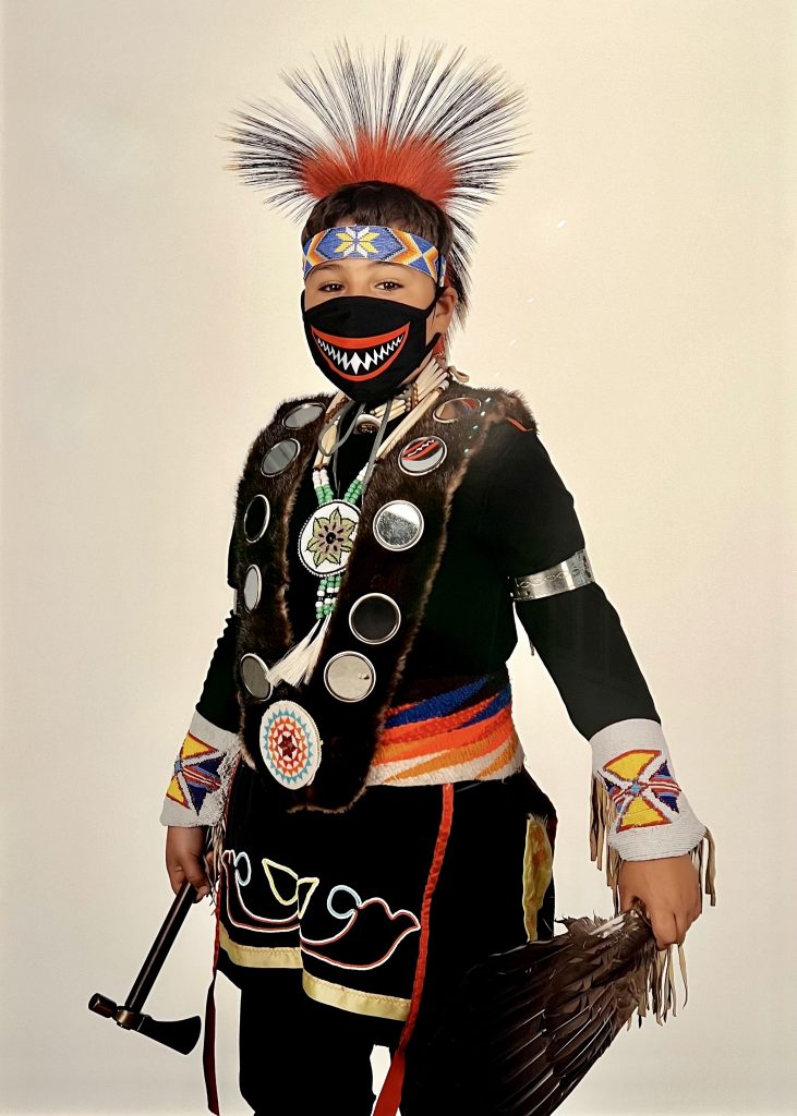
One of the most striking photographs in the exhibition is a portrait of Blake Funmaker (2020) in ceremonial regalia that includes an embroidered and beaded face mask. COVID-19 was a particular danger to Native American communities. Noreen Goldman, demographer and social epidemiologist at Princeton University reports, “Elevated COVID-19 death rates among Native Americans serve as a stark reminder of the legacies of historical mistreatment and the continued failure of governments to meet basic needs of this population.” To promote the protection of the community during the pandemic, the Ho-Chunk Nation Department of Health commissioned Jones to photograph members of his community with facemasks as part of their full regalia. 

What is consistent across the diverse bodies of work is the existence of a Native photographic language, one that blends traditional Indigenous art forms imbued with ritual, spirituality, and heritage with the detail and historicity lent to a subject by the medium of photography. In contrast to white photographers who have perpetuated the idea that Indigenous nations have vanished or are frozen in a romanticized past, Jones’ visual language instead reinforces that Native peoples are resisting erasure and maintaining their identities despite attempts by colonizers to assimilate them. 
Tom Jones: Here We Stand is on view at the Museum of Fine Art, St.Petersburg through August 27, 2023. The exhibition originated at the Museum of Wisconsin Art in West Bend, Wisconsin. A catalogue, including a major essay by Dr. Jane L. Aspinwall, accompanies the exhibition and is available for purchase in the MFA Store. Installation photography photo credit: Darcy Schuller, Museum of Fine Arts, St. Petersburg.
About the artist

Tom Jones is an artist, curator, writer, and educator. He graduated with a Bachelor of Fine Arts in Painting from the University of Wisconsin-Madison, a Master of Fine Arts in Photography, and a Master of Arts in Museum Studies from Columbia College in Chicago, Illinois. Jones is currently a Professor of Photography at the University of Wisconsin-Madison. For more information about the artist, visit his website.

About the author

Bay Art Files contributor Sabrina Hughes holds an M.A. in Art History from the University of South Florida with a focus on the History of Photography. Hughes has worked at the National Gallery of Art and the Museum of Fine Arts, St. Petersburg, and is an adjunct instructor at USF, and is the founder and principal of photoxo, a personal archiving service specializing in helping people preserve their family photos. She has an ongoing curatorial project, Picurious, which invests abandoned slides with new life. Follow her on Instagram @sabrinahughes for selfies, hiking, and dogs, and @thepicurious for vintage photos.

The Woman who Broke Boundaries: Photographer Lee Miller

by Sabrina Hughes

Lee Miller is a fascinating figure in the history of photography, and it is refreshing to experience a retrospective of her work of this size and scope, more than 130 images spanning her decades-long career.  The Woman who Broke Boundaries was curated by Dr. William Jeffett, chief curator of exhibitions at The Dalí Museum in St. Petersburg, FL, with all photographs on loan from the Lee Miller Archives in Sussex, England, managed by her son Antony Penrose.  

Miller’s career, and her photographic archive, represents her ceaseless drive to see, express, and experience. Her place in the industry and its history seems almost fated. Yet Miller’s insatiable ambition to become an important photographer and writer is sometimes downplayed in favor of telling the stories of her relationships to several key figures who Miller encountered along the way. 

The exhibition’s organization is informed by The Lives of Lee Miller a biography that her son Antony Penrose wrote. However, since the first introduction visitors get to the exhibit’s thesis is “This exhibition tells the story of Lee Miller’s extraordinary and unconventional life as seen through her photographic portraits of others” it is within this framework that viewers are meant to situate what they learn of Miller—through her portraits of and relationships with others. The exhibition, however, does not address many of the tragedies of Miller’s early life and simplifies key relationships that were more complex than they seem.

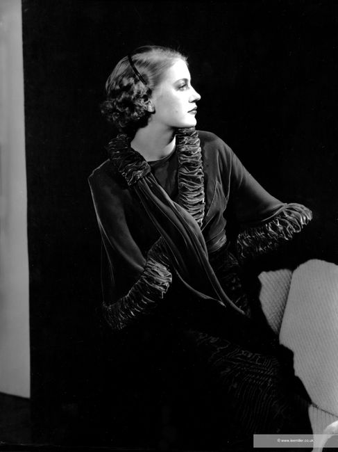
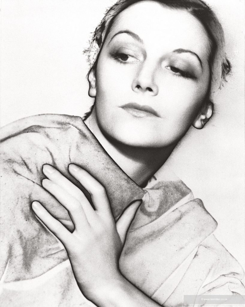
Self portrait [with headband], Lee Miller Studios Inc., New York, USA,
circa 1932 by Lee Miller
(NYS 12-6-C) © Lee Miller Archives England 2020.
All Rights Reserved

The exhibition begins with a large didactic panel situating Miller as Artist, War Correspondent, Model & Muse. Miller modeled for Vanity Fair and Vogue in her late teens and early 20s and was vaunted as the pinnacle of beauty standards of the 1920s. This was how she met Edward Steichen, an absolute giant in the field of both artistic and commercial photography who would later become a curator at the Museum of Modern Art. 

Miller was in front of, rather than behind, the camera during this period of her career, therefore this part of her life is not detailed much in the exhibition. Nevertheless, it represents the sum of numerous formative moments since Steichen wrote her a letter of introduction and recommendation to work with Man Ray, the American surrealist artist living in Paris. 

Surrealist aims of accessing unconscious creativity, desires, and expression have a natural affinity with the medium of photography. Photography captures fractions of a moment that the eye and the brain experience very differently than what the camera captures. A photo represents a different plane of reality. Additionally, photography’s formal characteristics allow for techniques like cameraless image creation (photograms), double exposures, combination printing, and any other number of manipulations that distort the “reality” that photography represented for many.

Since surrealism as an art movement (including writers, poets, painters, and photographers, and other creators in all sorts of media) was preoccupied with Freudian psychology, women in the group may have had a challenge being taken seriously as creators and were more often treated as Muses—passive inspiration for the creators. Or at least that is how it’s been reported in the photo history books. 

Miller’s relationship with Man Ray is well documented and marks the introduction to her photographic work proper in The Woman Who Broke Boundaries. This critical part of her photographic career also has scant representation in the exhibition. Though she was a model for Man Ray, Miller was far more than muse. They were technical and artistic collaborators. One of the surrealist photographic techniques that is synonymous with Man Ray’s legacy is that of solarization. 

Solarised Portrait (thought to be Meret Oppenhiem), Paris, France, 1932 by Lee Miller
(NC00585) (c) Lee Miller Archives England 2020. All Rights Reserved.

A negative, while in the process of being developed (so while it is still sensitive to light exposure) is exposed to a brief bright light. The result is a sort of otherworldly reversal of some tones in the final photograph—the highlights and shadows create an illusion of lighting that would be impossible to achieve without the manipulation. Sometimes the relationship between figure and background is lost and the model appears to be a relief carved from stone. 

History books say Ray invented the technique, but Miller reports that it was something that happened while she was working alone in the darkroom. In The Lives of Lee Miller, she is quoted: “It was all very well my making that one accidental discovery, but then Man had to set about how to control it and make it come out exactly the way he wanted to each time.” 

In the biography, Penrose suggests “Few examples of her early photographs survived her subsequent traveling and the strange contempt in which she held her own work.” However, just a few pages later Penrose writes, “A measure of Lee’s and Man Ray’s mutual respect was that neither of them was seriously concerned when their credits were wrongly ascribed” indicating that some of Miller’s work may have been attributed to Ray at the time, and in legacy.  

Miller’s photographs in this portion of the exhibition are representative of her avant-garde approach to portraiture—for sitters who were up for it. Solarized portraits of socialites such as Dorothy Hill denote a desire for Miller’s unique combination of techniques developed while working with Ray and her own sense of what makes remarkable portraits. 

This segment of the exhibition also showcases photographs of Miller’s friends, surrealist artists, and work she made in Egypt. The former grouping, Miller and friends, is a name-dropper’s paradise. With the pictures as proof of Miller’s intimate association with major artists, her own renown as an artist grew. 

Her photographs from the period she lived in Egypt are among the most fascinating of the exhibition. It seems to have taken Miller a while to resuscitate her creativity after marrying and moving to Egypt, but the images she eventually produced defined her mature photographic style. When creatively unfettered and free to pursue her own vision, Miller’s style of surrealist photography creates a playful tension by highlighting odd juxtapositions of subject matter. Portrait of Space (1937), an image made in Al Bulwayeb, near Siwa, Egypt, demonstrates the way an everyday scene can become a record of a dream in Miller’s hands. A simple torn window screen becomes an aperture to an otherwise shrouded ambiguous landscape—is it desert or beach? An oddly hung mirror seems to reflect the blank wall behind the photographer, but it also looks like it is a portal into the sky. It is hard to look away from the image because it invites and rewards close looking.

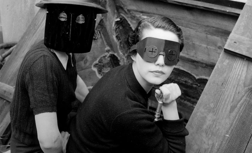
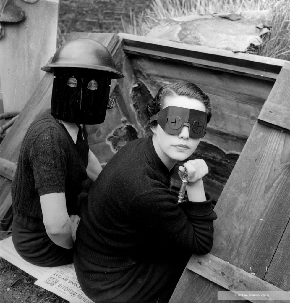
Miller’s wartime photographs also demonstrate her style of surrealism-via-juxtaposition. The realities of life in London during the Blitz must have eclipsed the surrealist visions she experienced in the desert. 

Fire masks, Downshire Hill, London, England 1941 by Lee Miller
(3840-8) © Lee Miller Archives England 2020. All Rights Reserved

She remained on staff as a photographer for Vogue and in 1942 Miller became accredited as a war photographer giving her the right to travel with the US Army. When Miller left London for the mainland, she found that she thrived in the bedlam of war. She was present for the Liberation of Paris, for the horrific discoveries at Buchenwald and Dachau, and for the first entry to the Berghof with its secret mountain passages. Her dispatches to Vogue began to slow as the world tried to move on after the war. Eventually, Miller also moved on from photography, leaving it almost completely in her past by 1954.

Miller’s life was indeed extraordinary and unconventional, and she is a photographer who should be celebrated for the boundaries she broke. The pictures in the exhibition don’t always stand on their own to demonstrate how exceptional she was, which is why the didactic text in the galleries (essays and label text) is so important for interpretive context. This is where the exhibition’s theme either becomes clear or not. 

In my subjective experience, the exhibition doesn’t achieve its goal which I’ll repeat here: “This exhibition tells the story of Lee Miller’s extraordinary and unconventional life as seen through her photographic portraits of others.”  As a woman and an artist, I would not like my life simplified to the degree that Miller’s has been to suit this simultaneously too-wide and too-narrow theme.  

The unspoken subtext of the exhibition, as I experienced it, seems to focus on Miller almost as connective tissue among the notable men she met along the way. Viewers may be spurred, as I was, to find out more about Miller’s life that’s hinted at between the lines of The Woman Who Broke Boundaries. In the exhibition writing there is a lot about Miller’s extraordinary life and trailblazing career that is glossed over, euphemized, or just plain omitted. 

What is evident from the work in this exhibition is that Miller was a master photographer, technician, and storyteller who created meaningful portraits and documents of her age with equal prowess. The opportunity to see such a range of photographs from an artist of Miller’s stature is not to be missed. 

The Woman who Broke Boundaries: Photographer Lee Miller is on view exclusively at The Dalí Museum in St. Peterburg, Florida, through Jan. 2, 2022.

Bay Art Files contributor Sabrina Hughes holds an M.A. in Art History from the University of South Florida with a focus on the History of Photography. Hughes has worked at the National Gallery of Art and the Museum of Fine Arts, St. Petersburg and is an adjunct instructor at USF and is the founder and principal of photoxo, a personal archiving service specializing in helping people preserve their family photos. She has an ongoing curatorial project, Picurious, which invests abandoned slides with new life. Follow her on Instagram @sabrinahughes for selfies, hiking, and dogs, and @thepicurious for vintage photos.

From Margins to Mainstays

By Sabrina Hughes

From Margins to Mainstays: Highlights from the Photography Collection is a small but impactful survey exhibition highlighting the work of photographers who may have experienced marginalization in their life because of part of their identity. The photos included are largely from the Museum of Fine Arts, St. Petersburg’s impressive photography collection, with a few important loans from area collectors. 

The title From Margins to Mainstays refers to artists (and in many cases, portrait subjects) whose identity existed on the margins of social norms. Making visible the work of photographers who were queer, BIPOC, women, and often multiple intersections of marginalized identities is the exhibition’s theme. I’ve been immersed in the history of photography for more than a decade and I still learned a lot from this exhibition. 

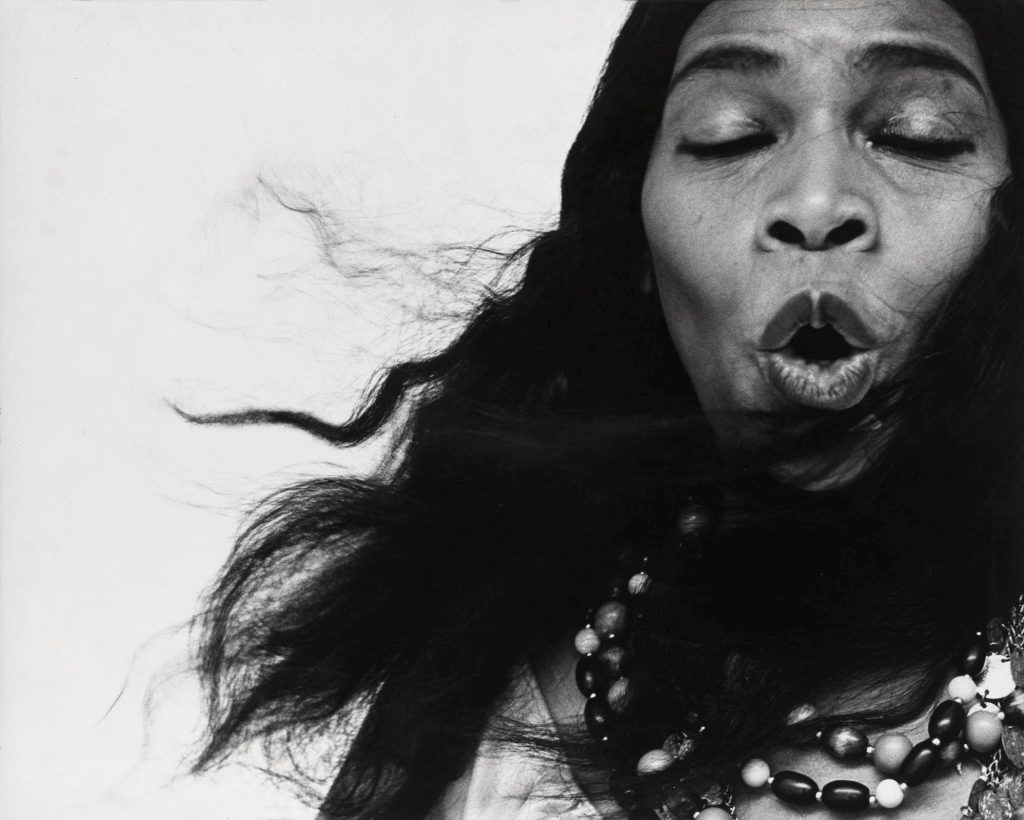
Richard Avedon (American, 1923–2004) Marian Anderson (Contralto, New York, June 30, 1955), 1955, Gelatin silver print, NEA photography purchase grant. Courtesy of the Museum of Fine Arts St. Petersburg.

A number of the artists included are queer, and that part of their identity was often hidden—either by themselves, such as Richard Avedon and Minor White who kept their queerness private during their lives, or just typically excluded from the general discourse around certain photographers and their work. 

While the exhibition’s focus is on revealing the axis of discrimination faced by photographers or other artists (with the subtext that this did not keep them from finding professional success) in many cases there is a concomitant axis of privilege that helped them become Mainstays.

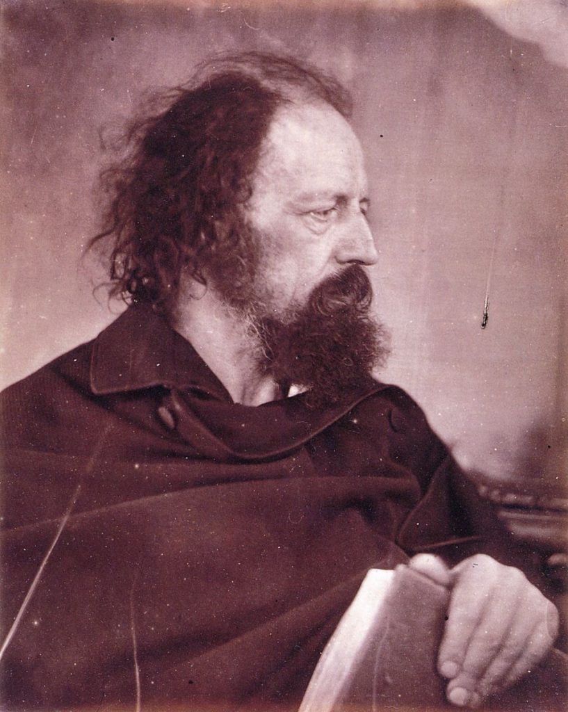
Julia Margaret Cameron is one example. While it’s true that women photographers were a relative minority in Victorian England, Julia Margaret Cameron was far from an average woman. She had an extremely rarified friend and portrait model group that included Robert Browning, Charles Darwin, and Alfred Lord Tennyson, whose portrait as The Dirty Monk, is included in From Margins to Mainstays

Julia Margaret Cameron (British, 1815–1879) The Dirty Monk, 1865, Albumen print.
Note: The print on display in the exhibition is on loan to the MFA, St. Peterburg from a private collection. This albumen print, similar to the one on display, was sourced online and is provided courtesy of the National Museum of Photography, Film & Television, Bradford, United Kingdom.

Cameron wasn’t a woman of average means or connections, so it’s hard to think of her for a stand-in for an average woman in the mid-19th century. Cameron had the means and resources to pursue copyrighting, marketing, exhibiting, and publishing her photographs. During her lifetime, she sold eighty prints to the Victoria and Albert Museum and entered a relationship with an established London print seller to publish and sell her photographs. This speaks to Cameron’s social connections and that assisted her career and legacy. Were there barriers to women photographers in the 1860s that couldn’t be overcome by wealth or connections? 

Studying art history, one learns quickly that social connections are disproportionately what determined who eventually got included in the history books when they were written. Yet, it has sparked in me curiosity about some of these photographers’ personal lives. 

Another example is Berenice Abbott. I studied her tangentially and momentarily because of her friendship with Eugene Atget, who I researched for a prolonged period. Berenice Abbott was studio assistant to Surrealist Man Ray in Paris in the 1920s, which is how she befriended Atget (Man Ray collected Atget’s photographs).

From the exhibition, I learned Abbott was an out lesbian! Personally, I cannot wait to learn more about this part of her life. It’s sparked for me a renewed interest about her time in 1920’s Paris and I’m glad to know that she likely did not spend all of her free social time with the group of Surrealists that she worked with! 

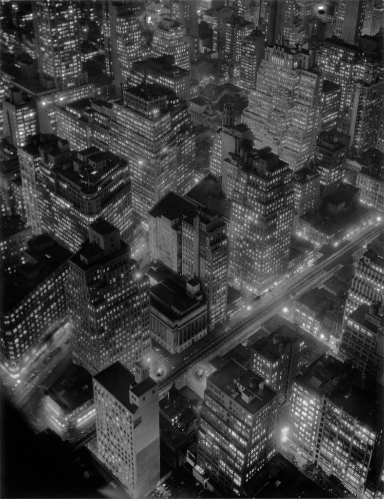
Berenice Abbott (American, 1898–1991), New York at Night, 1932, Gelatin silver print, Museum purchase with funds provided by the NEA and FACF. Courtesy of the Museum of Fine Arts St. Petersburg.

Abbott made a name for herself as a photographer in the mid-to-late 1930s for her wide-ranging project Changing New York, funded by the Works Progress Administration Federal Art Project. Her photograph in the exhibition, New York at Night (1932), is a dreamlike view from atop a skyscraper, looking down on other buildings and the twinkling lights of the city. 

Abbott’s contribution to photography history was likely solidified before Changing New York because she facilitated the acquisition of thousands of Atget’s prints and negatives which eventually became a donation to the Museum of Modern Art and a landmark exhibition and production of scholarship decades later in the 1980s. 

From Margins to Mainstays relies on the text to help viewers to make the connections between the exhibition theme and the images. In other words, with a few exceptions, the images themselves don’t communicate marginalization. 

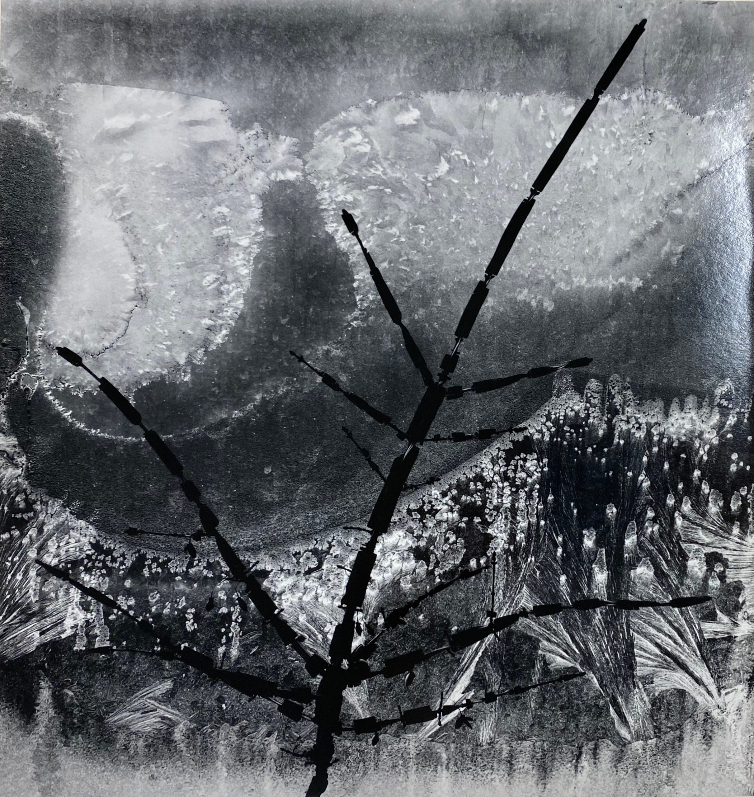
Minor White (American, 1908-1976), Ritual Branch, Frost on Window, 1958, Silver gelatin print, Gift of the photographer. Courtesy of the Museum of Fine Arts St. Petersburg.

These very minor critiques of a diverse and thoughtful exhibition come from my closeness to the subject matter. I had to purposely turn the volume down on my internal photography historian’s commentary, only because it’s hard to think of some of the artists included as being on the margins when they have become such giants in the field. However, that, I suppose, is the strength of the exhibition. Simply expanding our knowledge about photographers we think we know because they are in the survey textbooks always generates new understanding in the present. 

From Margins to Mainstays: Highlights from the Photography Collection was organized by MFA St. Petersburg Curator of Photography
Allison Moore, Ph.D.
, and will be on view at the Museum of Fine Arts, St. Petersburg through September 26, 2021. For additional information and related programming visit the Museum’s website.


Bay Art Files contributor Sabrina Hughes holds an M.A. in Art History from the University of South Florida with a focus on the History of Photography. Hughes has worked at the National Gallery of Art and the Museum of Fine Arts, St. Petersburg and is an adjunct instructor at USF and is the founder and principal of photoxo, a personal archiving service specializing in helping people preserve their family photos. She has an ongoing curatorial project, Picurious, which invests abandoned slides with new life. Follow her on Instagram @sabrinahughes for selfies, hiking, and dogs, and @thepicurious for vintage photos.

From Chaos to Order

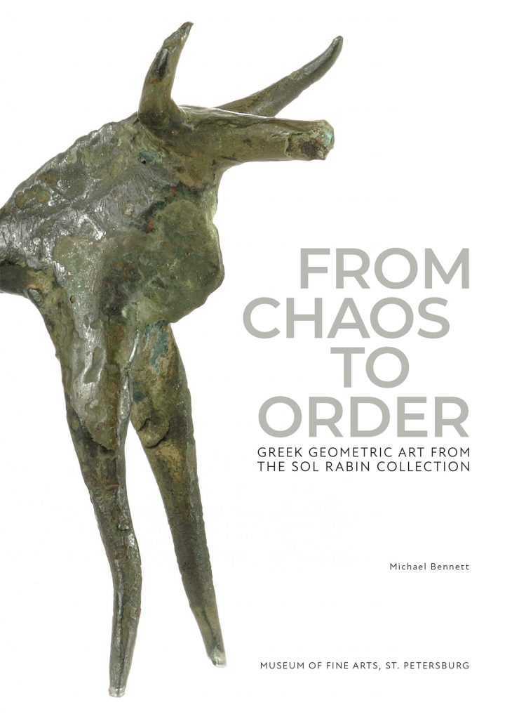
From Chaos to Order: Greek Geometric Art from the Sol Rabin Collection

By Dr. Bob Bianchi

Some of us, I suppose, might initially be reluctant to attend an exhibition featuring 57 relatively small objects from the obscure Geometric period (about 900-700 BCE) of ancient Greek art placed within the context of ancient Greek epic poetry and philosophy. And, I would also imagine, others among us would suspect that reading labels and slugging our way through an accompanying catalogue would be of boringly little interest. We might even echo the sentiments of Callimachus, a Greek poet writing in Alexandria, Egypt, in the 3rd century BCE, who once famously quipped, “A big book is even bigger pain!”  But hang on for a second, because big things come in small packages!

The first is the sagacious selection of the objects by Dr. Michael Bennett, Senior Curator of Early Western Art at the Museum of Fine Arts, who curated this exhibition. He made the selection from the approximately 700 in the private collection of Mr. Sol Rabin, who has so exclusively focused for decades on acquiring works of art from that period that his collection is universally considered to be the finest of its kind.

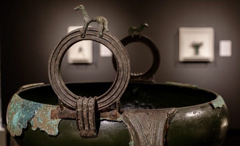
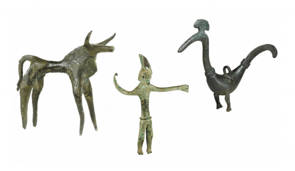
Dancing Bull, Greek, (Olympia?), Eighth century BC, Bronze. Helmeted Warrior, Greek, (Thessaly?), Late eighth century BC, Bronze. Peacock, Greek, Eighth century BC, Bronze. All from The Sol Rabin Collection (Peacock photo courtesy of the J. Paul Getty Museum, Los Angeles)

The second is the text, both in the labels and panels in the exhibition and in the catalogue itself. All were written by Dr. Bennett. His main essay represents a decades-long distillation of his own thoughts on the Geometric period. It  is felicitously written and peppered with contemporary references so that it is a very easy read. He defines in very understandable terms the ancient Greek concept of beauty and the Greek definition of that term within the context of his overarching discussion of ordering chaos.

His syntheses of the so-called Presocratic philosophers, his elucidation of the principles of Pythagoras, his discussion of Plato’s famed “simile of the cave,” and his presentation of passages from Aristotle’s Metaphysics are presented in such a reader-friendly manner that the complex becomes simple. Interwoven within those discussions is the place of oral, epic poetry of both Hesiod and Homer, appropriate passages of which he quotes in English translation. Despite its simplicity of style, Dr. Bennett’s essay represents “a fundamental reappraisal of the birth of Greek art,” as the Museum’s Executive Director and CEO, Kristen A. Shepherd, so aptly states in her “Foreword.” I could not agree more.

A fully illustrated catalogue, written by Dr. Bennett, accompanies the exhibition and is available for purchase online.

To begin with, the Geometric period was so labeled by modern scholars because of the Geometric patterns found on decorated vases of the period, two of which are featured in the exhibition. The repetitive patterns of their decoration are linked, correctly so, to the repetitive patterns found in the poetry of Homer. Those patterns, I might add, have been suggested to have been based on contemporary, now lost, textiles, ostensibly woven by women, as exemplified in The Odyssey, where Penelope holds her suitors at bay until she completes the weaving of a funerary shroud for Laertes. As an added bonus, visitors to this exhibition might also want to take in the concurrent exhibition, Color Riot! How Color Changed Navajo Textiles, in order to understand  just how the repetition of geometric patterns are inherent in the technical mechanics of physical weaving a textile.

One must always remember that the population of the Geometric period of Greece was relatively small, major urban areas rarely containing more than an estimated 5,000 residents. Those residents were neither dominated by the worldwide web nor bombarded by posts on social media. It was an age dominated by oral, epic poetry, and with the exception of Hesiod, Homer was the only show in town. Consequently, the Geometric period of ancient Greek art can indeed be regarded as an age dominated by the epic poetry of Homer. That the poetry of Homer should so dominate an age should come as no surprise. More than 26% of all papyri containing literary texts recovered from the sands of Egypt during the Roman Imperial Period are Homeric! Dr. Bennett is certainly correct, then, in identifying the bronze statuette of a singer accompanying himself on a phorminx as Homer, because the ancient sources clearly state that Hesiod never learned how to play the cithera, the other stringed instrument of the day. 

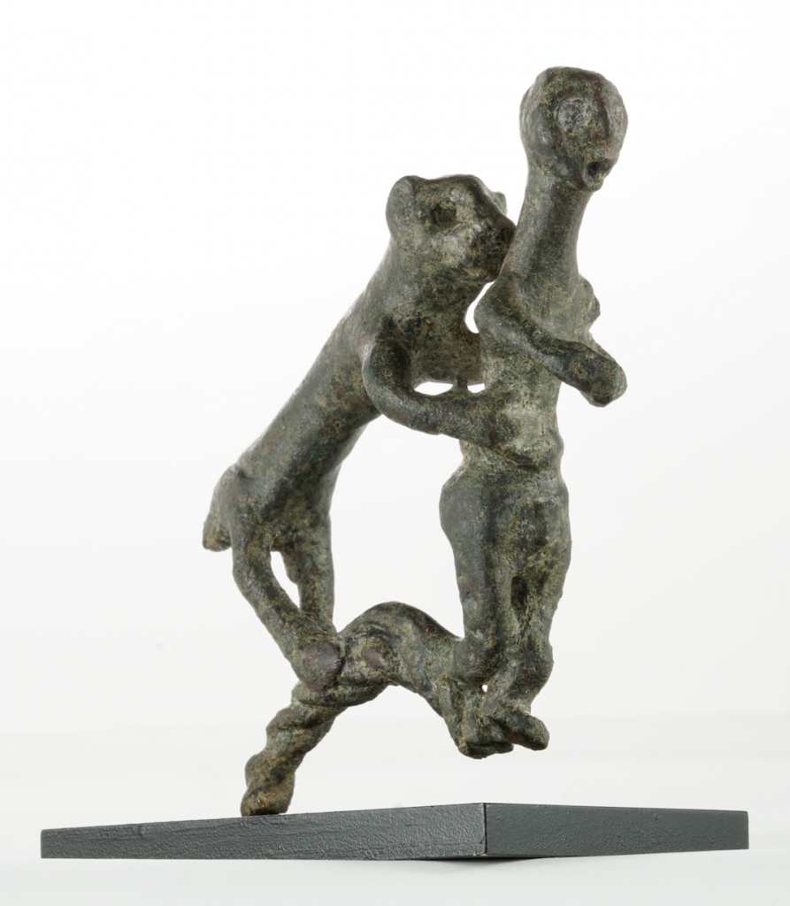
Dr. Bennett’s linking of  certain passages from the epics of Homer with the subjects represented on the bronzes is compelling. His discussion of the role of lions in those epics is consistent with his interpretation of the bronze group of a lion attacking a man. The bronzesmith responsible for its creation may also have relied on the Greek artistic convention of portraying the “pregnant moment,” that is a point in the action just prior to its climax. The lion is about to fell its prey, but is not devouring it. The choice is comparable to the scene in Sophocles Oedipus Rex, wherein the protagonist resolves to blind himself, then exits so that the act is anticipated but not consummated on stage.

Man and Lion, Greek, 8th century BC, Bronze, The Sol Rabin Collection

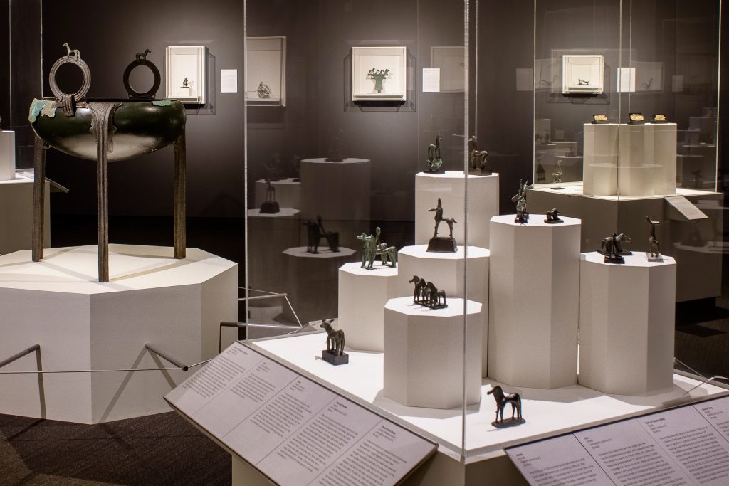
And there are statuettes of horses, horses galore in this exhibition. Here again, Dr. Bennett is doubtless correct when he observes that this repetition of a type is not a mechanical, knee-jerk, simple replication, but represents a repetitive pursuit of perfection and clarity. To my mind, these horses are also evocative of passages in The Iliad (17, 474-8) where the goddess Hera grants one of Achilles’s horses the ability to speak and in so doing predicts the imminent death of his master; and the final lines of that same poem, “…and thus was their burial of Hector, prince of charioteers.”

Installation shot courtesy of the Museum of Fine Arts St. Petersburg.

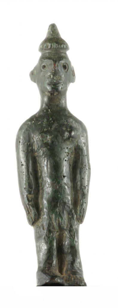
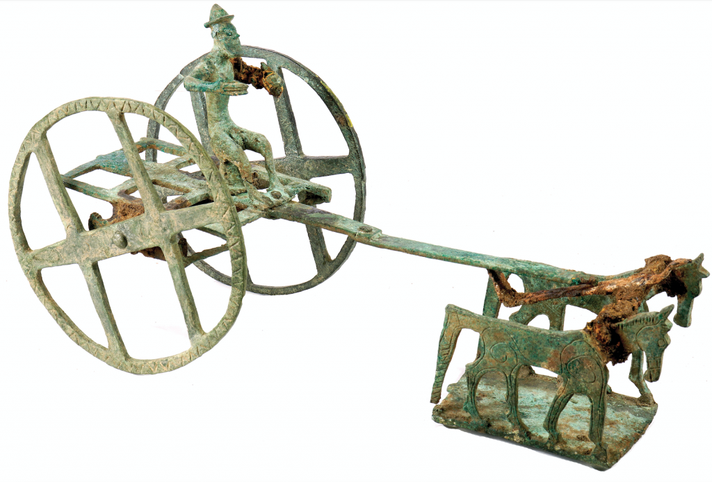
I would like to conclude with two observations in order to indicate just how thought-provoking this exhibition and its accompany catalogue really are. First, the inclusion of three statuettes of nude women is certainly noteworthy inasmuch as the nude female disappears from the repertoire of Greek art until its reintroduction in the 4th century BCE by Praxiteles. Might these statuettes also represent one of the three goddess whose beauty Paris was to judge, and whose decision sparked the Trojan War? And, second, should we not place Mr. Rabin’s pattern of collecting into the context of the longevity of some of the objects in his collection? The nude, hatted figure driving the horse-drawn cart exhibits unmistakable signs of ancient repairs, suggesting it was long-lived because of its perceived value. I think we owe Mr. Rabin a debt of gratitude for likewise perpetuating the longevity of these objects, the value of which Dr. Bennett has so eloquently explained.

Nude Female with Conical Hat, Greek, 8th century BC, Bronze, The Sol Rabin Collection
Wheeled Cart, Greek, (Samos?), Eighth century BC, Bronze, The Sol Rabin Collection

Dr. Bob Bianchi received his Ph.D. from the Institute of Fine Arts, New York University, after which he served as curator in the Department of Egyptian, Classical, and Ancient Middle Eastern Art at the Brooklyn Museum of Art. During his career he has been the recipient of several post-doctoral fellowships, has subsequently served as a curator in museums in the States, Europe, and the Middle  East, has excavated for 17 seasons in Egypt, and has taught as an adjunct professor at three universities.  To date, he has published 96 books, 378 journal articles, and book reviews, and has appeared in 105 telecasts worldwide. As a critical art historian with a specialization in Ptolemaic Egypt, he continues to explore intercultural artistic connections between Egypt, Greece, and Rome. He recently retired, as chief curator, after almost twenty years of service with the Foundation Gandur pour l’Art, Genéve. Dr. Bianchi continues to publish, address international congresses, and serve as a fine art advisor and certified appraiser to collectors and institutions. He can be reached at Dr.BobBianchi@gmail.com.

From Chaos to Order: Greek Geometric Art from the Sol Rabin Collection is on view at the Museum of Fine Arts, St. Petersburg in downtown St. Petersburg, Florida, through Sunday, April 11, 2021. A fully illustrated catalogue, written by Dr. Bennett, accompanies the exhibition and is available for purchase online.

RELATED MUSEUM PROGRAMMING

Thursday, January 14, 7 pm- 8:30 pm
From Chaos to Order with Dr. Michael Bennett and Dr. Sol Rabin
An online ZOOM conversation between Senior Curator of Early Western Art Michael Bennett Ph.,D. and art collector Sol Rabin, Ph.D. to discuss the special exhibition. Dr. Rabin has been collecting in this area for over 30 years, and the vast majority of the works in his collection have never been on public display.  Free for MFA members; Not-yet members $20. Online registration required.

Radical Pleasures

by Sabrina Hughes

“I didn’t know that that work was even radical in the way that I see it as being radical now until I started to have a conversation with people—even black people—who thought that my work was “positive.”
Derrick Adams, Artnet News, February 5, 2020.

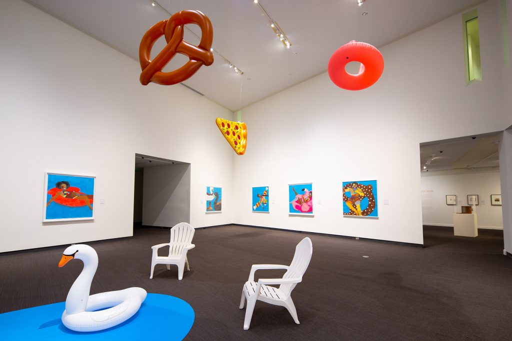
Derrick Adams: Buoyant is on its last tour stop at the Museum of Fine Arts, St. Petersburg through November 29, 2020. The exhibition was initially conceived by the Hudson Valley Museum and curated by James E. Bartlett, founder of Open Art and former Executive Director of the Museum of Contemporary African Diasporan Arts, in Brooklyn, and Laura Vookles, Chair of the Hudson River Museum’s Curatorial Department. 

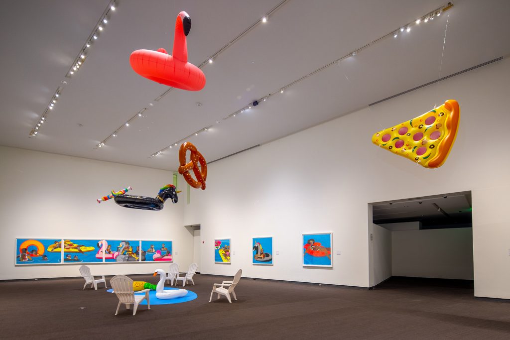
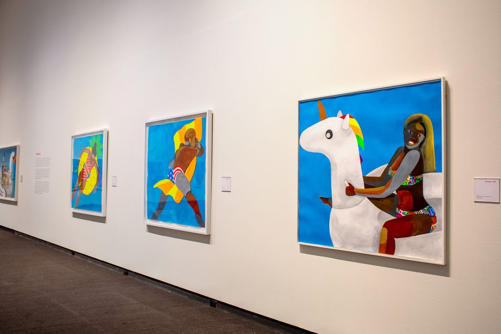
Installation view of Derick Adams: Buoyant.
Photo: Courtesy of the Museum of Fine Arts, St. Petersburg.

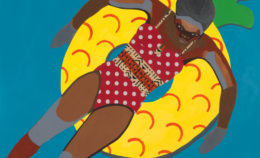
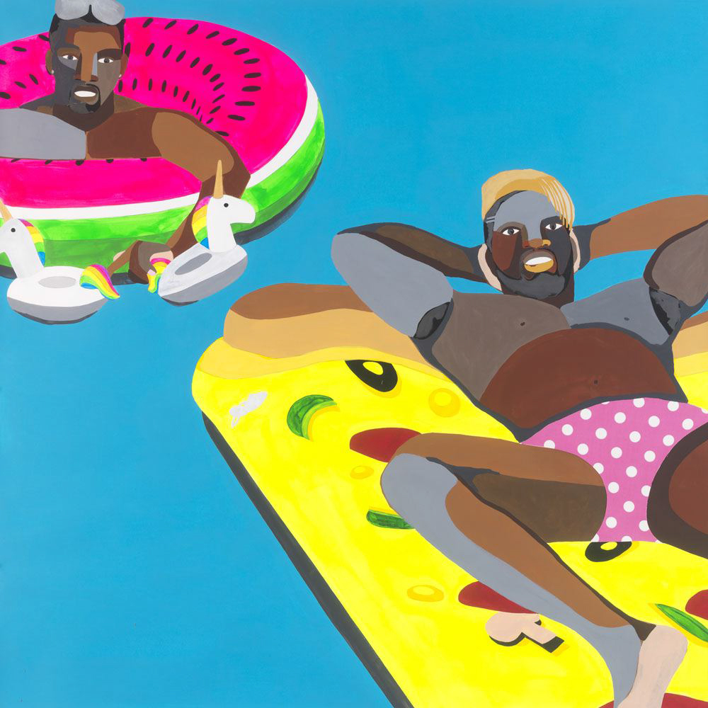
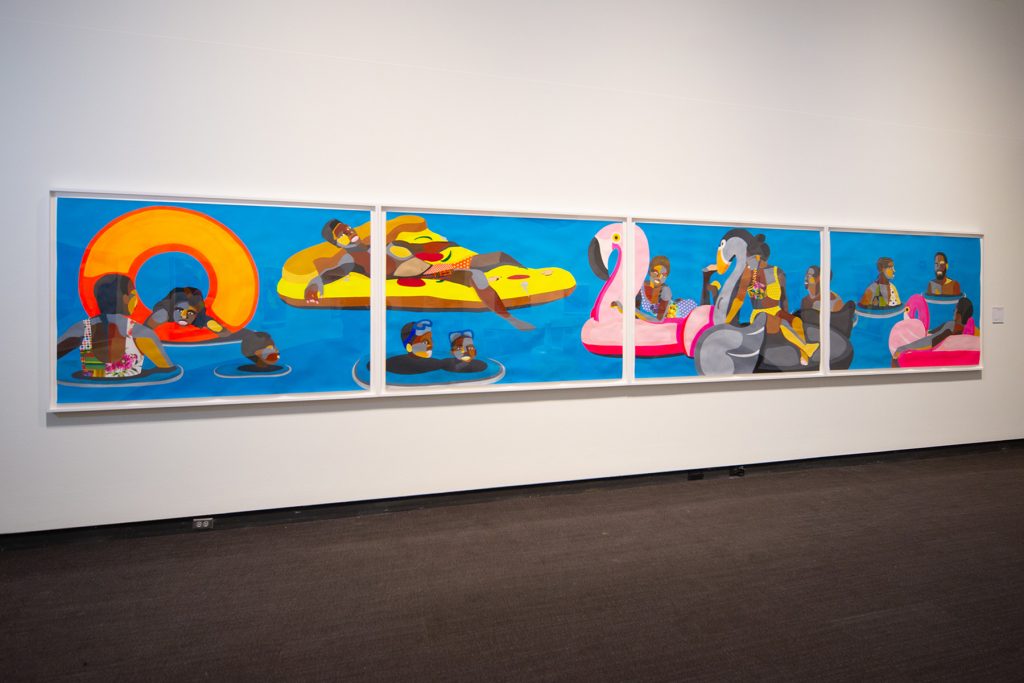
On entering, the exhibition may strike a viewer as many things: joyful, fun, playful, enticing, or whimsical. The twelve large-scale paintings in the exhibition are an explosion of neon and novelty. Radical may not be the first word that comes to mind upon visiting the exhibition when the subject matter, groups of people and individuals relaxing on novelty pool floats, is so patently ordinary. 

The Floaters series was created over a span of three years (2016-2019). This is a rare opportunity to see works on loan from private collections, and to see some of the Floaters together as a group, which creates a much different feeling than would seeing any one on its own. Walking into the gallery is walking into a space occupied by paintings of African Americans. Part of the impact of the exhibition is that it highlights how rarely we see representations—in art or popular media—of Black people simply existing. This everyday reality of Black life in America suffers from erasure by omission.  

Floater 66, 2018, Acrylic paint and collage on paper, Collection of D. Rebecca Davies and Jeremy Kramer. Photo: Courtesy of the Museum of Fine Arts, St. Petersburg.

In relation to the picture planes of all of the Floaters, the viewer is left rather floating themselves. With the exception of one, the backgrounds of the paintings are one solid shade of blue (one painting has a darker blue at the top that seems to denote the difference between sky and water, the only horizon line in the gallery). The paintings are acrylic on paper, so there are ripples in the paper most noticeable in the blue background as the paper absorbed the paint and dried. The ripples and the occasional variations in the blue field—not a different color, but from more or less paint on the brush—enhance the suggestion of water and gentle motion. 

Figures are anchored to their novelty pool floats, but beyond that there are no clues to what kind of space they occupy, other than that it’s water. Without a horizon line, the viewer is left in an uncertain space. Some of the figures are looking out of their space, making eye contact with viewers while many others are engaged with other figures or are simply looking elsewhere. 

Installation view of Derick Adams: Buoyant.
Photo: Courtesy of the Museum of Fine Arts, St. Petersburg.

The swimsuits of each figure are collage elements of different fabric, adding another visual flourish to the already dazzling paintings.

In an interview with Charles Moore for artnet news that I’ll refer to several times, Derrick Adams uses the phrase “Black radical imagination” which, as he sees it, can be a tool to create the future. It is worth exploring this idea so we can fully appreciate how radical these day-glo spaces inhabited by patchwork figures are. 

Representation reflects and creates reality. We have seen this thought repeated a lot over the last decade or so—representation matters. Everyone wants to be able to see themselves and their possibilities reflected in the popular media they consume. When Adams conceived the Floaters series in 2015, he searched Instagram for #floaties and the algorithm returned only pictures of white people. In this instance, the representation failed to align with the reality that he had experienced.  

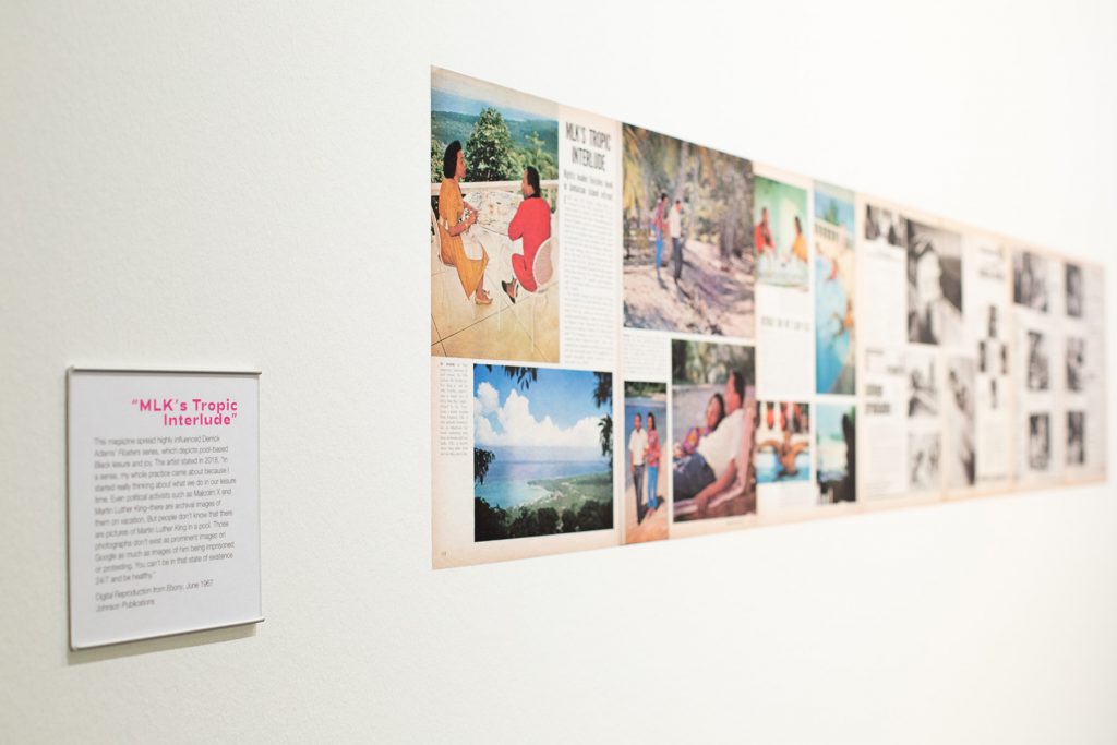
Digital Reproduction from Ebony, June 1967. Installation view of Derick Adams: Buoyant. Photo: Courtesy of the Museum of Fine Arts, St. Petersburg.

In further research, Adams found inspiration in an Ebony feature from June 1967 of Coretta and Dr. Martin Luther King, Jr. on a tropical escape to Ocho Rios, Jamaica (also included in the exhibition). While the article makes clear that this is not a vacation (King wanted a month in a place without a phone to write his book Where Do We Go from Here?), the photo essay is almost exclusively comprised of images showing Dr. King at rest: walking on the beach, relaxing in the pool, having breakfast on the balcony in his robe and slippers, reading the newspaper in bed. This fascinating editorial shows a seldom-seen side of Dr. King, but also shows what is necessary to fuel his public acts in the struggle for equal civil rights: rest, quiet, isolation, time to think and to put thoughts in order. Time and space to just exist. 

It’s worth quoting Adams at length because his intent with the Floaters series was to depict Black people at rest, similar to how Dr. King had been photographed for Ebony. 

Floater 74. Installation view of Derick Adams: Buoyant.
Photo: Courtesy of the Museum of Fine Arts, St. Petersburg.

“What I love the most is when I’m at an event or a party at someone’s house and I look around and everyone in the room is doing something. It’s all Black people doing all these amazing things and I’m like, wow, this is great. And I say to myself, this is what we should be making work about, this type of atmosphere. Young Black people should see that there are very normal, very consistent spaces like these—regardless of what’s happening in the news, regardless of what’s happening on social media. With all the conflicts that we’re having, we’re still finding the time. And not everyone in this room has money! These aren’t people who are all well off!

That’s what I’m thinking about in my studio: What can I reveal that has not been shown? And it always goes back to the simplest of things, like normalcy. Black people—not entertaining, just being, living. Letting people deal with that as reality. We’re sitting on this pool float. We’re thinking about life. We’re thinking about nothing. We don’t have to think about something every day. It’s a real human experience not to ponder on things constantly.”

The paintings that resonated most with me were both paintings of women. I’ll describe them but they’re not reproduced here, so you’ll have to go to the exhibition to see them for yourself. 

Floater #28 depicts a woman on a white unicorn float. Her bathing suit is neon animal print with hearts and stars, like a Lisa Frank notebook. She looks out of her space and is smiling. Though the blue fields that the figures float on often have the effect of suggesting water through the variations in paint application, most of the geometric planes that comprise the figures are more even in tone—less painterly, more hard-edge. This figure is different. The paint application on her legs and abdomen create a variation in tone within the planes that most of the other figures don’t exhibit. It’s like seeing the natural variation in skin tone across different parts of someone’s body. Adams has also employed the grey-tone paint—usually reserved for the parts of the figures bodies that are underwater—on the figure’s arm and face that couldn’t be the only part under the water if the rest of her is not. It’s the kind of variation that feels like improvisation on the theme. It’s just different enough to have made me stop and look a lot more closely.

Representations like Floaters reflect one reality experienced by Black folks in America, one that aligns with the experience of love, community, family, and just living life. It hints at another reality from the not-so-distant past—the reality that all-Black spaces were backed by apartheid laws and violently enforced by police and mercenary groups. Pools and beaches were sites of contestation. Here in St. Petersburg, the beaches downtown were segregated. From Spa Beach north was designated whites only. The beaches for African Americans were South Mole at what is now Demen’s Landing and Lassing Park. 

The subject matter of the paintings contain the tension of present and past, even while Adams is trying to create a future where celebrations of everyday Black life are more commonplace.  

We see Black lives snuffed out on live Facebook broadcasts. We see representations of Black Americans working, struggling, mourning. We see them relative to the white supremacist political and economic system that their kidnapped ancestors were forced to build, and that largely controls what type of images are disseminated in the public sphere. It is rare to see representations of Black people resting. Images of Black bodies at rest are radical. 

Installation view of Derick Adams: Buoyant.
Photo: Courtesy of the Museum of Fine Arts, St. Petersburg.

Floater #17 portrays a pregnant woman lounging on a hot pink float. I imagine the buoyancy of her body, with or without the float, is a welcome relief from gravity’s pull on the extra bulk of her body carrying a baby. Black women experience overlapping oppression of misogyny and racism, represented by the term misogynoir. As a class, they have always been expected to work (when white women may have been homemakers, Black women may have been their maids or nannies) and have had the highest labor force participation among all women for years. The United States has a dark history of sterilizing Black women without their consent throughout the 20th century. Yet look back earlier, when African Americans were enslaved and performing forced labor, and Black women’s bodies were commodities that grew the labor force. 

Artists are worldbuilders. By making these paintings, Adams populates our world with many more images of Black leisure. Adams realizes the power of the artist to create reality—to create the world in images so that later people can create it through action. If you want an action to succeed, you have to be able to imagine it has happened, and then imagine what happens next. Adams invites viewers to co-create a future where images like this aren’t “positive” in comparison to other pictures, where all aspects of Black life aren’t adjunct to their white counterparts, presented as the default.

The term radical seems to be used with such frequency that the impact of the word has faded. From radical feminism to radical self-care, radical honesty to the radical left, radical is just as often used by Instagram influencers to sell protein powder as in any political reformist sense. We live in a radical-saturated world. Invoking Black radical imagination asks for a rethinking of all assumptions about Black life in America, from the roots up. Ask why things are the way they are and why they seem unchangeable. And then imagine what systems need to be torn down to their foundations and rebuilt differently. In 2020 conversations about prison abolition have entered mainstream political discourse. This is radical imagination at work. 

As I’m writing this review, the verdict in Louisville has just come in. Nobody is going to be criminally charged for Breonna Taylor’s murder, though one officer is being charged for endangering the lives of her white neighbors. I’m thinking about Breonna who was not only at home, but was sleeping, literally at rest, when she was killed. Imagine if this had had a different outcome. Imagine what needs to be torn down and rebuilt to ensure future Black lives are valued and protected. I’m also thinking how even though Adams’ intent was to show Black joy and play and people just existing, it seems that there is no neutral in the representation of African Americans. It becomes political as soon as it enters the public because Black people just existing is a radical and revolutionary act. Unless we are part of the communities that Adams is talking about, we may not see the experience that he’s talking about. Black people just living, just being. Black figures at rest. Black people not othered by the implicit or explicit comparison to whiteness. Being in the gallery with so many Floaters makes me wonder if it’s a pool, how enormous the pool must be to hold the figures, the floats, and to still not see the horizon. Are we floating with them? Part of the party? Or interlopers?

Related Exhibition Programming

PANEL DISCUSSION: AFRICAN AMERICAN LEISURE IN THE SUNSHINE STATE & BEYOND WITH DERRICK ADAMS
October 15, 2020, 6:30-8 pm
Free for members, and $10 for not-yet-members.
An online conversation featuring Derrick Adams, Dr. Gretchen Sorin, author of Driving While Black: African American Travel and the Road to Civil Rights, and Cynthia Wilson-Graham, co-author of Remembering Paradise Park: Tourism and Segregation in Silver Springs. The discussion will be moderated by MFA Curator of Contemporary Art Katherine Pill.

BLACK FANTASTIC, BUOYANT AND BOLD: ART’S WAYS OF LEVITATING OVER THE WEIGHT OF THE WORLD WITH AUTHOR TENEA D. JOHNSON
October 22, 2020, 6-7 pm
Free for members, and $10 for not-yet-members
Author Tenea D. Johnson will read joy-centered selections from her latest book, Blueprints for Better Worlds (May 2020)as well as the forthcoming collection, Broken Fevers

POETRY AND SPOKEN WORD WITH DENZEL JOHNSON-GREEN
October 25, 2020, 3-4 pm
Free for members, and $20 for not-yet-members.
Join poet and author Denzel Johnson-Green in the time-honored tradition of utilizing spoken word and poetry to both raise awareness of, and develop mechanisms for addressing, the world around us. 

About the author:
Bay Art Files contributor Sabrina Hughes holds an M.A. in Art History from the University of South Florida with a focus on the History of Photography. Hughes has worked at the National Gallery of Art and the Museum of Fine Arts, St. Petersburg and is an adjunct instructor at USF and is the founder and principal of photoxo, a personal archiving service specializing in helping people preserve their family photos. She has an ongoing curatorial project, Picurious, which invests abandoned slides with new life. Follow her on Instagram @sabrinahughes for selfies, hiking, and dogs, and @thepicurious for vintage photos.

We Must Go…

By Sabrina Hughes

The Museum of Fine Arts, St. Petersburg’s newest exhibition is Theo Wujcik: Cantos, a series of works based on Dante’s Inferno. The exhibition is in turns lyrical, poetic, and dark in keeping with Wujcik’s literary inspiration for the paintings.

If, like me, it’s been decades since thinking about Dante in any way, substantial or otherwise, a refresher on the basics of the Inferno will help add layers of interpretive flesh to the works in the exhibition. The Inferno is the first part of Florentine poet Dante Alighieri’s three-part epic poem The Divine Comedy. In this part of his journey, Dante travels through the nine circles of hell guided by ancient Roman poet Virgil at the behest of his love Beatrice who is in heaven and notices that Dante has wandered off his proper path. Dante trades the offer of fame in the living world for the tortured souls’ stories. Each canto in the poem is analogous to a chapter in the story.

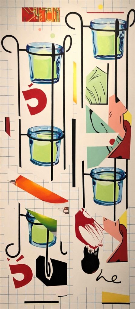
C-2-C Invocation of the Muses, 1998. Acrylic on canvas. Collection of Alan J. and Sue Kaufman.

Like any proper epic poem, Theo Wujcik: Cantos begins with an invocation of the muses. In Dante’s second canto, he calls upon the muses to ask for creative aid in recounting his story faithfully. Wujcik’s paintings in the introductory gallery C-2-A and C-2-C, both subtitled Invocation of the Muses (1998), are not only an introduction to the themes of Cantos but also to the visual fragmentation and recombination that has come to be Wujcik’s stylistic hallmark. These first two paintings in the exhibition had at one time been part of the same canvas, but Wujcik excised these sections from the whole creating two distinct works. C-2-C, with its simple and recognizable votive holder motif paired with the title sets the mood for ritual experience.

Wujcik moved to Tampa in 1970 to join the staff at Graphicstudio as a master printer at the University of South Florida. He lived and worked in Ybor City until his death in 2014. Wujcik found inspiration in comic strips and other found imagery of the mass media. Several collages are included in the exhibition, revealing the way he combined and composed drawings, photos, and comics. The personalized symbolism that manifests in his work is pop filtered through the visual language of Florida. Ever present in his work since the mid-1980s is the diamond chain link fence motif. This visual device further heightens the fragmentation and visual confusion that begins in collage and ends on the canvas.

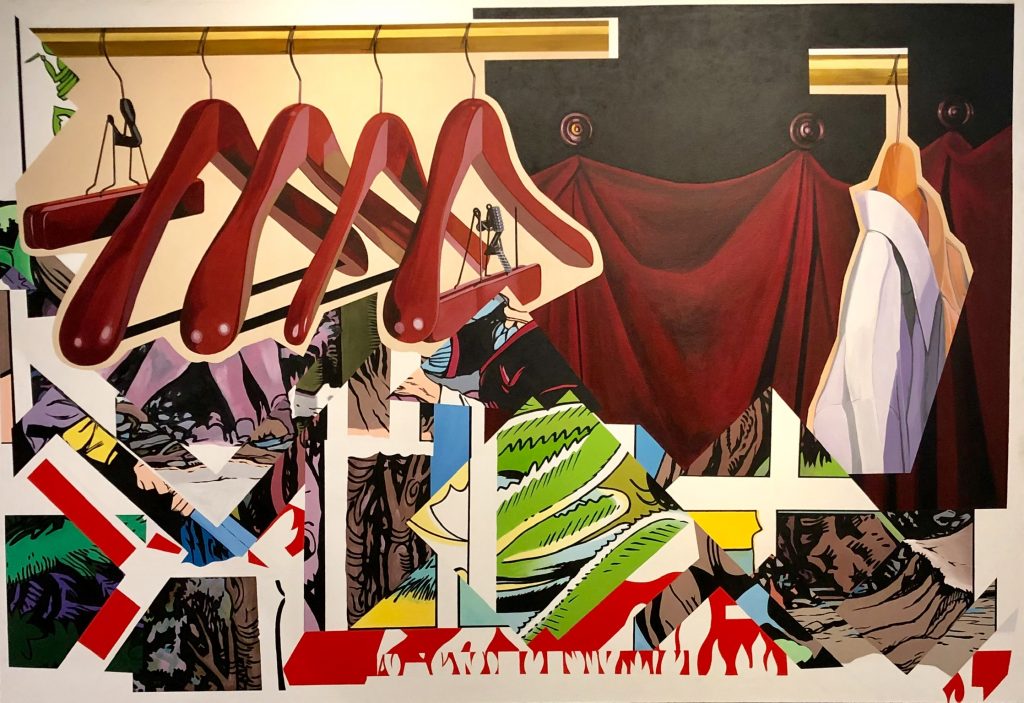
Men Were We Once (Canto XIII), 1997. Acrylic on canvas. Collection of The Terrier Foundation, Tampa, FL.

Wujcik’s personal symbolic structures are reworked in Cantos to metaphorically reference Dante. In Men Were We Once (Canto XIII) (1997), red drapery and a white button-down shirt represent Virgil and Dante. In this canto, the travelers enter the seventh circle of hell and meet those who have committed violence against themselves–suicides. These souls have been transmuted into tree stumps that speak and bleed. The empty wooden hangers directly reference both the wooden form of the souls as well as part of the punishment—that the flesh they used to “wear” now hangs like clothing among the trees. The comic strip imagery below the hangers hint at conflict and violence that they may have experienced in life, as well as the forest Dante describes in the story.

Theo Wujcik: Cantos is anchored by two large-scale paintings in the MFA’s collection: Canto II (1997) and Gates of Hell (1987).

Canto II, 1997. Polymer emulsion and charcoal on canvas. Gift of Bonita L. Cobb in memory of Nikki C. Cobb.

In Inferno, it is in Canto II that Dante learns how and why Virgil was sent to him—directed by three women in heaven looking out for his well being: Beatrice, St. Lucia, and Mary. Virgil has told Dante that they must travel through hell to get back on the proper path, and while Dante is at first brave, he quickly loses his resolve. He wavers not out of fear but from self-sabotage, uncertainty, and feelings of unworthiness.

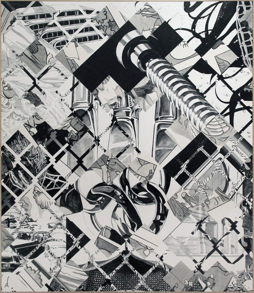
In Wujcik’s Canto II, the viewer is confronted with an overwhelming fragmentation of images—one’s eyes slide over the monochrome surface looking for purchase, something solid to focus on. The element that resolves first and most prominently, that gives the eye a place to rest, is a large bolt in the upper right quadrant. The winding threads of the bolt may reference the concentric circles of hell that Dante is about to spiral into. Three butter knives are situated in the center of the canvas, large yet somehow almost invisible among the cacophony; below them appear three chain links all rendered naturalistically while surrounding and overlaid are cartoons and the ubiquitous diamond fence. Perhaps this jumble of overwhelming image fragment foreshadow the chaos and distress that Dante will experience in hell. Or perhaps it is all of the memories that Dante is attempting to make sense of to create a coherent narrative.

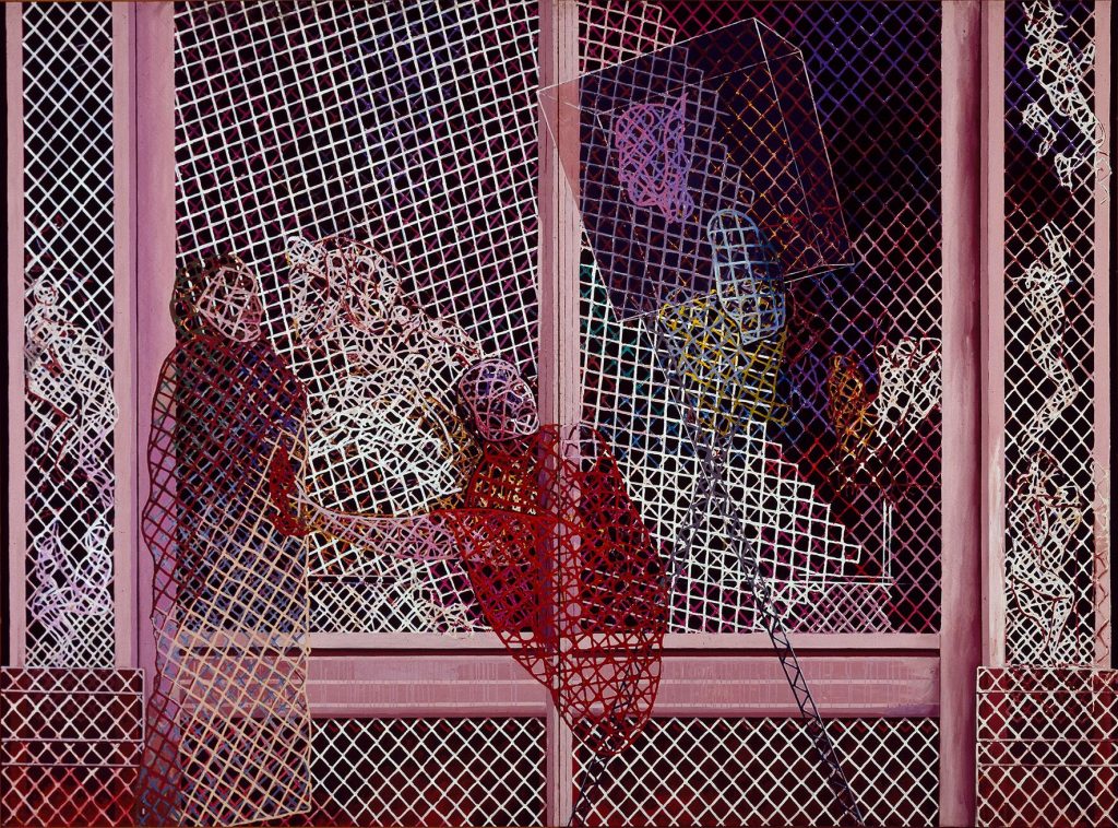
The Gates of Hell references Canto III when Dante and Virgil set out into the underworld. The gates are inscribed with verse ending “Abandon hope, who enter here.” This canto describes an area called the vestibule of hell where souls reside who took no sides in life. They are not in hell but neither are they out of it—eternally trapped in the liminal doorway due to their relentless self-interest in life. The sage figure on the left, presumably Virgil, encounters one such soul who, as described by Dante, is sentenced to eternally chase a banner while themselves being chased by bees (!). Further into the pictorial space is Charon, the ferryman for the souls who are driven by celestial balance to enter hell proper.

Gates of Hell, 1987. Acrylic and collage on canvas. Gift of Susan Johnson in honor of Katherine Pill.

In contrast to the thick chain link device that fragments the surface of Canto II, in Gates of Hell, the familiar device serves a different visual purpose. The figures and planes appear to be shaped from a diamond-wire armature. All are made of, behind and in front of the ubiquitous chain link motif. In this painting, the chain armatures are tantalizing. They create figures that are paradoxically solid and hollow. Like shades encountered in the underworld, they are simultaneously there and not. Rather than creating lines that obstruct and confuse the viewer’s progress through the pictorial space, here it creates and shapes the space.

The only solid elements in the painting are the pink door frame mouldings defining the edges of the space. Even these solid surfaces, however, when examined closely, reveal the chain links texturally embedded and painted over. Wujcik used paper towels, polymers, and other inclusions on the canvas surface to produce dimensionality on his otherwise relentlessly flat painting surfaces.

PSST!, 1997. Acrylic on canvas. Collection of Beth Daniels, Largo, FL.

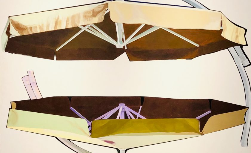
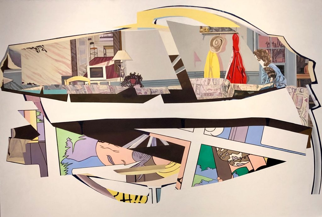
Cantos provides viewers a way out of Wujcik’s Inferno with the paired paintings We Must Go (Canto XXXIV) (1997) and PSST! (1997) where the exit from hell is fittingly made of cantilever patio umbrellas. In We Must Go, the horizontally-mirrored umbrella canopies float on a white ground. It is a simple yet elegant composition that so subtly references the Inferno that were it not for the title, I think a viewer would not make the connection. PSST! is a painting after a preparatory collage included in the first gallery. Here, one umbrella canopy shape is filled in with a domestic scene from what looks like an interior design publication decades old even at the time of the painting’s creation. The mirrored canopy contains fragmented comic strip imagery, juxtaposing two different rendering styles, one an idealized interior space, the other a cartoon. In Dante’s Inferno, Canto XXXIV is the final one, where Dante and Virgil have come to the center of hell where Lucifer resides in stasis. In order to leave hell, they must climb down Lucifer’s torso to a point, only visible to those who know to look for it, where a threshold is crossed, gravity is inverted, the world is topsy turvy, and they are no longer in hell. In PSST!, especially as it is in conversation with the preparatory collage where the composition is inverted, the question is which is the ninth circle of hell and which is the way out? Is the ideal home scene hell or the way out?

Wujcik’s Cantos represent a theme that he returned to over the span of more than a decade. In other words, it wasn’t a thought that was completed easily. As Dante experienced, hell is not traversed easily, and the only way out is through.

Bay Art Files contributor Sabrina Hughes holds an M.A. in Art History from the University of South Florida, with a focus on the History of Photography. Hughes has worked at the National Gallery of Art and the Museum of Fine Arts, St. Petersburg and is an adjunct instructor at USF and is the founder and principal of photoxo, a personal archiving service specializing in helping people preserve their family photos. She also has an ongoing curatorial project, Picurious, which invests abandoned slides with new life. Follow her on Instagram @sabrinahughes for selfies, hiking, and dogs, and @thepicurious for vintage photos.

Theo Wujcik: Cantos is on view at the Museum of Fine Arts, St. Petersburg through June 2, 2019. In tribute of the artist’s love of the Ybor City night club scene, the MFA’s support group The Contemporaries is hosting a dance party fundraiser “Theo’s Inferno” on Friday, May 17th at the Museum. 1980s punk and new wave tunes spun by Tampa-based DJ Gabe Echazabal, Ybor City-themed food offerings, and an open beer bar will set the retro tone for the evening. General admission is from 7 – 10 pm with an extra special VIP offering starting at 6:30 pm featuring a private tour by Susan Johnson of the Theo Wujcik Estate and MFA Curator of Contemporary Art Katherine Pill. Advance tickets available for purchase online at the Museum’s website.

Theo Wujcik: Cantos is on view at the Museum of Fine Arts, St. Petersburg through June 2, 2019. In tribute of the artist’s love of the Ybor City night club scene, the MFA’s support group The Contemporaries is hosting a dance party fundraiser “Theo’s Inferno” on Friday, May 17th at the Museum. 1980s punk and new wave tunes spun by Tampa-based DJ Gabe Echazabal, Ybor City-themed food offerings, and an open beer bar will set the retro tone for the evening. General admission is from 7 – 10 pm with an extra special VIP offering starting at 6:30 pm featuring a private tour by Susan Johnson of the Theo Wujcik Estate and MFA Curator of Contemporary Art Katherine Pill. Advance tickets available for purchase online at the Museum’s website.

The Museum of Fine Arts, St. Petersburg received generous support for this exhibition from Ann and Bill Edwards and The Gobioff Foundation.

My Camera My Self(ie)

My Camera My Self(ie)

by Sabrina Hughes


In my History of Photography course, there is a class meeting on the syllabus dedicated to discussing selfies. I’m sure my undergraduate students roll their eyes when they see this and wait for me to deliver a punchline that never arrives. Discussing selfies, even uttering the word at all, feels like a relic of 2014, a simpler time. There can’t possibly be any more defenses or lamentations can there? Can’t we just stop talking about them?

Not quite yet. The exhibition This Is Not a Selfie: Photographic Self-Portraits from the Audrey and Sydney Irmas Collection, organized by the Los Angeles County Museum of Art (LACMA) and currently on view at the Museum of Fine Arts St. Petersburg, Florida once again revives the conversation between the art of photographic self-portraiture and the omnipresent culture of the selfie.

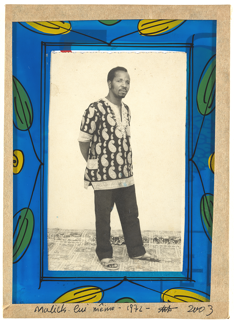
Malick Sidibé, Malick lui même (Malick himself), 1972, gelatin silver print, Los Angeles County Museum of Art, The Audrey and Sydney Irmas Collection, © Malick Sidibé, Courtesy of the artist and Jack Shainman Gallery, New York, photo © Museum Associates/LACMA


The term selfie is cute. It’s a truncated form of self-portrait, just as the image produced is, presumably, dashed off quickly, without forethought, without composition, without art. The word, like the photo itself, and a characteristic projected onto people who take selfies, is infantilizing. Selfies are immature. They are not and will never be serious art. They are not worth talking about. SELF PORTRAITS, on the other hand, are demonstrative of the skill of the artist. They can be political, satirical, cutting. They can be ART. This artificial dichotomy permeates all critical discussions of selfies, and is the very cornerstone of the exhibition.

To anyone without a background in art, the title of the exhibition simply seems to reiterate that claim that selfies are somehow lesser than. But it asks us to grant these self-portraits the benefit of the doubt. Don’t worry, these aren’t selfies. They belong here.

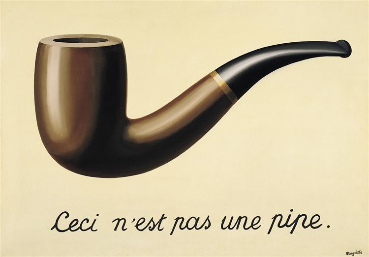
The title is a direct reference to Rene Magritte’s painting The Treachery of Images (This is Not a Pipe) from 1928, also in LACMA’s permanent collection which may give some insight into the curatorial decision to reference this work in the title. The painting, which depicts a pipe floating on a flat ecru background with the words “Ceci n’est pas une pipe” inscribed in cursive script beneath plays with the ways meaning is ascribed to objects. This is not, in fact, a pipe. It is a painting.


René Magritte, The Treachery of Images (This is not a pipe), 1928-29, oil on canvas, Los Angeles County Museum of Art


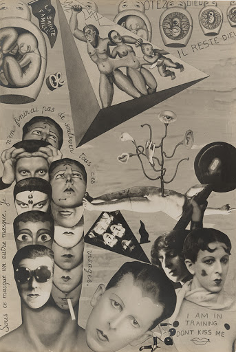
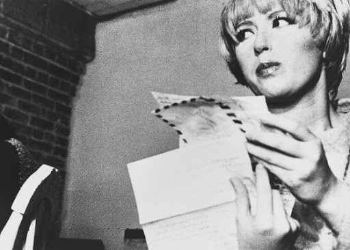
This is Not a Selfie contends that the photographic self-portraits within are not selfies. They have loftier aspirations and have Something To Say. They are role play (like Cindy Sherman’s Untitled Film Still #5 from 1977), they are explorations of identity (like Claude Cahun’s photocollage I.O.U. (Self-Pride) from 1929-30), they are political statements (like Robert Mapplethorpe’s Self Portrait from 1988, a clear commentary on the devastation caused by AIDS in the gay community). Self-portraits can be artificial (like Lucas Samaras Photo Transformation 8/19/76), they can be authentic (like Malick Sidibé’s head-to-toe Malick lui même from 1972), they can be deadly serious or playful (like William Wegman’s Half and Halfs from 1973). They can be anything. Except they can’t be selfies.

Claude Cahun, I.O.U. (Self-Pride) 1929-1930, gelatin silver print, Los Angeles County Museum of Art, The Audrey and Sydney Irmas Collection, © Estate of Claude Cahun, photo © Museum Associates/LACMA


Certainly, a number of the photographs in the exhibition truly do not function within the art historical discourse of self-portraiture: they are not selfies. I think of Sherman’s Untitled Film Still series where she is very obviously not Cindy in front of the camera. She is an anonymous ingenue from a-movie-that-looks-familiar-but-you-can’t-quite-place-it. She is a fabrication. Likewise, Henri Cartier-Bresson’s photo of his recumbent torso and legs framing a street scene, for instance, seems less about him as a subject and more like a playful riff on his skill at finding a decisive moment even while he’s resting.

Cindy Sherman, Untitled Film Still #5, 1977, gelatin silver print, Los Angeles County Museum of Art, The Audrey and Sydney Irmas Collection, © Cindy Sherman, Courtesy of the artist and Metro Pictures, New York


In a number of the works, the photographers wear masks, turn their backs, or otherwise keep their face out of the camera’s sight. Ralph Eugene Meatyard’s Untitled from The Family Album of Lucybelle Crater (where everyone photographed for the project wears a rubber mask) confounds the viewer—it is hard to tell whether Meatyard also wears a mask or if his face is simply obscured in the shadow of his hat. Wolfgang Tillmans’ Lacanau-self (1986), a deadpan photo from the point of view of Tillmans’ eyes—what he would see as he’s looking down—may leave viewers asking what does or doesn’t make a self-portrait? Is it required that we see the artist’s face or any identifying characteristics at all? Lee Friedlander’s shadow reveals his proximity to a woman he follows on the street of New York City (1966), which is how his presence manifests in front of the camera while he remains safely behind it. Is a shadow a self-portrait? Shrug.


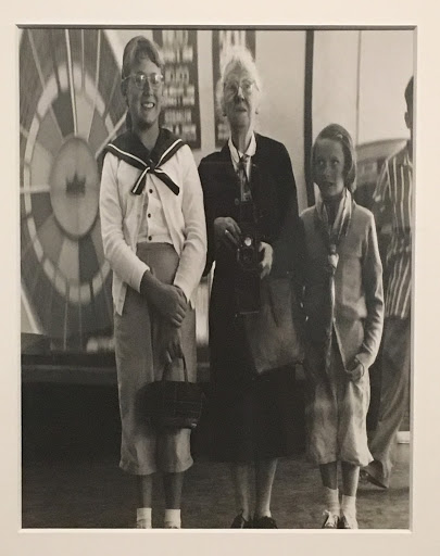
Imogen Cunningham, With grandchildren at the Fun House, 1955, gelatin silver print, Los Angeles County Museum of Art, The Audrey and Sydney Irmas Collection; Photo by the author.


The real contradiction within the exhibition comes when the institution is left to perform the interpretive gymnastics of justifying how some of the images are different from selfies (spoiler: some aren’t any different! Does this invalidate them as art? No!). Photos by Imogen Cunningham (With grandchildren at the Fun House) and Ilse Bing (Self-Portrait in Mirrors) are no different in intent or execution than a mirror selfie that draws the ridicule of many on the internet for being vain or silly. Most poignant of the mirror selfies, and possibly of the entire exhibition, is Diane Arbus’s disarmingly intimate Self-portrait in mirror (1945) where the sometimes brutalizing photographer, pregnant with her first child, uses her full-length mirror and bulky view camera to create a gentle nude to send to her husband while he was overseas in the Army.

Berenice Abbott’s Portrait of the Author as a Young Woman is delightful, an analog distortion of her face to comic effect. One of my favorite images in the exhibition is 1001 Gesichter (1957) by Peter Keetman. Between Keetman’s face and the camera lens is a wet screen. His face beyond the screen is out of focus but thousands of tiny Keetmans are refracted in the water droplets suspended in the mesh and look back at us. Photographers experimenting with their photographic tools create playful images with water, mirrors, disco balls, and double- or long-exposures.

This is Not a Selfie invites us to consider the ways that, in the hands of artists, the self-portrait can be invested with any number of culturally important interpretations. I would invite a critical viewer to ask in response: why and how are selfies assumed to be devoid of these characteristics? What is the ideological difference between artists experimenting with mirror selfies and distortions, costumes, masks, or alternate selves and any one of us trying the same via our digital camera, facial recognition filters, and Instagram? Doesn’t the nearly ubiquitous access to cameras via our phones (which is what ushered in the explosion of selfies) encourage a new generation of photographers in this type of experimentation?

If I were discussing This is Not a Selfie with my History of Photography students, I would ask them to think carefully about what is at stake in the narrative of the exhibition. Before we discuss selfies in the course we have already spent two classes talking about how photography has functioned as a tool for marginalized groups, particularly in Jim Crow America. While, for example, African Americans were often portrayed in the popular media through a variety of insidious (and persistent) stereotypes, their personal photos of family and friends reveal the antithesis of that harmful view. We learn that photography has a unique ability to empower individuals and groups to conceive and represent the image that they, not others, want to show to the world. Photography is a powerful tool for self-fashioning. It’s within this context and with this groundwork that we finally approach the discussion of selfies as a product of other drives within the history of photography, the history of art, and the social history of photography in its most banal and everyday form: printed or digital personal albums. By the time the class comes around the students completely understand why selfies must be discussed.

The politics of self-representation cannot be overlooked and should not be dismissed. What is behind the pervasive urge to collectively disparage a form of self-representation that empowers the photographer-slash-subject in crafting and distributing their own image? Who is doing the disparaging and who benefits from the results? For instance, when Vogue, uncontested international arbiter of taste and high fashion, publishes an article calling selfies idiotic, readers are being told that they are not good enough as they are. It makes sense. Why should readers listen to Vogue (and therefore keep buying the magazines and the products from the magazine’s advertisers) if they started believing what their selfies tell them—that they are already enough?


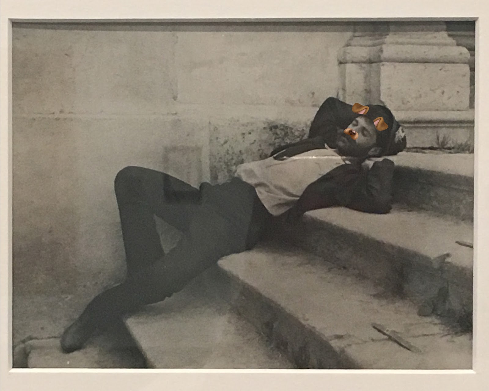
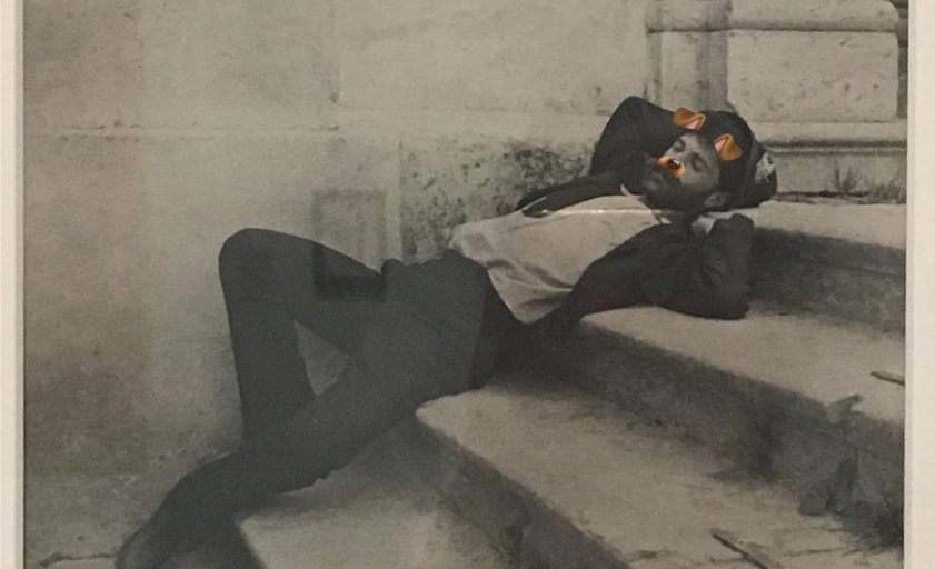
Alfred Stieglitz, Self-Portrait, Cortina, 1890, gelatin silver print, Los Angeles County Museum of Art, The Audrey and Sydney Irmas Collection; Snapchat photo by the author Sabrina Hughes.


For museums—elite cultural institutions responsible for defining what is or is not high art while collectively struggling to diversify their collections and expand the voices they represent—punching down at selfies feels like a cheap shot. Why can Alfred Stieglitz languor on a set of picturesque steps and set up his self-timer but we should not? Why can artists document moods or changes in their bodies but we are wrong to? Why not use the institutional platform to stand up for and legitimize the lineage of selfies as an integral part of the history of photography (one of the earliest photographs after its invention, Hippolyte Bayard’s Self Portrait as a Drowned Man from 1840, is a selfie after all) instead of creating a narrative that tries to create differences in practice, intent, or validity when there often is none?  

All of these questions invite one more: how should we view selfies if not as silly, vain, and disposable? Like any form of visual representation, selfies mean any number of things to each person who makes them. Just like the people that make selfies, they don’t have to hold to only one interpretation. Their ambiguity is their power. They mirror the depth and breadth of all of our various lives and experiences. For some of us, our very existence is political. Making ourselves visible as we want to be seen is a way to retain control of the means of representation rather than leaving it to those who want to control, influence, or sell to us. That is, in fact, how I define selfies to my classes. An image wherein the subject is also in control of the mode of representation. All selfies are political. We, and our selfies, contain multitudes. Take more selfies.


Bay Art Files contributor Sabrina Hughes holds an M.A. in Art History from the University of South Florida, with a focus on the History of Photography. Hughes has worked at the National Gallery of Art and the Museum of Fine Arts, St. Petersburg and is an adjunct instructor at USF and is the founder and principal of photoxo, a personal archiving service specializing in helping people preserve their family photos. She also has an ongoing curatorial project, Picurious, which invests abandoned slides with new life. Follow her on Instagram @sabrinahughes for selfies, hiking, and dogs, and @thepicurious for vintage photos.


Conversation with a Curator: Really! This is (So) Not a Selfie

Thursday, October 25, 2018, at the Museum of Fine Arts St. Petersburg.
FREE with Museum admission, $10 on Thursdays after 5 pm.

The special exhibition This is Not a Selfie is curated from a single collection, the Audrey and Sydney Irmas Collection at the Los Angeles County Museum of Art (LACMA).
This is Not a Selfie curator Eve Schillo, Assistant Curator of the Wallis Annenberg Photography Department at LACMA, will be at the Museum on October 25th for a gallery talk to discuss the influence of the Audrey and Sydney Irmas Collection of self-portraiture photography in today’s world.

Lisa Anne Auerbach, Take This Knitting Machine and Shove It, 2009, inkjet print, Los Angeles County Museum of Art, The Audrey and Sydney Irmas Collection, © Lisa Anne Auerbach, Courtesy of the artist and Gavlak Gallery, photo © Museum Associates/LACMA.