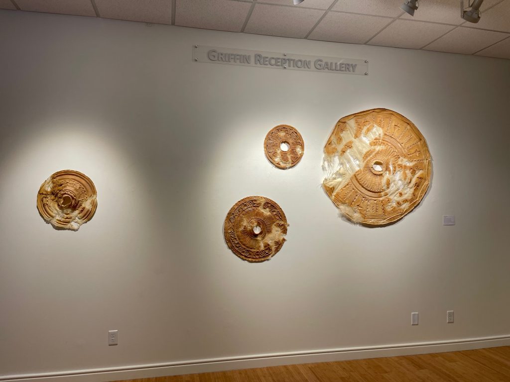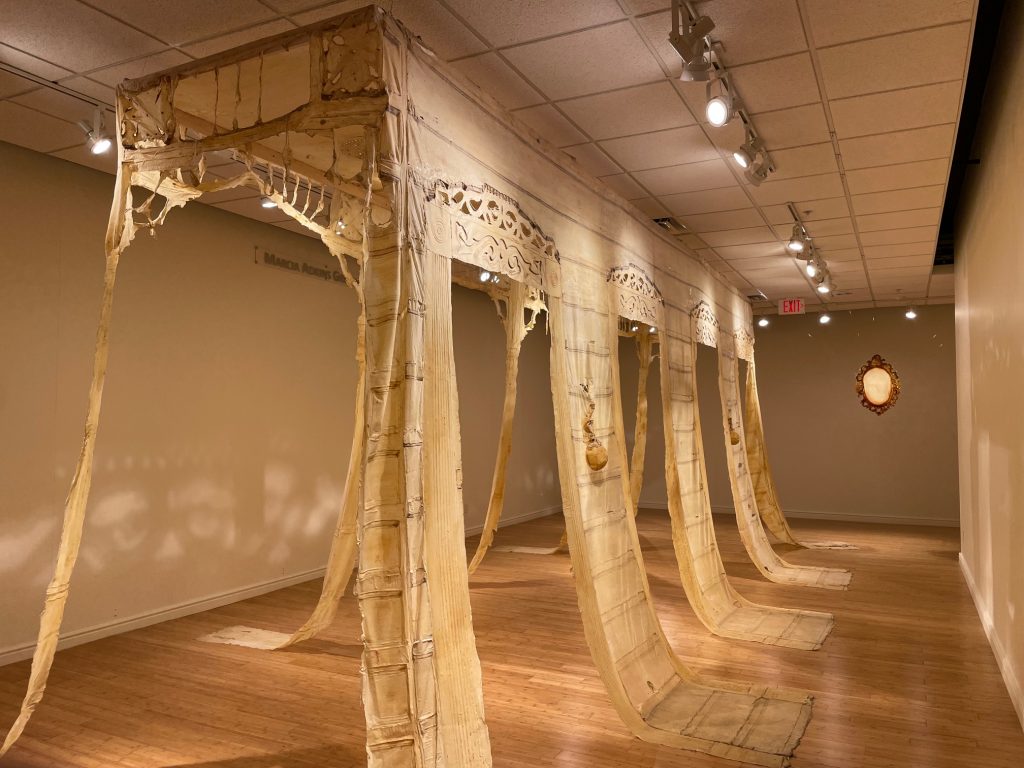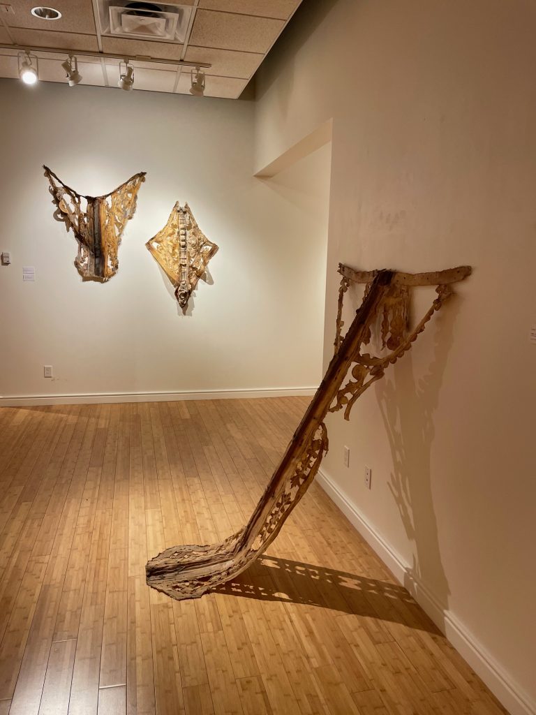
In Good Company

In Good Company: Strength of Character at Creative Pinellas
by Jessica Todd

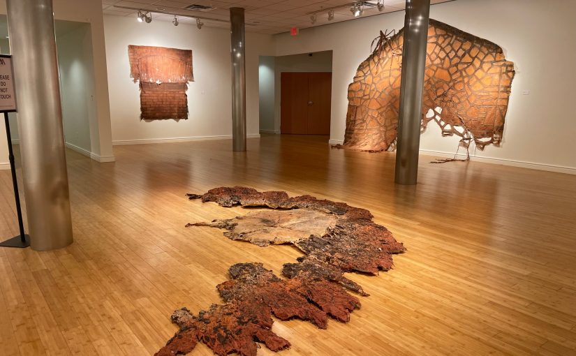
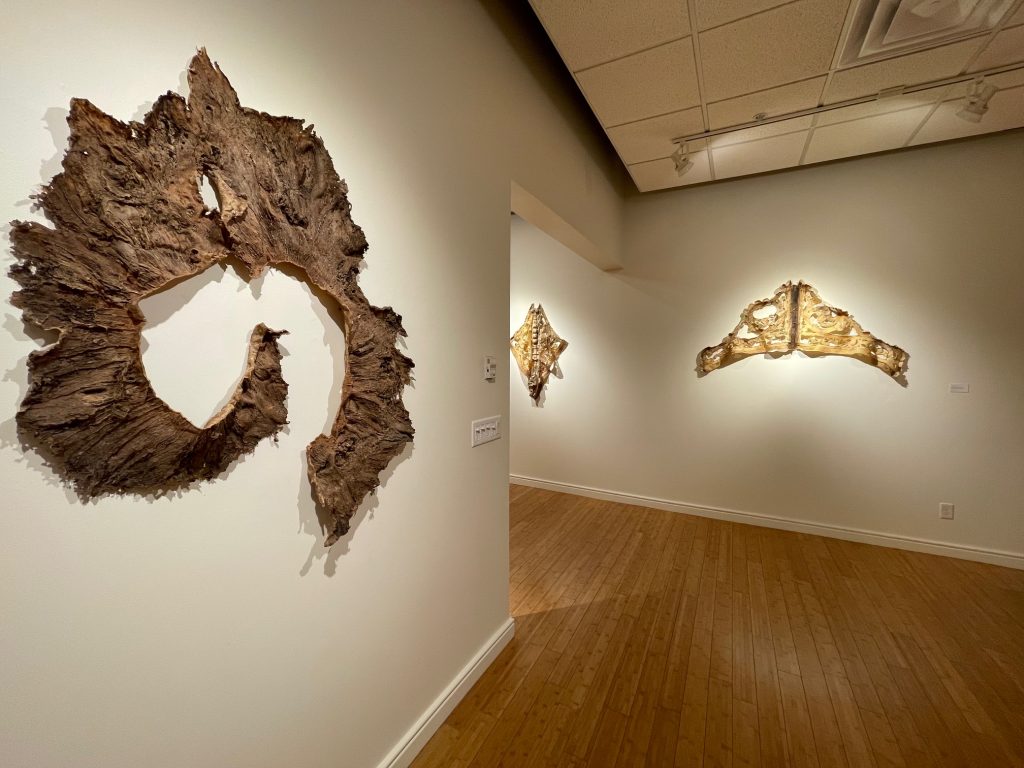
In her latest exhibition, Strength of Character at Creative Pinellas, curator Katherine Gibson welcomes the viewer into the gallery with warm familiarity. Oak seats and fruit chandeliers allude to home. Rich colors, natural materials, and hints of domesticity soften the formality of the impressively grand galleries of Creative Pinellas. There’s even a scent of cedar in the air.
The Art world is still shedding the restrictive boundaries between “Fine Art” and Crafts and Design. The Western Art canon has long excluded work due to medium, process, functionality, and proximity to the domestic. While oil painting and marble sculpture dominate the collections of major institutions and the pages of Art History books, a wealth of works in traditional Crafts media such as ceramics, wood, glass, fine metal, fibers, and paper have been largely ignored.

This exclusion is not due to a lack of artistic merit. Rather, it is deeply rooted in classism, racism, and sexism. Availability of materials, differing cultural applications of art objects, and restricted access to education and patronage led to different kinds of artmaking throughout history. To assert the dominance of the upper-class Western European male, the materials and functionality associated with the art of socially repressed groups were deemed inferior. And the tradition lives on.

Today, we see artists and curators challenging this bias. Audiences’ enthusiasm for Crafts media, Design, and functional work continues to push it into the mainstream. We see materials, processes, and forms we’re accustomed to living with in our homes now in gallery and museum spaces. This familiarity offers an entry point to the viewer. It democratizes Western art in a revolutionary way.

Gibson’s curatorial work is, in this sense, revolutionary. She integrates Crafts media with painting and sculpture, functional with conceptual work, and self-trained with academically trained artists. She integrates these works into the gallery seamlessly. Most importantly, her exhibitions are not “about” Art hierarchies. They’re about placing thoughtfully made artworks in a space and allowing them to converse with each other and with the viewer.

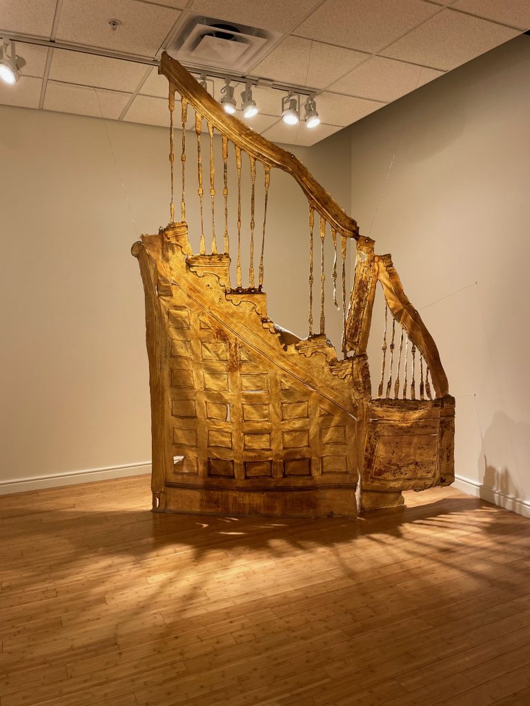
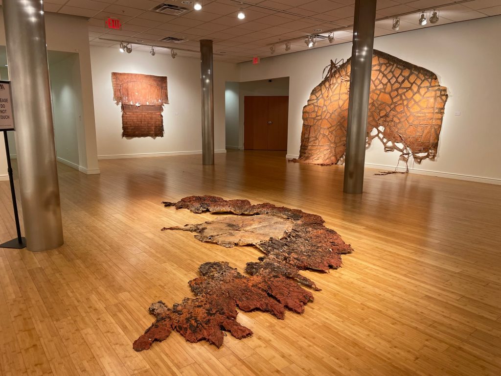
Strength of Character beautifully iterates this concept. We see the abstract paintings of Edgar Sanchez Cumbas next to the carved wooden furniture of David and Kathleen Bly alongside the sculptural installations of Kendra Frorup, which integrate printmaking, casting, and metalwork. Chandeliers converse with stretched canvas. Stools talk to framed paintings.

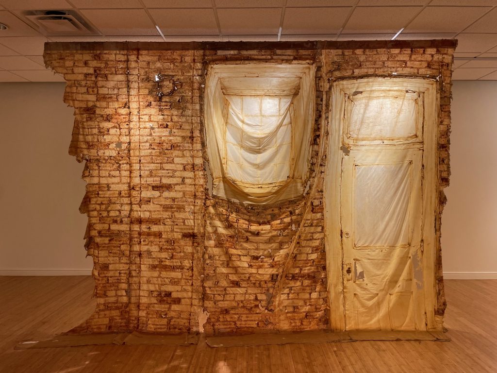
The harmony of the work in the gallery is a reflection of the collaborative installation process. The curator, artists, and Creative Pinellas staff came together to design an exhibition that is both cohesive and unexpected. Gibson isn’t afraid to ask the viewer to look upward or downward – “gallery height” is merely a suggestion. She’s a master of balancing scale in improbable ways: the Blys’ four petit Live Oak sculptures hold their own resting on the ground catty-cornered to Frorup’s wall-sized installation and substantial Sugar Apple Chandelier.

Each artist also contributed their unique perspective to the installation process: Frorup’s talent for collaging objects, Sanchez Cumbas’s eye for color and form, and the Blys’ engagement with architecture. Freddie Hughes (Gallery and Facilities Engagement Manager for Creative Pinellas) was instrumental in bringing the exhibition to life with his extensive installation knowledge and technical support. Serendipitous moments, like finding an old fence post outside to anchor Sanchez Cumbas’s Brush, or Frorup upending a utility cart from her studio to hold Banana Chandelier, reflect an openness to experimentation and play.

Though diverse in their media, the works in Strength of Character are united visually. Warm, rich earthy tones dominate the palette with intermittent pops of teal and quiet moments of textured white. Voluminous abstract shapes uncovered in the natural wood patterns of the Blys’ Live Oak series mirror Sanchez Cumbas’s explorations of human form in his Skinless series. Frenetic feather-like shapes in Sanchez Cumbas’s Compression Series and Reduction in Volumes are reflected in the crisscrossing screen- printed palm fronds of Frorup’s untitled installation. After seeing the symmetrical wood-turned bumps of the Blys’ work, Frorup responded with similarly shaped spun metal hardware to hang her Sugar Apple Chandelier.

Conceptually, all of the artists in the exhibition start with process. Frorup’s practice begins with collecting objects. She then problem solves through active making. Frorup engages in a range of art-making processes – from casting to papermaking to screenprinting – to arrive at her installations and sculptures. Her high regard for process is evident in her untitled installation featuring used screen-printing screens. The fruits that appear in Frorup’s work are an homage to her Bahamian roots and her mother’s farm that she grew up working on. Much like the artwork, the fruits are the sweet end result of a long cultivation process.

The Blys’ work is similarly driven by collected materials – reclaimed trees from Tampa’s urban neighborhoods. Their sculptures are a collaboration with the tree that bore the wood, which evolves throughout the making process. The tree tells them where to carve and when to stop. They work the wood while it’s still green, rather than fully dried, so that after their intervention the wood continues to bend, move, and crack. The resulting sculptures, many of which function as furniture, act as monuments to the downed tree from which they were sourced.

Sanchez Cumbas responds to the world around him through the cathartic process of painting. His kinetic brushstrokes in Compression Series and Reduction in Volumes reflect the turbulent war in Afghanistan and politics of 2010, when they were made (he notes, still relevant today). These works mark a turn from his figurative paintings, the last of which is Brush, also in the exhibition, a nod to the Buddha and his own Buddhist practice, a piece that is notably calmer and more grounded. The much more restrained works in the Skinless series sensitively explore bodies and skin, and issues around skin tone in the Latinx community. Each piece is a visual reflection of the emotion with which it was created.

It’s evident when speaking with Gibson and the artists of Strength of Character that they all share an immense respect for each other’s practices. The joyful spirit with which they engaged in this collaborative project is palpable in the gallery, and reflected in the enthusiasm of Creative Pinellas’s passionate staff. Head to Largo and make yourself at home in this beautiful exhibition, up through April 28, 2024.

A special thanks to the Gobioff Foundation for supporting this exhibition through their Microgrant program.

Creative Pinellas is Pinellas County’s non-profit local arts agency providing funding and support to artists while connecting businesses, tourism and the public with the arts community.

Jessica Todd is a curator, writer, and artist based in Tampa, Florida. She is passionate about building the creative infrastructures that support artists, and studying and addressing issues of equity, access, and inclusion in the arts. In October 2022, Jessica opened Parachute Gallery in Ybor City, first serving as an exhibition space for national artists and later a retail gallery representing local artists. Parachute Gallery currently operates remotely through online resources and off-site programming. Jessica has worked with a number of arts organizations since moving to Tampa in 2020, including Tempus Projects, Artspace Tampa Initiative, Crab Devil, and the Morean Arts Center. For six years, prior to moving to Tampa, she was the Residency Manager for the Rauschenberg Residency in Captiva, Florida. Jessica holds an MFA in Jewelry/Metals/Enameling from Kent State University, a BA in Art from Penn State University, and a Diploma of Hispanic Studies from the University of Barcelona.

Photography credit: Jessica Todd

Marisol in Miami

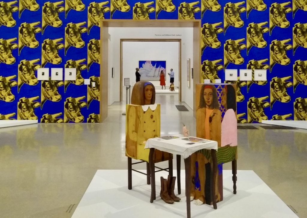
Marisol Escobar. Dinner Date, 1963.

Marisol in Miami

By Katherine Gibson

Two figures sharing a meal together, Dinner Date from 1963, was my introduction to Marisol’s work. I gravitated to it right away when scrolling sculpture images several years ago. I was not familiar with the artist Marisol (Maria Escobar, Venezuelan-American, 1930-2016) but kept bookmarking images of these captivating, odd, intriguing carved figures with various details highlighted, an actual shoe here, a sculpted hand there. I was immediately fascinated by Marisol’s work and vowed to see it in person.

That opportunity came this summer when my good friend Jose Gelats and I learned that the Pérez Art Museum Miami (PAMM) was showing Marisol’s work in a traveling exhibition, Marisol and Warhol Take New York, organized by The Andy Warhol Museum in Pittsburg, PA.

Driving to Miami took much less time than I remembered, and winding through the streets of South Beach was pure delight. Nothing compares to the authentic, historical, elegant Art Deco buildings, an architectural Disneyland in magical pastels. We stayed at The Whitelaw Hotel on Collins Avenue, one block up from Ocean Drive, and immediately found a delicious coffee shop nearby. Across the street, we stumbled into a tucked-away hotel bar complete with a kind (patient) bartender, Darrell, who put up with two chatty Kathys. He made delicious cocktails and even talked me into trying peanut butter bourbon which insulted me at first (bourbon doesn’t need a flavor) — however, it wasn’t terrible, and now I have a bottle of my own.

Our zigzagging drive to The Pérez the following morning took us through various neighborhoods, reminding me how tropical and lush Miami is — you can round the corner and feel like you are in a dense, colorful rainforest. Vivid beauty in every direction.

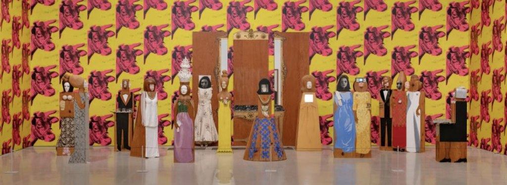
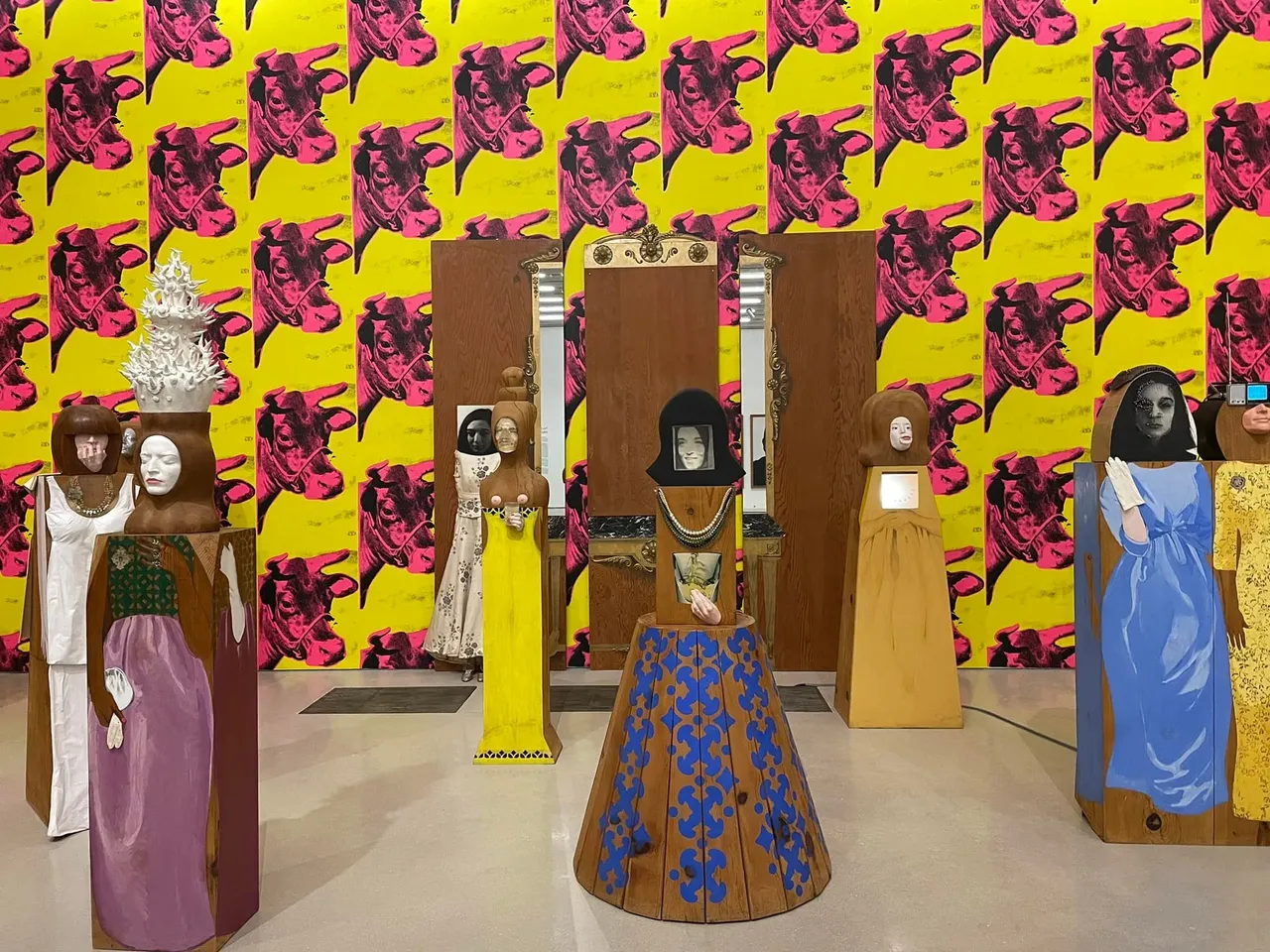
Once at the Museum, I made a beeline to Marisol’s work. I breezed past the entrance layout and introductory wall text in search of the larger free standing installations — Dinner Date being a favorite (top image) and The Party, one of her most well-known (below).

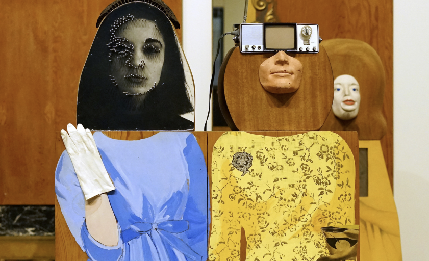
It was easy to become distracted by the wooden structures and how elements were presented. When I actually locked eye-to-eye with the figures, their features were superbly drawn and many were immediately recognizable as well-known newsmakers of the time.

Who is this person who can come up with such original configurations of mediums while simultaneously rendering identities and known personalities so well, yet in an unusual, unorthodox way? Marisol also incorporated objects and fabric, yet you weren’t initially aware of the materials — at least I wasn’t at first. I was so mesmerized by the whole chunky, blocky, wood figure, or figures, that the skill, meticulous craftsmanship, and sheer artistry of a face, body, or detail was discovered moments later — and then, I would marvel at her work all over again. I’m just so darn knocked out by her work.

Standing amidst The Party guests — fifteen life-sized, carved figures in wood, each having its own dramatic flair and all sharing similar facial features — I was enchanted by the flourishes of each costume, the clever use of drama, and exposure. I also noted the aloneness of each figure — all were arranged together but hardly a connection between them.

The placement of Warhol’s loud pink and yellow cow wallpaper, running floor to ceiling behind The Party, was annoying. Obnoxious party crasher. I was incensed and confused. Why would you do that?

Marisol’s The Party, 1965-66, as installed in the exhibition Marisol and Warhol Take New York
at the Pérez Art Museum Miami.
Listen to curator Jessica Beck from the Andy Warhol Museum discuss this particular work in a video walkthrough of Marisol and Warhol Take New York.
Detail of The Party as installed at the Pérez Art Museum Miami. Photo: Camp Jen

In one review I read, the author felt very much like I did but expressed the impact more clearly. “The only mistake in this display of “The Party” is the use of Warhol’s cow wallpaper as a backdrop, which grotesquely draws oxygen away from Marisol’s genius,” wrote Emily Cardenas of The Biscayne Times.

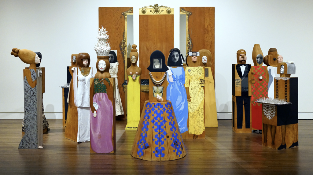
Below is an image of The Party without wallpaper distraction, as shown in The Toledo Museum of Art (TMA), where is it part of the Museum’s permanent collection. TMA’s published description of the installation reads, “As someone who always felt uncomfortable in the 1960s social scene, Marisol chose to display the figures in a setting where none of them interact with each other, many appearing entirely self-absorbed. By seeing these figures up close, you will also notice that each one shares similar facial features; Marisol often used herself as a model.”

Marisol Escobar, The Party, 1965-66. As installed at the Toledo Museum of Art.
For a fascinating discussion on this work, listen to Fashion & Alienation in 1960s New York with Dr. Halona Norton-Westbrook of the Toldeo Museum of Art and Dr. Steven Zucker of Smarthistory. Photo: Dr. Steven Zucker

Perhaps TMA could add an installation addendum requesting that the piece be shown without a background, ideally a plain white wall providing a clear and undistracted view.

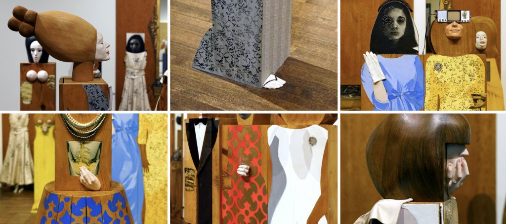
Installation details of The Party, 1965-66. Photos: Dr. Steven Zucker.

Meandering through the full exhibition at PAMM, I noticed that a few other installations suffered from the wallpaper cacophony. Marisol’s wonderful sculpture of John Wayne on a horse — when you look straight at it — is almost erased due to the louder, bolder cow images behind the figure (see image). Warhol continues to mark his territory in ways that hinder views of Marisol’s work. Ironically, one of the few unencumbered views of Marisol’s work is her figure of Andy Warhol himself. Andy sits — as if on a throne — in a pristine, white corner.

Marisol Escobar, John Wayne, 1963, and Andy, 1962-63.

Tricky to do, to show two very different bodies of work, together, created during the same timespan by two very different artists — both influenced by, and motivated by, the other. I find it interesting — fascinating really — to see how each chose to convey similar ideas. Marisol’s work, to me, just blows Warhol’s work away and I wince to see her unique authentic work watered down by an attempt to blend the less impressive work of another artist — or perhaps, in the opposite way, Marisol’s work shines even brighter because, when seen side-by-side, her work far surpasses Warhol’s.

“A lot of people will assume that Warhol was the famous one first, but really it was [Marisol],” says PAMM’s curator Maritza Lacayo in an art article that appeared in the Miami New Times. “There was so much about her that Warhol admired. She, in a way, inspired him.”

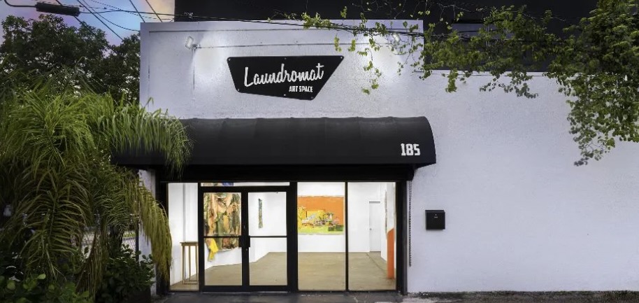
On our way out of town, we stumbled on the Laundromat Art Space, in the neighborhood known as Little Haiti, a clever re-use of an actual laundromat converted into a gallery and artist studios. Even though the building wasn’t open, we knocked anyway. And to our delight, an artist appeared and let us in and showed us around.

Laundromat Art Space is an artist-run studio and exhibition space located in the neighborhood of Little Haiti in Miami, Florida.

Jose and I are curious Nancy Drews at heart, and delight in aimless moseying. All we need is an inspiring anchor to organize around, and we are off and running. This last stop was a nice way to wrap up our indulgent, highly enjoyable road trip, spurred on by seeing Marisol’s work in person. Completely worth it — and really not that far from Tampa — a repeat round trip for sure.

As you drive here and there for the holidays, visiting — or escaping — family and friends, try taking the backroads instead of boring interstates; drop in a diner instead of a drive-through; visit a fruit stand instead of a jiffy store. Go in the direction of what gets your attention and tune out the obnoxious cow heads along the way.

About the exhibition

Marisol and Warhol Take New York debuted at The Andy Warhol Museum in Pittsburg in October 2021 and was curated by Jessica Beck, The Warhol’s Milton Fine Curator of Art. On view at the Pérez Art Museum Miami from April 15, 2022, through September 5, 2022, it was organized by Franklin Sirmans, Director, and Martiza Lacayo, Assistant Curator.

About the author

Katherine Gibson, creator of ArtHouse3, is a regional art consultant and independent curator living in St. Petersburg, Florida. Gibson is the former Director of the Hillsborough Community College (HCC) Dale Mabry Gallery, which was rebranded Gallery221@HCC. Gibson received a 2018 Individual Artist Award from the St. Petersburg Arts Alliance for her Drive-by Window Project and was selected for an ArtsUp Grant by Creative Pinellas as creator and curator of the 2019 summer exhibition Tonge & Groove. Creating temporary exhibits in alternative spaces is a focus, and so far, has included storefront windows, empty lofts, rustic lake houses, and her home. Current projects include selecting artwork for various client environments, hosting exhibitions in ArtHouse Upstairs and writing the occasional piece for Bay Art Files.

The Constant Curator: The Important Work of Nellie Mae Rowe

The Constant Curator: The Important Work of Nellie Mae Rowe

by Katherine Gibson

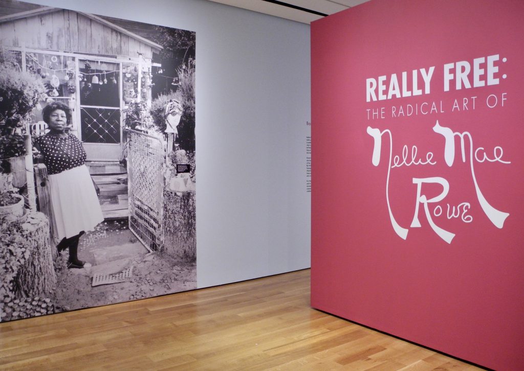
The exhibition REALLY FREE: THE RADICAL ART OF NELLIE MAE ROWE was on view at the High Museum of Art, in Atlanta, Georgia, from September 3, 2021 – January 9, 2022, and was organized by Katherine Jentleson, the Merrie and Dan Boone Curator of Folk and Self-Taught Art.


Entrance to “Really Free”; High Museum of Art, Atlanta.

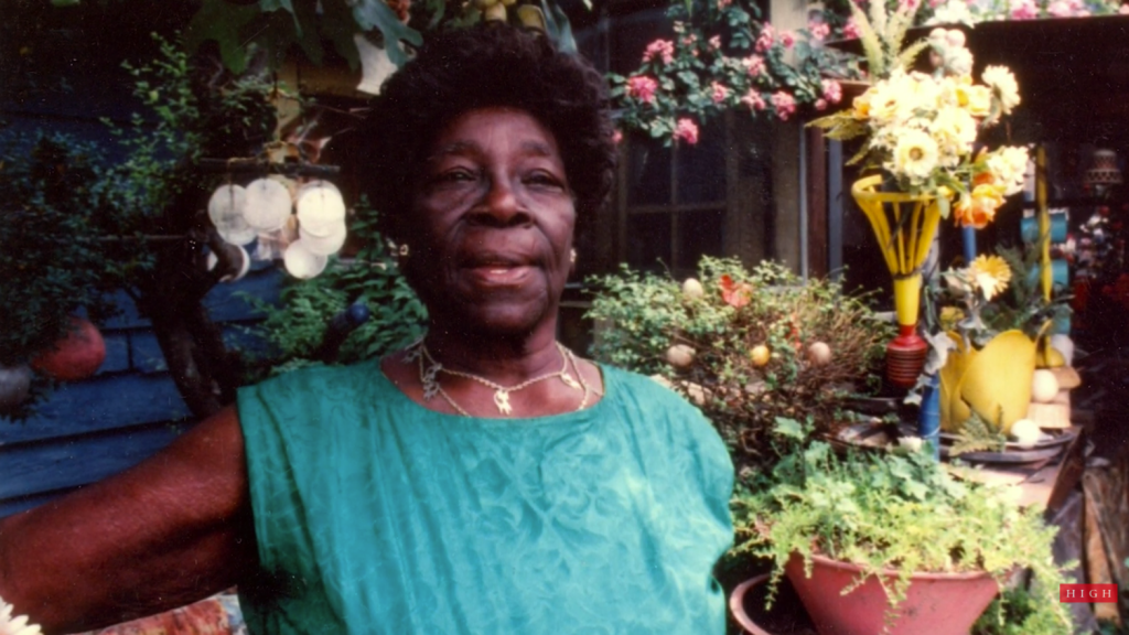
Nellie Mae Rowe greeted me at the gate to her home – at least her likeness did, in the blown-up, life-sized, black and white image of her at the entrance to what she called her Playhouse (referring to her house and yard area). The giant fuchsia wall to the right presented Nellie’s artistic signature as an essential part of the exhibit title, “Really Free: The Radical Art of Nellie Mae Rowe.”

It was the day after Christmas. My sister Jane and I, along with our niece Katie, took in the Nellie Mae Rowe (American, 1900-1982) exhibit at the High Museum of Art in Atlanta. Jane and Katie walked through the show, reading the text for each piece and following the gallery sequence. I’m envious of people who can do that. I don’t seem to be able to go in order, and as a result, I often miss important connections. What I’m always most interested in, is the overall feel of a show, the environment created, the mood and the flow of how someone may experience it. I amble around the space, in no organized way, absorbing visual impressions and relationships.

After a few times around in various directions, I found I wanted the exhibit to feel more connected. The spacing between pieces and groupings was generous, perhaps more than needed. Given that Nellie’s home was chock full of colorful things and objects inside and out – the galleries were spare in comparison, and somewhat static. I felt like the layout could have infused more of the vibrant energy, conviction and general playfulness that Nellie lived by.

That said though, how do you infuse a stagnant exhibit with Nellie’s kind of joyful flow? How do you translate her world into a world others can experience – and, do you need to?

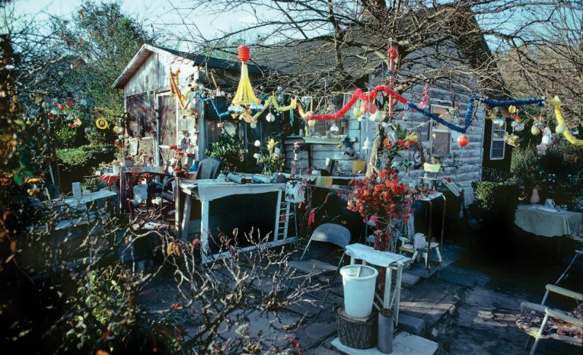
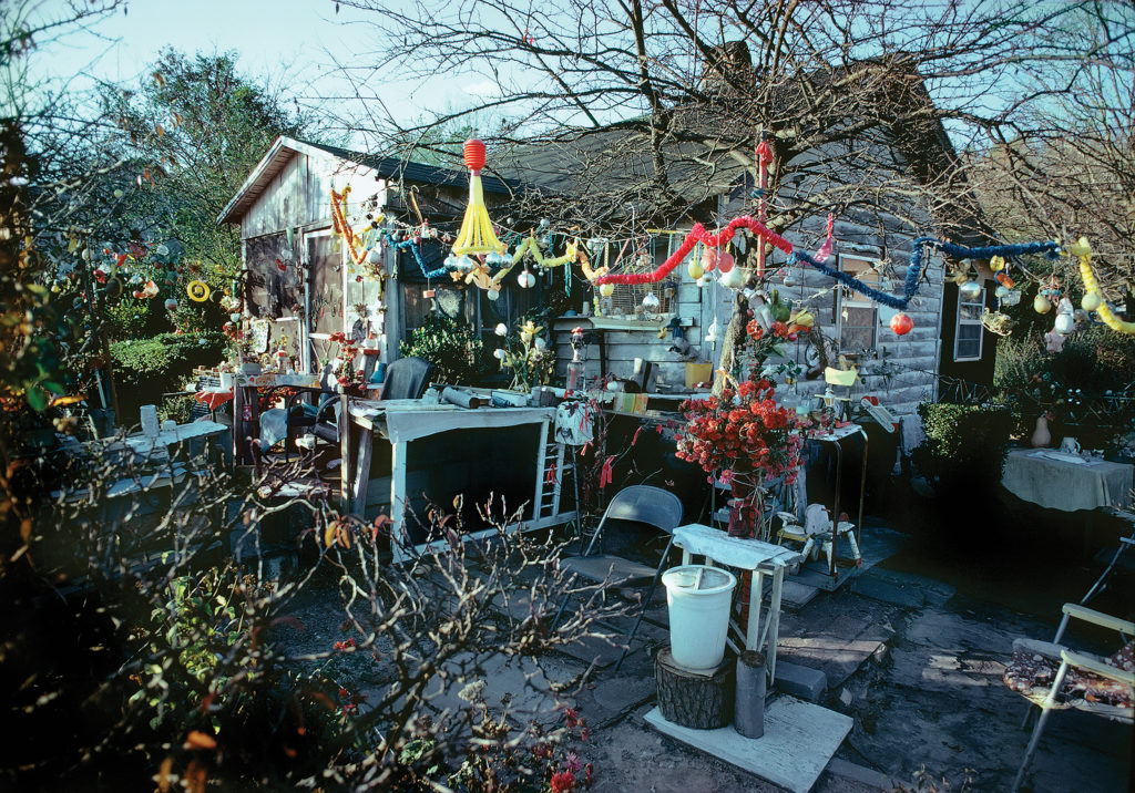
In ruminating over the exhibit and these questions, I can understand what a challenge it was to come up with the best way to show Nellie Mae Rowe’s work. The environment she created throughout her home and property had the same traits as the images she created: layered and overlapping; full of rich color from end to end; animals, objects, plants, sculptures all existing together. One was not separate from the other. I don’t think I got this until later, when I was scrolling through my images, still feeling like something was missing, and then it dawned on me that it was near impossible to convey Nellie’s world without her masterpiece Playhouse.


Lucinda Bunnen, Nellie Mae Rowe’s House (1971).
Photo ©Lucinda Bunnen, collection of the artist, courtesy of the High Museum of Art, Atlanta.

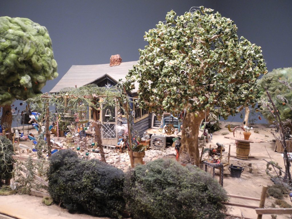
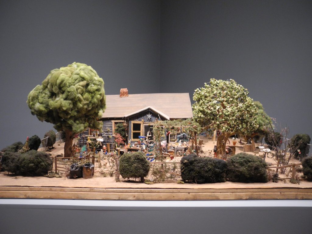
That’s where an unbelievable scale model of Nellie’s Playhouse comes in. Unique to this exhibit, Opendox, a New York documentary-making firm, created two scale models of the Playhouse – the first model was of the entire property presented on a large, flat, table-like surface akin to something a model train environment might sit on. The second model was larger, and was assembled in a corner area near the end of the exhibit, with created interior rooms the size of a child’s playroom.


Model of Nellie Mae Rowe’s Playhouse (detail). High Museum of Art, Atlanta.


Model of Nellie Mae Rowe’s Playhouse. High Museum of Art, Atlanta.

The miniature model of the entire property drew me in and completely blew my mind due to the amazing detail, down to the tiniest possible replica of the many objects scattered throughout Nellie’s environment. Same with the child-sized model of interior rooms of the Playhouse, created to use in filming the documentary about Nellie and her life. “This World is Not My Own” will be available later this year and will be fascinating to watch – not only to learn more about Nellie Mae Rowe and her unapologetic way of living her creative life, but also to see these astounding, meticulously created sets in context. (https://thisworldisnotmyown.com/)

My sister really loved the short film about the making of the documentary that was part of the exhibit, next to the scale house created for the filming.  Those components of the exhibit, she said, helped her get a palpable sense of Nellie’s world and gave context for how Nellie lived. Jane appreciated the tactile model combined with the sound in the film because it made the experience of Nellie’s garden come alive for her.

Strangers Welcomed

Nellie’s home was in a small town west of Atlanta.

“When passersby in sleepy Vinings saw Nellie Mae Rowe’s decorated yard packed with handmade dolls and chewing gum sculptures and beads and wigs hanging from trees, they didn’t know what to make of it,” wrote Bo Emerson in an article for The Atlanta-Journal-Constitution (May 18, 2021). “Some gawked. Some thought she was a “hoodoo” woman or a fortune teller. Some pitched bottles through her windows and broke her flower pots. She met all responses with poise. Those who threw missiles, she invited in to see her yard and her ‘playhouse.’ …Her guestbook was signed by more than 800 people who had toured her house and gardens just from May 1973 to March 1975.”


Still from High Museum of Art Curator Video Diary: Who Nellie Mae Rowe Was (Available on YouTube).

Chewing Gum Sculpture

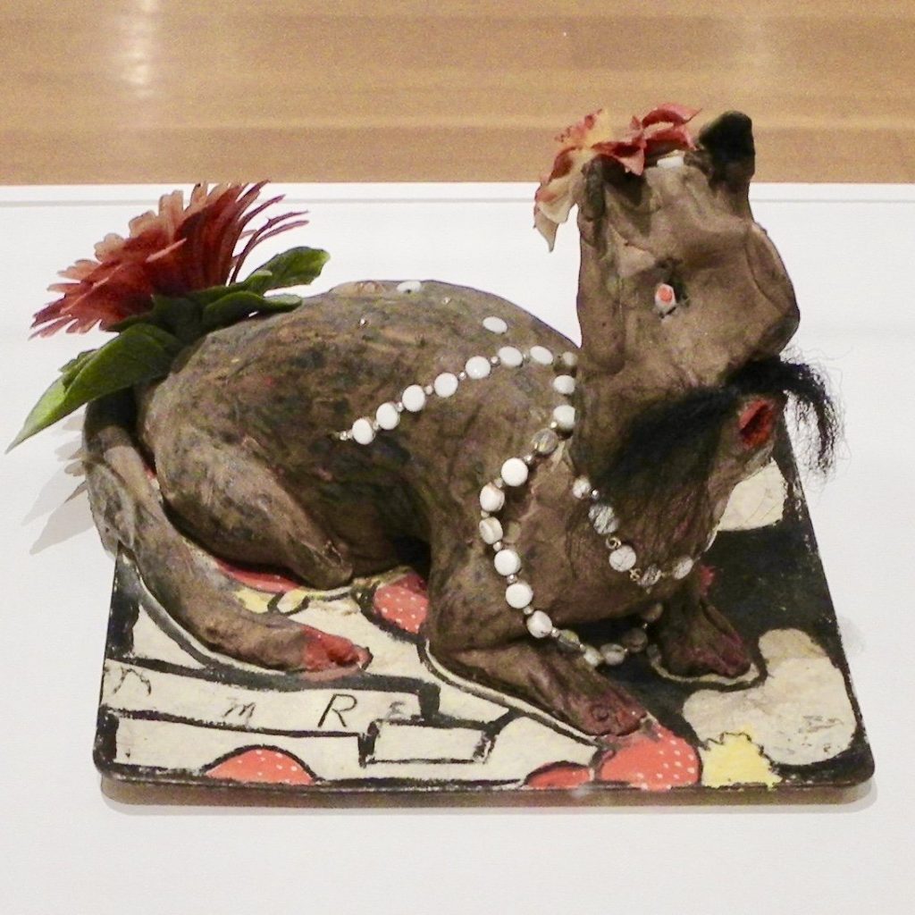
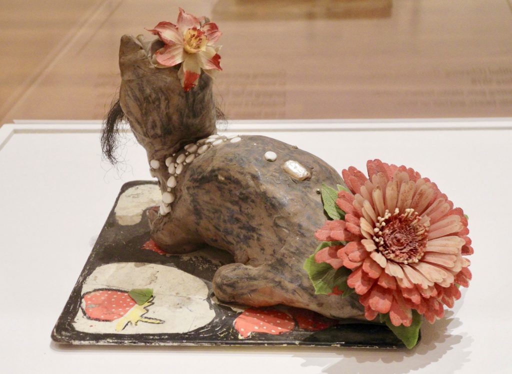
The idea of creating figures out of chewing gum initially repulsed me but in the context of Nellie’s clever resourcefulness, I found it humorous, especially when I saw the figure featured in the exhibit. “He” was an animal – possibly a cat – with a hair mustache and a large plastic flower on his backside (see image). As I took him in, I noticed how well he was formed and sculpted; a concentrated effort yet it still had the playful lightness Nellie brought to her creations.

“I chewed a lot of chewing gum because the doctor said chewing would help the jumping in my head. People began bringing me packages of chewing gum. And I said, now as much chewing gum as I chew, I’m going to make something. So I saved my chewing gum and when I saved a big ball, I started making things. I used to have chewing gum cats and dogs all up and down my fence. Now, I chew gum just to make things.” (https://www.soulsgrowndeep.org/artist/nellie- mae-rowe)

You can imagine the delight she must have felt in bringing this mustached character to life, adding white decorative beads and a smaller flower on his head casually cocked to one side, like a British fascinator.

He was a feature in the exhibition, singled out, and presented on a large pedestal, under a tall clear bonnet – all adding to his importance, which made him even more entertaining to me.

Judith & Nellie Mae

Nellie met gallerist Judith Alexander when she was in her late 70s. They knew each other only a few years, yet it seems like – from all accounts – they deeply trusted each other and formed a unique and solid friendship. On the Judith Alexander Foundation website is a section about Nellie with a description of their influences on each other:

“Of all the artists whose lives Judith Alexander touched, none was as strong an influence on her as Nellie Mae Rowe. It’s safe to surmise that Judith’s influence on Nellie was equally powerful. Theirs was a relationship that took the notion of synergy way beyond its boundaries.

“Judith saw to it that Nellie Mae Rowe’s legacy would endure with her major gift of works to the High Museum of Art in Atlanta. Judith also established The Nellie Mae Rowe Gallery at the museum, an area exclusively dedicated to a rotating display of the work.” (www.judithalexander.org/brief-biography)

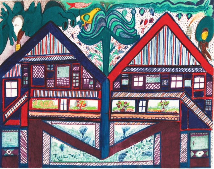
One of the pieces that resonated with me was a detailed, colored drawing of two, almost identical houses, side by side. The form of a tree is drawn rising up from the center where the houses are joined. On the top of each roof is a figure – one appears to be the figure most often associated with Judith (lighter skin tone and more formally dressed) and the other most likely representing Nellie. As I study the drawing, it clearly conveys to me that each figure has their own domain yet their intersection is strong, beautiful and growing.


Untitled (Nellie and Judith’s Houses), 1978-1982, crayon, marker, and pencil on paper. 

The exhibition wall text reads: “These conjoined houses signify how the destinies of Rowe and her gallerist Judith Alexander were mutually dependent. Alexander had been showing contemporary art for decades, but her close relationship with Rowe led her to become one of the South’s only gallerists dedicated to self-taught artists.”

Sense of Place

To look at pictures of the inside and outside of Nellie’s home, you may think things were strewn willy-nilly but Judith Alexander made a point of saying (in some of the referenced videos) that Nellie used the word “placed” when talking about arranging pieces in her home, and further explained that she purposely put things in a certain location because that’s how she wanted to see them. I think of Nellie as a constant curator, incorporating pieces she made or found, with pieces and things people gave her.

Nellie shares some of the things her visitors would bring her in this interview transcript available on the Souls Grown Deep Foundation site:

“The yard was decorated pretty. Because of the talent God gave me, many people started visiting and taking pictures. What is exciting and surprising and makes me feel good is to think about the people I would never have seen if I had not been doing things that were interesting to them. Folks brought me all kinds of things: dolls, stuffed animals, beads, bottles, and sometimes strangers would leave things at my gate. I would place them in my yard and some I would hang indoors against the walls. Everything else, other than what people gave me, I picked up. I like it when things keep on changing; keeps me busy.”

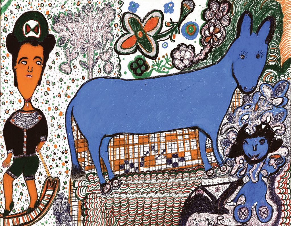
Rolling Tree Mule


 Rolling Tree Mule, 1981, crayon and ink on paper, gift of Martha and Jim Sweeny in memory of Judith Alexander.
Museum of Fine Arts, St. Petersburg, Florida.

Two works by Nellie Mae Rowe are included in the Museum of Fine Arts (MFA) St. Petersburg, Florida, collection. One is seen above. This image of Rolling Tree Mule is also included on their website, highlighting pieces from the permanent collection, and offers this brief summery of Rowe’s life:

Rowe faced racism and discrimination, was widowed twice, and worked as a domestic for roughly thirty years. Born in Fayetteville, Georgia, she spent most of her life in Vinings, outside of Atlanta. Her parents were farmers and also made handicrafts: her father, born into slavery in 1851, smithed and made baskets; her mother made quilts. As a girl, Rowe made dolls out of rags and figures from chewing gum. In 1948, after the death of her second husband, she began making art, “something out of nothing.” She saw her artistic life as a second childhood, terming her home “Nellie’s Playhouse.”

Play

Rowe was proud and happy about what she was creating. When creativity comes purely and directly through a person, it doesn’t need explanation, permission or approval. The result is the rawest and most authentic kind of expression.

In Nellie Mae Rowe 1 video (YouTube, 1976), Nellie is moving around her garden area, sweeping, planting, and fussing with various things as she meanders. Her voice can be heard over the footage, explaining “I do too many things, start sewing, next thing, I’m outdoors in my hole (garden), then uh, put that down, and then go to drawing a little, that’s just how it go… I never finish nothing at once. I just enjoy playing like that. I’m like a child. I wanna play in my Playhouse.”

Closing

At the start of this writing, I was seeking to share impressions of the High Museum’s exhibition of Nellie Mae Rowe’s work. While I have shared some impressions, I found Nellie herself to be more compelling to think about, and to write about, so I’ve taken liberties to include some of those impressions too.

There is so much to admire about her – especially the way she crafted her life in just the way she wanted to live it. And in doing so, the barriers that would have normally limited her success – being a woman, an artist, black, and older – she instead, moved right through them, inviting anyone and everyone into her home to experience her Playhouse. Imagine this kind of generous invitation now, much less in the 70s.

Nellie Mae Rowe was a constant curator living in her greatest work of art. The ever-evolving Playhouse environment was a major source of energy and motivation where she was able to express her thoughts to her own satisfaction, all the while sharing her creations with others, inviting them into her world where hundreds of curious strangers were moved and inspired.


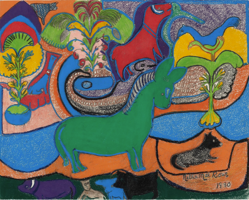
Green Horse, 1980, crayon, pastel, and graphite on paper. Recently sold at Christies from the property of the William Louis-Dreyfus Foundation, Mount Kisko, New York.
 
About the author

Katherine Gibson, creator of ArtHouse3, is an independent curator and regional art consultant living in St. Petersburg, Florida. Gibson received a 2018 Individual Artist Award from the St. Petersburg Arts Alliance for her Drive-by Window Project and was selected for an ArtsUp Grant by Creative Pinellas as creator and curator of the 2019 summer exhibition Tongue & Groove.

USF Public Art Walking Tour

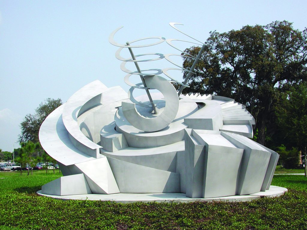
In this month of March, celebrating Women in History, Sarah Howard, USF Curator of Public Art & Social Practice, will lead a free walking tour on Wednesday, March 27th of site-specific public art on the Univerity of South Florida campus in Tampa. The one-hour tour starts at artist Nancy Holt’s Solar Rotary at noon.

USF’s public art collection includes some significiant examples of works by major female artists. It is of particular interest to see how artists have applied their practice to site-specific commissions in the university environment. It is the sense that thoughts which should be of interest; relationships with place, environment and, indeed, with each other as a community, are explored and provoked is the remit of successful public art, especially so in a place of education.

Specifically, the women represented in this tour have added significantly to important gender equity issues over time. Women in History Month seeks to highlight and celebrate, indeed educate the public of such contributions. The nexus of important matters and public art within the university campus, irrespective whether they are accurately, in fact, purely a historical matter should be of great interest to us.

Alice Aycock, Maze, 2000. Photography courtesy of USF Public Art.


Per the USF Facebook event page, “The tour will feature site-specific works by renowned artists such as Alice Aycock, Lynda Benglis, Nancy Holt, Stacy Levy, and Janaina Tschäpe. Participants will have the opportunity to learn about the history of the program, and the artists and collaborators who created the public artworks. Tour will begin at Nancy Holt’s Solar Rotary, adjacent to the USF Communication & Information Sciences Building (CIS), weather permitting.”

Light Through Her Hands: Patricia Cronin at the Tampa Museum of Art

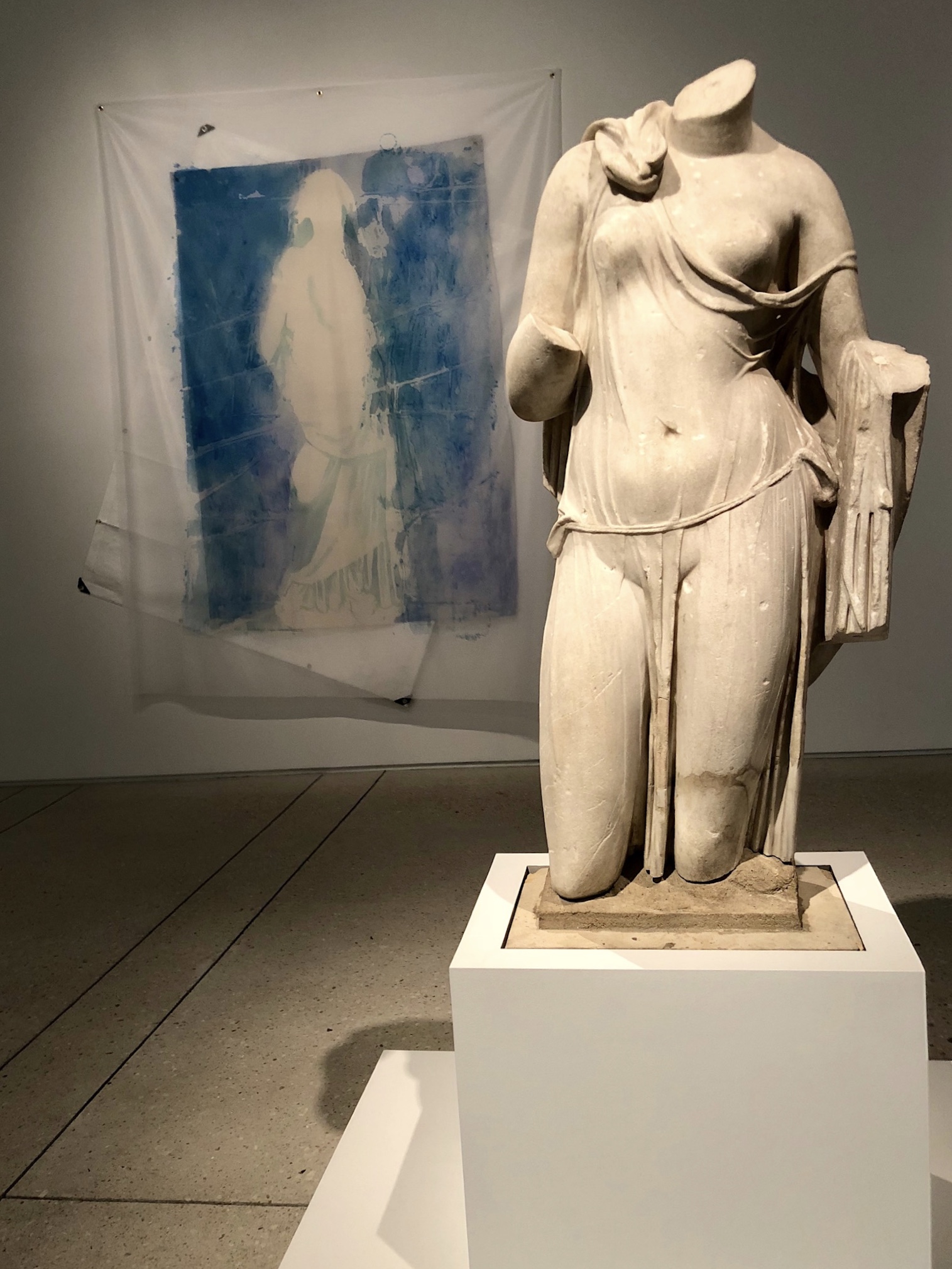
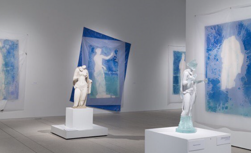
Installation view of the exhibition "Patricia Cronin, Aphrodite, and the Lure of Antiquity: Conversations with the Collection" at the Tampa Museum of Art. Photo: Eleanor Eichenbaum

Artist Patricia Cronin’s “Aphrodite and the Lure of Antiquity” is the inaugural exhibition in the Tampa Museum’s Conversations with the Collection, which puts contemporary art in dialogue with classical antiquities. The exhibit fills two large galleries and the outdoor terrace on the Museum’s second floor. Cronin, a widely recognized Brooklyn-based artist, offers a show that is thoughtful, feminist, materially dazzling, and asks dimensional questions of the fragment and the whole.

The exhibition features three main series of works, all of which engage materially and conceptually. The works feature tactile media; from stone to glass to blue painter’s tarps, to create a densely layered experience. The works echo with female multiplicity— the woman as artist, the woman as symbol, the woman as present, the woman as absent. Cronin interrogates what is missing – in the history of women, of women artists, and in physical reality. Sculptures may be partial, paintings may contain traces, negative space may be charged.

Walking through the exhibition, a viewer threads connections between thoughts and works. Seams – flickering lines of betweenness— are integral to the character of the show. Cronin’s works hinge on the possibility of questions made visible, of touching the ephemeral through noticing the absent.

Installation view of the exhibition "Patricia Cronin, Aphrodite, and the Lure of Antiquity: Conversations with the Collection" at the Tampa Museum of Art. Photo: Bay Art Files.

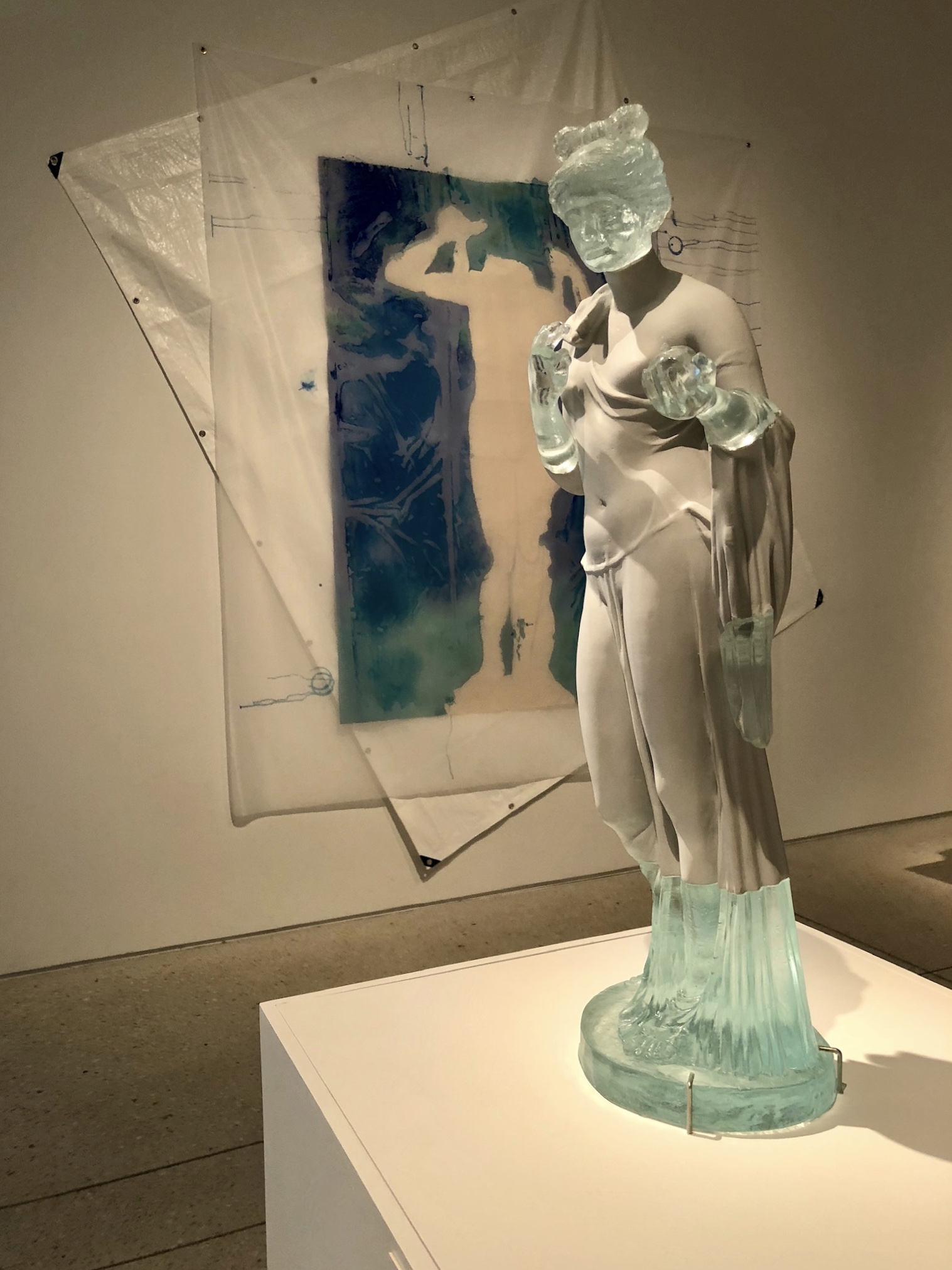
The gallery closest to the stairs, where the visitor arrives, features works from the Aphrodite Reimagined series. Cronin’s mastery of material choices resonates in this cool bluish room where the sculptural pieces converse with the layered works on the walls. Large paintings with gossamer transparencies depict outlines of individual Aphrodite sculptures from various museum collections. The paintings show the different presences of these particular Aphrodites; the form of the sculptural body is featured in relief, the background rendered as an aqueous field. Viewing these many traces of Aphrodites, a viewer may consider multiplicities in Aphrodite’s symbolic identities and in the histories of these sculptures. Cronin’s paintings are soft and illuminate the ineffable space between line and body. These works conjure what is ghostly, what is fluid— a seam of the permeable that runs through the show.

Of particular interest is Cronin’s Aphrodite (Metropolitan Museum): a two-part sculpture made of deep green cast glass displayed on a pedestal, its two halves set apart by a cushion of space. This piece is Cronin’s first work in cast glass and displays the sculptural body as impression. The seam, a site of joining to create a potential whole, is rendered visible here through the two halves that the viewer may work to visually assemble. In addition to its watery translucence, the apt material choice holds the moment the molten glass stills. This quiet interrogation of the momentary resonates in the exhibition.

Cronin’s moving Memorial to a Marriage and works that focus on the 19th-century American female sculptor Harriet Hosmer share the next large gallery. These works amplify questions of presence and absence. Memorial to a Marriage is functional as an iteration of memorial sculpture in Woodlawn Cemetery for Cronin and her wife, the artist Deborah Kass. They are depicted in marble, asleep and embracing under folds of sheets. The sculpture witnesses the connected lives of two female artists and holds both tenderness and contemplative melancholy. The creamy stone is perhaps the exhibition’s most taut moment of absence, as it materializes questions of mortality. Memorial to a Marriage was initially created in 2002 and predates the legalization of gay marriage by the United States Supreme Court by thirteen years. Another kind of booming absence – one of equality.

Through the project Harriet Hosmer: Lost and Found, A Catalogue Raisonne, Cronin illuminates Hosmer’s work and asks that the viewer see the artist’s works that have been lost to history. Cronin renders these lost works as watery shimmering outlines on paper and as towering abstractions on fabric – revealing each as a glance, a shadow, a ghost. The threads of what was lost are realized in two monumental wall-mounted silk pieces: Queen of Naples and Ghost. The fabric cascades far above the viewer’s height and the air in the gallery animate these pieces with slight billows. The works are both subtle and imposing, like an urgent but hazy memory or like blinking in a dark room trying to find her.


Installation view of the exhibition "Patricia Cronin, Aphrodite, and the Lure of Antiquity: Conversations with the Collection" at the Tampa Museum of Art. Photo: Bay Art Files
.
Installation view of the exhibition "Patricia Cronin, Aphrodite, and the Lure of Antiquity: Conversations with the Collection" at the Tampa Museum of Art. Photo: Bay Art Files.

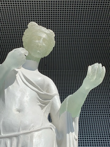
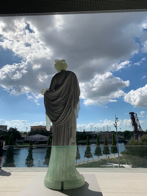
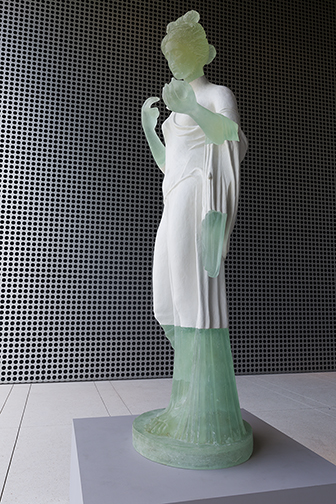
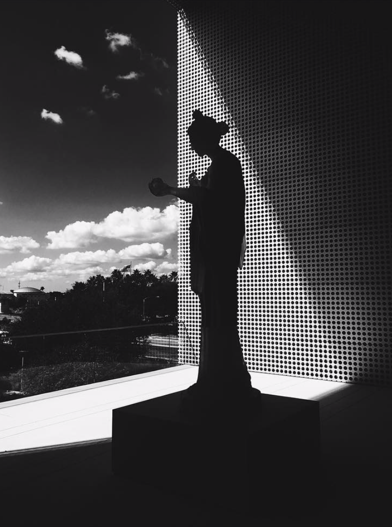
The her that the viewer ultimately finds is Cronin’s outdoor sculpture, Aphrodite Reimagined. She towers above the viewer and dialogues with light and landscape, her face towards the Hillsborough River. The piece, a whole composite Aphrodite, was inspired by a fragmentary 1st-century AD sculpture in the Museum’s classical antiquities collection. In fact, the viewer may encounter the ancient marble torso on display in the gallery, before proceeding to the terrace. This impression of the fragmentary flashes and is enforced in Cronin’s monumental, Aphrodite Reimagined. Strikingly, her legs, feet, arms, hands, and head are translucent resin, pale green and watery while the draped torso is gray and fixed in stone. Outside, these glassy hands catch light. Light slips through them – a prismatic recasting of stubborn histories. Hands, the means by which we count, gesture, touch, and hold are rendered physically anew from a material that mimics absence and calls attention to what we can now see.

Eleanor Eichenbaum is a writer and educator based in St. Petersburg, Florida. She is also an independent curator of visual arts and has organized exhibits in New York, New Jersey, and California.

Patricia Cronin, Aphrodite, and the Lure of Antiquity: Conversations with the Collection is on view at the Tampa Museum of Art through March 17, 2019.
For more information, visit the museum’s website at tampamuseum.org.

The Tampa Museum of Art’s Educating Collections

Patricia Cronin (American, b. 1963), Aphrodite Reimagined, 2018. Cold-cast marble and resin. Tampa Museum of Art, Commission. Installed on the Bretta B. Sullivan Terrace. Courtesy of Patricia Cronin Studio; Photographer: Selina Roman.


Museums please don’t stay still and keep on moving. So it is with Patricia Cronin, Aphrodite, and the Lure of Antiquity: Conversations with the Collection at the Tampa Museum of Art on view through January 6, 2019. This is the inaugural exhibition of a biennial series of commissioned contemporary art explorations which seeks to examine the synergy that might be wrought from their collections.

In many respects, it is a challenge for museums to avoid the ‘end-of-the-line’ sense of the collections that they hold and display. Broadly speaking, a ‘permanent collection’ for the purposes here,  by definition, might be termed as a ‘set’ of related objects and the relationships between the objects define the notion of the collection. Specifically, one of the major curatorial charges is to communicate such a sense of collection…the bonding agent if you will. In particular, the notion that is over and above any individual constituent itself. Consequently, to continually engage a community and to cultivate new appreciations, it is important that museums challenge the stasis of their collections.

There are two roots to the word ‘education’ i) ‘educare’ which means to train or to mold and ii) ‘educere’ which denotes the drawing out of a meaning.

Perhaps, it is with this in mind that the Tampa Museum of Art has embarked on this program of special exhibitions. Specifically, in this case to ‘educere’ and extrude a new sense within which their significant Classical Antiquities collection can be re-seen and (re-)interpreted.

Furthermore, it is interesting to note that this collection is central to the Museum’s remit and as such, every schoolchild in Hillsborough County is invited to see the collection. I dare to say, that distinct from my day, today’s school children’s visits are more ‘educere’ than the ‘educare’ they were for me. I do hope so. It remains to say that, presently, there are interesting and important curatorial developments in ‘cajoling’ the traditional understanding of ‘collections’  into a contemporary practice.

Such a sense of intellectual vigor is very much evident in Patricia Cronin, Aphrodite, and the Lure of Antiquity: Conversations with the Collection. Cronin’s work is informed by her deep interest in the ancient world. Significantly, this exhibition is a strikingly productive crossover in which she combines advocacy, research, and knowledge with (her) considerable creative energy. In taking, as inspiration, the museum’s antiquities collection this exhibition is a very successful dialogue with contemporary art practices. Cronin’s particular methodology is apposite in ‘synergizing’ the idea with which we might previously have viewed the museum’s antiquity collection.

At Bay Art Files we have asked St. Petersburg-based Eleanor Eichenbaum to write about the exhibition and this will be published online soon. In bringing a sense of crafted space and tempo to her impressions and experience, the piece reads poetically and reflective in ways that a traditional review might not read. Just as the Museum’s biennial ‘synergy’ series reconsiders its holdings, so it is hoped that you might see this exhibition anew through Eichenbaum’s writing.