More is More

EMBELLISH ME: Works from the Collection of Norma Canelas Roth and William Roth

by Dr. Robert Steven Bianchi

One of the most significant imperatives of the exhibition philosophy of the Tampa Museum of Art is to present visually stimulating works of art which are not only possessed of superior aesthetic qualities in their own right but whose subject matter is relevant. That relevance is formulated by asking its visitors to view those works of art within the context of current international discourse about pressing social issues. The permanent exhibition, Identity in the Ancient World, explores such issues as ethnicity, gender, and sexuality as lived experiences resonating with similar issues impacting upon our contemporary society.

Embellish Me: Works from the Collection of Norma Canelas Roth and William Roth is its parallel, temporary loan exhibition, showcasing a panorama of stimulating eye candy reveling in glorious patterns and captivating decorative motifs. But like the themes articulated in the Identity exhibition, Embellish Me engages its visitors in an equally compelling art historical discourse, what is art and who decides what is art.

For about a decade from the mid-1970’s to the mid-1980’s a group of artists on the East and West Coast participated in a movement now known as P&D, the Pattern and Decoration Movement. The participating members, mostly women, understood that artistic discourse was dominated by men who, it seemed, arbitrarily and somewhat disparagingly dumped textiles, basketry, and the like into the pejorative “craft” category, effectively divorcing those creations from the supposedly superior category of “fine art.” That hierarchical categorization had an unfortunate misogynist side effect, because, traditionally, from the dawn of civilization women were the dominant weavers of textiles and baskets. The P&D movement’s imperative, therefore, was to set aside such rigid hierarchies and in so doing, intercalate the contributions of women into the ages-old continuum of visual creations. The movers and shakers of P&D also correctly observed that textiles and baskets were themselves often imbued, as a result of the materials used and the patterns employed, with an intrinsic sensuality effected by their retinal-commanding ornament.

The combined oeuvre of the participants of the P&D Movement offered a viable alternative to what some have termed the general manliness of modernism. It demolished the artificial boundaries traditionally separating fine art from craft. Significantly P&D succeeded in elevating the status of women as artists in their own right. 

Joanna Robotham, the Curator of Modern and Contemporary Art at Tampa since 2016, collaborated with Dr. Amy Galpin, former Chief Curator at the Frost Art Museum (now Executive Director and Chief Curator at MOAD in Miami) on Embellish Me. Robotham reinforces the added significance of this exhibition for our Tampa Bay community because, as she rightly stresses, the works of view are from the collection of Norma Canelas Roth (1943-2022), and her husband, William. Mrs. Roth was born in Santurce, Puerto Rico, is an alumna of the University of South Florida, and lived most of her life right here in the Sunshine State. Early on she recognized the marginalization of women artists because they were often ignored, and hence neglected, by mainstream gallerists and collectors. 

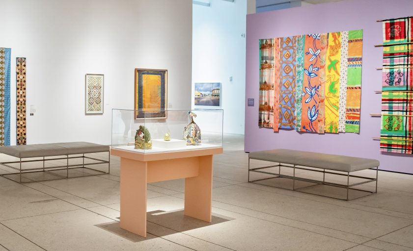
Figure 1. Installation view of the exhibition Embellish Me at the Tampa Museum of Art.
Photograph by Paige Boscia. Courtesy of the Museum.

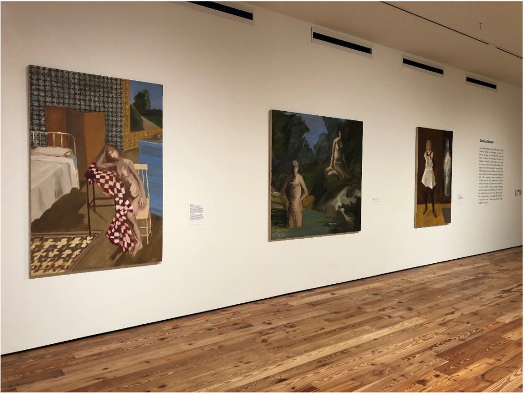
The exhibition space is sumptuously designed (Figure 1) with its aubergine-colored accent walls and strategically-placed benches affording visitors various vantage points from which to contemplate the works of art, each one of which occupies its own environment. Every work stands alone and proud, there is no clutter, there is no crowding.

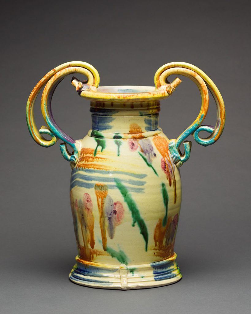
Figure 2. Betty Woodman (1930-2018). Untitled, 1981.

Among the works of art on view are an exuberant vase (Figure 2) potted by ceramist Betty Woodman, one of the mainstays of P&D. The vase is noteworthy for both its size and consummate polychromatic effects. 

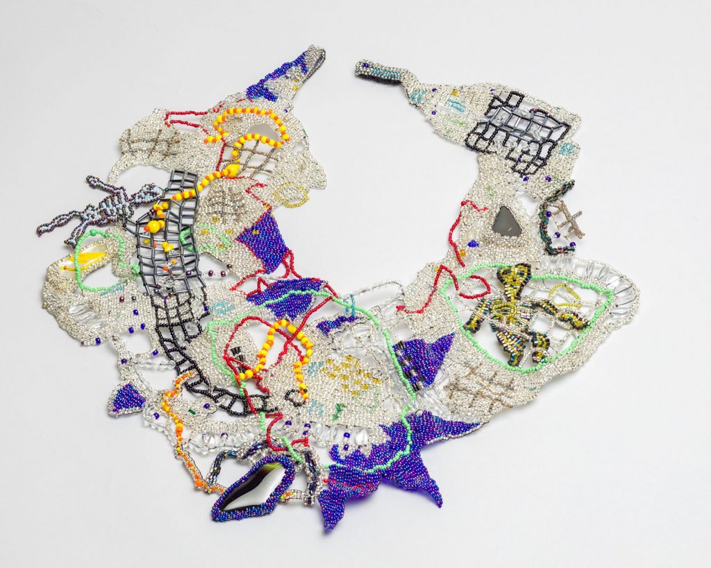
Figure 3. Joyce Scott (born 1948). Necklace (Skeletons), 1994.

The necklace (Figure 3) by Joyce Scott, created from glass beads and semi-precious stones, is a deceptive masterpiece in miniature because it deserves more than a passing glance. This work, informed by Scott’s Afro-American heritage, alludes to current social issues by virtue of the initially inconspicuous skeletons which are subtly intercalated into its overall, seeming ornamental design. 

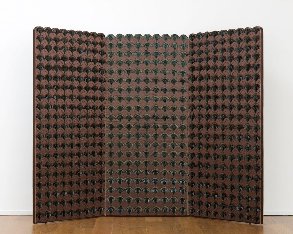
Figure 4. Jane Kaufman (1938-2021). Screen, 1979.

Equally deceptive and likewise worthy of contemplation is the screen (Figure 4) by Jane Kaufman, a leader of P&D. She transformed the skills of embroidery and sewing, taught to her by her Russian-born grandmother, by introducing bugle beads and metallic threads, often glued together, into her compositions. She also foregrounded feathers into her oeuvre, as seen in this exacting, meticulously designed screen in which each pheasant feather appears to be so identical that one’s first impression is that they had been mechanically reproduced rather than being selectively plucked from nature.

Figure 5. Tony Robbin (born 1943). 1978-21, 1978.

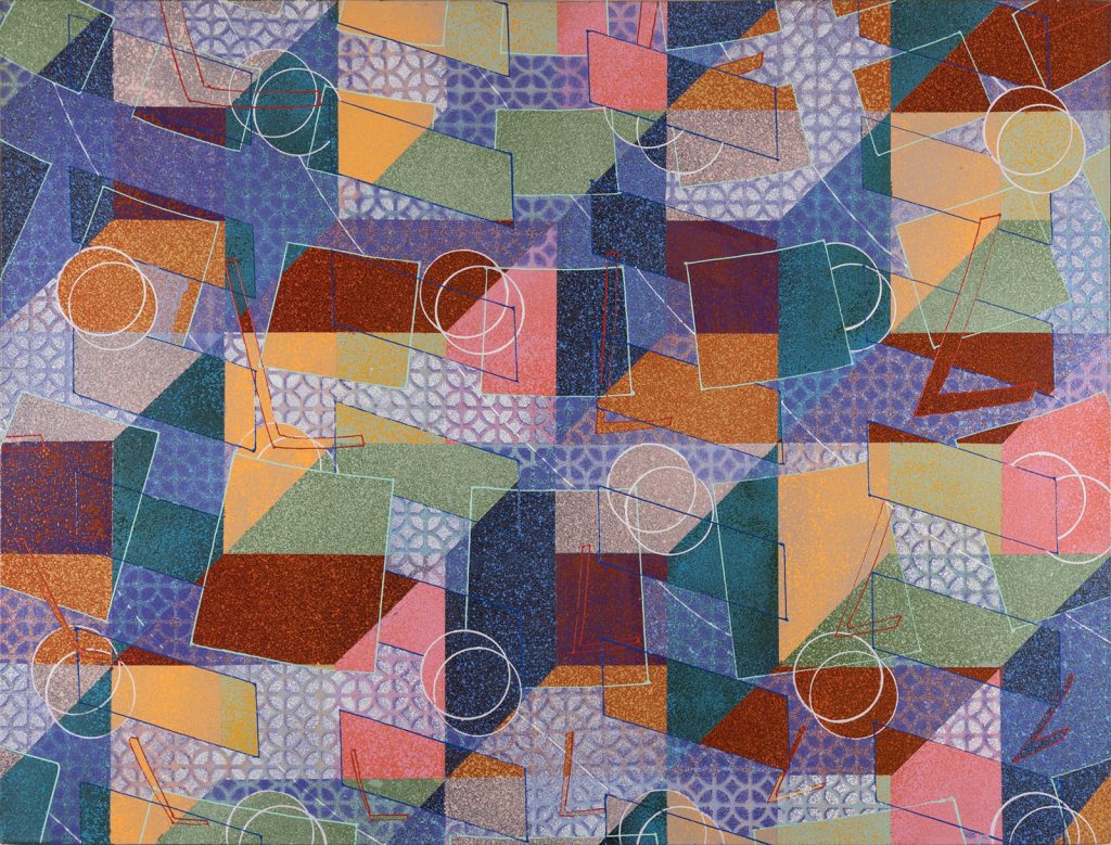
Toby Robbin was a member of an improvisational theater group and a member of a men’s consciousness-raising group before joining the P&D. There his oeuvre concentrated on illusion effective by compositions of polyvalent geometric patterns. The repeated patterns of shape and color in 1978-21 (Figure 5) are a tour de force, oscillating as they do between the linear and the painterly, the static and the kinetic. 

Figure 6. Lucas Samaras (1936-2024). Reconstruction #39, 1978.

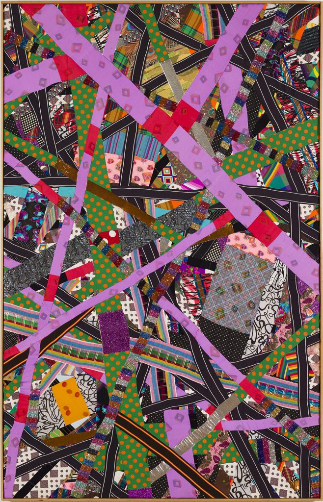
Lucas Samaras participated in P&D, particularly in the 1970’s when he began his Reconstruction series, of which Reconstruction #39 (Figure 6) is representative. He composes his geometric motifs from swatches of fabric which he combines into compositions with a sewing machine. The resulting works of art purposefully resonate with the aesthetic concerns of the Russian Suprematist Art Movement in which the traditional distinction between foreground and background are blurred.

Embellish Me, therefore, engages not only the visitor’s eye with its dazzling array of decorative, polychromatic ornamentation but challenges the visitor to reassess the place of ornament within one’s own environment. That mental engagement may force one to rethink the attraction that we have either for patterned bed sheets or for wallpaper. And that rethinking should awaken everyone to the role that pattern and ornament have played in the visual culture of virtually every civilization since the beginning of time.

Embellish Me: Works from the Collection of Norma Canelas Roth and William Roth is organized by the Patricia & Philip Frost Art Museum at Florida International University, Miami, and presented in collaboration with the Tampa Museum of Art. The exhibition is on view through July 28, 2024.

Dr. Robert Steven Bianchi, a critical art historian, is currently chief curator of the Ancient Egyptian Museum Shibuya in Tokyo. During his career, he has curated exhibitions of contemporary art in New York City, Antibes, and Tokyo. He has previously written about exhibitions in the Tampa Bay area for Bay Art Files. 

In Good Company

In Good Company: Strength of Character at Creative Pinellas
by Jessica Todd

In her latest exhibition, Strength of Character at Creative Pinellas, curator Katherine Gibson welcomes the viewer into the gallery with warm familiarity. Oak seats and fruit chandeliers allude to home. Rich colors, natural materials, and hints of domesticity soften the formality of the impressively grand galleries of Creative Pinellas. There’s even a scent of cedar in the air.

The Art world is still shedding the restrictive boundaries between “Fine Art” and Crafts and Design. The Western Art canon has long excluded work due to medium, process, functionality, and proximity to the domestic. While oil painting and marble sculpture dominate the collections of major institutions and the pages of Art History books, a wealth of works in traditional Crafts media such as ceramics, wood, glass, fine metal, fibers, and paper have been largely ignored.

This exclusion is not due to a lack of artistic merit. Rather, it is deeply rooted in classism, racism, and sexism. Availability of materials, differing cultural applications of art objects, and restricted access to education and patronage led to different kinds of artmaking throughout history. To assert the dominance of the upper-class Western European male, the materials and functionality associated with the art of socially repressed groups were deemed inferior. And the tradition lives on.

Today, we see artists and curators challenging this bias. Audiences’ enthusiasm for Crafts media, Design, and functional work continues to push it into the mainstream. We see materials, processes, and forms we’re accustomed to living with in our homes now in gallery and museum spaces. This familiarity offers an entry point to the viewer. It democratizes Western art in a revolutionary way.

Gibson’s curatorial work is, in this sense, revolutionary. She integrates Crafts media with painting and sculpture, functional with conceptual work, and self-trained with academically trained artists. She integrates these works into the gallery seamlessly. Most importantly, her exhibitions are not “about” Art hierarchies. They’re about placing thoughtfully made artworks in a space and allowing them to converse with each other and with the viewer.

Strength of Character beautifully iterates this concept. We see the abstract paintings of Edgar Sanchez Cumbas next to the carved wooden furniture of David and Kathleen Bly alongside the sculptural installations of Kendra Frorup, which integrate printmaking, casting, and metalwork. Chandeliers converse with stretched canvas. Stools talk to framed paintings.

The harmony of the work in the gallery is a reflection of the collaborative installation process. The curator, artists, and Creative Pinellas staff came together to design an exhibition that is both cohesive and unexpected. Gibson isn’t afraid to ask the viewer to look upward or downward – “gallery height” is merely a suggestion. She’s a master of balancing scale in improbable ways: the Blys’ four petit Live Oak sculptures hold their own resting on the ground catty-cornered to Frorup’s wall-sized installation and substantial Sugar Apple Chandelier.

Each artist also contributed their unique perspective to the installation process: Frorup’s talent for collaging objects, Sanchez Cumbas’s eye for color and form, and the Blys’ engagement with architecture. Freddie Hughes (Gallery and Facilities Engagement Manager for Creative Pinellas) was instrumental in bringing the exhibition to life with his extensive installation knowledge and technical support. Serendipitous moments, like finding an old fence post outside to anchor Sanchez Cumbas’s Brush, or Frorup upending a utility cart from her studio to hold Banana Chandelier, reflect an openness to experimentation and play.

Though diverse in their media, the works in Strength of Character are united visually. Warm, rich earthy tones dominate the palette with intermittent pops of teal and quiet moments of textured white. Voluminous abstract shapes uncovered in the natural wood patterns of the Blys’ Live Oak series mirror Sanchez Cumbas’s explorations of human form in his Skinless series. Frenetic feather-like shapes in Sanchez Cumbas’s Compression Series and Reduction in Volumes are reflected in the crisscrossing screen- printed palm fronds of Frorup’s untitled installation. After seeing the symmetrical wood-turned bumps of the Blys’ work, Frorup responded with similarly shaped spun metal hardware to hang her Sugar Apple Chandelier.

Conceptually, all of the artists in the exhibition start with process. Frorup’s practice begins with collecting objects. She then problem solves through active making. Frorup engages in a range of art-making processes – from casting to papermaking to screenprinting – to arrive at her installations and sculptures. Her high regard for process is evident in her untitled installation featuring used screen-printing screens. The fruits that appear in Frorup’s work are an homage to her Bahamian roots and her mother’s farm that she grew up working on. Much like the artwork, the fruits are the sweet end result of a long cultivation process.

The Blys’ work is similarly driven by collected materials – reclaimed trees from Tampa’s urban neighborhoods. Their sculptures are a collaboration with the tree that bore the wood, which evolves throughout the making process. The tree tells them where to carve and when to stop. They work the wood while it’s still green, rather than fully dried, so that after their intervention the wood continues to bend, move, and crack. The resulting sculptures, many of which function as furniture, act as monuments to the downed tree from which they were sourced.

Sanchez Cumbas responds to the world around him through the cathartic process of painting. His kinetic brushstrokes in Compression Series and Reduction in Volumes reflect the turbulent war in Afghanistan and politics of 2010, when they were made (he notes, still relevant today). These works mark a turn from his figurative paintings, the last of which is Brush, also in the exhibition, a nod to the Buddha and his own Buddhist practice, a piece that is notably calmer and more grounded. The much more restrained works in the Skinless series sensitively explore bodies and skin, and issues around skin tone in the Latinx community. Each piece is a visual reflection of the emotion with which it was created.

It’s evident when speaking with Gibson and the artists of Strength of Character that they all share an immense respect for each other’s practices. The joyful spirit with which they engaged in this collaborative project is palpable in the gallery, and reflected in the enthusiasm of Creative Pinellas’s passionate staff. Head to Largo and make yourself at home in this beautiful exhibition, up through April 28, 2024.

A special thanks to the Gobioff Foundation for supporting this exhibition through their Microgrant program.

Creative Pinellas is Pinellas County’s non-profit local arts agency providing funding and support to artists while connecting businesses, tourism and the public with the arts community.

Jessica Todd is a curator, writer, and artist based in Tampa, Florida. She is passionate about building the creative infrastructures that support artists, and studying and addressing issues of equity, access, and inclusion in the arts. In October 2022, Jessica opened Parachute Gallery in Ybor City, first serving as an exhibition space for national artists and later a retail gallery representing local artists. Parachute Gallery currently operates remotely through online resources and off-site programming. Jessica has worked with a number of arts organizations since moving to Tampa in 2020, including Tempus Projects, Artspace Tampa Initiative, Crab Devil, and the Morean Arts Center. For six years, prior to moving to Tampa, she was the Residency Manager for the Rauschenberg Residency in Captiva, Florida. Jessica holds an MFA in Jewelry/Metals/Enameling from Kent State University, a BA in Art from Penn State University, and a Diploma of Hispanic Studies from the University of Barcelona.

Photography credit: Jessica Todd

Fall in Unordinary Love: Salman Toor in Tampa

Fall in Unordinary Love: Salman Toor in Tampa

by Richard Ellis

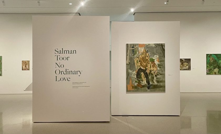
This spring, visitors of the Tampa Museum of Art (TMA) have the uncommon chance to view a profoundly whimsical exhibition of works by a preeminent contemporary painter. Salman Toor: No Ordinary Love, features more than forty-five paintings and works on paper completed between 2019 and 2022. The exhibition is organized by the Baltimore Museum of Art and is on view at the TMA from February 23rd through June 4th, 2023.

Born in 1983, in Lahore, Pakistan, Salman Toor resides and works in New York City and exhibits internationally. His oeuvre primarily consists of dreamlike scenes, in which cartoonish figures appear suspended like marionettes, caught in the plotlines of ambiguous narratives. The stories are drawn from moments of the urban lives of imagined queer young men, as well as from the artist’s own lived experience and those of his friends. The emotional atmospheres of his canvases fluctuate between intimacy and isolation, contentment and embarrassment, and tenderness and violence.

This exhibition is important and timely as it draws attention to international human rights issues as well as domestic queer politics. In Pakistan, acts of homosexuality are punishable by life imprisonment, or even death in extreme cases.1 In America, LGBTQ+ rights, representation and recreation are coming under fire from lawmakers, politicians, and homophobic and transphobic members of the public who are banning or restricting drag shows throughout the country.

On view in the museum’s newly constructed gallery space, the exhibition consists of oil paintings done on panel and canvas, several drawings done in charcoal, ink, and gouache, and two of the artist’s sketchbooks. This body of works offers conceptual, material, and technical variety while also showcasing Toor’s characteristic style. Despite the surreal quality of many of Toor’s paintings and the specificity of his subject matter, the moments that he constructs are deeply sensitive to the human condition. There is a naivete to his figures, but their innocence is occasionally broken by the salacious scenarios in which they appear entangled.

Toor’s paintings reward the visually literate and those well-versed in Western art history. Drawing from the European painting tradition, he invites us to traverse through centuries of time without ever leaving our contemporary moment behind. Toor brings this legacy into our times to confront colonial structures that still confine us. In postcolonial fashion, Toor turns the canon on its head by replacing the typical subjects of Western easel paintings with queer, brown-skinned boys and men. Toor demonstrates his mastery over the Western tradition in a bold act of subversion that begs the question of who owns whose art history.

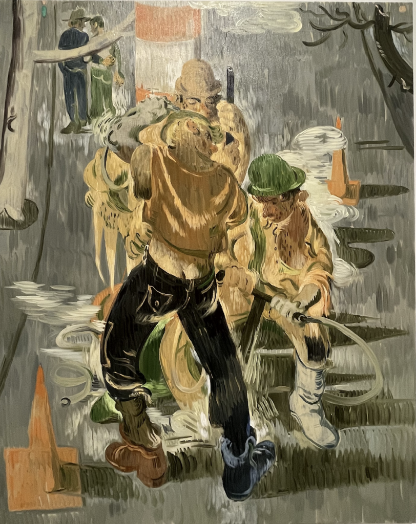
Figure 1: Construction Men, Salman Toor, 2021, oil on canvas, 60 x 48 in. (152.4 x 121.9 cm), photo by author.
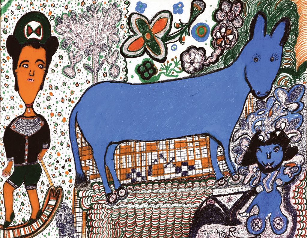
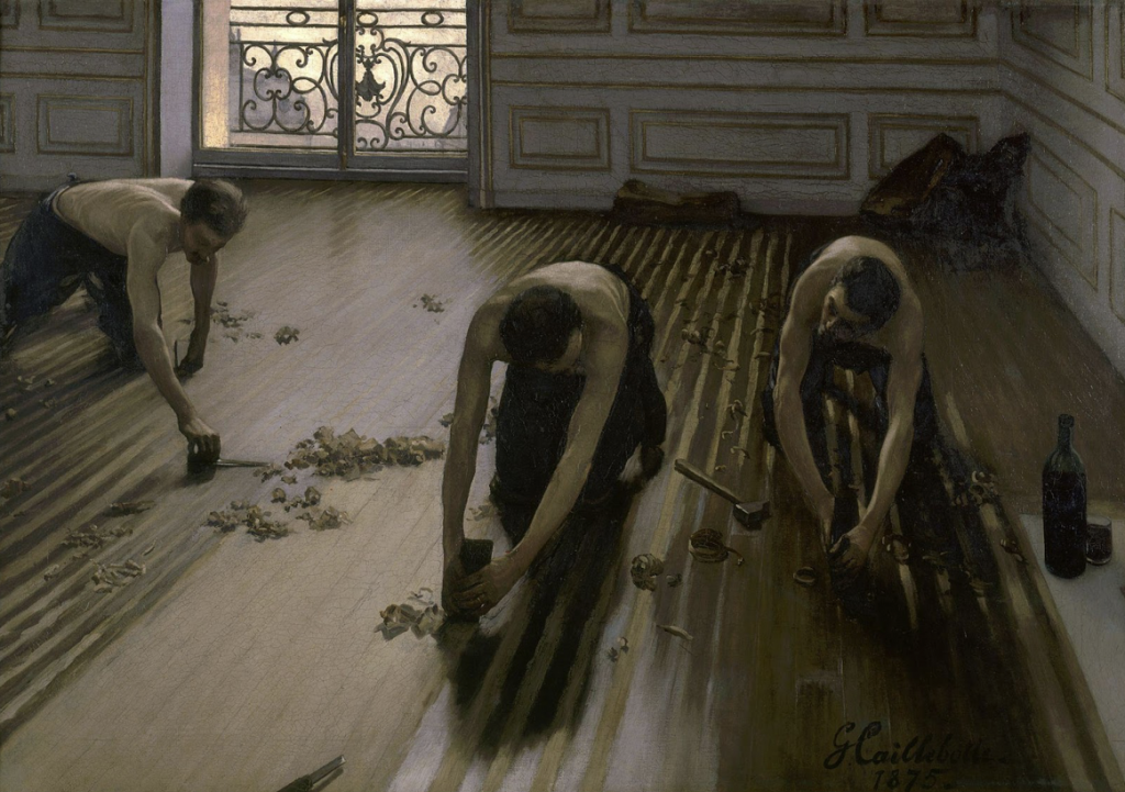
Figure 2: Les Raboteurs de Parquet (The Floor Scrapers), Gustave Caillebotte, 1875, oil on canvas, 40.2 x 57.7 in (102 x 146.5 cm), Google Arts and Culture.

When visitors enter the gallery, they are immediately confronted by Construction Men (Figure 1), a scene that continues the homoerotic celebration of male laborers that can be traced back to Gustave Caillebotte’s The Floor Scrapers (Figure 2), of 1875, though with a campy flare evocative of costumes for The Village People. From there, visitors may circulate the room and explore the three thematic categories that the works are separated into, including desire, tradition, and family. Many of the paintings are neatly spaced along the horizon line of the gallery walls, with carefully adjusted spotlights illuminating each one. His smaller works, though, are clustered together on the south wall, in a way that evokes the salon-style displays of public galleries in the nineteenth century. This strategy slows down the viewing experience and aligns with Toor’s connection to artistic conventions of the past, but it also makes it difficult to see the details in each of them closely, especially for viewers whose vantage point is lower than others.

Not all the works in the catalog make an appearance at this venue. Two notable exclusions include The Latecomer, 2021, and the monumental Fag Puddle with Candle, Shoe and Flag, 2022, which is featured on the cover of the catalog edited by Asma Naeem and available for purchase at the Museum’s store. The painting is a self-referential triumph that blends symbols from Toor’s lexicon, including phalluses, shoes, used condoms, and tombstones. It is perhaps the standout of the show, but it is not on view at the TMA because it was swiftly purchased by the Metropolitan Museum of Art. Congratulations are in order for the artist as this painting is the first of his to be acquired by the prestigious institution, but I lament the missed opportunity for a Floridian audience to view this painting.

While the compositions that underly many of Toor’s canvases are taken from monuments of Early Modern European art, these works find themselves quite at home at the TMA, even though such a collection is conspicuously absent. The TMA has historically been known for its collection of classical art from Greece and Southern Italy, but its exhibition programming and the development of its permanent collection have also been centered around outlier art of the modern and postmodern eras. The humor, irony, postcolonial angst, and queer grunge, that we find on the surface of Toor’s paintings bear an uncanny affinity with the irreverent and kitschy contemporary art scene of the greater Tampa Bay area.

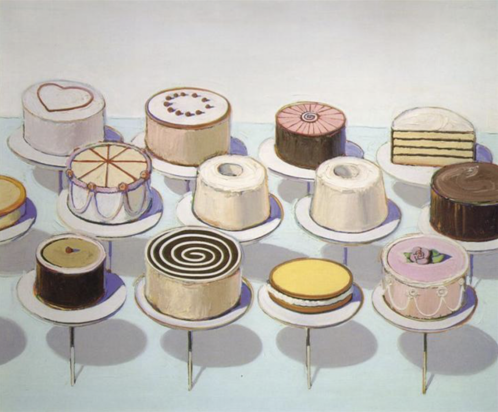
Figure 3: Cakes, Wayne Thiebaud, 1963, oil on canvas, (152.4 x 182.9 cm), Wikiart.

Several of the works made for this exhibition pull directly from works in the Baltimore Museum of Art’s collection of European paintings from the 17th– to the 19th-centuries. Attention to Toor’s references to early modern art is well-established but has perhaps overshadowed his visual connections to later painters. Toor typically uses oil paints over a surface primed with dark brown acrylic paint. His style is painterly, with thick, visible brushstrokes. The built-up textures of his paintings have been described as frosting on a cake, not unlike Wayne Thiebaud, whose paintings of seemingly mundane desserts and pastries, such as Cakes (Figure 3), 1963, were imbued with a postmodern sensibility and likewise question notions of desire, consumption, class, and privilege.2

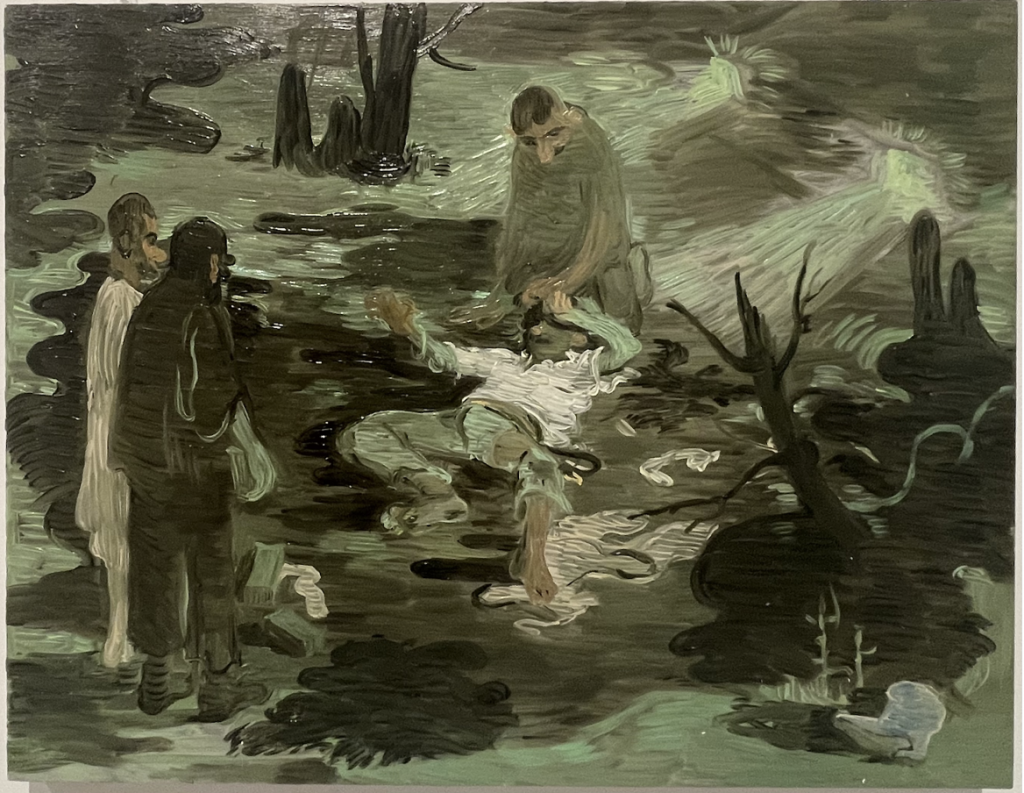
Figure 4: Night Capture, Salman Toor, 2021, oil on panel, 14 x 18 in. (35.6 x 45.7 cm), photo by author.
The Western canon is not the only power structure that Toor seeks to upend. Toor also takes issue with the endemic homophobia that plagues his home country of Pakistan, as well as most other Muslim-majority nations. The perils that LGBTQ+ people face within these communities is a topic brought forth by several of Toor’s paintings, such as Stone Throwers, Night Capture (Figure 4), and The Vigil. The threat of violence compels us to hide beneath the protective cover of night and within the fickle safety of wooden areas, where individuals may cruise at their own risk. In Shadow Park, Toor provides us a glimpse into the underworld of queer desire that echoes the sexually charged nightmare-fantasies of Robert Gober’s The Heart is Not a Metaphor.

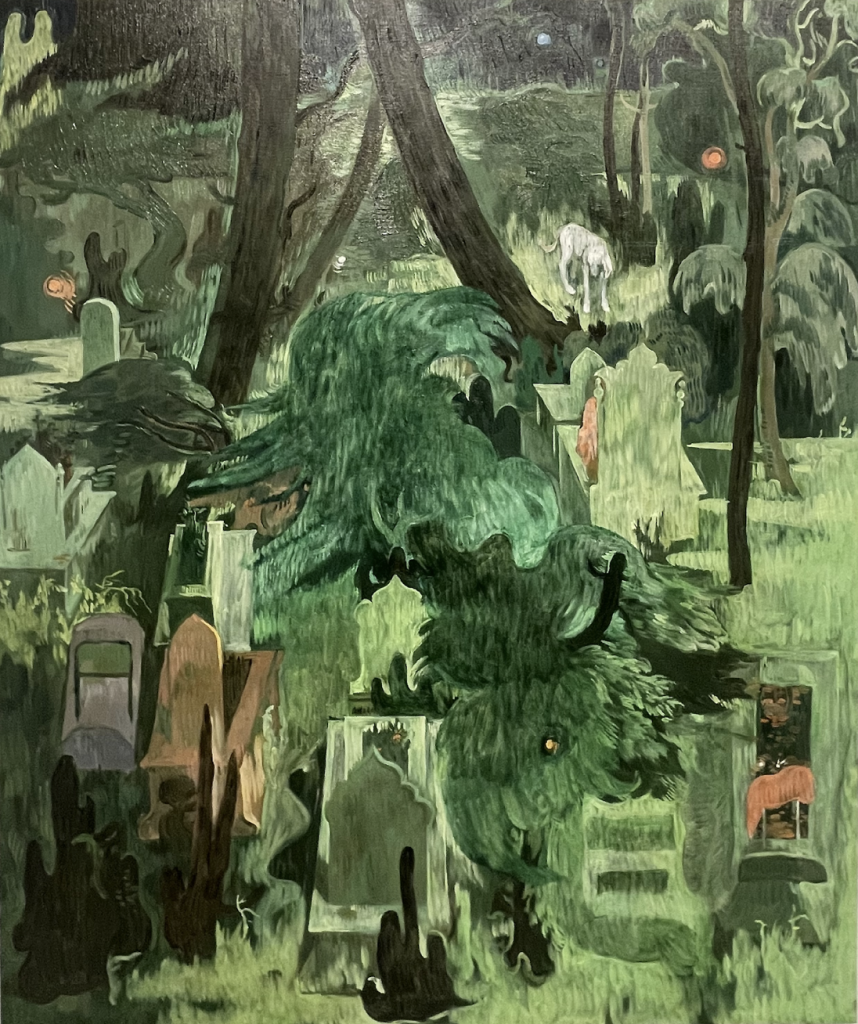
Figure 5: Cemetery with Dog, Salman Toor, 2022, oil on canvas, 43 x 36 in. (109.2 x 91.4 cm), photo by author.
In some of Toor’s paintings such as Thunderstorm and Back Lawn, we see domestic gardens as a space for freedom and unbridled affection. In Cemetery with Dog (Figure 5), Toor explores a different setting entirely, in which the homoerotic paradise of Sa’di’s garden is now a graveyard.3 The scene has the isometric perspective of Persianate manuscript paintings, through which we peer down at above-ground graves and tombstones. Unlike most of his paintings, this one is conspicuously absent of any visible human figures, though it hardly feels like an empty landscape. By searching for a person, we come to the grim realization that a graveyard is never an empty landscape, as the ground literally contains invisible bodies. In the background, there are trees entwined, an established motif in painting, prose, and poetry from the Islamic world for lovers yearning to embrace one another.4 By conflating the garden with the cemetery, and life and death, this painting serves as a dark reminder of the risk of pursuing forbidden love.

Toor is known for his proclivity for green, a color that has, perhaps coincidentally, also enjoyed an emblematic role in Islamic culture. Green is the color of the Prophet Muhammad, who is said to have privileged the color above all others, as well as the color of paradise, which is envisioned as a garden.5 For modern artists in the West, such as Ernst Ludwig Kirchner and Pablo Picasso, green indicates a sickness manifests on multiple levels. Toor says that he is aware of the poisonous associations with green, but for him, the color is “velvety, nocturnal, and comforting.”6 The conflicting potentialities for the symbolic significance of green in Toor’s paintings, in a way, queer the color itself.

At the heart of his work, Toor celebrates the common love found in causal romances of the sex-positive queer world by elevating it by giving it the treatment of one that is found beyond the realm of the ordinary. He celebrates these because they are valuable, and we take them for granted, forgetting that these small acts of seemingly meaningless affection are a luxury not afforded to all.

Glowing like the green light from F. Scott Fitzgerald’s The Great Gatsby, these gleaming, verdant paintings shine into the night, beckoning us into a world of uninhibited frivolity, misplaced desire, and dangerous trysts. Like Nick Carraway, the narrating protagonist of the hazy tale, Toor seems to find dissatisfaction with the world in which he has entered, where love is free, and therefore made worthless. Lovers are had and then disposed. Forbidden love is no longer forbidden, and therefore has become ordinary. Toor gifts us a fresh perspective by showing the value that remains in public displays of affection and to show us that there is nothing at all ordinary about such love.

Salmon Toor: No Ordinary Love is on view at the Tampa Museum of Art through June 4, 2023. The exhibition is organized by the Baltimore Museum of Art.

About the author

Richard Ellis is an adjunct professor at the University of Tampa, in the Department of Art & Design, and at the University of South Florida, in the School of Art & Art History. He holds a B.A. and M.A., both in art history and from the University of South Florida. His areas of interest include Islamic art and architecture, modern and contemporary art of the Middle East, North Africa, South Asia, and the diasporas, as well as Orientalism.

Footnotes

  1. “Pakistan,” Human Dignity Trust, accessed May 8, 2023, https://www.humandignitytrust.org/country-profile/pakistan/.
  2. Asma Naeem, “Salman Toor’s Brown Boys,” in Salman Toor: No Ordinary Love, ed. Asma Naeem (New York and Baltimore: Gregory R. Miller & Co. and the Baltimore Museum of Art), 10.
  3. Mika Natif, “The generative garden: Sensuality, male intimacy, and eternity in Govardhan’s illustration of Sa‘dī’s Gulistān,” in Eros and Sexuality in Islamic Art, ed. Francesca Leoni and Mika Natif (Farnham and Burlington: Ashgate, 2013), 3.
  4. Michael Barry, “Illustrating ‘Attār: A Pictorial Meditation by Master Habīballāh of Mashhad in the Tradition of Master Bihzād of Herat,” in ‘Attār and the Persian Sufi Tradition: The Art of Spiritual Flight, ed. Leonard Lewisohn and Christopher Shackle (London and New York: I.B. Tauris, 2006), 148.
  5. Mohammad Gharipour, Persian Gardens and Pavilions: Reflections in History, Poetry, and the Arts (London and New York, I.B. Taurus, 2013), 24.
  6. Evan Moffitt, “Green as the Night” in Salman Toor: No Ordinary Love, ed. Asma Naeem (New York and Baltimore: Gregory R. Miller & Co. and the Baltimore Museum of Art), 49.

Bibliography

Barry, Michael. “Illustrating ‘Attār: A Pictorial Meditation by Master Habīballāh of Mashhad in the Tradition of Master Bihzād of Herat.” In ‘Attār and the Persian Sufi Tradition: The Art of Spiritual Flight, ed. Leonard Lewisohn and Christopher Shackle, 135-64. London and New York: I.B. Tauris, 2006.

Gharipour, Mohammad. Persian Gardens and Pavilions: Reflections in History, Poetry, and the Arts. London and New York: I.B. Tauris, 2013.

Human Dignity Trust. “Pakistan.” Accessed May 8, 2023. www.humandignitarytrust.org/country-profile/pakistan/.

Naeem, Asma, ed. Salman Toor: No Ordinary Love. ed. New York and Baltimore: Gregory R. Miller & Co. and the Baltimore Museum of Art, 2022.

Natif, Mika. “The generative garden: Sensuality, male intimacy, and eternity in Govardhan’s illustration of Sa‘dī’s Gulistān.” In Eros and Sexuality in Islamic Art, ed. Francesca Leoni and Mika Natif, 43-64. Farnham and Burlington: Ashgate, 2013.

The Constant Curator: The Important Work of Nellie Mae Rowe

The Constant Curator: The Important Work of Nellie Mae Rowe

by Katherine Gibson

The exhibition REALLY FREE: THE RADICAL ART OF NELLIE MAE ROWE was on view at the High Museum of Art, in Atlanta, Georgia, from September 3, 2021 – January 9, 2022, and was organized by Katherine Jentleson, the Merrie and Dan Boone Curator of Folk and Self-Taught Art.


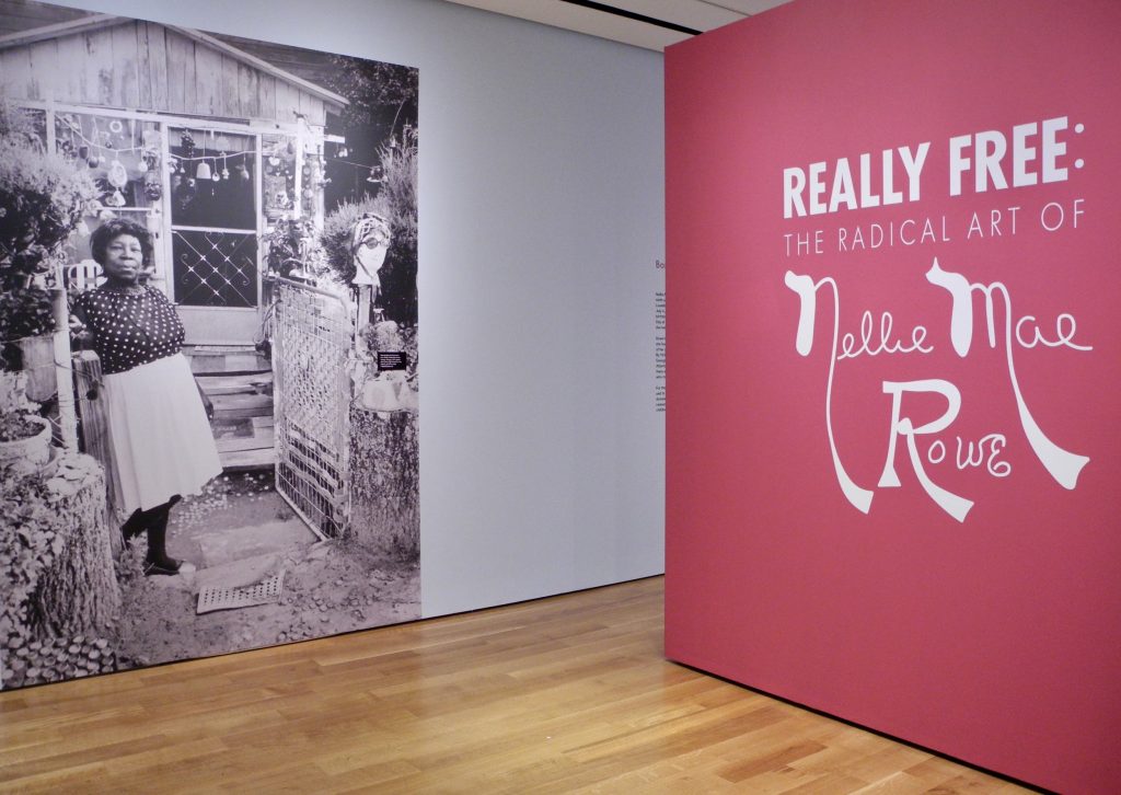
Entrance to “Really Free”; High Museum of Art, Atlanta.

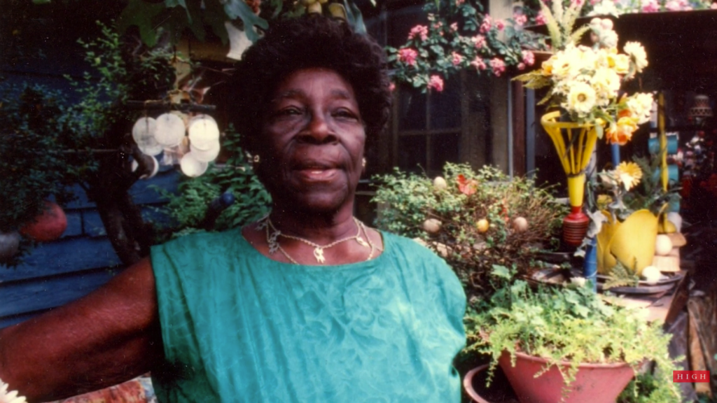
Nellie Mae Rowe greeted me at the gate to her home – at least her likeness did, in the blown-up, life-sized, black and white image of her at the entrance to what she called her Playhouse (referring to her house and yard area). The giant fuchsia wall to the right presented Nellie’s artistic signature as an essential part of the exhibit title, “Really Free: The Radical Art of Nellie Mae Rowe.”

It was the day after Christmas. My sister Jane and I, along with our niece Katie, took in the Nellie Mae Rowe (American, 1900-1982) exhibit at the High Museum of Art in Atlanta. Jane and Katie walked through the show, reading the text for each piece and following the gallery sequence. I’m envious of people who can do that. I don’t seem to be able to go in order, and as a result, I often miss important connections. What I’m always most interested in, is the overall feel of a show, the environment created, the mood and the flow of how someone may experience it. I amble around the space, in no organized way, absorbing visual impressions and relationships.

After a few times around in various directions, I found I wanted the exhibit to feel more connected. The spacing between pieces and groupings was generous, perhaps more than needed. Given that Nellie’s home was chock full of colorful things and objects inside and out – the galleries were spare in comparison, and somewhat static. I felt like the layout could have infused more of the vibrant energy, conviction and general playfulness that Nellie lived by.

That said though, how do you infuse a stagnant exhibit with Nellie’s kind of joyful flow? How do you translate her world into a world others can experience – and, do you need to?

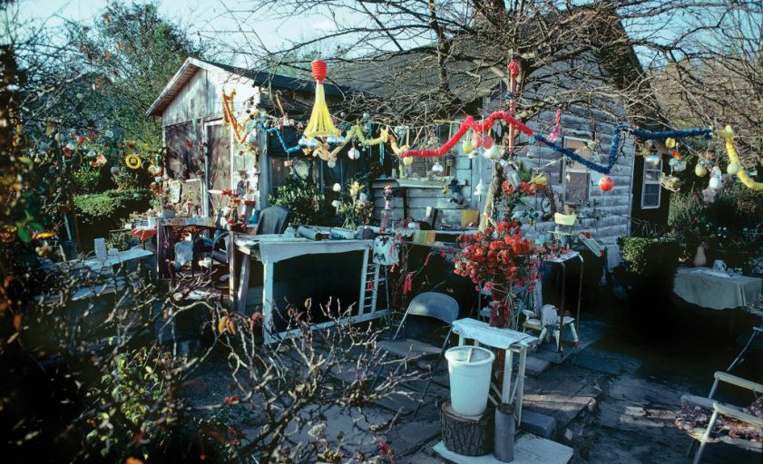
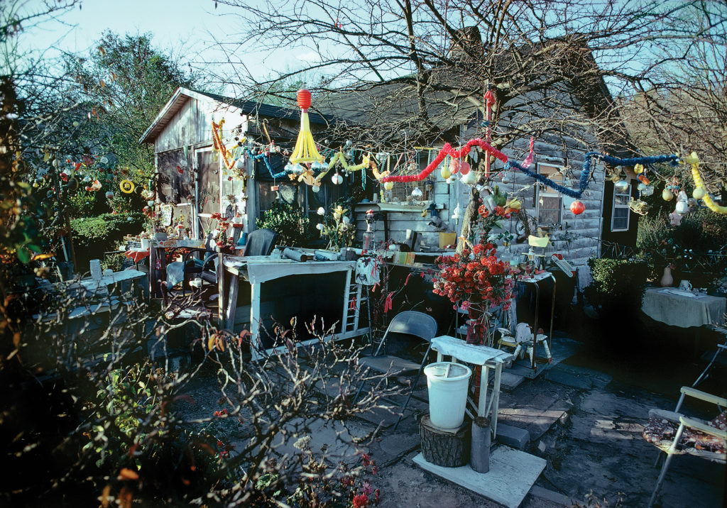
In ruminating over the exhibit and these questions, I can understand what a challenge it was to come up with the best way to show Nellie Mae Rowe’s work. The environment she created throughout her home and property had the same traits as the images she created: layered and overlapping; full of rich color from end to end; animals, objects, plants, sculptures all existing together. One was not separate from the other. I don’t think I got this until later, when I was scrolling through my images, still feeling like something was missing, and then it dawned on me that it was near impossible to convey Nellie’s world without her masterpiece Playhouse.


Lucinda Bunnen, Nellie Mae Rowe’s House (1971).
Photo ©Lucinda Bunnen, collection of the artist, courtesy of the High Museum of Art, Atlanta.

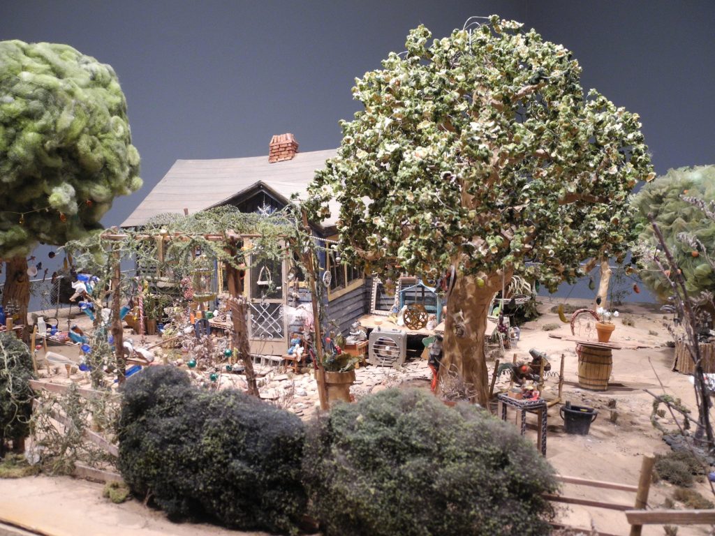
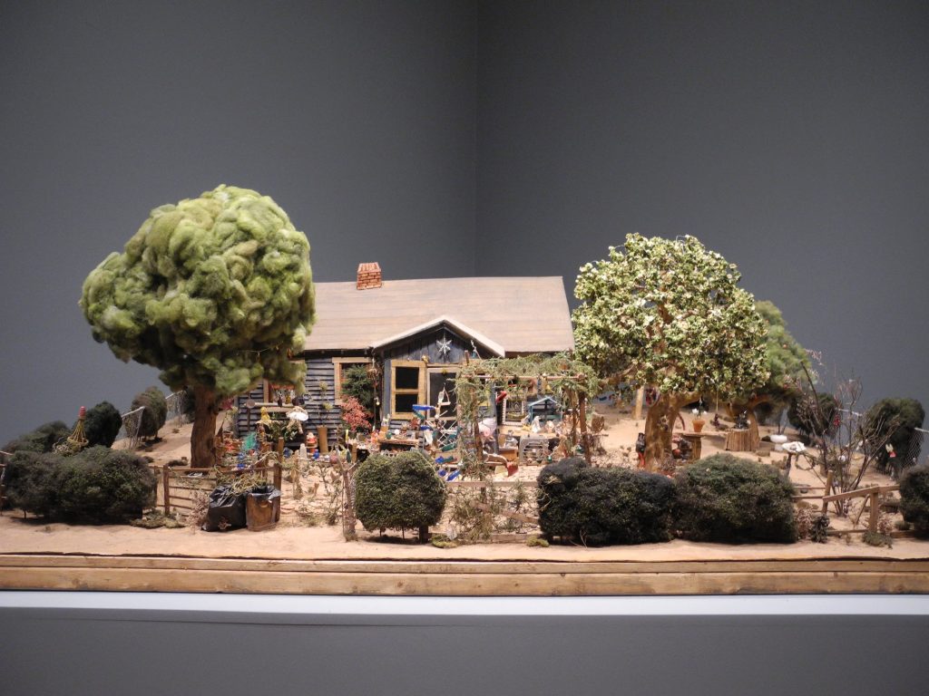
That’s where an unbelievable scale model of Nellie’s Playhouse comes in. Unique to this exhibit, Opendox, a New York documentary-making firm, created two scale models of the Playhouse – the first model was of the entire property presented on a large, flat, table-like surface akin to something a model train environment might sit on. The second model was larger, and was assembled in a corner area near the end of the exhibit, with created interior rooms the size of a child’s playroom.


Model of Nellie Mae Rowe’s Playhouse (detail). High Museum of Art, Atlanta.


Model of Nellie Mae Rowe’s Playhouse. High Museum of Art, Atlanta.

The miniature model of the entire property drew me in and completely blew my mind due to the amazing detail, down to the tiniest possible replica of the many objects scattered throughout Nellie’s environment. Same with the child-sized model of interior rooms of the Playhouse, created to use in filming the documentary about Nellie and her life. “This World is Not My Own” will be available later this year and will be fascinating to watch – not only to learn more about Nellie Mae Rowe and her unapologetic way of living her creative life, but also to see these astounding, meticulously created sets in context. (https://thisworldisnotmyown.com/)

My sister really loved the short film about the making of the documentary that was part of the exhibit, next to the scale house created for the filming.  Those components of the exhibit, she said, helped her get a palpable sense of Nellie’s world and gave context for how Nellie lived. Jane appreciated the tactile model combined with the sound in the film because it made the experience of Nellie’s garden come alive for her.

Strangers Welcomed

Nellie’s home was in a small town west of Atlanta.

“When passersby in sleepy Vinings saw Nellie Mae Rowe’s decorated yard packed with handmade dolls and chewing gum sculptures and beads and wigs hanging from trees, they didn’t know what to make of it,” wrote Bo Emerson in an article for The Atlanta-Journal-Constitution (May 18, 2021). “Some gawked. Some thought she was a “hoodoo” woman or a fortune teller. Some pitched bottles through her windows and broke her flower pots. She met all responses with poise. Those who threw missiles, she invited in to see her yard and her ‘playhouse.’ …Her guestbook was signed by more than 800 people who had toured her house and gardens just from May 1973 to March 1975.”


Still from High Museum of Art Curator Video Diary: Who Nellie Mae Rowe Was (Available on YouTube).

Chewing Gum Sculpture

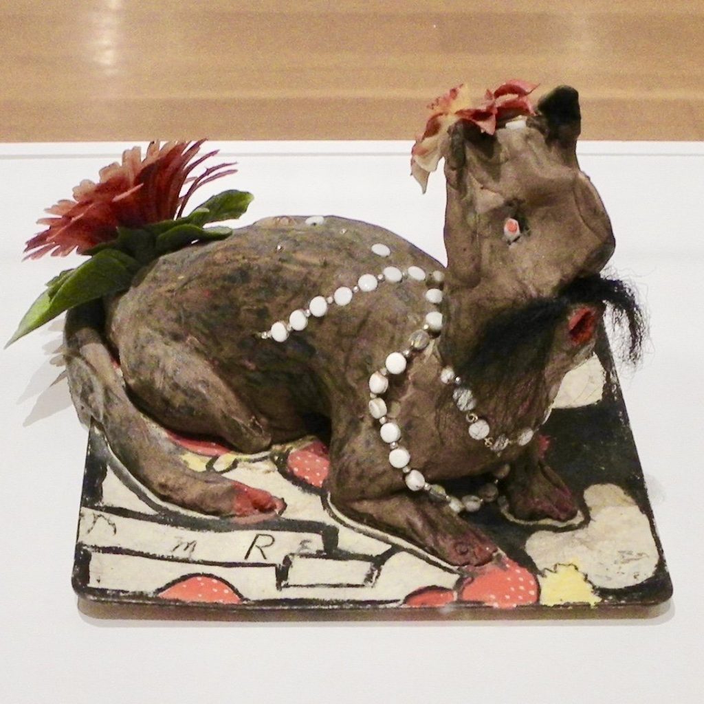
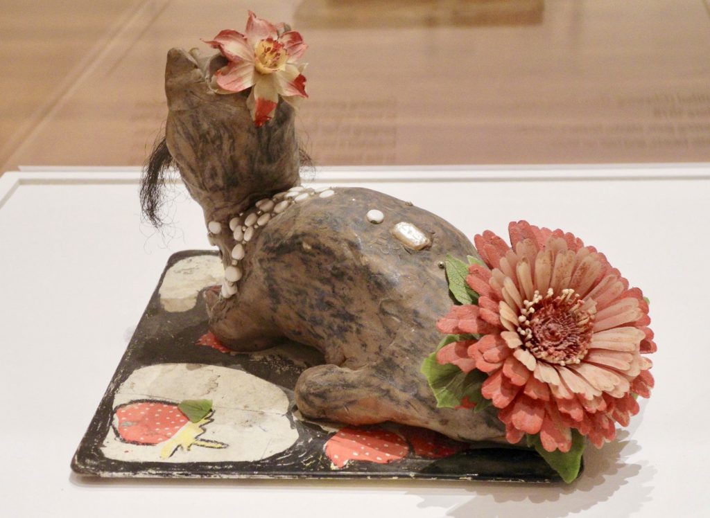
The idea of creating figures out of chewing gum initially repulsed me but in the context of Nellie’s clever resourcefulness, I found it humorous, especially when I saw the figure featured in the exhibit. “He” was an animal – possibly a cat – with a hair mustache and a large plastic flower on his backside (see image). As I took him in, I noticed how well he was formed and sculpted; a concentrated effort yet it still had the playful lightness Nellie brought to her creations.

“I chewed a lot of chewing gum because the doctor said chewing would help the jumping in my head. People began bringing me packages of chewing gum. And I said, now as much chewing gum as I chew, I’m going to make something. So I saved my chewing gum and when I saved a big ball, I started making things. I used to have chewing gum cats and dogs all up and down my fence. Now, I chew gum just to make things.” (https://www.soulsgrowndeep.org/artist/nellie- mae-rowe)

You can imagine the delight she must have felt in bringing this mustached character to life, adding white decorative beads and a smaller flower on his head casually cocked to one side, like a British fascinator.
He was a feature in the exhibition, singled out, and presented on a large pedestal, under a tall clear bonnet – all adding to his importance, which made him even more entertaining to me.

Judith & Nellie Mae

Nellie met gallerist Judith Alexander when she was in her late 70s. They knew each other only a few years, yet it seems like – from all accounts – they deeply trusted each other and formed a unique and solid friendship. On the Judith Alexander Foundation website is a section about Nellie with a description of their influences on each other:

“Of all the artists whose lives Judith Alexander touched, none was as strong an influence on her as Nellie Mae Rowe. It’s safe to surmise that Judith’s influence on Nellie was equally powerful. Theirs was a relationship that took the notion of synergy way beyond its boundaries.

“Judith saw to it that Nellie Mae Rowe’s legacy would endure with her major gift of works to the High Museum of Art in Atlanta. Judith also established The Nellie Mae Rowe Gallery at the museum, an area exclusively dedicated to a rotating display of the work.” (www.judithalexander.org/brief-biography)

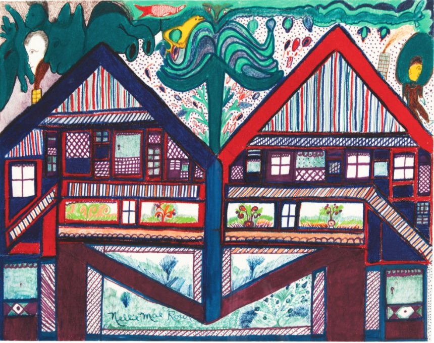
One of the pieces that resonated with me was a detailed, colored drawing of two, almost identical houses, side by side. The form of a tree is drawn rising up from the center where the houses are joined. On the top of each roof is a figure – one appears to be the figure most often associated with Judith (lighter skin tone and more formally dressed) and the other most likely representing Nellie. As I study the drawing, it clearly conveys to me that each figure has their own domain yet their intersection is strong, beautiful and growing.


Untitled (Nellie and Judith’s Houses), 1978-1982, crayon, marker, and pencil on paper. 
The exhibition wall text reads: “These conjoined houses signify how the destinies of Rowe and her gallerist Judith Alexander were mutually dependent. Alexander had been showing contemporary art for decades, but her close relationship with Rowe led her to become one of the South’s only gallerists dedicated to self-taught artists.”
Sense of Place

To look at pictures of the inside and outside of Nellie’s home, you may think things were strewn willy-nilly but Judith Alexander made a point of saying (in some of the referenced videos) that Nellie used the word “placed” when talking about arranging pieces in her home, and further explained that she purposely put things in a certain location because that’s how she wanted to see them. I think of Nellie as a constant curator, incorporating pieces she made or found, with pieces and things people gave her.

Nellie shares some of the things her visitors would bring her in this interview transcript available on the Souls Grown Deep Foundation site:

“The yard was decorated pretty. Because of the talent God gave me, many people started visiting and taking pictures. What is exciting and surprising and makes me feel good is to think about the people I would never have seen if I had not been doing things that were interesting to them. Folks brought me all kinds of things: dolls, stuffed animals, beads, bottles, and sometimes strangers would leave things at my gate. I would place them in my yard and some I would hang indoors against the walls. Everything else, other than what people gave me, I picked up. I like it when things keep on changing; keeps me busy.”

Rolling Tree Mule


 Rolling Tree Mule, 1981, crayon and ink on paper, gift of Martha and Jim Sweeny in memory of Judith Alexander.
Museum of Fine Arts, St. Petersburg, Florida.

Two works by Nellie Mae Rowe are included in the Museum of Fine Arts (MFA) St. Petersburg, Florida, collection. One is seen above. This image of Rolling Tree Mule is also included on their website, highlighting pieces from the permanent collection, and offers this brief summery of Rowe’s life:

Rowe faced racism and discrimination, was widowed twice, and worked as a domestic for roughly thirty years. Born in Fayetteville, Georgia, she spent most of her life in Vinings, outside of Atlanta. Her parents were farmers and also made handicrafts: her father, born into slavery in 1851, smithed and made baskets; her mother made quilts. As a girl, Rowe made dolls out of rags and figures from chewing gum. In 1948, after the death of her second husband, she began making art, “something out of nothing.” She saw her artistic life as a second childhood, terming her home “Nellie’s Playhouse.”

Play

Rowe was proud and happy about what she was creating. When creativity comes purely and directly through a person, it doesn’t need explanation, permission or approval. The result is the rawest and most authentic kind of expression.

In Nellie Mae Rowe 1 video (YouTube, 1976), Nellie is moving around her garden area, sweeping, planting, and fussing with various things as she meanders. Her voice can be heard over the footage, explaining “I do too many things, start sewing, next thing, I’m outdoors in my hole (garden), then uh, put that down, and then go to drawing a little, that’s just how it go… I never finish nothing at once. I just enjoy playing like that. I’m like a child. I wanna play in my Playhouse.”

Closing

At the start of this writing, I was seeking to share impressions of the High Museum’s exhibition of Nellie Mae Rowe’s work. While I have shared some impressions, I found Nellie herself to be more compelling to think about, and to write about, so I’ve taken liberties to include some of those impressions too.

There is so much to admire about her – especially the way she crafted her life in just the way she wanted to live it. And in doing so, the barriers that would have normally limited her success – being a woman, an artist, black, and older – she instead, moved right through them, inviting anyone and everyone into her home to experience her Playhouse. Imagine this kind of generous invitation now, much less in the 70s.

Nellie Mae Rowe was a constant curator living in her greatest work of art. The ever-evolving Playhouse environment was a major source of energy and motivation where she was able to express her thoughts to her own satisfaction, all the while sharing her creations with others, inviting them into her world where hundreds of curious strangers were moved and inspired.


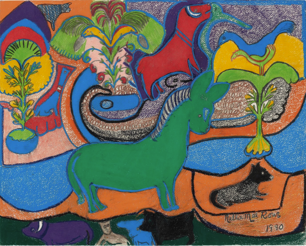
Green Horse, 1980, crayon, pastel, and graphite on paper. Recently sold at Christies from the property of the William Louis-Dreyfus Foundation, Mount Kisko, New York.
 
About the author

Katherine Gibson, creator of ArtHouse3, is an independent curator and regional art consultant living in St. Petersburg, Florida. Gibson received a 2018 Individual Artist Award from the St. Petersburg Arts Alliance for her Drive-by Window Project and was selected for an ArtsUp Grant by Creative Pinellas as creator and curator of the 2019 summer exhibition Tongue & Groove.

Art and Race Matters: The Career of Robert Colescott

By Jonathan Talit

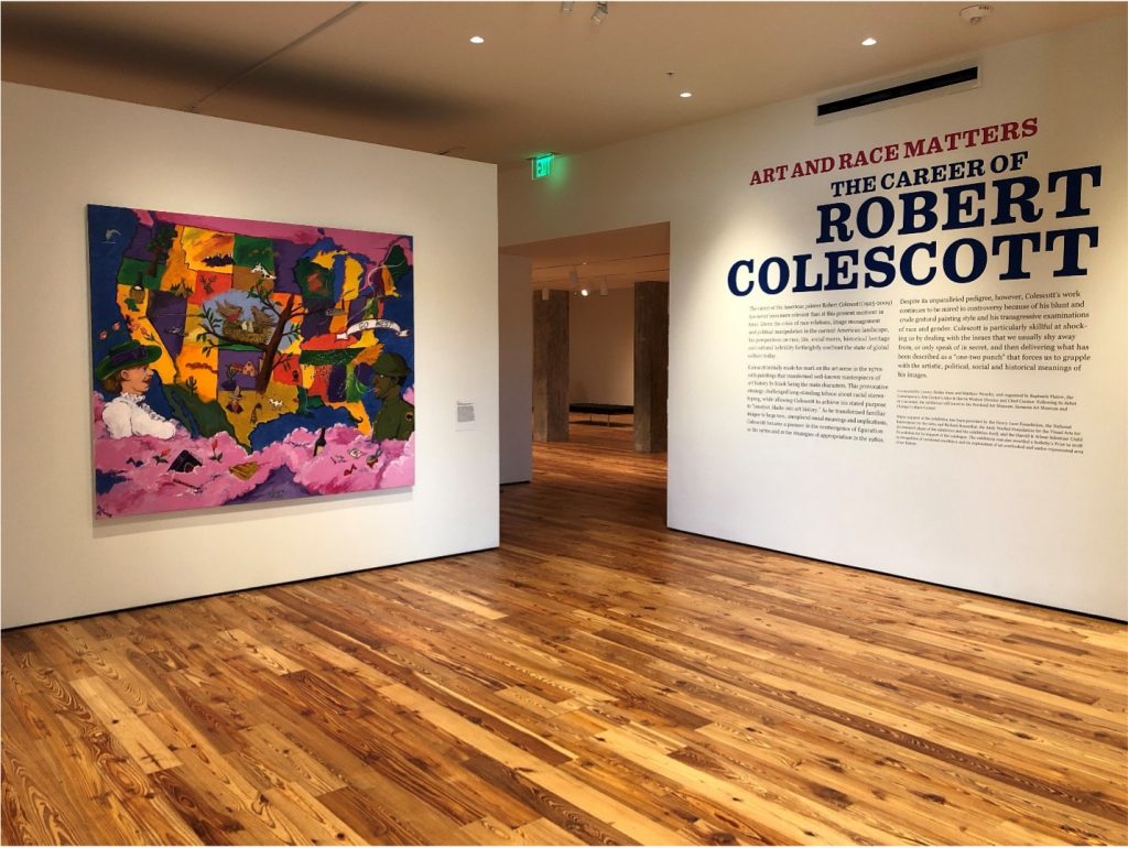
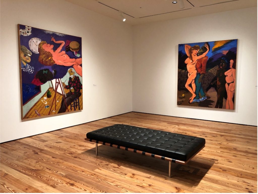
Installation shot of Art and Race Matters: The Career of Robert Colescott with 1919 (1980) on the left.
All photographs courtesy of the author unless otherwise noted.

Establishing the Sarasota Art Museum was a lengthy process that began back in 2003. After two years of speaking with community leaders in the arts and education sectors, the Sarasota Art Museum joined forces with Ringling College of Art + Design. Their decision? To transform the historic 1926 Sarasota High School into an art museum and education space. The school was originally designed by M. Leo Elliott but features a mid-century addendum created in 1959 by Paul Rudolph, an architect whose influence is still seen today in Sarasota. In 1996, classes officially moved to the current Sarasota High School, leaving the previous building abandoned for nearly 20 years. There were talks of demolishing the building until thirteen Sarasota volunteers, partnered with the Ringling College of Art + Design, petitioned for it to be transformed into an art museum. 

The Sarasota School Board unanimously awarded them the building in 2004.  From there, years of rigorous fundraising were required to begin renovations on the building.  Over $22 million was raised by 2014. In 2015, they brought on Anne-Marie Russell to serve as founding executive director and chief curator, a position she held for six years.  Russell oversaw the final renovations, the museum opening in December of 2019, as well as exhibitions and other programming through 2022. This includes Art and Race Matters: The Career of Robert Colescott.

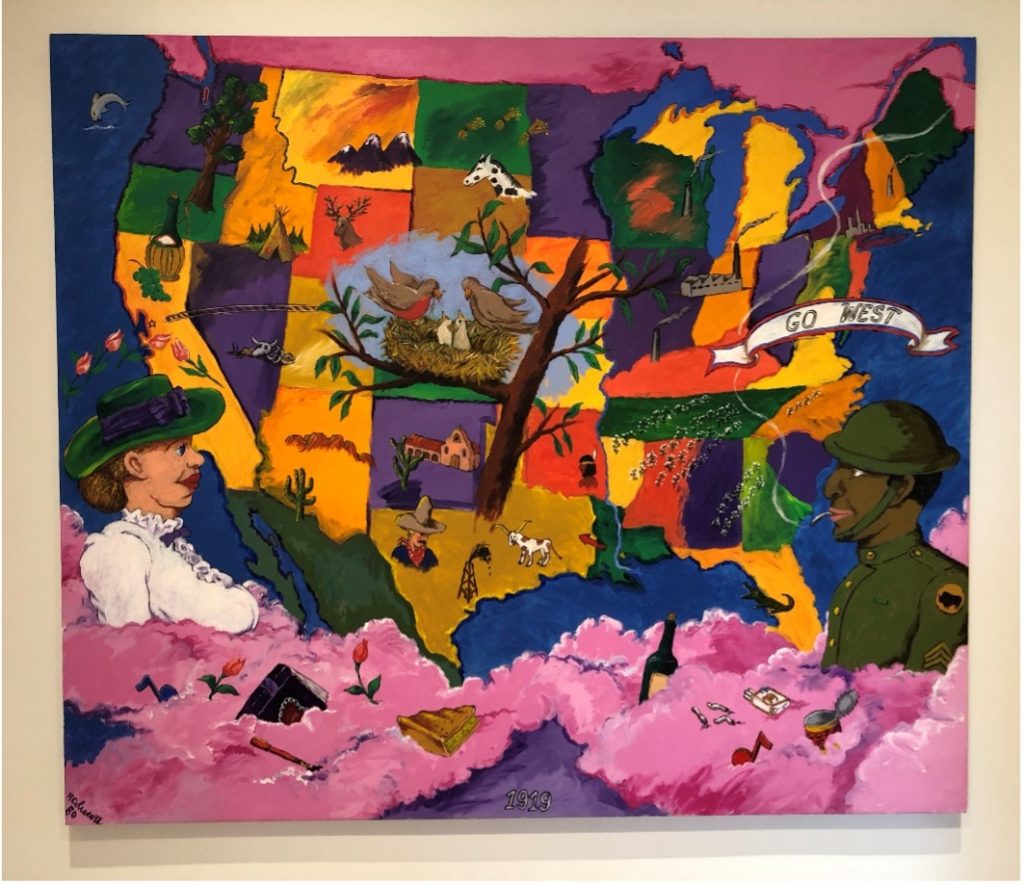
1919, 1980, Acrylic on Canvas.

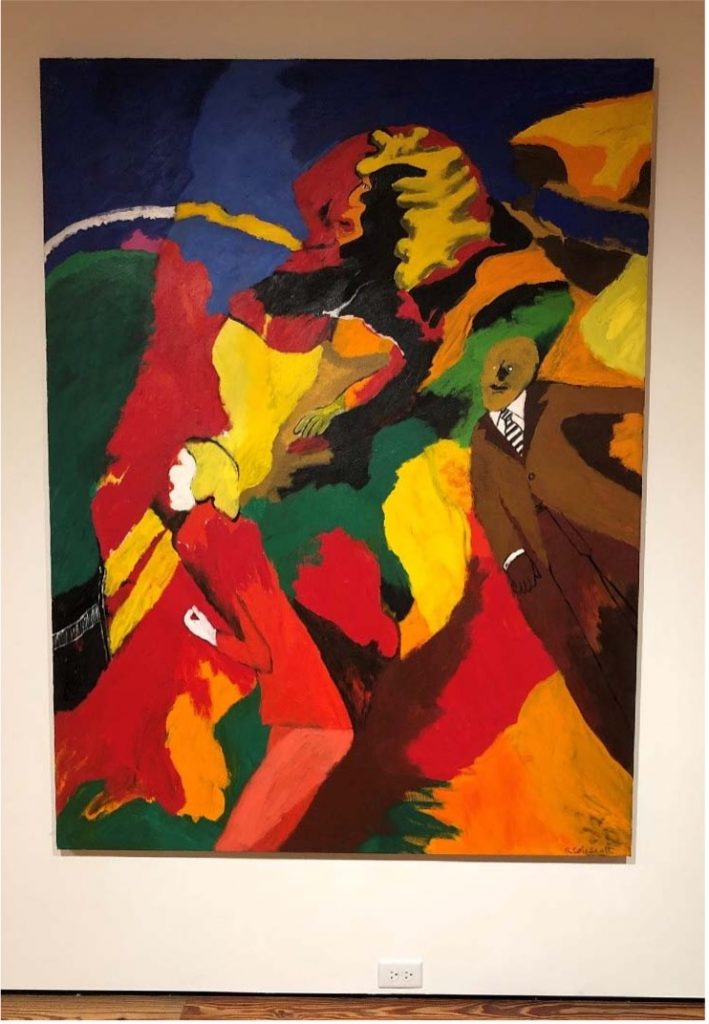
The first painting in the Robert Colescott exhibition is the first thing on most of our minds lately: America. Regardless of one’s political position, it is difficult not to see events in our country over the past few years as anything other than grim, claustrophobic, and without clear resolution. 1919 (1980), Colescott’s painting of the continental United States of America, presents our massive and varied slab of land, still curiously bound together somehow, at least on a map.  The rendering of this map is not bleak and dreary, however, but throbbing with vivid technicolor. Each state is granted its own color that is different from the surrounding states, emphasizing contrast. Some states are stamped with images symbolic of their culture: an alligator in Florida, a bottle of wine in California, an ox skeleton in Nevada, charmingly rendered. The map is flanked by two figures in profile who are only visible from the chest up. The rest of their bodies are submerged in a billowy mass of cotton-candy clouds, sprinkled with “studio sweepings” like cigarette butts and opened cans. The figure on the left is a white woman, hilariously buxom, and the figure on the right is a Black man in uniform. Evidently, these are the artist’s parents, who are also symbolized in the bird’s nest image in the center of the painting.  

There are a lot of tropes here: 19th-century silhouettes in the figures in profile, state symbols on children’s maps, the “melting pot” of America formed by distinct cultures, and the latent but potent tension between Black men and white women in our country. 1919 certainly taps into the unsightly race relations that helped form and maintain the U.S. but it’s with a light touch. As the exhibition progresses, Colescott becomes increasingly direct about his positions regarding race, the history of painting, and American popular culture. This cocktail of uncomfortable social commentary, crude figuration, and a lush color palette is Colescott’s modus operandi. Like Paul Mooney and Robert Crumb, Colescott aims for the status of great comedy by presenting these blunt and jagged truths with a sense of levity and even glee. Essentially, he’s his own straight man and funny man; Laurel and Hardy in one painterly package.

Installation shot of the artist’s early work.

It took a while to get there, however, and the exhibition traces Colescott’s history succinctly. Born in 1925, Colescott doesn’t develop his signature style until the 1970’s when he was well into his forties. This is peculiarly late for an artist to “find their voice,” particularly when individual styles were so prized in the mid-20th century. A room in the exhibition dedicated to Colescott’s early work presents a serious student of art history, from Manet to Matisse to Léger (a teacher of Colescott’s). These paintings are mostly executions of the styles of other artists, if not copying specific artworks altogether. One exception is a small painting, Untitled (1949), made while Colescott was a graduate student at UC, Berkeley. It’s a small work of geometric abstraction that is an early cue of Colescott’s later strategies for organizing compositions and his affinity for pink. The rest of the work documents Colescott’s attempt to find his point of view through other artists. Fake it ‘til you make it. All artists go through this, but Colescott’s lengthy growing pains risked him becoming a permanent student of art history: a practitioner of the values of others instead of synthesizing his own. 

That all changes after an extended stay in Egypt beginning in 1964 where Colescott became the first artist-in-residence at the American Research Center in Cairo. It’s always a little slippery to deduce clear cause-and-effect from an artist’s life to their work, but with Colescott, it’s pretty case-closed. There is a dramatic shift in formal concerns and sensibility that result from Colescott’s five-year stint in Egypt. The paintings become larger, the colors more saturated and delicious, and the figures less realistic yet full of life somehow. Dr. Ehrlich’s Magic Bullet (1968) is an early example. This is the beginning of the “cartoonish” style for which Colescott is remembered. Something about Egypt awakened his childhood love of color and comic strips (I suspect Egyptian hieroglyphics and ornate linen are to credit). It’s apt that Pop Art and psychedelia were occurring simultaneously in the States and the UK while Colescott was in Egypt. The social revolution of the 1960s was also brewing, exploding into the Civil Rights Movement in America and Second Wave Feminism in the west writ large.

Dr. Ehrlich’s Magic Bullet, 1968, Acrylic on Canvas.

This leads to another clear awakening for Colescott in Egypt: race. It seems that moving from the Pacific Northwest to Cairo forced Colescott to confront, accept, and celebrate his own bi-racialism. This, paired with his beatnik influence after moving to Oakland in 1969, focused Colescott to present these issues with a crass, cheeky sense of humor and almost hallucinogenic imagery. Sprinkle in some appropriation from art history and American popular culture, along with the occasional flashes of self-reflection and autobiography (see Bad Habits from 1983), and voila: you’ve got an artwork by Robert Colescott. 

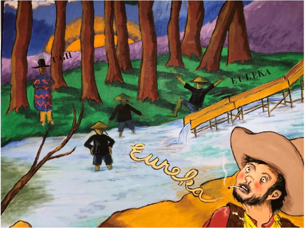
Colescott is extraordinarily productive once he finds his groove. The exhibition is replete with examples of Colescott keeping his basic ingredients but playing with the proportions. Cactus Jack in El Dorado (1977) amps up the transparent use of stereotypes, in images and text, but dials back the viscous painting style for which Colescott is best known. The painting’s crisp colors and flat rendering narrow the attention to Colescott’s matter-of-fact delivery of stereotypes, inducing an appropriate discomfort. Even the scenery is a stereotype of the American landscape and desire to head west. 

Detail of Cactus Jack in El Dorado, 1977, Acrylic on Canvas.

Hard Hats (1987), by contrast, relishes in cloddish, lumpy figures but doesn’t reduce them to signs or stereotypes. Instead, Colescott presents a rather intimate scene of solidarity between a wife and her husband, a construction worker and his coworkers, Americans and their fellow citizens. “We’re all building this together.” While the comradery is definitely visible, so is the looming fear of collapse. Hence, the hardhats. When is this whole thing going to tumble?

Some paintings eschew any immediate story altogether. Sleeping Beauty (2002), a large diptych centrally mounted in the exhibition, appears more interested in marks rather than images. Reduced and swift, the marks made on the canvas tempt the viewer to decipher any specific reference but are ultimately illegible. The painting has a sweeping sense of time that is enhanced by its large scale. It invokes the history of recording touch, from cave paintings to Abstract Expressionism, but isn’t particularly located in the specific project of America that concerns the rest of his work. 

These paintings, however, are examples of Colescott’s deep cuts. They meander slightly from his primary “one-two punch” strategy: presenting the audience with cherished imagery and symbolism that connects them to their childhoods and rosy-eyed views of America, then immediately injecting the garish, foul costs of that imagery without any clear path towards reconciliation. They get the sweet and the bitter. 

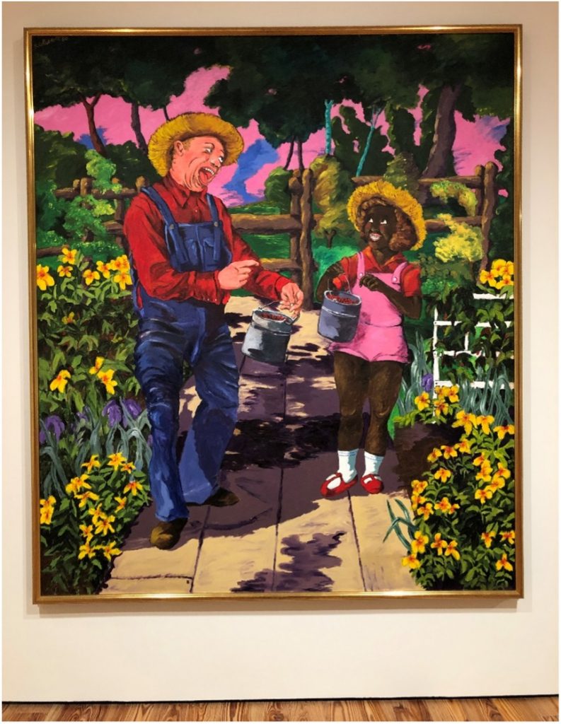
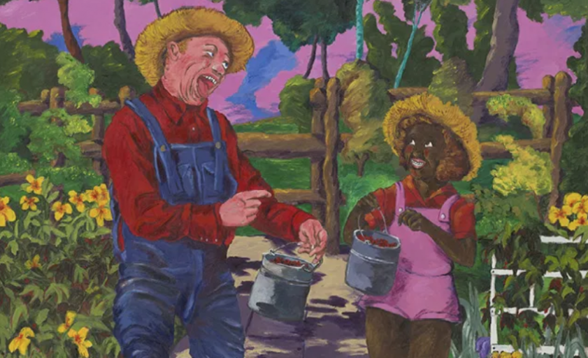
Shirley Temple Black and Bill Robinson White, 1980, Acrylic on Canvas.

Or at least, that’s the goal. This “one-two punch” often consists of injecting Black figures into scenes in which they weren’t originally visible, like Rubens or Lichtenstein paintings. Sometimes Colescott is even more upfront by portraying white figures as Black and vice-versa. Shirley Temple Black and Bill Robinson White (1980) is an example. Here, the famed actor/tap dancer ambles through a garden with the iconic child star of the 1930s. It could easily be a scene from one of the several movies they made together except that 1) the scene is in color and 2) their races are switched. Colecott’s intense color palette, drenched in saturation, amplifies the feeling of disorientation. The figures, however, are some of Colescott’s most realistically rendered. The result is a painting that is acutely abnormal. Besides the disarming switch of the figures’ races, the friction between the cartoonish colors (the background sunset looks like something straight out of The Simpsons) and the more focused realism of the figures confuses fantasy and reality. Don’t movies do this, too? There’s got to be a Wizard of Oz joke deep in this painting; the double entendre of switching from black and white to color when Dorothy arrives in Oz. The painting contains a remarkable stillness, as if frozen in suspended animation. A tonal remix occurs, too. Robinson’s laughter reads more like horror and Temple’s luminous enthusiasm comes off more withholding and cautious. 

Left: Bad Habits, 1983, Acrylic on Canvas. Right: The Judgement of Paris, 1984, Acrylic on Canvas

They aren’t all hits, however. The Judgement of Paris (1984) uses the same “one-two punch” but just comes off rushed. Colescott had a fine line to walk: how to employ clear strategies of appropriation but not become utterly formulaic.  The Judgement of Paris wears its formula on its sleeve: steal a title and composition from a canonized painter, usually a white male, and make one or all the figures Black! That’s a fine place to start, but The Judgement of Paris doesn’t really go anywhere with it. It doesn’t transcend this formula. The paintings have to offer more than the sum of their parts, and with Colescott they usually do. If not, the humor flattens, the point is cheapened, Colescott’s hard-earned voice is lost, and the painting quickly sums itself up. Yawn. 

However, the final room that contains The Judgement of Paris does present other work that successfully complicates Colescott’s practice. Colescott’s signature oeuvre relies on this “one-two punch” that the viewer, ironically, is continuously hit over the head with throughout the exhibition. The idea being that Colescott shows us what these symbols from history books, Disney movies, and magazine advertisements really mean. He, the insightful artist and enfant terrible, reveals the truth of our complicity to us. Without him, perhaps we’d be lost in our personal fantasies and delusions of grandeur; fantasies in which we’re the heroes, of course. That’s fine, but it’s just fine. The show becomes richer when Colescott points that outward perception a little closer to home, making tidy, moral judgments tougher to deliver. After all, it is his work that relies quite heavily on stereotypes, on appropriating charged imagery that already exists only to alter it slightly, if at all. 

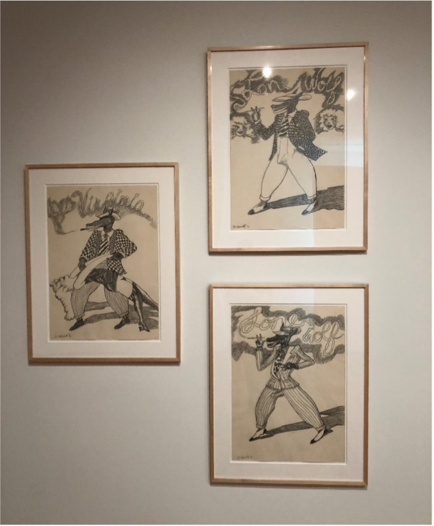
Lone Wolf Trilogy (Strutting his Stuff, Checking It Out, Yes Virginia), 1976, Graphite on Paper.

Perhaps Colescott never completely developed his own unique strategy for creating images outright. Whether it’s through Rubens or Shirley Temple, Colescott almost always needs a pre-existing vehicle through which to express his ideas and attitude. A series of drawings called Lone Wolf Trilogy (1974) makes this compromise well. Colescott steals the stereotype of a dapper, randy wolf, originally made popular by famed animator Tex Avery. With a lengthy and lascivious grin, the wolf is always standing confidently, puffing on a cigar (shout out to Freud), and dressed to the nines. In case it wasn’t already clear what the wolf is hungry for, Colescott draws an obvious dick print in the wolf’s pants. His legs spread wide exacerbate his intentions: he’s ready to deliver. 

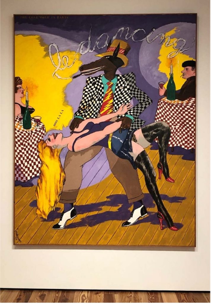
Lone Wolf in Paris, 1977, Acrylic on Canvas.

Colescott uses one of these drawings as a template for the painting Lone Wolf in Paris (1977). Here, the wolf is dancing with a blonde woman at a restaurant. Orbs of light (spotlights?) focus on the couple as the wolf dips the woman, an iconic and erotic position in salsa dancing. His once obvious erection is obscured the bent body of the woman, but sexual symbols linger. What else could those stiff candles, slowly dripping milky wax, be there for? The shadow underneath the dancers, an amalgam of intertwined forms, predicts more shapes and contortions that the dancers will take on later when they find someplace a little more private.

Of course, the wolf is Robert Colescott. Whether it’s how he saw himself, or how he wished he did, or both, who knows. Regardless, what’s successful about these drawings and the resulting painting is their sharp humor and lack of judgment. Colescott understands the pleasure of being a horndog and the resulting complications of it. It’s possible that the work in this room reveals Colescott to be even more reflective. What if stereotypes are often unfair representations with real consequences and pleasurable to slap onto others? If one needs a clear takeaway or lesson from an art exhibition (I don’t), this one offers a useful quandary: how do we attempt to make a better world for each other, whatever that means, while accepting our innate appetites to segregate and flatten each other into caricatures? What if America isn’t as pretty and fluffy as we’re sometimes told it is, but that’s because we aren’t either and never will be? Not in some high-minded, academic way, but in our tedious, daily negotiations with our egos and various thirsts?

In a culture where image management is high currency and many people, perhaps artists most egregiously, are constantly manicuring their morality on “the public stage” like a bird preens its plumage, Robert Colescott reminds us that manicures only go so far. In fact, they could even be detrimental in their disguising of the malformed and grisly impulses that run through all of us. Like all good art, Colescott’s work provides an opportunity for integration: to work on a better, more equitable world for all while acknowledging the quiet rumble in our bellies at the cheap pain of others; our animal eyes glowing in the dark. 

Art and Race Matters: The Career of Robert Colescott, curated by Lowery Stokes Sims, Raphaela Platow, and Matthew Weseley, was organized by the Contemporary Arts Center in Cincinnati. The traveling exhibition is on view at the Sarasota Art Museum through October 31, 2021. For additional information and related programming, visit the museum’s website.

Bay Art Files contributor Jonathan Talit is an artist currently based in central Florida. He received his BFA from Boston University and recently received his MFA from the University of South Florida, Tampa. He makes sculptures, essays, exhibitions, friends, fun, and occasionally money. 

Themes for the American Kestrel

An exhibition of works by Ry McCullough

by Tony Wong Palms

Pausing at the entrance, taking in what is in front of me, many things come to mind when walking into Gallery114@HCC at the School of Visual and Performing Arts on the Ybor City campus and encountering the works of Ry McCullough. 

Ry McCullough, Themes for the American Kestrel, installation view.
Image courtesy of Gallery114@HCC Ybor City Campus.

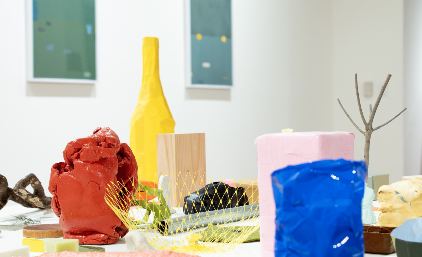
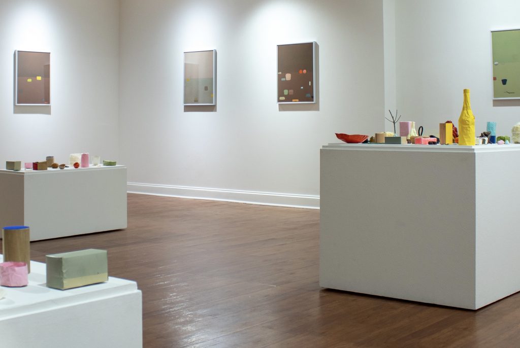
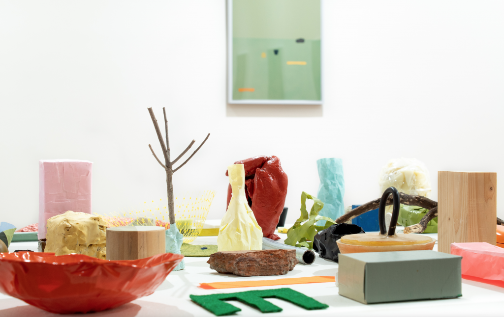
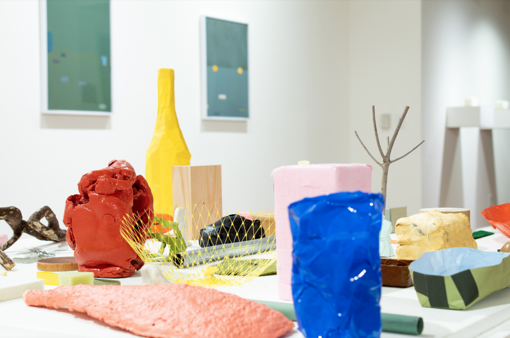
There are three pedestals composed in the middle of the floor, each covered with little objects, some with oddly familiar shapes, like Claes Oldenburg’s monumental sculptures that more or less resemble everyday things, except these are in sizes that can easily fit inside a coat pocket; there’s a video showing the same stuff in a smaller, but ever-changing grouping, the setting like a photographer’s studio; there are framed mixed media works hung on the wall, each depicting a landscape with a scattering of these objects; and finally there’re two small shelves, each with a rectangular box made delicately from Japanese paper, sitting on a greenish felt, like architectural models of some basic structural forms.

Ry McCullough, Themes for the American Kestrel, installation view.
Image courtesy of Gallery114@HCC Ybor City Campus.

The pedestals could be an archipelago, a small group of islands with colored and differently shaped things that washed in from the sea, and the wind blew them around and around to end up where they are now, curios.

And taking a walk on these island shores, kicking around at your feet, these shaped and color things, maybe they are sea shells, or sand smoothed pebbles, perhaps pieces of coral, but most definitely flotsam and jetsam telling tales of their long transformative voyage through the ocean waves, when a glint of something catches your eye and you pick it up, examine it, drop it in your pocket, take it home, place it on a shelf, or window sill, or the end table, alongside all the other odds and ends that have been collected from here and there over the years, and now together they all are, in the same time and space, more or less coexisting, little islands in of themselves.

A friend comes and visits and they might admire your collection, picks one up, studies it, puts it back, but not quite the same spot or orientation; or maybe it’s cleaning day, and the objects are lifted one by one, dusted and put back, and again, not all returned to the exact same position. The arrangement thus shifts slightly, hardly noticeable, and continues shifting one cleaning day after another, one friend’s exploratory hands after another.

This constant picking up and putting back is essentially the 20 minutes long video piece. With the magic of video editing, pieces suddenly pop in and out of existence, creating a slightly different composition with each editing cut. One piece may go poof and reappear in a little while next to something else, or maybe never appear again. The viewer’s brow tense with concentrated anticipation. Did someone just get kidnapped, or is this an example of what physicists call entanglement? Who knew such unassuming objects appearing and disappearing could create such a drama. A suspenseful video performance where the artist is unseen.

The framed works on the wall is non-action action in a flat space. There’s a line, could be a table’s edge or the horizon, plane of the sky meets plane of the earth, but unlike the objects on the pedestals or in the video where they’re visibly grounded, the objects in these mixed media pieces feel suspended, while not as high as the floating bowler hat men in a René Magritte painting, they are not as affected by the gravity that anchors their pedestal counterparts.

Ry McCullough, Themes for the American Kestrel, installation view.
Image courtesy of Gallery114@HCC Ybor City Campus.

Within each frame is a vignette of possibilities. They are very precise and elegant, exuding a calm to the videos’ caprice. Its stillness belies conscious intentions and subtleties of movement, like a person in meditation, where meditation is a deliberate act, as in the long wave of the tsunami, its motion unseen, or unrecognized until it momentously meets the shore.

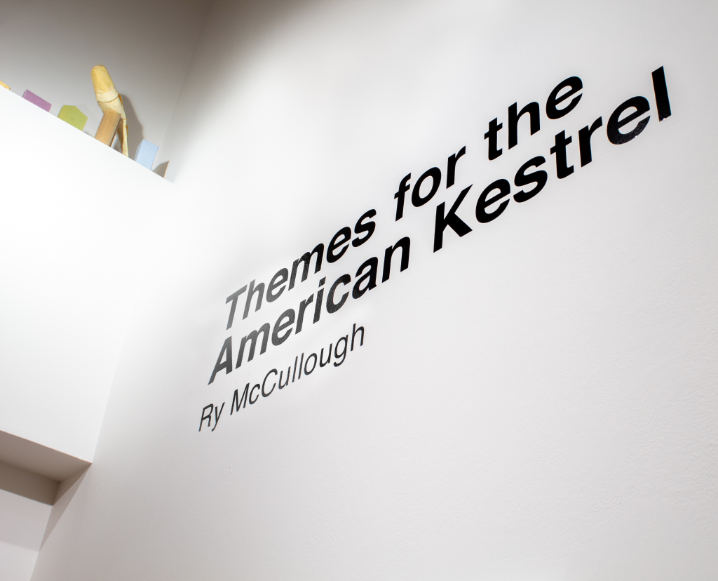
The exhibition is titled Themes for the American Kestrel. There’s a curious group of objects way up on one of the gallery’s architectural ledges, next to the title wall, with one of the objects resembling a bird, watching all that’s below. This little vignette does not have a title or exhibition label, nor is it acknowledged anywhere else, and being high above eye level, could be easily missed. 

Ry McCullough, Themes for the American Kestrel, installation view.
Image courtesy of Gallery114@HCC Ybor City Campus.

Perhaps the zen like statement from the artist in the exhibition brochure may explain this apparition high on the ledge: “I sit and the bird arrives or the bird sits and I arrive, or not.”, or maybe it’s the meaning of the exhibition title, or both, or neither.

The exhibition brochure, designed like one of the framed wall works, is very handsome, includes a meaningful quote from Virginia Woolf, with the opening phrases: “How much better is silence; the coffee cup, the table. How much better to sit by myself like the solitary sea-bird that opens its wings on the stake….”

Following this is a brief artist statement outlining his ideas and intentions. Towards the end of the statement, McCullough references the artist Giorgio Morandi and his still-life paintings as a counterpoint to the evolving compositions in his video piece.

Ry McCullough, Themes for the American Kestrel, installation view. Image courtesy of Gallery114@HCC Ybor City Campus.

Morandi (1890-1964) lived his whole life in Bologna, Italy, where for the last 40 or so years of his artistic practice he maintained a singular focus on regimented compositions of bottles, vases, and similarly shaped and size objects, painted with subtle hues and tone gradations. It is an ascetic discipline, like a monk repeating a mantra, like Sol LeWitt’s endless iterations of the skeletal cube. The subtlest of details and changes are noticed with potential significance, like when physicists discovering an elemental particle, or that tiny chili pepper altering the flavor makeup of an entire dish.

If Morandi’s 40 years could be compressed into a 20 minutes time-lapse video, the result might be something like McCullough’s own video performance. Of course, a time-lapse video skips over many moments and details. But what is 40 years or 20 minutes, barely a nanosecond within a razor-thin sliver of a rock layer tucked in a stratum of the earth’s crust in the expanse of geologic time.

The exhibition is open to the public by appointment through June 24, 2021. For additional information about the gallery visit the Galleries at HCC website.

Ry McCullough received his MFA in Printmaking and Book Arts from the Lamar Dodd School of Art at the University of Georgia. He is an Associate Professor of Art and Design at the University of Tampa in Tampa, FL.

Tony Wong Palms is the Exhibitions Coordinator/Designer at the University of South Florida Contemporary Art Museum in Tampa, FL.

Radical Pleasures

by Sabrina Hughes

“I didn’t know that that work was even radical in the way that I see it as being radical now until I started to have a conversation with people—even black people—who thought that my work was “positive.”
Derrick Adams, Artnet News, February 5, 2020.

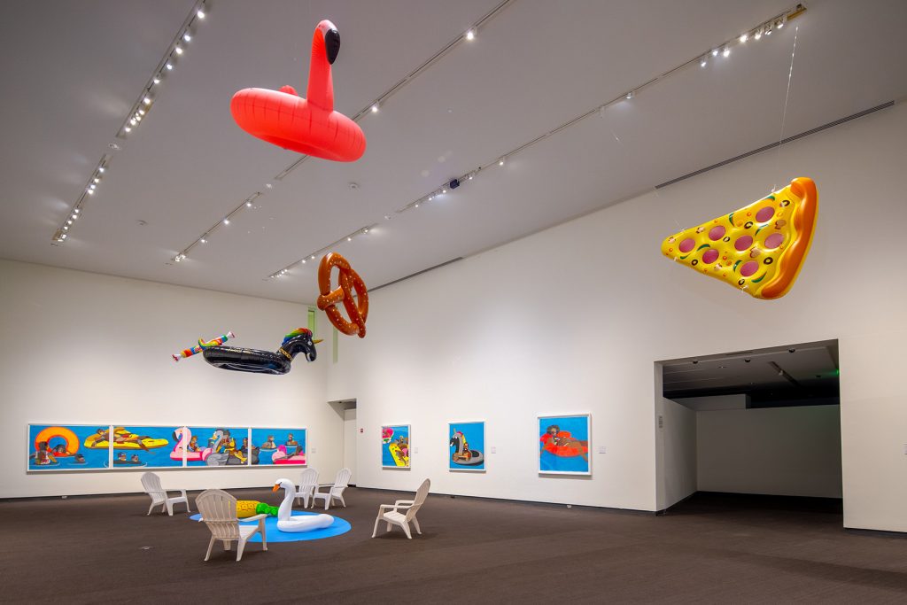
Derrick Adams: Buoyant is on its last tour stop at the Museum of Fine Arts, St. Petersburg through November 29, 2020. The exhibition was initially conceived by the Hudson Valley Museum and curated by James E. Bartlett, founder of Open Art and former Executive Director of the Museum of Contemporary African Diasporan Arts, in Brooklyn, and Laura Vookles, Chair of the Hudson River Museum’s Curatorial Department. 

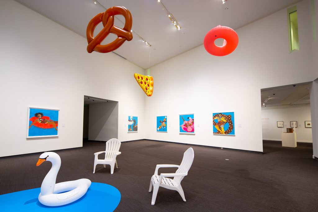
Installation view of Derick Adams: Buoyant.
Photo: Courtesy of the Museum of Fine Arts, St. Petersburg.

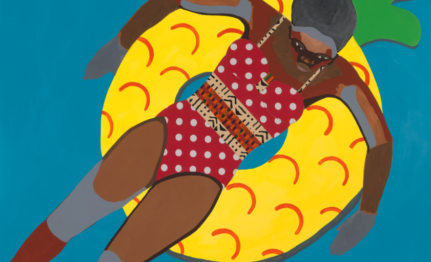
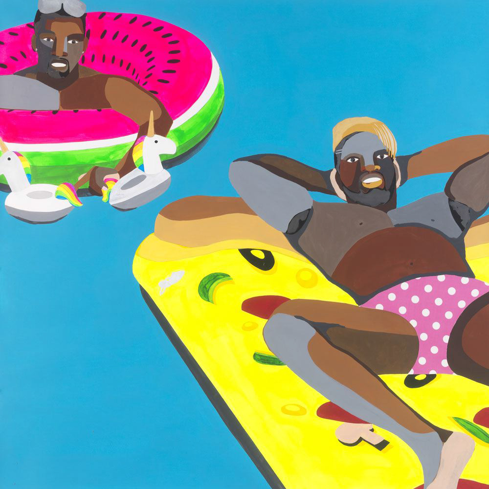
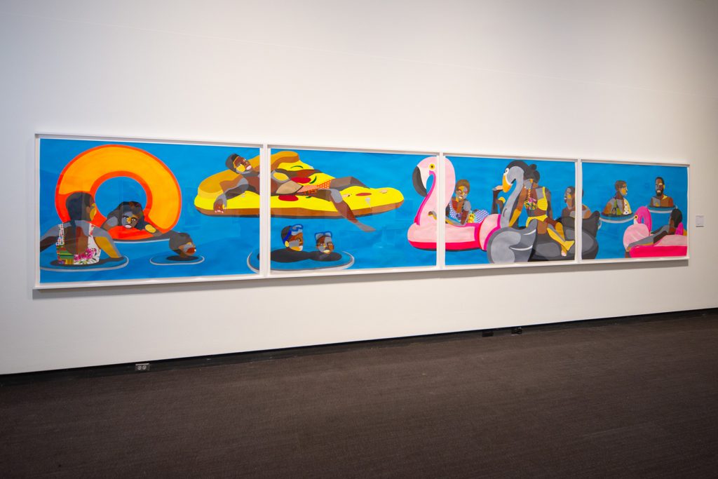
On entering, the exhibition may strike a viewer as many things: joyful, fun, playful, enticing, or whimsical. The twelve large-scale paintings in the exhibition are an explosion of neon and novelty. Radical may not be the first word that comes to mind upon visiting the exhibition when the subject matter, groups of people and individuals relaxing on novelty pool floats, is so patently ordinary. 

The Floaters series was created over a span of three years (2016-2019). This is a rare opportunity to see works on loan from private collections, and to see some of the Floaters together as a group, which creates a much different feeling than would seeing any one on its own. Walking into the gallery is walking into a space occupied by paintings of African Americans. Part of the impact of the exhibition is that it highlights how rarely we see representations—in art or popular media—of Black people simply existing. This everyday reality of Black life in America suffers from erasure by omission.  

Floater 66, 2018, Acrylic paint and collage on paper, Collection of D. Rebecca Davies and Jeremy Kramer. Photo: Courtesy of the Museum of Fine Arts, St. Petersburg.

In relation to the picture planes of all of the Floaters, the viewer is left rather floating themselves. With the exception of one, the backgrounds of the paintings are one solid shade of blue (one painting has a darker blue at the top that seems to denote the difference between sky and water, the only horizon line in the gallery). The paintings are acrylic on paper, so there are ripples in the paper most noticeable in the blue background as the paper absorbed the paint and dried. The ripples and the occasional variations in the blue field—not a different color, but from more or less paint on the brush—enhance the suggestion of water and gentle motion. 

Figures are anchored to their novelty pool floats, but beyond that there are no clues to what kind of space they occupy, other than that it’s water. Without a horizon line, the viewer is left in an uncertain space. Some of the figures are looking out of their space, making eye contact with viewers while many others are engaged with other figures or are simply looking elsewhere. 

Installation view of Derick Adams: Buoyant.
Photo: Courtesy of the Museum of Fine Arts, St. Petersburg.

The swimsuits of each figure are collage elements of different fabric, adding another visual flourish to the already dazzling paintings.

In an interview with Charles Moore for artnet news that I’ll refer to several times, Derrick Adams uses the phrase “Black radical imagination” which, as he sees it, can be a tool to create the future. It is worth exploring this idea so we can fully appreciate how radical these day-glo spaces inhabited by patchwork figures are. 

Representation reflects and creates reality. We have seen this thought repeated a lot over the last decade or so—representation matters. Everyone wants to be able to see themselves and their possibilities reflected in the popular media they consume. When Adams conceived the Floaters series in 2015, he searched Instagram for #floaties and the algorithm returned only pictures of white people. In this instance, the representation failed to align with the reality that he had experienced.  

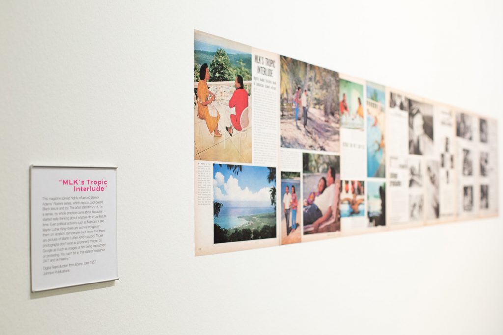
Digital Reproduction from Ebony, June 1967. Installation view of Derick Adams: Buoyant. Photo: Courtesy of the Museum of Fine Arts, St. Petersburg.

In further research, Adams found inspiration in an Ebony feature from June 1967 of Coretta and Dr. Martin Luther King, Jr. on a tropical escape to Ocho Rios, Jamaica (also included in the exhibition). While the article makes clear that this is not a vacation (King wanted a month in a place without a phone to write his book Where Do We Go from Here?), the photo essay is almost exclusively comprised of images showing Dr. King at rest: walking on the beach, relaxing in the pool, having breakfast on the balcony in his robe and slippers, reading the newspaper in bed. This fascinating editorial shows a seldom-seen side of Dr. King, but also shows what is necessary to fuel his public acts in the struggle for equal civil rights: rest, quiet, isolation, time to think and to put thoughts in order. Time and space to just exist. 

It’s worth quoting Adams at length because his intent with the Floaters series was to depict Black people at rest, similar to how Dr. King had been photographed for Ebony. 

Floater 74. Installation view of Derick Adams: Buoyant.
Photo: Courtesy of the Museum of Fine Arts, St. Petersburg.

“What I love the most is when I’m at an event or a party at someone’s house and I look around and everyone in the room is doing something. It’s all Black people doing all these amazing things and I’m like, wow, this is great. And I say to myself, this is what we should be making work about, this type of atmosphere. Young Black people should see that there are very normal, very consistent spaces like these—regardless of what’s happening in the news, regardless of what’s happening on social media. With all the conflicts that we’re having, we’re still finding the time. And not everyone in this room has money! These aren’t people who are all well off!

That’s what I’m thinking about in my studio: What can I reveal that has not been shown? And it always goes back to the simplest of things, like normalcy. Black people—not entertaining, just being, living. Letting people deal with that as reality. We’re sitting on this pool float. We’re thinking about life. We’re thinking about nothing. We don’t have to think about something every day. It’s a real human experience not to ponder on things constantly.”

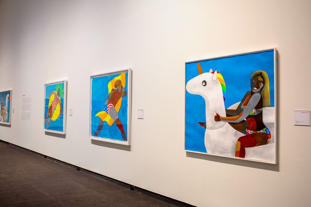
The paintings that resonated most with me were both paintings of women. I’ll describe them but they’re not reproduced here, so you’ll have to go to the exhibition to see them for yourself. 

Floater #28 depicts a woman on a white unicorn float. Her bathing suit is neon animal print with hearts and stars, like a Lisa Frank notebook. She looks out of her space and is smiling. Though the blue fields that the figures float on often have the effect of suggesting water through the variations in paint application, most of the geometric planes that comprise the figures are more even in tone—less painterly, more hard-edge. This figure is different. The paint application on her legs and abdomen create a variation in tone within the planes that most of the other figures don’t exhibit. It’s like seeing the natural variation in skin tone across different parts of someone’s body. Adams has also employed the grey-tone paint—usually reserved for the parts of the figures bodies that are underwater—on the figure’s arm and face that couldn’t be the only part under the water if the rest of her is not. It’s the kind of variation that feels like improvisation on the theme. It’s just different enough to have made me stop and look a lot more closely.

Representations like Floaters reflect one reality experienced by Black folks in America, one that aligns with the experience of love, community, family, and just living life. It hints at another reality from the not-so-distant past—the reality that all-Black spaces were backed by apartheid laws and violently enforced by police and mercenary groups. Pools and beaches were sites of contestation. Here in St. Petersburg, the beaches downtown were segregated. From Spa Beach north was designated whites only. The beaches for African Americans were South Mole at what is now Demen’s Landing and Lassing Park. 

The subject matter of the paintings contain the tension of present and past, even while Adams is trying to create a future where celebrations of everyday Black life are more commonplace.  

We see Black lives snuffed out on live Facebook broadcasts. We see representations of Black Americans working, struggling, mourning. We see them relative to the white supremacist political and economic system that their kidnapped ancestors were forced to build, and that largely controls what type of images are disseminated in the public sphere. It is rare to see representations of Black people resting. Images of Black bodies at rest are radical. 

Installation view of Derick Adams: Buoyant.
Photo: Courtesy of the Museum of Fine Arts, St. Petersburg.

Floater #17 portrays a pregnant woman lounging on a hot pink float. I imagine the buoyancy of her body, with or without the float, is a welcome relief from gravity’s pull on the extra bulk of her body carrying a baby. Black women experience overlapping oppression of misogyny and racism, represented by the term misogynoir. As a class, they have always been expected to work (when white women may have been homemakers, Black women may have been their maids or nannies) and have had the highest labor force participation among all women for years. The United States has a dark history of sterilizing Black women without their consent throughout the 20th century. Yet look back earlier, when African Americans were enslaved and performing forced labor, and Black women’s bodies were commodities that grew the labor force. 

Artists are worldbuilders. By making these paintings, Adams populates our world with many more images of Black leisure. Adams realizes the power of the artist to create reality—to create the world in images so that later people can create it through action. If you want an action to succeed, you have to be able to imagine it has happened, and then imagine what happens next. Adams invites viewers to co-create a future where images like this aren’t “positive” in comparison to other pictures, where all aspects of Black life aren’t adjunct to their white counterparts, presented as the default.

The term radical seems to be used with such frequency that the impact of the word has faded. From radical feminism to radical self-care, radical honesty to the radical left, radical is just as often used by Instagram influencers to sell protein powder as in any political reformist sense. We live in a radical-saturated world. Invoking Black radical imagination asks for a rethinking of all assumptions about Black life in America, from the roots up. Ask why things are the way they are and why they seem unchangeable. And then imagine what systems need to be torn down to their foundations and rebuilt differently. In 2020 conversations about prison abolition have entered mainstream political discourse. This is radical imagination at work. 

As I’m writing this review, the verdict in Louisville has just come in. Nobody is going to be criminally charged for Breonna Taylor’s murder, though one officer is being charged for endangering the lives of her white neighbors. I’m thinking about Breonna who was not only at home, but was sleeping, literally at rest, when she was killed. Imagine if this had had a different outcome. Imagine what needs to be torn down and rebuilt to ensure future Black lives are valued and protected. I’m also thinking how even though Adams’ intent was to show Black joy and play and people just existing, it seems that there is no neutral in the representation of African Americans. It becomes political as soon as it enters the public because Black people just existing is a radical and revolutionary act. Unless we are part of the communities that Adams is talking about, we may not see the experience that he’s talking about. Black people just living, just being. Black figures at rest. Black people not othered by the implicit or explicit comparison to whiteness. Being in the gallery with so many Floaters makes me wonder if it’s a pool, how enormous the pool must be to hold the figures, the floats, and to still not see the horizon. Are we floating with them? Part of the party? Or interlopers?

Related Exhibition Programming

PANEL DISCUSSION: AFRICAN AMERICAN LEISURE IN THE SUNSHINE STATE & BEYOND WITH DERRICK ADAMS
October 15, 2020, 6:30-8 pm
Free for members, and $10 for not-yet-members.
An online conversation featuring Derrick Adams, Dr. Gretchen Sorin, author of Driving While Black: African American Travel and the Road to Civil Rights, and Cynthia Wilson-Graham, co-author of Remembering Paradise Park: Tourism and Segregation in Silver Springs. The discussion will be moderated by MFA Curator of Contemporary Art Katherine Pill.

BLACK FANTASTIC, BUOYANT AND BOLD: ART’S WAYS OF LEVITATING OVER THE WEIGHT OF THE WORLD WITH AUTHOR TENEA D. JOHNSON
October 22, 2020, 6-7 pm
Free for members, and $10 for not-yet-members
Author Tenea D. Johnson will read joy-centered selections from her latest book, Blueprints for Better Worlds (May 2020)as well as the forthcoming collection, Broken Fevers

POETRY AND SPOKEN WORD WITH DENZEL JOHNSON-GREEN
October 25, 2020, 3-4 pm
Free for members, and $20 for not-yet-members.
Join poet and author Denzel Johnson-Green in the time-honored tradition of utilizing spoken word and poetry to both raise awareness of, and develop mechanisms for addressing, the world around us. 

About the author:
Bay Art Files contributor Sabrina Hughes holds an M.A. in Art History from the University of South Florida with a focus on the History of Photography. Hughes has worked at the National Gallery of Art and the Museum of Fine Arts, St. Petersburg and is an adjunct instructor at USF and is the founder and principal of photoxo, a personal archiving service specializing in helping people preserve their family photos. She has an ongoing curatorial project, Picurious, which invests abandoned slides with new life. Follow her on Instagram @sabrinahughes for selfies, hiking, and dogs, and @thepicurious for vintage photos.

@tampabaebae art files

@tampabaebae art files

by James Cartwright

jenal, 2019. Acrylic, oil, coffee grounds, enamel, on board, foamular frame, 50 x 50 inches. Image courtesy of the artist.

Jenal Dolson is a nervous flyer even under normal circumstances. Add scrambling to get out of the country during a global pandemic before international borders close and anyone’s stress levels will ascend to new heights. It is Tuesday, March 31st, and she is leaving the United States and returning home to Canada to shelter with her family as the severity of COVID-19 slowly dawns on U.S. citizens. She sits alone in Tampa International Airport, waiting to board a flight that she never expected to be on and saying goodbye to a place she is not ready to leave behind. 

To call the last few weeks of Dolson’s time in Tampa a whirlwind would be an understatement. At this point in March, she is a MFA candidate at the University of South Florida, in the thick of her final semester when the coronavirus hits America. Between transitioning her in-person classes to an online platform (no easy feat for studio art courses), finishing her thesis work, writing about said work, preparing for install, and making travel arrangements, change is the constant. Her graduating class’s MFA exhibition Battin’ A Hundred is canceled, their reception is canceled, their panel discussion moderated by artist Kalup Linzy is canceled. It feels like everything is canceled. However, the artists are undeterred, and they still exhibit their work in the USF Contemporary Art Museum. There is almost a defiant pride in displaying their art knowing that it will not be seen in person.

Dolson spends her precious final hours in Tampa packing for her flight and installing her work in the CAM, with the invaluable assistance of museum staff Vincent Kral, Eric Jonas, and Tony Wong Palms. She recalls visiting the museum for the first time on a 2014 trip to Tampa and sensing then that she would one day show work in this space, a premonition fulfilled these six years later.

Bump Dream, 2020. Acrylic, latex, oil on canvas, 72 x 72 inches.
From the MFA thesis exhibition. Image taken by Jezabeth Roca Gonzalez.
Soother, 2020. Acrylic, oil, fabric, foamular, on MDF, 50 x 50 inches.
From the MFA thesis exhibition. Image taken by Jezabeth Roca Gonzalez. 
Whale, 2020. Acrylic, oil, foamular, on panel, 50 x 50 inches.
From the MFA thesis exhibition. Image taken by Jezabeth Roca Gonzalez.

Her arrival in Toronto is not met with a warm embrace from Dolson’s parents, who are relieved to see their daughter home safe but still respecting the social distancing rules that now measure our lives. Everyone dons their face masks and Dolson sits in her parents’ backseat on the car ride from the Toronto airport to their family home outside of Cambridge, Ontario, taking these moments to let a wave of quiet calm wash over her and finally exhale. She is deeply grateful to her parents for hosting her, knowing that in doing so they have committed to the country’s mandatory 14 day returning traveler quarantine alongside her. 

Dolson uses the next few days to reacclimate to these surroundings, the familiarity of place comforting her during an unfamiliar time. She self-isolates in a section of her family’s basement, with her beloved chihuahua Bam Bam to keep her company and a mini-fridge stocked with snacks to keep her fed, courtesy of mom. That Friday she joins a Zoom reception hosted by CAM for the MFA exhibition, which has a great turnout as many people are eager to see the artists’ work and congratulate them. Dolson later passes the two-week quarantine mark on the same day that she passes her thesis defense, and her reward for this tremendous accomplishment is finally being able to hug her parents. 

Into the Belly, 2020. Coloured pencil, watercolour pencil, gesso, on board, 8.75 x 8.75 x 0.6 inches. Image courtesy of the artist.

A welcome focus for Dolson’s energy comes in the form of creating a solo exhibition entitled Into the Belly for Tempus Projects, highlighted on the non-profit gallery’s Instagram account. The show, which ran from May 30th-June 12th, neatly aligns with the Tampa-based gallery’s approach to the pandemic’s unique challenges. Tempus is utilizing social media to showcase a series of mini-virtual exhibits that feature works on a small, intimate scale. As Tempus Founder and Programming Director Tracy Midulla explains, “We have taken the approach of offering small, short virtual exhibitions. This allows us to keep the quality of the work featured at a high standard, but the format and delivery of the works to a manageable level for everyone as we are distanced from one another.”

Installation view of Into the Belly in a section of Dolson’s converted basement space. Image courtesy of the artist.

Into the Belly consists of eight coloured pencil drawings on gessoed board, with each work’s dimensions around 5×6 or 7×8 inches. Dolson’s process is reliant on found materials, so she seamlessly adapts to her new circumstances by repurposing leftovers in her old studio in her parents’ house. Her use of coloured pencils on board allows for textures to come out of the surface itself, some areas pulling through the grain of the wood or underlaying brushwork; paired with a uniform attention to colour blocking and gradient fades. These underlaying patterns resemble countless tiny fissures, which further emphasize the material’s surface while adding layers of complexity to already rich compositions.

The Days Eye (Edelweiss), 2020. Coloured pencil, watercolour pencil, gesso, on board, 8.75 x 4.8 x 0.6 inches. Image courtesy of the artist.

The small scale of each work is in keeping with the gallery’s current theme of miniature exhibitions. Dolson also expresses her interest in scaling down the works to a size that is accessible, where they can be held in your hand and you can take them with you very easily. Although these new images are much smaller than her thesis paintings, she draws several parallels between the two bodies of work. Dolson clarifies that the viewer is still looking at a series of shapes, forms, lines, directions, and pathways, which you can follow around the work finding little areas where something new can be seen.

Bathhouse, 2020. Coloured pencil, watercolour pencil, gesso, on board, 5.8 x 4.8 x 0.75 inches. Image courtesy of the artist.

There is plenty to see in Dolson’s drawings, so much that you might get lost in looking. The artist presents the viewer with a plethora of shapes and motifs to latch onto and alluring pathways through each labyrinth. One might glance at a piece like Bathhouse and seize upon the chain in the lower right of the composition as a good entry point. If you follow this chain directly upwards, it becomes veiled by a light blue rectangular shape that hints of cloth or drapery. If you choose a different approach and start from top to bottom, does the chain then become unveiled? Other areas may suggest something recognizable while leaving you grasping to articulate this familiarity.

Into the Belly is an apt title, as Dolson equates our current COVID-19 reality with entering the belly of the whale or belly of the beast. As levels of infection fluctuate worldwide and we find ourselves months into isolation with no clear end in sight, she muses “it is hard to say if we are on the other side yet, are we still inside of it completely, or can we see the light? There is a lot of emotion in this time that is kind of unpredictable and everyone’s pace of life has changed dramatically. It is not only a metaphor, but it is allegorical of how everyone has been forced into this journey.”

The title also attaches us to the body, to be within a living thing, which she connects to the physical referents that a lot of the shapes and forms take on in her work. The tempest of emotions and anxieties we feel manifest physically in our bodies, and the pandemic makes us hypersensitive to these sensations. We continually self-monitor for the first signs of fever, the slightest cough, and to make sure we have not lost our sense of smell or taste. As Dolson succinctly puts it, “our emotions in our bodies are really in our guts.”

Insulation (viewfinder), 2020. Coloured pencil, watercolour pencil, gesso, on board, 5.8 x 4.8 x 0.6 inches. Image courtesy of the artist.

Dolson is appreciative of Tempus for giving her a platform to explore new ideas post thesis, amidst the pandemic. She explains that the timing was especially beneficial, as it “really gave me a lot of purpose during the first month and a half that I was back. I was able to come home and put in work drawing 8-10 hours a day and that was absolutely amazing. I think Tempus has a strong sense of what it means to be an art space in that they truly value their artists and look to foster a sense of creativity and programming that makes sense for who they are affiliated with.” 

Proceeds from Dolson’s show will go towards helping Tempus fundraise for a paid full-time director position for the gallery. Dolson is also donating a portion of the proceeds from future sales to Black Lives Matter Tampa.

What is next for Jenal Dolson? “Making more work” is her immediate, unflinching answer. Dolson is making a new series of paintings on canvas and she looks forward to waking up each morning and having her studio time. She relishes the daily grind of making work, embodying that true artist-as-hustler mentality, where the balancing act of juggling multiple jobs and projects only energizes her to seek more.

In terms of future exhibitions, Dolson is thrilled to have a solo show this fall at an artist-run space in Benson, Nebraska called The Pet Shop, and she beams when discussing the opportunity. Her close friend Kim Darling, currently a MFA candidate at USF, ran a space at the gallery and helped Dolson make connections in Benson. Dolson also remains in good virtual company through regular studio visits with friends and a gallery in Chicago with which she is enamored. Finally, it has been only days since Dolson moved into an apartment in the port city of Hamilton, Ontario. The industrious city’s “steel town” identity matches her own tenacious work ethic. She is drawn to the city’s strong local arts scene, where she can make her marks on the community. There is also a lovely blend of nature and rich architectural history that she is wasting no time in exploring. Dolson is eager to create her place in this new environment, and everywhere she looks she absorbs new lines, new shapes, new textures, new patterns, and new objects, searching for another source of inspiration around every corner.

Dolson in her Tampa studio with Bam Bam. Image taken by Kim Darling.

Into the Belly ran from May 30-June 12 and it can still be viewed on the Tempus Projects Instagram account. For more information about Jenal Dolson, you can visit her website and Instagram account. You can also learn more about the 2020 MFA exhibition on the USF Contemporary Art Museum website. 

James Cartwright earned his M.A. in Art History from USF in 2017. He focuses on cross-cultural exchanges in art production, while occasionally wandering into the realm of contemporary art criticism. He is an adjunct Art History instructor at USF and the University of Tampa, where he uses his liberal arts background to corrupt the impressionable youth of America. 

We Must Go…

By Sabrina Hughes

The Museum of Fine Arts, St. Petersburg’s newest exhibition is Theo Wujcik: Cantos, a series of works based on Dante’s Inferno. The exhibition is in turns lyrical, poetic, and dark in keeping with Wujcik’s literary inspiration for the paintings.

If, like me, it’s been decades since thinking about Dante in any way, substantial or otherwise, a refresher on the basics of the Inferno will help add layers of interpretive flesh to the works in the exhibition. The Inferno is the first part of Florentine poet Dante Alighieri’s three-part epic poem The Divine Comedy. In this part of his journey, Dante travels through the nine circles of hell guided by ancient Roman poet Virgil at the behest of his love Beatrice who is in heaven and notices that Dante has wandered off his proper path. Dante trades the offer of fame in the living world for the tortured souls’ stories. Each canto in the poem is analogous to a chapter in the story.

C-2-C Invocation of the Muses, 1998. Acrylic on canvas. Collection of Alan J. and Sue Kaufman.

Like any proper epic poem, Theo Wujcik: Cantos begins with an invocation of the muses. In Dante’s second canto, he calls upon the muses to ask for creative aid in recounting his story faithfully. Wujcik’s paintings in the introductory gallery C-2-A and C-2-C, both subtitled Invocation of the Muses (1998), are not only an introduction to the themes of Cantos but also to the visual fragmentation and recombination that has come to be Wujcik’s stylistic hallmark. These first two paintings in the exhibition had at one time been part of the same canvas, but Wujcik excised these sections from the whole creating two distinct works. C-2-C, with its simple and recognizable votive holder motif paired with the title sets the mood for ritual experience.

Wujcik moved to Tampa in 1970 to join the staff at Graphicstudio as a master printer at the University of South Florida. He lived and worked in Ybor City until his death in 2014. Wujcik found inspiration in comic strips and other found imagery of the mass media. Several collages are included in the exhibition, revealing the way he combined and composed drawings, photos, and comics. The personalized symbolism that manifests in his work is pop filtered through the visual language of Florida. Ever present in his work since the mid-1980s is the diamond chain link fence motif. This visual device further heightens the fragmentation and visual confusion that begins in collage and ends on the canvas.

Men Were We Once (Canto XIII), 1997. Acrylic on canvas. Collection of The Terrier Foundation, Tampa, FL.

Wujcik’s personal symbolic structures are reworked in Cantos to metaphorically reference Dante. In Men Were We Once (Canto XIII) (1997), red drapery and a white button-down shirt represent Virgil and Dante. In this canto, the travelers enter the seventh circle of hell and meet those who have committed violence against themselves–suicides. These souls have been transmuted into tree stumps that speak and bleed. The empty wooden hangers directly reference both the wooden form of the souls as well as part of the punishment—that the flesh they used to “wear” now hangs like clothing among the trees. The comic strip imagery below the hangers hint at conflict and violence that they may have experienced in life, as well as the forest Dante describes in the story.

Theo Wujcik: Cantos is anchored by two large-scale paintings in the MFA’s collection: Canto II (1997) and Gates of Hell (1987).

Canto II, 1997. Polymer emulsion and charcoal on canvas. Gift of Bonita L. Cobb in memory of Nikki C. Cobb.

In Inferno, it is in Canto II that Dante learns how and why Virgil was sent to him—directed by three women in heaven looking out for his well being: Beatrice, St. Lucia, and Mary. Virgil has told Dante that they must travel through hell to get back on the proper path, and while Dante is at first brave, he quickly loses his resolve. He wavers not out of fear but from self-sabotage, uncertainty, and feelings of unworthiness.

In Wujcik’s Canto II, the viewer is confronted with an overwhelming fragmentation of images—one’s eyes slide over the monochrome surface looking for purchase, something solid to focus on. The element that resolves first and most prominently, that gives the eye a place to rest, is a large bolt in the upper right quadrant. The winding threads of the bolt may reference the concentric circles of hell that Dante is about to spiral into. Three butter knives are situated in the center of the canvas, large yet somehow almost invisible among the cacophony; below them appear three chain links all rendered naturalistically while surrounding and overlaid are cartoons and the ubiquitous diamond fence. Perhaps this jumble of overwhelming image fragment foreshadow the chaos and distress that Dante will experience in hell. Or perhaps it is all of the memories that Dante is attempting to make sense of to create a coherent narrative.

The Gates of Hell references Canto III when Dante and Virgil set out into the underworld. The gates are inscribed with verse ending “Abandon hope, who enter here.” This canto describes an area called the vestibule of hell where souls reside who took no sides in life. They are not in hell but neither are they out of it—eternally trapped in the liminal doorway due to their relentless self-interest in life. The sage figure on the left, presumably Virgil, encounters one such soul who, as described by Dante, is sentenced to eternally chase a banner while themselves being chased by bees (!). Further into the pictorial space is Charon, the ferryman for the souls who are driven by celestial balance to enter hell proper.

Gates of Hell, 1987. Acrylic and collage on canvas. Gift of Susan Johnson in honor of Katherine Pill.

In contrast to the thick chain link device that fragments the surface of Canto II, in Gates of Hell, the familiar device serves a different visual purpose. The figures and planes appear to be shaped from a diamond-wire armature. All are made of, behind and in front of the ubiquitous chain link motif. In this painting, the chain armatures are tantalizing. They create figures that are paradoxically solid and hollow. Like shades encountered in the underworld, they are simultaneously there and not. Rather than creating lines that obstruct and confuse the viewer’s progress through the pictorial space, here it creates and shapes the space.

The only solid elements in the painting are the pink door frame mouldings defining the edges of the space. Even these solid surfaces, however, when examined closely, reveal the chain links texturally embedded and painted over. Wujcik used paper towels, polymers, and other inclusions on the canvas surface to produce dimensionality on his otherwise relentlessly flat painting surfaces.

PSST!, 1997. Acrylic on canvas. Collection of Beth Daniels, Largo, FL.

Cantos provides viewers a way out of Wujcik’s Inferno with the paired paintings We Must Go (Canto XXXIV) (1997) and PSST! (1997) where the exit from hell is fittingly made of cantilever patio umbrellas. In We Must Go, the horizontally-mirrored umbrella canopies float on a white ground. It is a simple yet elegant composition that so subtly references the Inferno that were it not for the title, I think a viewer would not make the connection. PSST! is a painting after a preparatory collage included in the first gallery. Here, one umbrella canopy shape is filled in with a domestic scene from what looks like an interior design publication decades old even at the time of the painting’s creation. The mirrored canopy contains fragmented comic strip imagery, juxtaposing two different rendering styles, one an idealized interior space, the other a cartoon. In Dante’s Inferno, Canto XXXIV is the final one, where Dante and Virgil have come to the center of hell where Lucifer resides in stasis. In order to leave hell, they must climb down Lucifer’s torso to a point, only visible to those who know to look for it, where a threshold is crossed, gravity is inverted, the world is topsy turvy, and they are no longer in hell. In PSST!, especially as it is in conversation with the preparatory collage where the composition is inverted, the question is which is the ninth circle of hell and which is the way out? Is the ideal home scene hell or the way out?

Wujcik’s Cantos represent a theme that he returned to over the span of more than a decade. In other words, it wasn’t a thought that was completed easily. As Dante experienced, hell is not traversed easily, and the only way out is through.

Bay Art Files contributor Sabrina Hughes holds an M.A. in Art History from the University of South Florida, with a focus on the History of Photography. Hughes has worked at the National Gallery of Art and the Museum of Fine Arts, St. Petersburg and is an adjunct instructor at USF and is the founder and principal of photoxo, a personal archiving service specializing in helping people preserve their family photos. She also has an ongoing curatorial project, Picurious, which invests abandoned slides with new life. Follow her on Instagram @sabrinahughes for selfies, hiking, and dogs, and @thepicurious for vintage photos.

Theo Wujcik: Cantos is on view at the Museum of Fine Arts, St. Petersburg through June 2, 2019. In tribute of the artist’s love of the Ybor City night club scene, the MFA’s support group The Contemporaries is hosting a dance party fundraiser “Theo’s Inferno” on Friday, May 17th at the Museum. 1980s punk and new wave tunes spun by Tampa-based DJ Gabe Echazabal, Ybor City-themed food offerings, and an open beer bar will set the retro tone for the evening. General admission is from 7 – 10 pm with an extra special VIP offering starting at 6:30 pm featuring a private tour by Susan Johnson of the Theo Wujcik Estate and MFA Curator of Contemporary Art Katherine Pill. Advance tickets available for purchase online at the Museum’s website.

Theo Wujcik: Cantos is on view at the Museum of Fine Arts, St. Petersburg through June 2, 2019. In tribute of the artist’s love of the Ybor City night club scene, the MFA’s support group The Contemporaries is hosting a dance party fundraiser “Theo’s Inferno” on Friday, May 17th at the Museum. 1980s punk and new wave tunes spun by Tampa-based DJ Gabe Echazabal, Ybor City-themed food offerings, and an open beer bar will set the retro tone for the evening. General admission is from 7 – 10 pm with an extra special VIP offering starting at 6:30 pm featuring a private tour by Susan Johnson of the Theo Wujcik Estate and MFA Curator of Contemporary Art Katherine Pill. Advance tickets available for purchase online at the Museum’s website.

The Museum of Fine Arts, St. Petersburg received generous support for this exhibition from Ann and Bill Edwards and The Gobioff Foundation.