Mimic: Carlie Trosclair at the Museum of Art – Deland

by Jonathan Talit

Installation view of “all the lives we ever lived” 2025

People don’t think about latex, but when they do, they think about balloons and condoms. Maybe gloves. Latex is just something stretchy that you inflate with air or with a member. A more niche application of latex is making molds. Just like a negative is an inverted copy of the photographed original, molds are negative copies of an actual object. For most people, the mold isn’t the end goal. They need the mold to cast multiple copies.

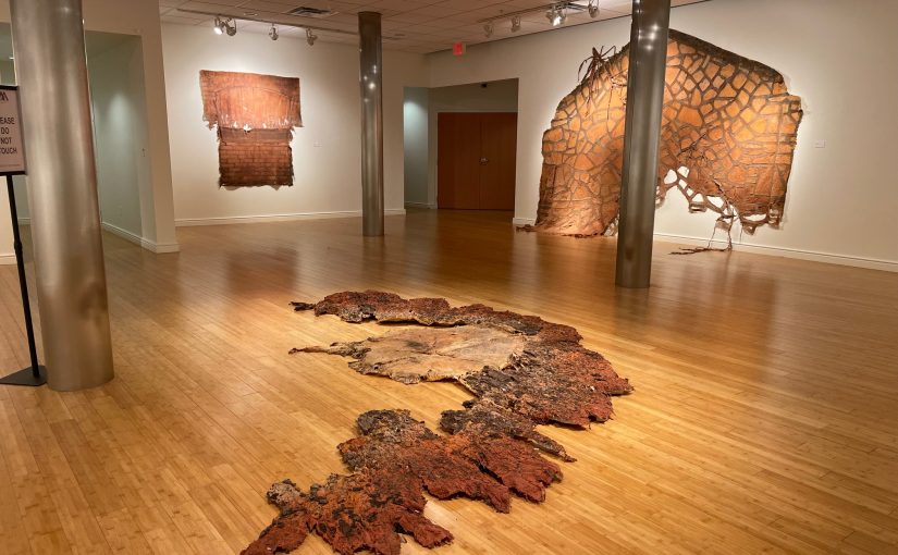
For Carlie Trosclair, her molds are the end goal. And really, they’re not presented as molds. They’re sculptures; synthetic skins mostly of architectural elements, like staircases and windows, but sometimes natural objects like tree stumps. These spooky husks are on display at Trosclair’s solo exhibition at the Museum of Art – Deland’s downtown gallery, titled “all the lives we ever lived.” Up until April 6th, the exhibition spans several rooms and combines discrete sculptures with broader installations.

I’ve never walked into an exhibition that had an allergy warning. At least, I don’t think so; and I got an arts education in Boston: the American Mecca of rules and legal disclaimers masquerading as etiquette. Granted, some people are allergic to latex, and there are barrels-worth of latex throughout these galleries. Most of the work is made exclusively out of latex.

Trosclair’s near religious fidelity to one medium is impressive. “all the lives we ever lived” is a testament to the quiet authority an artist can convey by sticking to their guns. The challenge, of course, is to not bore with a schtick that runs its course. But Trosclair succeeds in keeping the attention by pushing sizes, densities, lighting, installations, etc. Her weakest attempts are when she fusses with her ingredients. Sometimes, she adorns latex with yarn (unsuccessfully. More on that later.) but the top billing always goes to latex.

Installation view of “all the lives we ever lived” 2025

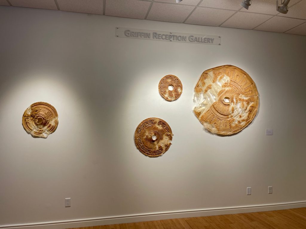
As one walks up the steps, they’re welcomed into the Griffin Reception Gallery by a handful of Trosclair’s circular wall pieces. At first, they look like enlarged amoebas or nods to Lee Bontecou’s oculus sculptures. Unlike Bontecou’s pieces, Trosclair’s are translucent and tattered. When viewed up close, they reveal themselves to be molds of plaster ceiling ornaments. The flabby gape in their center was likely where a ceiling fan or chandelier would be anchored. The molds are discolored and worn. Shreds of what looks like cheesecloth fray like fascia on the weaker sections of the pieces. All of this suggests age and the antiquated practice of decorating buildings with plaster ornaments.

But these pieces are just bite-sized introductions. Immediately behind the gallery wall is a room-sized installation titled Chrysalis: Reflections of the Interstitial (2020). The piece consists of several large latex molds surgically stitched together. Once assembled, it creates a long hallway with several passages. The piece stretches down the room such that when one stands at either end of it, they get the feeling of being little Danny Torrance riding his tricycle in the Overlook Hotel.

Chrysalis: Reflections on the Interstitial, 2020, Latex and wood

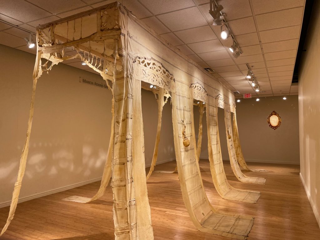
Whether Chrysalis… recreates an actual hallway or makes one up is unclear. Do Ho Suh’s soft architecture installations come to mind. However, Suh’s work is often neat and taut. Everything’s prim. Trosclair lets her pieces slack a bit. The extra length of the latex walls inChrysalis…curls on the floor like a tongue. This makes the piece look truly exhausted, as if sighing its last breath.

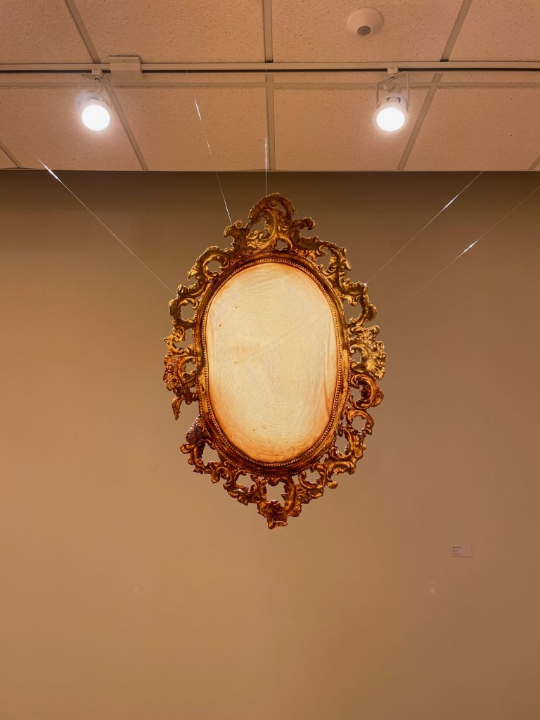
Near the back of the room is the best piece of the show. Mirror (2017) hangs alone next to Chrysalis…and is easy to almost miss. Its title is frank enough. The piece is a pristine latex mold of a mirror. Well, pristine in how much detail is captured, not in terms of color. A single wall mirror and its intestinal, ornamental frame are captured with such accuracy it’s shocking. The mirror section is an off yellow while the frame is a gnarly brown. It’s an intelligent move to have Mirror hang freely instead of adhering to the wall. It gives the piece authority. Despite its small size, Mirror floats with total command like an archangel sent from on high.

Mirror, 2017, Latex

What Trosclair does best is capitalize on latex’s limits. It’s a cheap medium that she applies one way: by brush. What makes it cheap? Well, it shrinks when it dries. This creates distortions that throw off senses of scale slightly. When the latex dries, the ultimate mold is usually translucent, making the material appear fragile. But latex is also dated, which harmonizes with Trosclair’s subject matter of historical buildings. This fragility, illustrating how all things wilt before time, adds to the preciousness of the molded objects.

What complicates this preciousness is how dirty latex is. For one, it smells. Ammonia gives latex a sharp odor. Even when the latex is fully dry, there is a faint bite in the air around it. Plus, latex discolors. It starts off-white and, over time, yellows and browns. Even the most sentimental pieces look sordid after a while. This discoloration is exacerbated if the original surface was dirty, like an exterior brick wall. Old paint, tree bark, dirt, and stains are peeled off their host and left on the other side of the latex. The yellowing effect and sharp smell give latex a urinous quality that makes the pieces much more interesting. Otherwise, they’d just be schmaltzy time capsules of grandma’s furniture.

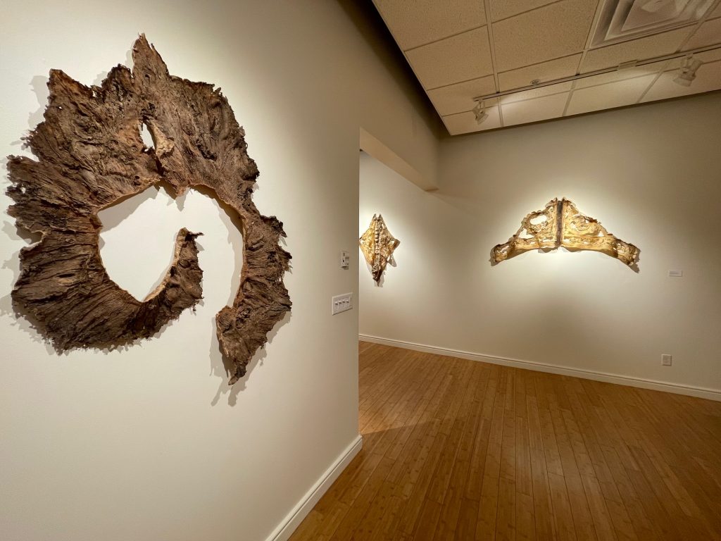
The second room pushes this ick factor. On the left wall, two sculptures are pinned with their wings splayed like taxidermy. They’re titled Goddess (Permutation I) and Locust (Permutation II). Clearly, they’re molded from some architectural decoration or a piece of furniture. The curved, ornamental lines give that away. From what object exactly is not as clear. They have bilateral symmetry, alluding to dissection and Rorschach tests. Both have plenty of negative space to breathe and break.

These pieces are also, clearly, dead. While the first room in the exhibition metaphorically suggests decay, the second room almost literalizes it. The edges of the piece curl and the colors dull as if in necrosis. There’s a haptic effect, too. Even though one can’t touch them, the sculptures look like they were once flexible and are now stiff. Goddess… sags down the middle and reaches into the gallery like Christ on the cross or the figurehead on a ship. Locust…stays flush to the wall. It’s aptly titled: its pale, undulating thorax made me want to dry-heave.

Foreground: Cobra, 2019, Latex and wood remnants
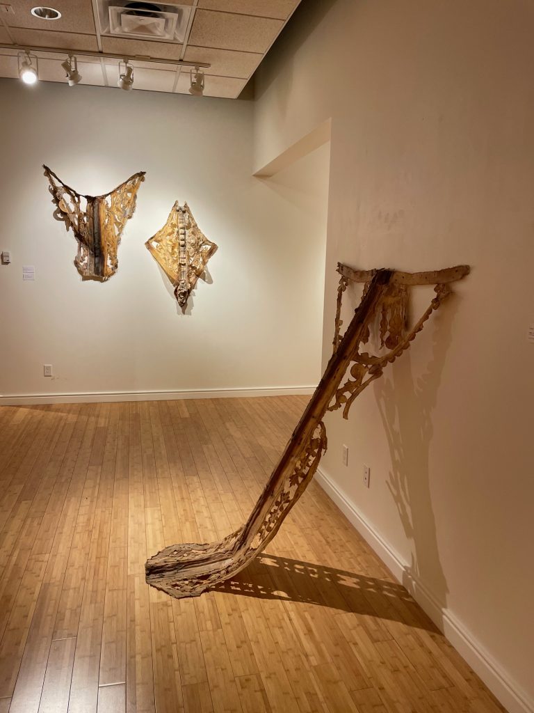
Background: Goddess (Permutation I), 2019
Locust (Permutation II) 2021

Just across the gallery, Cobra stretches nearly four feet in length. Its hood is pinned to the wall and its tail angles towards the floor. This severe line from wall to floor is standard operating procedure for fine art sculpture. Lighting plays more of a role, too, since Cobra casts an undulating shadow. Surrounded by these empty cocoons, one imagines that some insect molted and is now slithering somewhere in the galleries, larger than it was before.

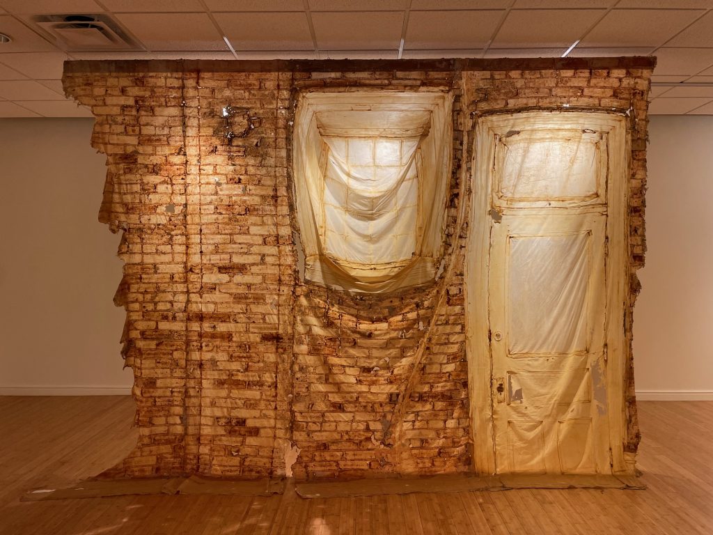
Lighting can really make or break Trosclair’s spell. In the same gallery, Letters From A Domicile (brick wall) hangs from floor to ceiling. The latex is molded from the exterior of the building, including its door, window, and supportive brick wall. Since the latex brings with it the stains of the brick, there is noticeable discoloration. Light passes through more intensely on the “purer” latex of the door and windows. Since Letters…hangs almost in the middle of the gallery, one is allowed to walk around and “see behind the curtain.”

Just to its left, however, a separate window piece hangs with no direct lighting and becomes totally inert. It’s one thing to make art that brings attention to the ignored objects and spaces of our day-to-day lives. It’s another thing to just place art in a gallery and ignore it.  Alone together (four doors) has some direct lighting and reads more purposeful. Despite somesatisfying, blocky cast shadows, it still appears somewhat disregarded. The piece is four separate latex doors grouped in a quadrant. Their feet don’t touch the ground. These ghouls gavotte together but only half are lit. This breaks the rhythm that the piece itself establishes.

Relics of passage (mirror), 2023, Latex and embroidery thread

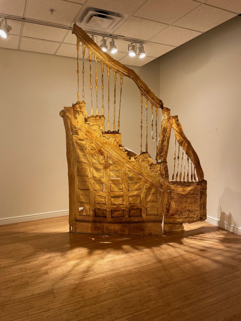
Some of these lighting failures are attributed to the wide-open space of a gallery. It’s difficult to light multiple translucent works when some are wall pieces and free-floating pieces, small and large. But the job is the job. Relics of passage is given a nook to focus its own lighting, and the results show. It’s also one of the most precarious pieces in the exhibition.  Relics…is the final section of a staircase, including the banister and bone-thin balusters. It’s perfectly lit to shine in all its urinal-stained glory. The downward slope, rounded installation, and thin skin create an image of a gradual decline, like a woman aging gracefully. Without the right lighting, the impact of this piece would become muffled.

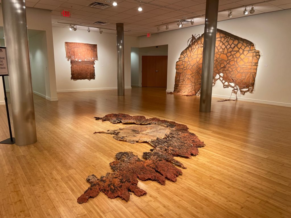
The final room contains the newest work. Here, Trosclair leaves behind most of her Leatherface-inspired domestic mementos. The natural world has become the new headliner. Trosclair brushed latex onto trees, usually their trunks, and presented the peeled surfaces. The latex isn’t cleaned. The peeled latex exfoliates the tree and brings all the bark and colors with it. The loudest piece is on the floor, titled Woodland Terrains. A tree stump, the nucleus, is surrounded by a ring of tree bark. Translucency is no more, piss-stained or not. Woodland Terrains is so dense with color and texture that it looks like a high relief copy. It’s a true still life. The work feels weightier now, even though it’s about as thin as the earlier work.

Of course, there is a connection between latex and trees: that’s where latex comes from. In that way, the final room is Trosclair coming full circle with her material. Most of the pieces in this room use Woodland Ruins’s unraveled globe format. The wall pieces let one get closer; pull the viewer in with the hairline-fracture detail of tree bark wrinkles. There’s so much subtly in Woodland Terrains II, for example, that you almost miss the blood red yarn woven into certain sections. Admittedly, Trosclair weaves them elegantly here. But once noticed, one wonders why alter such a quietly beautiful and confident piece with some string from Michael’s? Why isn’t the latex enough now?

Artists are perpetually allowed to give it the old college try. Deservedly, Trosclair’s openness to display experimental works should be appreciated. That just doesn’t mean they work.  Propagation I (triptych) combines an actual piece of tree bark, her signature latex, and Carolina red clay. While there are some interesting textures in the transitions from one material to another, these are fleeting moments of success. Propagation I (triptych) looks fussy and clunky, like a few square pegs being forced into not enough round holes. The other propagations in the series, II and III, are more convincing, especially the simpler elegance of Propagation II (triptych). Even still, they don’t totally sell it. From the removed perspective of the viewer, the larger issue is that these experiments literalize the materials and their subject: “I like latex. Latex comes from trees. Thus, I’ll put latex next to tree, and that will make meaning.” Oooga-booga.

Foreground: Woodland Terrains, 2022, Latex, embroidery thread, soil and bark debris

From the hands-on perspective of an artist, the issue with these experiments is that they involve combing separate materials into one sculpture. This hasn’t yet fallen under Trosclair’s purview. The material was always latex, always brushed, plus whatever it brought along with it once peeled. Maybe some structural supports or sewn adornments here and there, but those were ancillary adjustments. Latex was the core. Now, these experiments are equal parts latex, equalparts mud, and equal parts stick. Assembling multiple materials into one, cohesive artwork is just a different skillset that Trosclair hasn’t sharpened – yet.

Successful or not, none of this work is really new. No big deal. There is an extensive family tree of artists who laid materials somewhat bare, who used architecture to highlight empty space as important as the things that inhabited it, who altered personal objects to convey poetry and carnage, whose work rotted in real time, whose art was an impression of another thing instead of the original itself.

Eva Hesse, Ennead, 1966. Acrylic, papier-mâché, plastic, plywood, and string. ICA Boston. Gift of Barbara Lee, The Barbara Lee Collection of Art by Women. Courtesy Hauser & Wirth. Photo by Abby Robinson. © The Estate of Eva Hesse

The mother arachnid at the center of this spiderweb family is Eva Hesse. Hesse’s work is often celebrated for its transparency: just letting the materials do their thing. This never fully squared with me. For one, the materials are manipulated, which is exactly what artists do: manipulate. It’s not all chance. There’s an author organizing all this. These decisions could and should be made with a large degree of intuition, but they’re made, nonetheless.

Also, just how transparent are the materials? I think Hesse’s power came from people not knowing just what they were looking at. Her sculptures were clearly made by hand, but how? Viewers likely intuited that the materials were visceral and ordinary, but the whole was still greater than the sum of its parts. Today, I bet Hesse’s ingredients are even more foreign. Our world is too convenient and technologically drab. Whether this makes Hesse’s work more powerful or more easily dismissed as an echo of an archaic era, I’m not sure.

Art’s resonance comes from its hypocritical cocktail of mystery and clarity. That doesn’t make art dishonest. People don’t like to be tricked or to have art handed to them on a silver, Youtube-recommended platter. Art creates a state of suspended animation by organizing matter in a cauldron of consciousness and spitting out something manmade and alien; elegant and strange. This imbues art with a faint icy quality. Like a distant planet, art isn’t hiding, but our view of it flickers. Not because it tries to: that’s just its nature. Acquiring new information doesn’t change this. We know, for example, that it rains diamonds on Neptune. Does that make Neptune less mysterious?

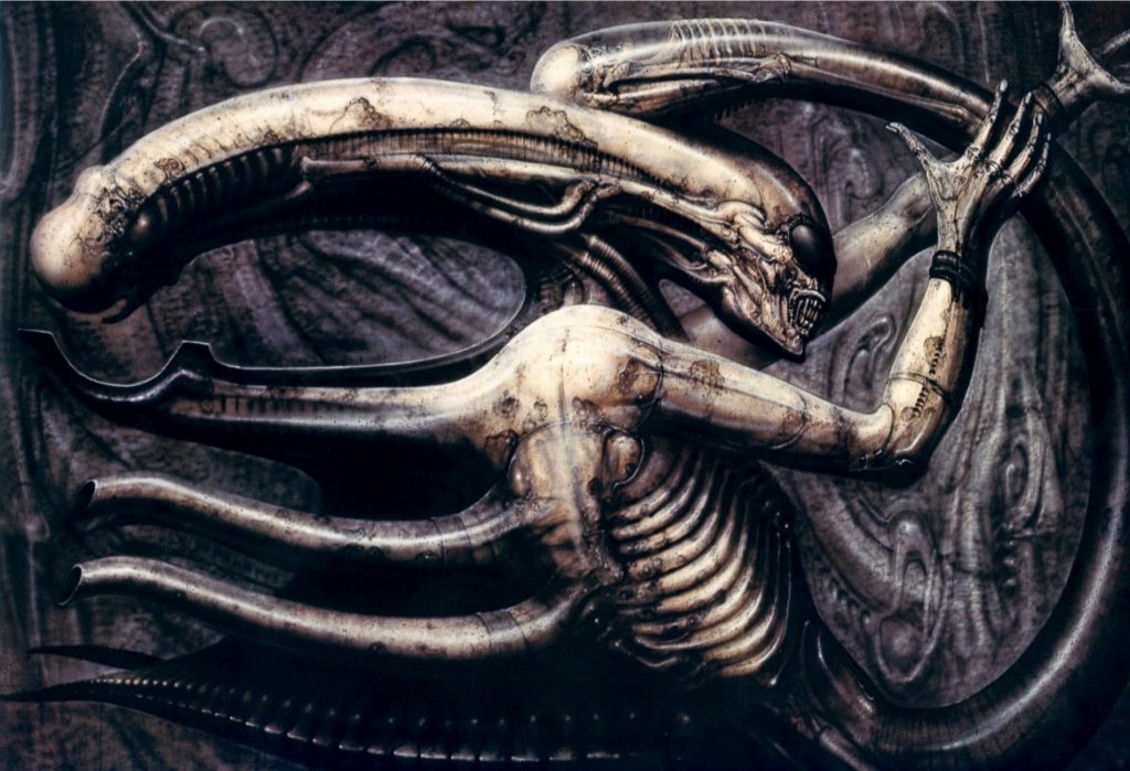
So, too, is Hesse’s work not less mysterious just because she’s “transparent” about what it is. Nor does retroactive analysis of Hesse herself through contemporary ideologies and preoccupations with people’s stories make her work more “accessible.” For all the fecundity and decay of Hesse’s life and work, its core of chilly mystery sustains its power. Even the work of H.R. Giger, Hesse’s brother from another mother, doesn’t have the same impact. Culturally, there’s no question: Giger wins. But sculpture for sculpture, Giger’s work reads more illustrative, compulsive, even manufactured. Hesse’s work breathes. There’s a soft, grimy gravitas to Hesse’s sculptures that suggest a life lived through a powerful, private connection between a human being and material. The sculptures are the throbbing artifacts of this relationship now long turned to dust. Long live the queen.

Eva Hesse, Untitled (Seven Poles), 1970,
Aluminum, fiberglass, plastic. Centre Pompidou © The Estate of Eva Hesse, courtesy Hauser & Wirth
H.R. Giger, Necronomicon IV, 1976, Paint. Museum in the Castle of Saint-Germain, Gruyere, Switzerland

“all the lives we ever lived” is an engaging and worthwhile exhibition that is equally transparent about the materials, but it could benefit from a little ice. Carlie Trosclair is clearly formed: she knows what she likes and what she doesn’t like. That’s great. But why force the meaning? The title alone, in its E. E. Cummings lowercase, insists a little too hard on a poetic reading of the work. Trosclair doesn’t need flowery exhibition names or poignant artwork titles to direct the viewer toward meaning. Her instincts are strong. Her skills are refined. Her sculptures pulse with earnest, grotesque mystery. Let them live.

Letters From A Domicile (brick wall), 2017, Latex and wood

The exhibition “all the lives we ever lived” is on view at the Museum of Art – Deland’s downtown gallery in Deland, Florida, through Sunday, April 6, 2025. The Downtown Gallery and Museum Store are located at 100 N. Woodland Blvd. on the corner of N. Woodland Blvd. and New York Ave. in Downtown DeLand.

Artist Carlie Trosclair lives and works in New Orleans, Louisiana.

Bay Art Files contributor Jonathan Talit is an artist currently based in Orlando. He received his BFA from Boston University and recently received his MFA from the University of South Florida, Tampa. He makes sculptures, essays, exhibitions, friends, fun, and occasionally money. 

Art and Race Matters: The Career of Robert Colescott

By Jonathan Talit

Installation shot of Art and Race Matters: The Career of Robert Colescott with 1919 (1980) on the left.
All photographs courtesy of the author unless otherwise noted.

Establishing the Sarasota Art Museum was a lengthy process that began back in 2003. After two years of speaking with community leaders in the arts and education sectors, the Sarasota Art Museum joined forces with Ringling College of Art + Design. Their decision? To transform the historic 1926 Sarasota High School into an art museum and education space. The school was originally designed by M. Leo Elliott but features a mid-century addendum created in 1959 by Paul Rudolph, an architect whose influence is still seen today in Sarasota. In 1996, classes officially moved to the current Sarasota High School, leaving the previous building abandoned for nearly 20 years. There were talks of demolishing the building until thirteen Sarasota volunteers, partnered with the Ringling College of Art + Design, petitioned for it to be transformed into an art museum. 

The Sarasota School Board unanimously awarded them the building in 2004.  From there, years of rigorous fundraising were required to begin renovations on the building.  Over $22 million was raised by 2014. In 2015, they brought on Anne-Marie Russell to serve as founding executive director and chief curator, a position she held for six years.  Russell oversaw the final renovations, the museum opening in December of 2019, as well as exhibitions and other programming through 2022. This includes Art and Race Matters: The Career of Robert Colescott.

1919, 1980, Acrylic on Canvas.

The first painting in the Robert Colescott exhibition is the first thing on most of our minds lately: America. Regardless of one’s political position, it is difficult not to see events in our country over the past few years as anything other than grim, claustrophobic, and without clear resolution. 1919 (1980), Colescott’s painting of the continental United States of America, presents our massive and varied slab of land, still curiously bound together somehow, at least on a map.  The rendering of this map is not bleak and dreary, however, but throbbing with vivid technicolor. Each state is granted its own color that is different from the surrounding states, emphasizing contrast. Some states are stamped with images symbolic of their culture: an alligator in Florida, a bottle of wine in California, an ox skeleton in Nevada, charmingly rendered. The map is flanked by two figures in profile who are only visible from the chest up. The rest of their bodies are submerged in a billowy mass of cotton-candy clouds, sprinkled with “studio sweepings” like cigarette butts and opened cans. The figure on the left is a white woman, hilariously buxom, and the figure on the right is a Black man in uniform. Evidently, these are the artist’s parents, who are also symbolized in the bird’s nest image in the center of the painting.  

There are a lot of tropes here: 19th-century silhouettes in the figures in profile, state symbols on children’s maps, the “melting pot” of America formed by distinct cultures, and the latent but potent tension between Black men and white women in our country. 1919 certainly taps into the unsightly race relations that helped form and maintain the U.S. but it’s with a light touch. As the exhibition progresses, Colescott becomes increasingly direct about his positions regarding race, the history of painting, and American popular culture. This cocktail of uncomfortable social commentary, crude figuration, and a lush color palette is Colescott’s modus operandi. Like Paul Mooney and Robert Crumb, Colescott aims for the status of great comedy by presenting these blunt and jagged truths with a sense of levity and even glee. Essentially, he’s his own straight man and funny man; Laurel and Hardy in one painterly package.

Installation shot of the artist’s early work.

It took a while to get there, however, and the exhibition traces Colescott’s history succinctly. Born in 1925, Colescott doesn’t develop his signature style until the 1970’s when he was well into his forties. This is peculiarly late for an artist to “find their voice,” particularly when individual styles were so prized in the mid-20th century. A room in the exhibition dedicated to Colescott’s early work presents a serious student of art history, from Manet to Matisse to Léger (a teacher of Colescott’s). These paintings are mostly executions of the styles of other artists, if not copying specific artworks altogether. One exception is a small painting, Untitled (1949), made while Colescott was a graduate student at UC, Berkeley. It’s a small work of geometric abstraction that is an early cue of Colescott’s later strategies for organizing compositions and his affinity for pink. The rest of the work documents Colescott’s attempt to find his point of view through other artists. Fake it ‘til you make it. All artists go through this, but Colescott’s lengthy growing pains risked him becoming a permanent student of art history: a practitioner of the values of others instead of synthesizing his own. 

That all changes after an extended stay in Egypt beginning in 1964 where Colescott became the first artist-in-residence at the American Research Center in Cairo. It’s always a little slippery to deduce clear cause-and-effect from an artist’s life to their work, but with Colescott, it’s pretty case-closed. There is a dramatic shift in formal concerns and sensibility that result from Colescott’s five-year stint in Egypt. The paintings become larger, the colors more saturated and delicious, and the figures less realistic yet full of life somehow. Dr. Ehrlich’s Magic Bullet (1968) is an early example. This is the beginning of the “cartoonish” style for which Colescott is remembered. Something about Egypt awakened his childhood love of color and comic strips (I suspect Egyptian hieroglyphics and ornate linen are to credit). It’s apt that Pop Art and psychedelia were occurring simultaneously in the States and the UK while Colescott was in Egypt. The social revolution of the 1960s was also brewing, exploding into the Civil Rights Movement in America and Second Wave Feminism in the west writ large.

Dr. Ehrlich’s Magic Bullet, 1968, Acrylic on Canvas.

This leads to another clear awakening for Colescott in Egypt: race. It seems that moving from the Pacific Northwest to Cairo forced Colescott to confront, accept, and celebrate his own bi-racialism. This, paired with his beatnik influence after moving to Oakland in 1969, focused Colescott to present these issues with a crass, cheeky sense of humor and almost hallucinogenic imagery. Sprinkle in some appropriation from art history and American popular culture, along with the occasional flashes of self-reflection and autobiography (see Bad Habits from 1983), and voila: you’ve got an artwork by Robert Colescott. 

Colescott is extraordinarily productive once he finds his groove. The exhibition is replete with examples of Colescott keeping his basic ingredients but playing with the proportions. Cactus Jack in El Dorado (1977) amps up the transparent use of stereotypes, in images and text, but dials back the viscous painting style for which Colescott is best known. The painting’s crisp colors and flat rendering narrow the attention to Colescott’s matter-of-fact delivery of stereotypes, inducing an appropriate discomfort. Even the scenery is a stereotype of the American landscape and desire to head west. 

Detail of Cactus Jack in El Dorado, 1977, Acrylic on Canvas.

Hard Hats (1987), by contrast, relishes in cloddish, lumpy figures but doesn’t reduce them to signs or stereotypes. Instead, Colescott presents a rather intimate scene of solidarity between a wife and her husband, a construction worker and his coworkers, Americans and their fellow citizens. “We’re all building this together.” While the comradery is definitely visible, so is the looming fear of collapse. Hence, the hardhats. When is this whole thing going to tumble?

Some paintings eschew any immediate story altogether. Sleeping Beauty (2002), a large diptych centrally mounted in the exhibition, appears more interested in marks rather than images. Reduced and swift, the marks made on the canvas tempt the viewer to decipher any specific reference but are ultimately illegible. The painting has a sweeping sense of time that is enhanced by its large scale. It invokes the history of recording touch, from cave paintings to Abstract Expressionism, but isn’t particularly located in the specific project of America that concerns the rest of his work. 

These paintings, however, are examples of Colescott’s deep cuts. They meander slightly from his primary “one-two punch” strategy: presenting the audience with cherished imagery and symbolism that connects them to their childhoods and rosy-eyed views of America, then immediately injecting the garish, foul costs of that imagery without any clear path towards reconciliation. They get the sweet and the bitter. 

Shirley Temple Black and Bill Robinson White, 1980, Acrylic on Canvas.

Or at least, that’s the goal. This “one-two punch” often consists of injecting Black figures into scenes in which they weren’t originally visible, like Rubens or Lichtenstein paintings. Sometimes Colescott is even more upfront by portraying white figures as Black and vice-versa. Shirley Temple Black and Bill Robinson White (1980) is an example. Here, the famed actor/tap dancer ambles through a garden with the iconic child star of the 1930s. It could easily be a scene from one of the several movies they made together except that 1) the scene is in color and 2) their races are switched. Colecott’s intense color palette, drenched in saturation, amplifies the feeling of disorientation. The figures, however, are some of Colescott’s most realistically rendered. The result is a painting that is acutely abnormal. Besides the disarming switch of the figures’ races, the friction between the cartoonish colors (the background sunset looks like something straight out of The Simpsons) and the more focused realism of the figures confuses fantasy and reality. Don’t movies do this, too? There’s got to be a Wizard of Oz joke deep in this painting; the double entendre of switching from black and white to color when Dorothy arrives in Oz. The painting contains a remarkable stillness, as if frozen in suspended animation. A tonal remix occurs, too. Robinson’s laughter reads more like horror and Temple’s luminous enthusiasm comes off more withholding and cautious. 

Left: Bad Habits, 1983, Acrylic on Canvas. Right: The Judgement of Paris, 1984, Acrylic on Canvas

They aren’t all hits, however. The Judgement of Paris (1984) uses the same “one-two punch” but just comes off rushed. Colescott had a fine line to walk: how to employ clear strategies of appropriation but not become utterly formulaic.  The Judgement of Paris wears its formula on its sleeve: steal a title and composition from a canonized painter, usually a white male, and make one or all the figures Black! That’s a fine place to start, but The Judgement of Paris doesn’t really go anywhere with it. It doesn’t transcend this formula. The paintings have to offer more than the sum of their parts, and with Colescott they usually do. If not, the humor flattens, the point is cheapened, Colescott’s hard-earned voice is lost, and the painting quickly sums itself up. Yawn. 

However, the final room that contains The Judgement of Paris does present other work that successfully complicates Colescott’s practice. Colescott’s signature oeuvre relies on this “one-two punch” that the viewer, ironically, is continuously hit over the head with throughout the exhibition. The idea being that Colescott shows us what these symbols from history books, Disney movies, and magazine advertisements really mean. He, the insightful artist and enfant terrible, reveals the truth of our complicity to us. Without him, perhaps we’d be lost in our personal fantasies and delusions of grandeur; fantasies in which we’re the heroes, of course. That’s fine, but it’s just fine. The show becomes richer when Colescott points that outward perception a little closer to home, making tidy, moral judgments tougher to deliver. After all, it is his work that relies quite heavily on stereotypes, on appropriating charged imagery that already exists only to alter it slightly, if at all. 

Lone Wolf Trilogy (Strutting his Stuff, Checking It Out, Yes Virginia), 1976, Graphite on Paper.

Perhaps Colescott never completely developed his own unique strategy for creating images outright. Whether it’s through Rubens or Shirley Temple, Colescott almost always needs a pre-existing vehicle through which to express his ideas and attitude. A series of drawings called Lone Wolf Trilogy (1974) makes this compromise well. Colescott steals the stereotype of a dapper, randy wolf, originally made popular by famed animator Tex Avery. With a lengthy and lascivious grin, the wolf is always standing confidently, puffing on a cigar (shout out to Freud), and dressed to the nines. In case it wasn’t already clear what the wolf is hungry for, Colescott draws an obvious dick print in the wolf’s pants. His legs spread wide exacerbate his intentions: he’s ready to deliver. 

Lone Wolf in Paris, 1977, Acrylic on Canvas.

Colescott uses one of these drawings as a template for the painting Lone Wolf in Paris (1977). Here, the wolf is dancing with a blonde woman at a restaurant. Orbs of light (spotlights?) focus on the couple as the wolf dips the woman, an iconic and erotic position in salsa dancing. His once obvious erection is obscured the bent body of the woman, but sexual symbols linger. What else could those stiff candles, slowly dripping milky wax, be there for? The shadow underneath the dancers, an amalgam of intertwined forms, predicts more shapes and contortions that the dancers will take on later when they find someplace a little more private.

Of course, the wolf is Robert Colescott. Whether it’s how he saw himself, or how he wished he did, or both, who knows. Regardless, what’s successful about these drawings and the resulting painting is their sharp humor and lack of judgment. Colescott understands the pleasure of being a horndog and the resulting complications of it. It’s possible that the work in this room reveals Colescott to be even more reflective. What if stereotypes are often unfair representations with real consequences and pleasurable to slap onto others? If one needs a clear takeaway or lesson from an art exhibition (I don’t), this one offers a useful quandary: how do we attempt to make a better world for each other, whatever that means, while accepting our innate appetites to segregate and flatten each other into caricatures? What if America isn’t as pretty and fluffy as we’re sometimes told it is, but that’s because we aren’t either and never will be? Not in some high-minded, academic way, but in our tedious, daily negotiations with our egos and various thirsts?

In a culture where image management is high currency and many people, perhaps artists most egregiously, are constantly manicuring their morality on “the public stage” like a bird preens its plumage, Robert Colescott reminds us that manicures only go so far. In fact, they could even be detrimental in their disguising of the malformed and grisly impulses that run through all of us. Like all good art, Colescott’s work provides an opportunity for integration: to work on a better, more equitable world for all while acknowledging the quiet rumble in our bellies at the cheap pain of others; our animal eyes glowing in the dark. 

Art and Race Matters: The Career of Robert Colescott, curated by Lowery Stokes Sims, Raphaela Platow, and Matthew Weseley, was organized by the Contemporary Arts Center in Cincinnati. The traveling exhibition is on view at the Sarasota Art Museum through October 31, 2021. For additional information and related programming, visit the museum’s website.

Bay Art Files contributor Jonathan Talit is an artist currently based in central Florida. He received his BFA from Boston University and recently received his MFA from the University of South Florida, Tampa. He makes sculptures, essays, exhibitions, friends, fun, and occasionally money.