Fee-Fi-Faux-Pfaff by Jonathan Talit
Any museum exhibition that even hints at celebrating debauchery is welcome in my book. At the time of this writing, American culture has sustained a “No-Fun Zone” mentality for at least a decade. I’m not naïve enough to expect outright fun in any museum, but there’s no reason exhibitions can’t be titillating, even sleazy. Museums themselves, however, seem dead set on convincing the public of how fun and carefree they are through a glut of programming like Teens’ Night, yoga classes, dance performances, and concerts. These programs are often hosted directly inside, and thus interrupt, the galleries. Designed to give the impression of “accessibility,” these programs can’t disguise the reality that museums are perpetually stern institutions. Museums are largely about propriety. I accept that – I’m an adult.
There is no horror quite like organized fun. Admittedly, my thirst for anything remotely stimulating has sometimes led me to initially qualify things as good in the negative: this TV show wasn’t as preachy as it could’ve been, that movie wasn’t as predictable as most movies lately, etc. When I heard that Judy Pfaff had an exhibition in Florida, about Florida, I had every reason to be primed to enjoy it.

It turns out Pfaff has a history with Florida; in particular: Sarasota. Known primarily for her engulfing multimedia installations, Judy Pfaff has worked as a prominent visual artist for over fifty years. In 1981, she had her first solo museum exhibition at the John and Marble Ringling Museum of Art. Just over a decade ago, she was invited back to Sarasota by the educational program ARTmuse. This program was created by the Sarasota Art Museum’s founders as an embryonic platform for what would ultimately become the brick-and-mortar museum itself. Things have come full circle as Pfaff has an exhibition up at the Sarasota Art Museum titled Picking Up the Pieces.
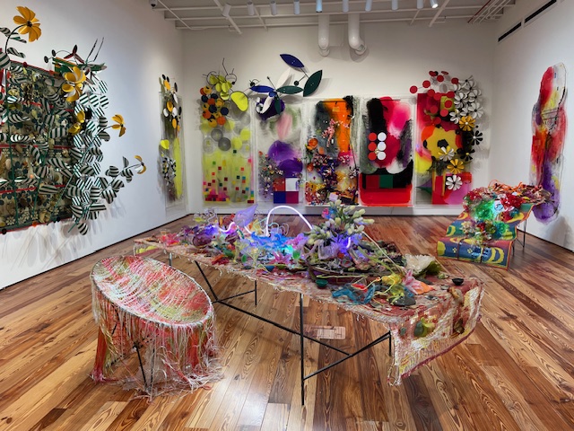
The exhibition is divided into two rooms. The first contains the most vibrant work and the least like installation. While they have oblong shapes, flex in multiple directions, and even reach out towards the viewer, each artwork is discernably contained. It isn’t that hard to figure out where one ends and the other begins. “My mind is wired as a painter,” Pfaff admits, and that primary sensibility is on display here.
Multiple panels line the wall of various shapes and sizes. They all appear to be made of acrylic. Some are intrinsically pigmented, others superficially by staining the surface with resin. Most of these panels have “limbs” that extend outward, complicating their initial flatness. These extensions are mostly welded steel lines that blossom into other forms: more panels, crescent shapes for leaves, tubes of neon twisting jaggedly. The long arm of Alexander Calder can’t be ignored. Flashes of Frank Stella blink within these works, too. Specifically, Stella’s wall sculptures that seem equally inspired by fluorescent lighting, the Art Deco revival of the 1980s, and cocaine.
Regardless of how saturated and active these panels are, they all maintain a degree of translucency. Some light can pass through, some sections disguise themselves against the supporting wall, some areas let you see yourself looking at them. Moments like these are reminders that the materials here aren’t actually moving, aren’t really fluid, aren’t truly alive, but are entirely fake.
In fact, Pfaff’s work relishes in all things fake. This is a key point that isn’t directly addressed in the supporting text. There’s no question that, “Pfaff’s impressions of Florida’s sun-soaked, life-affirming landscape, fecund nature, and leisurely rhythm of life,” are presented. There are “…a plethora of readymade faux flowers, fruits, and vegetables…and three-dimensional elements that resemble flora and foliage,” all over these galleries. However, that’s only half right. There should be more emphasis on the word “faux,” as I see Pfaff’s work as a celebration of Florida’s evident natural life and obvious affinity for the artificial. That is Florida’s power: the cheap but seamless harmony of the natural and the synthetic worlds; a shotgun wedding between the Jurassic and the plastic.
This unorthodox synthesis is evident in this room’s only free-standing sculptures. In the center, a long table extends diagonally across the gallery next to a lawn chair. Or, it used to be a lawn chair. The tight network of warp and weft has become just the slightest bit molten, the littlest bit loose. Now, the plastic strings are frozen in limbo: a permanent refractory period. The table itself is smeared with detritus. Before the viewer lies an opulent spread of fake deserts, plastic bags, half-drunk cocktails, fabric flowers, and neon lights, all entombed in goo. Neon is a sharp analogy to Florida, as neon is a natural element but registers as otherworldly and disposable: hypnotic garbage.
As fun as these works are, they are often too literal. Fake fruits and fake flowers are used to represent…Florida’s real fruits and real flowers? That’s a bit too on the nose for me. Other works, like the two-panel pieces on the righthand wall, entertain more subtlety. The first, measuring at about 3’ x 3’, is an orange panel erupting into circular steel shapes. Lacing those shapes are small lights that blink in a gentle rhythm akin to Christmas lights. This all reads like flowers and bees without literally being those things. It’s also one of the pieces with the darkest color palettes: could those lights be little stars? The piece is backlit with surreal blue and green lights that recall a gas station at night. The panel piece to its right is a larger rug with a multicolored neon light zipping through it like a waterslide.

With all this activity, one almost misses the rug-turned-tablecloth that flows off the table at almost completely ninety- degrees. Itself covered in resin, it looks like roadkill in the final stages of rigor mortis, or a stray sock in a teenage boy’s room. One can hear the sound it would make if it fell on the floor. Across the gallery, another rug undulates like a tongue as it belches a small meal of plastic margarita glasses.
All these are richer strategies than “cocktail glasses to represent cocktail glasses.” Still, the work encapsulates Pfaff’s acute sense of the fun, futureless frivolity of Florida. This state is the perpetual butt of cheap jokes and single-minded analyses: heralded as a bastion of freedom and family values, derided from afar as “America’s dick,” or grimly presented as the canary in the coal mine of right-wing fascism and censorship that’s ready at a moment’s notice to leap onto the country writ large.
Florida is much richer and dumber than all that. It’s a place of off-season carnivals, dinosaurs past their prime, strip malls, strip clubs, loose morals, endless lawsuits, lush landscape, low taxes, low education, violent storms, finger foods, and the brisk exchange of fluids. The weather is nice, and the people are mean. It values transience and expedience: cheap thrills year-round. Obviously, this means no community, no history and no future, and absolutely no real obligations. That’s not exactly a role model. But what history matters in a place so relentlessly present? What future could ever happen in a state that is designed with no attention span? That has one season? Whose main business is tourism: strangers leaving just as quickly as they came? Pfaff astutely and lovingly distills Florida’s Multiple Personality Disorder into more digestible forms without reducing its amusement and frustration.
One gleans quite a different reading from the exhibition documents and the title itself, Picking Up the Pieces. Both the title of the exhibit and the title of a large-scale installation in the second room, refer to Hurricane Ian. According to the museum text, Picking Up the Pieces is inspired by, “Hurricane Ian’s devastating impact on southwestern Florida in September 2022.” The text continues to correctly describe Hurricane Ian’s “bewildering chaos and tumult” and the “indelible mark” it left in its “aftermath.” Some of this aftermath is presented in a video projection that accompanies the installation. Pfaff herself bore witness to Ian’s “destructive power” at Fort Myers Beach and Sanibel Island.
Words like these are apt descriptions of the damage caused by Hurricane Ian. What’s less apt is the implied equivalence between the somber memories of Hurricane Ian and the experience of Pfaff’s work here. Yes, twisted metal, pools of plastic, flying panels, and shorn fabric abound. Random objects from drinking glasses, neon lights, seashells, and honeycomb cardboard stock are married by the stirring forces of wind and flood. Natural disasters make their own mixed media installations out of our lives. Pfaff communicates that point well enough.
The issue is that Pfaff’s work just isn’t that sad. She may have felt sadness seeing what Hurricane Ian left behind – who wouldn’t? – but that’s her business. Sorrow is not evident in these galleries. But the supporting text and the dismal documentary-style of the video imply a mournful experience that just isn’t there, and a degree of chaos when the work is usually quite prim, for better or worse.

That said, the second room is notably more muted in color. Starburst candy colors are out, and the paler shades of taupe, beige, and grey are in. Largely, this is the result of a material swap: cardboard, polyurethane foam, concrete slabs, aged wood, and a monochromatic video dominate this room. There are still colored acrylic panels and neon lights, but they’re accents against a quieter backdrop. Speaking of backdrops, the room’s architecture lends to this new atmosphere. Instead of having the titanium white gallery walls of the first room, the second room exposes the weathered bricks of the original building, a former high school. These bricks, in their smeared glory, contribute heavily to the industrial, nautical feeling of the gallery. Dimmed lights allow viewers to see the video projection, obviously, but also induce a hush.

The centerpiece is a large installation of steel pipes, stone, colored panels, LED light strips, and sailboats suspended mid-air. They don’t move, but you can. Viewers can walk through this space, around these objects and their various harnessing apparatuses, to get the simulated, safer, lower-resolution experience that they’re in the eye of the hurricane. A single skylight window beams down soft, natural light roughly in the installation’s center. The power cords of the LED strips, the unnatural light in the room, are disguised, hilariously, by flooring tape with a “wood floor” image on their backside. Some large strips of that same tape are slapped against the gallery walls where their camouflage does them less good.
Again, where’s the doom and gloom? Viewers are impressed by this installation, not depressed. “How did they get these pieces in here?” “How do they all stay still?” “Who could think of this?” “Why is this so fun?” These are a few of the questions I overheard other visitors compelled to ask out loud. Some visitors preoccupied themselves with the logistics of how it was assembled, a common and distracting Achielle’s heel of most installation art. Many people, however, easily let go of those questions and drifted off into the museum VR-experience of matter swirling around them. My personal favorite of these Twister floating objects are the sunflowers and their towering stalks sealed in intergalactic platinum paint.

Well, if you don’t find sadness in this exhibit yourself, it’ll be handed to you. Opposite the installation is a large wall with a projected video. This video documents various sites of the destruction of Hurricane Ian from the vantage point of a car window. Collapsed buildings, enormous boats slammed into one another, long stretches of land filled with scrap: all presented in black and white, in case you didn’t register how solemn this is supposed to be. This is a flimsy juxtaposition to the vibrance and Fantasia-style animation of dead objects in the rest of the gallery. It’s a needless bummer. Presumably, the viewer is supposed to interpret this pairing as evidence of the exhibition’s sophisticated duality: holding the vividness and pleasure of the natural world with its hazardous potential for carnage. How mature.
This just belies Pfaff’s organic interests and the obvious effects of her work. It’s just as useless to insist on even a shred of this exhibit being mournful as it is to insist on Goya being happy-go-lucky. Quieter, yes. In fact, the artwork lining the walls surrounding the installation are some of the best works by Judy Pfaff that I’ve ever seen. On the left, two enormous wall pieces comingle cardboard, foam, and metal until they look like mutated hornet’s nests. When you get closer, the layering of colors, adjustments from gloss to matte, and degrees of opacity are so rich that they deserve the same reverent vocabulary used to describe oil painting. The porous cardboard stock rhymes nicely with the aforementioned sunflowers.
On the back wall, a horizontal steel frame acts as the skeleton for a billowing mass of plastic. It reads almost like a color spectrum, beginning on the left with some green and deep blues, transforming into violet and red, and then evaporating into translucency. A select amount of LED and neon lights breathe the most tender amount of life into this rubble. Beneath the circulating web of plastic neurons is the cortex: a multicolored disco ball. Despite the mass of material blocking out much of its already faint light, it spins faithfully: beaming out whatever signal it can.

The wall closest to the video projection holds a similar sculpture. This time, there’s no color: just steel, a white LED light, and translucent plastic. No disco ball, either. Unlike its sister sculpture, this one appears devoid of life. Backlit by the sterile white LED light, it suspends like a ghost waiting to cross over. Or maybe that’s pessimistic: what if its blankness isn’t the end of life, but the beginning, like a stem cell?
Underneath that is a large display of objects not dissimilar from the sordid table in the first room. This piece is more securely (i.e. more conservatively) positioned near a wall against which a large LED light projects. It appears to be a slab of concrete coated with foam tinted in various shades of blue, resin, seashells, plants, and dilapidated pottery. Both the seashells and the plastic twinkle as one walks by. Small orifices gape while masses of urethane foam crest and rock, all giving the appearance of a seafloor caught in the moment where the current stops just before shifting directions.
In my mind, these artworks display the most technical acumen and emotional resonance of the work on view. That said, their resonance is not that potent. If there’s any sadness in this exhibition, it’s the realization that the work isn’t as loose or audacious as their initial jolt suggests. After the sugar rush comes the crash. Granted, it’s not a major crash, there’s interesting and fun artwork here, but there is a noticeable dip in enthusiasm once one takes a second lap through the galleries.

While Pfaff’s piquant visual interests are obvious, so is her ultimate conventionalism. There’s nothing wrong with that per se, but the brashness of the work ques the viewer up for an experience that is, frankly, rather innocuous. Just as exotic sea life and reptiles flaunt vibrant colors and dizzying patterns to signal danger, I wish these works had more of the venom I felt they promised me. Alas, I left the gallery not sucking out the symbolic poison or asking a loved one to urinate on my metaphorical jellyfish sting.
Picking Up the Pieces has the distinct feeling of butterflies in one’s stomach as they get ready for a party – the imagined possibilities of laughter, music, dancing, getting buzzed, getting laid, blowing off steam. Then, they get to the party and it’s just a little smaller, just a little quieter, the lights a little too bright, the decor a little too neat, the conversations a little stiff, the people a little more sober than one had hoped, the specter of etiquette hiding just behind the door.
The exhibition Judy Pfaff: Picking Up the Pieces is on view at the Sarasota Art Museum in Sarasota, Florida, through Sunday, March 24, 2024.
Bay Art Files contributor Jonathan Talit is an artist currently based in Orlando. He received his BFA from Boston University and recently received his MFA from the University of South Florida, Tampa. He makes sculptures, essays, exhibitions, friends, fun, and occasionally money.
