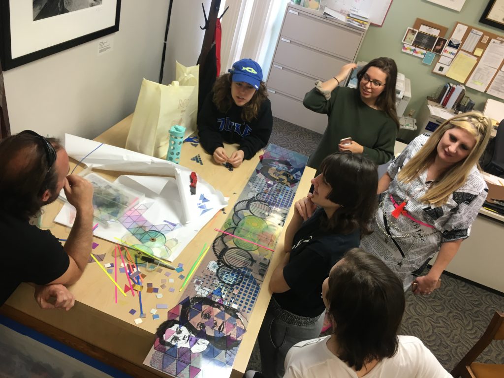
Pausing at the entrance, taking in what is in front of me, many things come to mind when walking into Gallery114@HCC at the School of Visual and Performing Arts on the Ybor City campus and encountering the works of Ry McCullough.
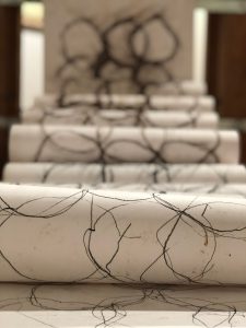
Ry McCullough, Themes for the American Kestrel, installation view. Image courtesy of Gallery114@HCC Ybor City Campus.
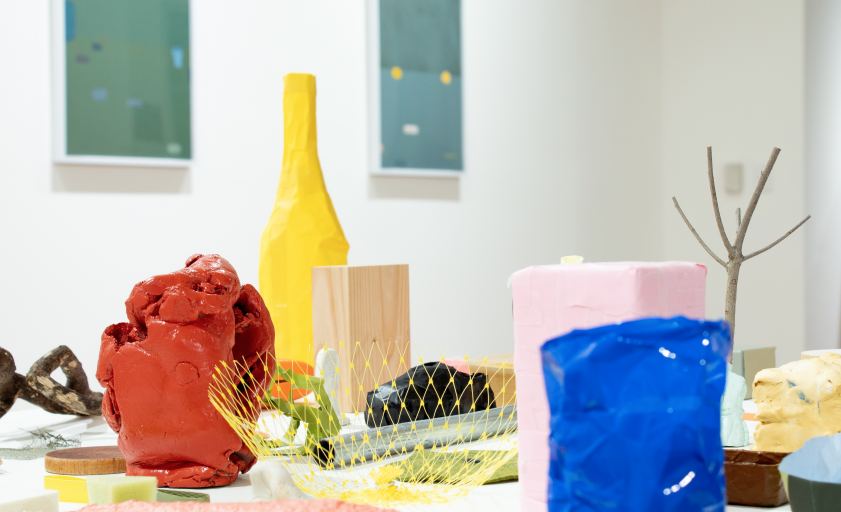
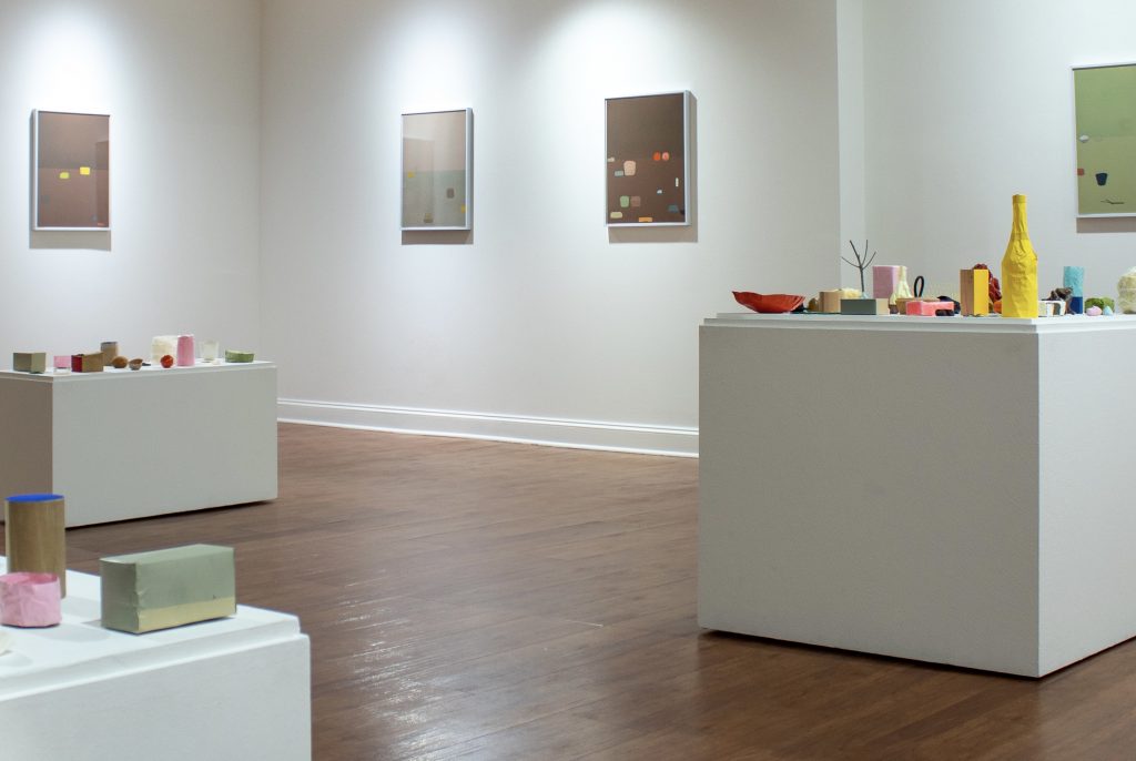
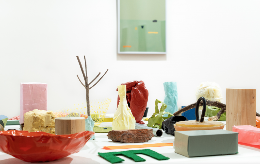
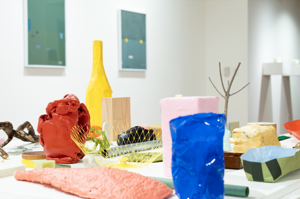
There are three pedestals composed in the middle of the floor, each covered with little objects, some with oddly familiar shapes, like Claes Oldenburg’s monumental sculptures that more or less resemble everyday things, except these are in sizes that can easily fit inside a coat pocket; there’s a video showing the same stuff in a smaller, but ever-changing grouping, the setting like a photographer’s studio; there are framed mixed media works hung on the wall, each depicting a landscape with a scattering of these objects; and finally there’re two small shelves, each with a rectangular box made delicately from Japanese paper, sitting on a greenish felt, like architectural models of some basic structural forms.
Ry McCullough, Themes for the American Kestrel, installation view. Image courtesy of Gallery114@HCC Ybor City Campus.
The pedestals could be an archipelago, a small group of islands with colored and differently shaped things that washed in from the sea, and the wind blew them around and around to end up where they are now, curios.
And taking a walk on these island shores, kicking around at your feet, these shaped and color things, maybe they are sea shells, or sand smoothed pebbles, perhaps pieces of coral, but most definitely flotsam and jetsam telling tales of their long transformative voyage through the ocean waves, when a glint of something catches your eye and you pick it up, examine it, drop it in your pocket, take it home, place it on a shelf, or window sill, or the end table, alongside all the other odds and ends that have been collected from here and there over the years, and now together they all are, in the same time and space, more or less coexisting, little islands in of themselves.
A friend comes and visits and they might admire your collection, picks one up, studies it, puts it back, but not quite the same spot or orientation; or maybe it’s cleaning day, and the objects are lifted one by one, dusted and put back, and again, not all returned to the exact same position. The arrangement thus shifts slightly, hardly noticeable, and continues shifting one cleaning day after another, one friend’s exploratory hands after another.
This constant picking up and putting back is essentially the 20 minutes long video piece. With the magic of video editing, pieces suddenly pop in and out of existence, creating a slightly different composition with each editing cut. One piece may go poof and reappear in a little while next to something else, or maybe never appear again. The viewer’s brow tense with concentrated anticipation. Did someone just get kidnapped, or is this an example of what physicists call entanglement? Who knew such unassuming objects appearing and disappearing could create such a drama. A suspenseful video performance where the artist is unseen.
The framed works on the wall is non-action action in a flat space. There’s a line, could be a table’s edge or the horizon, plane of the sky meets plane of the earth, but unlike the objects on the pedestals or in the video where they’re visibly grounded, the objects in these mixed media pieces feel suspended, while not as high as the floating bowler hat men in a René Magritte painting, they are not as affected by the gravity that anchors their pedestal counterparts.
Ry McCullough, Themes for the American Kestrel, installation view. Image courtesy of Gallery114@HCC Ybor City Campus.
Within each frame is a vignette of possibilities. They are very precise and elegant, exuding a calm to the videos’ caprice. Its stillness belies conscious intentions and subtleties of movement, like a person in meditation, where meditation is a deliberate act, as in the long wave of the tsunami, its motion unseen, or unrecognized until it momentously meets the shore.
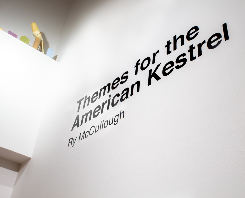
The exhibition is titled Themes for the American Kestrel. There’s a curious group of objects way up on one of the gallery’s architectural ledges, next to the title wall, with one of the objects resembling a bird, watching all that’s below. This little vignette does not have a title or exhibition label, nor is it acknowledged anywhere else, and being high above eye level, could be easily missed.
Ry McCullough, Themes for the American Kestrel, installation view. Image courtesy of Gallery114@HCC Ybor City Campus.
Perhaps the zen like statement from the artist in the exhibition brochure may explain this apparition high on the ledge: “I sit and the bird arrives or the bird sits and I arrive, or not.”, or maybe it’s the meaning of the exhibition title, or both, or neither.
The exhibition brochure, designed like one of the framed wall works, is very handsome, includes a meaningful quote from Virginia Woolf, with the opening phrases: “How much better is silence; the coffee cup, the table. How much better to sit by myself like the solitary sea-bird that opens its wings on the stake….”
Following this is a brief artist statement outlining his ideas and intentions. Towards the end of the statement, McCullough references the artist Giorgio Morandi and his still-life paintings as a counterpoint to the evolving compositions in his video piece.
Ry McCullough, Themes for the American Kestrel, installation view. Image courtesy of Gallery114@HCC Ybor City Campus.
Morandi (1890-1964) lived his whole life in Bologna, Italy, where for the last 40 or so years of his artistic practice he maintained a singular focus on regimented compositions of bottles, vases, and similarly shaped and size objects, painted with subtle hues and tone gradations. It is an ascetic discipline, like a monk repeating a mantra, like Sol LeWitt’s endless iterations of the skeletal cube. The subtlest of details and changes are noticed with potential significance, like when physicists discovering an elemental particle, or that tiny chili pepper altering the flavor makeup of an entire dish.
If Morandi’s 40 years could be compressed into a 20 minutes time-lapse video, the result might be something like McCullough’s own video performance. Of course, a time-lapse video skips over many moments and details. But what is 40 years or 20 minutes, barely a nanosecond within a razor-thin sliver of a rock layer tucked in a stratum of the earth’s crust in the expanse of geologic time.
The exhibition is open to the public by appointment through June 24, 2021. For additional information about the gallery visit the Galleries at HCC website.
Ry McCullough received his MFA in Printmaking and Book Arts from the Lamar Dodd School of Art at the University of Georgia. He is an Associate Professor of Art and Design at the University of Tampa in Tampa, FL.
“The main appeal of the name is that it speaks to how an artist collective functions on exhibition night: one shared space with many distinct voices.” – Katelyn Montagna and Adam Mathieu
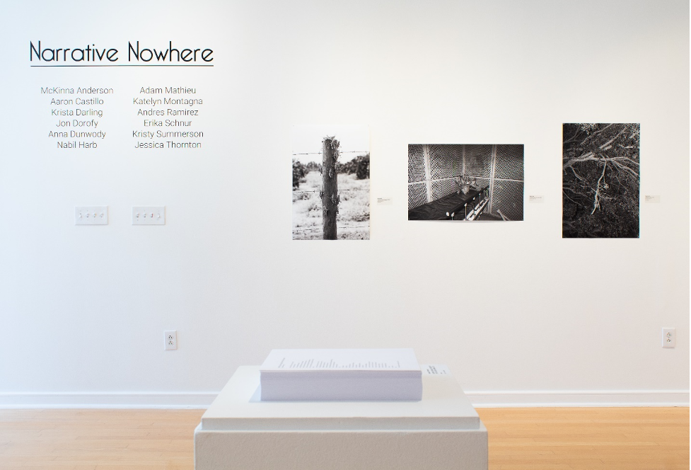
Separate Checks is an artist collective founded in the summer of 2018 by Katelyn Montagna and Adam Mathieu, who created the group to reconnect with friends and encourage each other to produce new work. Additional members include McKinna Anderson, Aaron Castillo, Krista Darling, Jonathon Dorofy, Anna Dunwody, Nabil Harb, Andres Ramirez, Erika Schnur, Kristy Summerson, and Jessica Thornton. Many members are University of South Florida alumni who came through the School of Art and Art History’s photography program or the School of Advertising and Mass Communications. It is easy to imagine that assembling the group’s roster had a definite “getting the band back together” feeling.
While the USF connection forms the backbone of Separate Checks, other artists have joined by contacting Adam and Katelyn on social media. Adam amusingly recalls how member Aaron Castillo slid into his DMs on Instagram before meeting with him and Katelyn in person. They describe the encounter as feeling like they were on a blind date with a photographer, but thankfully everyone clicked and the date did not end in awkwardness and disappointment.
Installation view of Narrative Nowhere exhibition at Gallery221. Photography credit: Emiliano Settecasi.
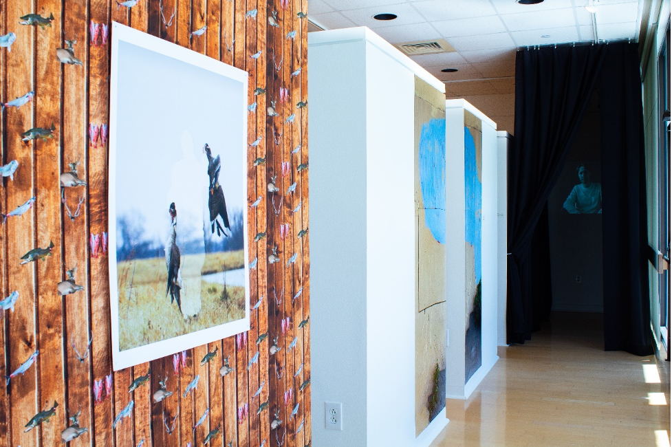
The many distinct voices of Separate Checks will be in conversation with each other in Narrative Nowhere, showing at Hillsborough Community College’s Gallery221@HCC Dale Mabry from November 2 – December 10. Visitors are encouraged to view the show in person, by making an appointment on the Gallery221 website and following guidelines on social distancing. Originally slated to debut this spring, it is yet another exhibition that was postponed because of the coronavirus. The show’s change in schedule also led to a change in content, as the extended timing allowed artists to respond to their experiences over the past eight months of this turbulent year.
The initial concept of Narrative Nowhere was to invite other artists to collaborate and reflect on personal histories and the geographic spread of the group, but some members have refocused on addressing Covid-19, racial tension in the United States, and the U.S. Presidential Election. The collective has worked in concert with Gallery221 director Amanda Poss to adjust to these atypical conditions and deliver a show well-suited for this cultural moment.
Andres Ramirez is one member whose work confronts the political, with the artist reacting to the Trump administration’s brutal border policies. His images in Narrative Nowhere are “about facades and what hides behind them; whether they’re digitally invented or not, these images are constructions much like the norms of our society.” This year he has been grappling with the concept of borders and their violently divisive nature, as he questions whether they should even exist.
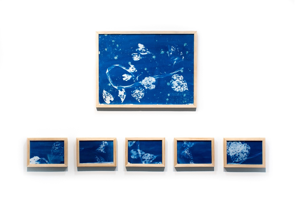
Anna Dunwody, Sempiternity I and Dioscorea bulbifera 1-5, 2020, cyanotypes. Photography credit: Emiliano Settecasi.
Anna Dunwody’s recent works tangle with themes of loss, discovery, and regrowth. Here she displays a series of cyanotypes that she created while in quarantine. She draws connections between the unpredictability of this year and her chosen media, musing that with cyanotypes “you can do everything with such care and intention and each one always comes out a little different and maybe not how you wanted or expected, much like life.” She says that in her work she seeks to find the constantly surprising and occasionally beautiful.
Installation view of Narrative Nowhere exhibition at Gallery221. Photography credit: Emiliano Settecasi.
The current exhibition at HCC represents a major sign of growth for the young collective, who previously held one-night-only showings in venues like the Creative Loafing Space and Dojo Sounds recording studio in Ybor. Those events emitted a special “blink-and-you’ll-miss-it” energy, where it was exciting to see a show in an unfamiliar space and not already know everyone there. However, Adam is thankful for the opportunity to display work in a fixed space like Gallery221, where the group can reach a wider audience and their works are given ample time and room to breathe.
The Main Course one-night-only show held at the Creative Loafing Space in 2018. Image taken by Anna Dunwody.
The members of Separate Checks meeting during simpler times. Image taken by an unnamed family member of the group. Sorry, fam!
Why join an artist collective in the first place? For McKinna Anderson, the group offers her friendship and a sense of accountability, without being restrictive or stifling her voice. Living in Nashville in 2018, she knew Adam and Katelyn from her time as an undergrad at USF and she found herself wandering through a similar post-graduate fog until she joined Separate Checks. She explains that the group has a tethering effect, acting as a lighthouse that always leads her back to the art community.
Separate Checks logo designed by Jonathon Dorofy
The group’s identity is still in flux, but it adopts several traits from its founders. Adam’s Fine Art background blends with Katelyn’s graphic and advertising skillset to produce something with an art school sensibility and savvy self-promotion. The mixing of elements is persistent among the membership, with both Aaron Castillo and Kristy Summerson moving between the Fine Art and advertising worlds. Member Jonathon Dorofy is also heavily involved with the group’s branding, where he imbues quintessential Florida motifs with a sleek veneer and graceful simplicity.
In a subtle way, the collective also has a quiet confidence that reflects Adam’s and Katelyn’s personalities, wherein his calm demeanor and her animated enthusiasm form a perfect partnership.
Separate Checks is currently finding its place in the Tampa Bay art community alongside established collectives like QUAID and the photography-centered Fountain of Pythons. USF photography professor Wendy Babcox is a member of FOP, and Katelyn remembers being intrigued by the group when Babcox mentioned it in class. Babcox’s guidance has had a lasting impact on Adam and Katelyn, and they single her out as an important mentor from their undergraduate days. Additionally, FOP member Selina Roman also serves as a member of Gallery221’s Advisory Council, and she proposed the Narrative Nowhere show to HCC. She was one of the earliest and most ardent supporters of Separate Checks, and she continues to offer her encouragement on its ventures.
What is next on the menu for the young collective? The group plans to eventually host a juried show, and they have kicked around the idea of having their own permanent exhibition space. They are becoming friendly with other artists collectives such as Portland’s Small Talk Collective and are discussing a show exchange and curating each other’s work. For now, they seem content with taking things as they come and not looking too far ahead.
When it comes to Separate Checks, part of the excitement is in not knowing what comes next. For many viewers, the Narrative Nowhere exhibition is likely their first exposure to the group. This show provides a rare chance to see numerous artists creating work together in the early stages of their careers. These separate voices are coalescing into something new right before our eyes. Don’t blink and miss the moment.
Narrative Nowhere runs from November 2 to December 10 at Gallery221@HCC Dale Mabry campus. To learn more about the gallery and make an appointment to view the exhibition, follow these links:
James Cartwright earned his M.A. in Art History from USF in 2017. He focuses on cross-cultural exchanges in art production, while occasionally wandering into the realm of contemporary art criticism. He is an adjunct Art History instructor at USF and the University of Tampa, where he uses his liberal arts background to joyfully corrupt the impressionable youth of America.
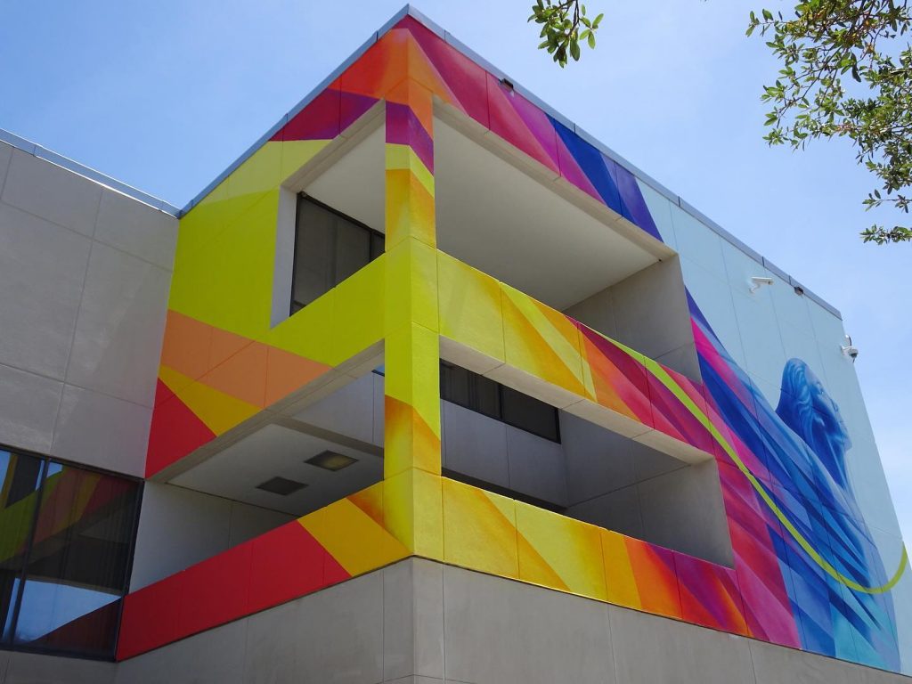
In the fall of 2019, Grounds4Art@HCC commissioned artist Cecilia Lueza to complete a mural on the Hillsborough Community Collge Dale Mabry Campus focusing on the theme of health and wellness. Community partners, such as the City of Tampa’s Arts & Cultural Affairs division, worked alongside a committee of HCC students, faculty, and staff to create a mural that would reflect upon the theme, taking into account feedback from the community, and to raise awareness of social issues such as food insecurity and mental and emotional health. The project resulted in a mural titled Exuberance that was completed in April 2020 on the exterior of the Social Sciences building. The artistic component was funded by a Community Arts Impact Grant through the Arts Council of Hillsborough County.
Amanda Poss is the Gallery Director of Gallery221@HCC Dale Mabry Campus and the Committee Chair for Grounds4Art@HCC.
Amanda Poss: I wanted to start this conversation with the opportunity for each of you to introduce yourself to our readers.
Cecilia Lueza: I’m a public artist with a focus on sculpture, mural art, and mixed media installations.
Melissa Davies: I work for the City of Tampa in the division of Arts & Cultural Affairs. I’m now in my 16th year there, believe it or not, working solely on public art projects. I’m a Tampa native… and I’m also a board member of the Florida Association of Public Art Professionals.
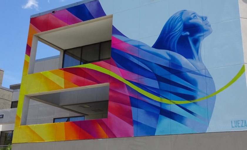
AP: Thank you both for introducing yourselves! Cecilia, let’s start with you and talk about your work, which can be found all over the Tampa Bay region. You have developed this very cohesive, very recognizable style: bright, colorful, and bold—often full of geometric patterns and shapes found in nature. This is something that you also brought to the mural you completed earlier this year at Hillsborough Community College (HCC), which you titled Exuberance. Could you describe what led you to this particular approach to art making?
CL: Well, it’s interesting because before moving to the United States, I was a very monochromatic type of painter. But I have always had a love of lines and curves and geometric elements. Then I moved to the US and things started changing—gradually I started incorporating more color, experimenting more, and trying to find a balance between geometric elements and color. I think that Florida, with its natural beauty, the light and the vibrancy really influenced my style. As an artist, especially as an art student, I was always looking for inspiration somewhere… and then I finally realized that nature has the answers.
AP: You can definitely feel that reaction to the Floridian landscape in your work. I’m a transplant from the Midwest, and color is something I always very strongly identify with Florida, living down here next to the water, surrounded by the pastels of beach houses, vibrant tropical plants, and the wildlife… So I love that you went from monochrome to this explosion of color in your work.
CL: Yes, because before Tampa Bay I was living in Buenos Aires, and in big cities, like New York, almost everything is monochromatic, buildings are gray, people wear neutral colors—wherever you live, as an artist, that influences you, and can really alter your work.
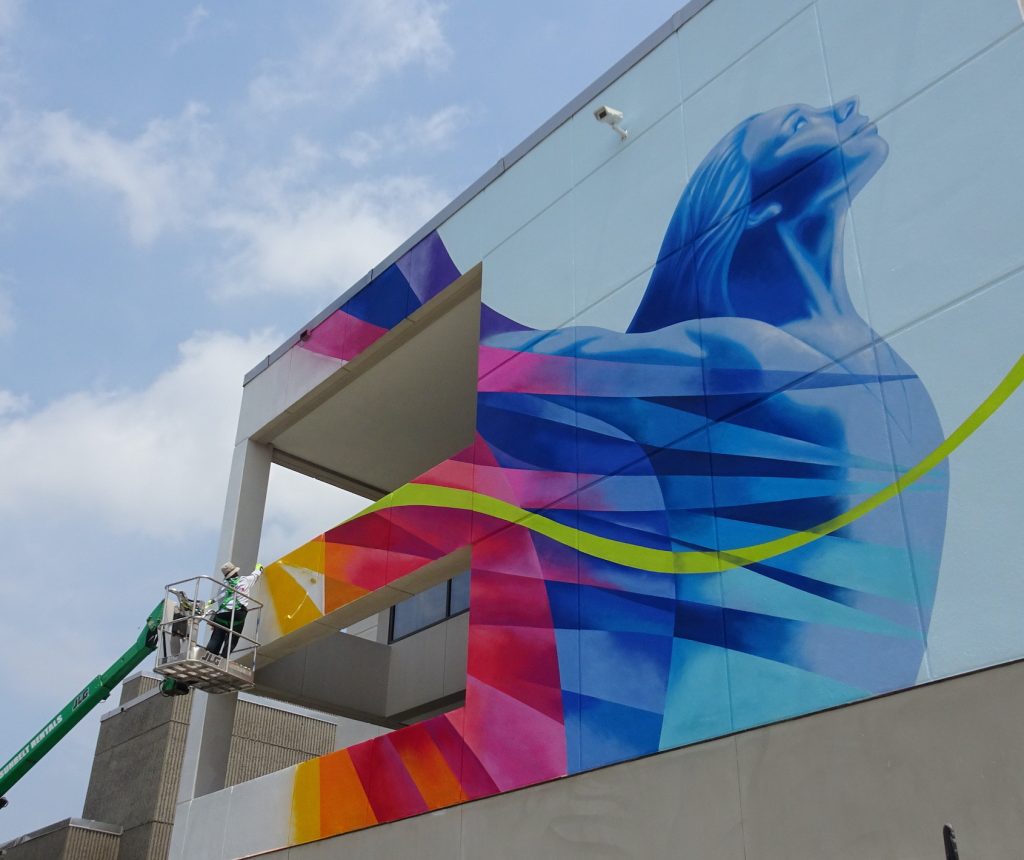
Lueza’s mural titled Exuberance that was completed in April 2020 and is located on the exterior of the centrally located Social Sciences building on the HCC Dale Mabry campus in Tampa, FL. The project was partially funded by a Community Arts Impact Grant through the Arts Council of Hillsborough County.
AP: So, what specifically inspired your design for Exuberance at HCC?
CL: First of all, it was the meeting we had with the community and the students. In this meeting, they learned about my work and we showed them [my] other projects, and they expressed that the colors made them feel amazing, and it was an expression of feeling good in every sense of the word—physically, emotionally, spiritually, mentally. So that was the starting point for me, this concert of colors as a symbol of complete wellness.
In early 2020, Lueza participated in a comprehensive and interactive Community Dialogue discussion about health and wellness with HCC Dale Mabry Campus students, faculty, staff, the campus Public Arts Committee, and members of the Tampa Bay community. Photo: Courtesy of Gallery221@HCC.
AP: Yeah, that was the Community Dialogue event that we hosted back in January, which seems so long ago now… You’ve mentioned in other interviews that you really thrive on meeting people and working with people in different locations, hearing their thoughts and impressions. Was there anything that some of the students or the participants of that event said that led you to this idea of a holistic sense of wellness, a well-being of the spirit?
CL: At one point I was at a table with two or three girls and they were telling me about their expectations for this mural. They wanted to see something that made them happy, something to uplift their spirits, to inspire them and make them feel proud.
AP: I remember you sitting with those girls. During the event I was so impressed by the way you connected with the participants. For instance, you spoke Spanish with them and I think that allowed them to feel comfortable and build a rapport with you—they were in conversation with you for a long time.
CL: Yeah, they were funny and sweet, and many of the students spoke Spanish… so it was easy for me to really connect and understand what they were trying to tell me.
AP: I think they felt like you could really listen to them.
CL: Yes, I love to listen to other people’s stories… I usually prefer to listen to other people.
MD: I think those conversations are really important for a successful end product and installation [of art], because not only does the artist listen and convey that into some level into the design, but also, on the flip side, the people that are involved really take ownership of it, and take pride in the fact that they were part of the process. The cool thing about public art is that every single space is different, every single community is different, and every team is different.
AP: Absolutely. For us, working with community partners and listening to community feedback was especially significant given our project’s focus on health and wellness. I also think, broadly speaking, we’re seeing this intersection of public art and social issues more and more in recent years.
CL: People want to see something that’s not just beautiful, but also meaningful and conveys a message that speaks to them and expresses what they feel… they want to see that they are represented. I think it doesn’t have to be a very complex type of art for people to really connect with it and to find something that’s not only about beauty but also meaning.
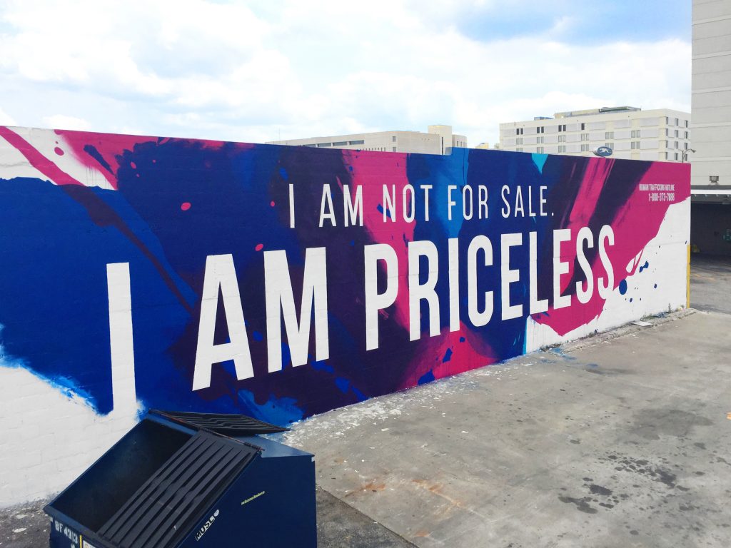
Tes One, I AM PRICELESS, 2017. Initiated and funded by the Junior League of Tampa in collaboration with the City of Tampa’s Division of Arts and Cultural Affairs. Photo: Courtesy of Tes One.
MD: There’s so much going on right now, for instance… on the front page [of the news] with Black Lives Matter murals throughout the country. Artists leading social justice projects can be really impactful. For instance, the City of Tampa was approached by the Junior League of Tampa, who wanted to do a mural highlighting the issue of human trafficking, which is a huge problem in Hillsborough County… So we brought in a local artist named Tes One [for the project]… and he met with former victims, organizations that help the victims, the Tampa Police Department and then with the Junior League of Tampa. The end result was a very powerful mural featuring the words “I am not for sale, I am priceless.” Additionally, in the upper corner, the artist added the human trafficking hotline. The location of the mural was situated in an area that is right by the bus station… and between the location and raising awareness… if we just reached one person, you know? A spin-off of that project is that Tes One brought in another local artist, Jay Giroux, who took the theme “I am priceless” and installed posters at a lot of the bus stops throughout the city of Hillsborough County and the City of Tampa.
AP: So, Melissa, in your view, how have public art projects have grown, developed, or changed in our area from where they started to now?
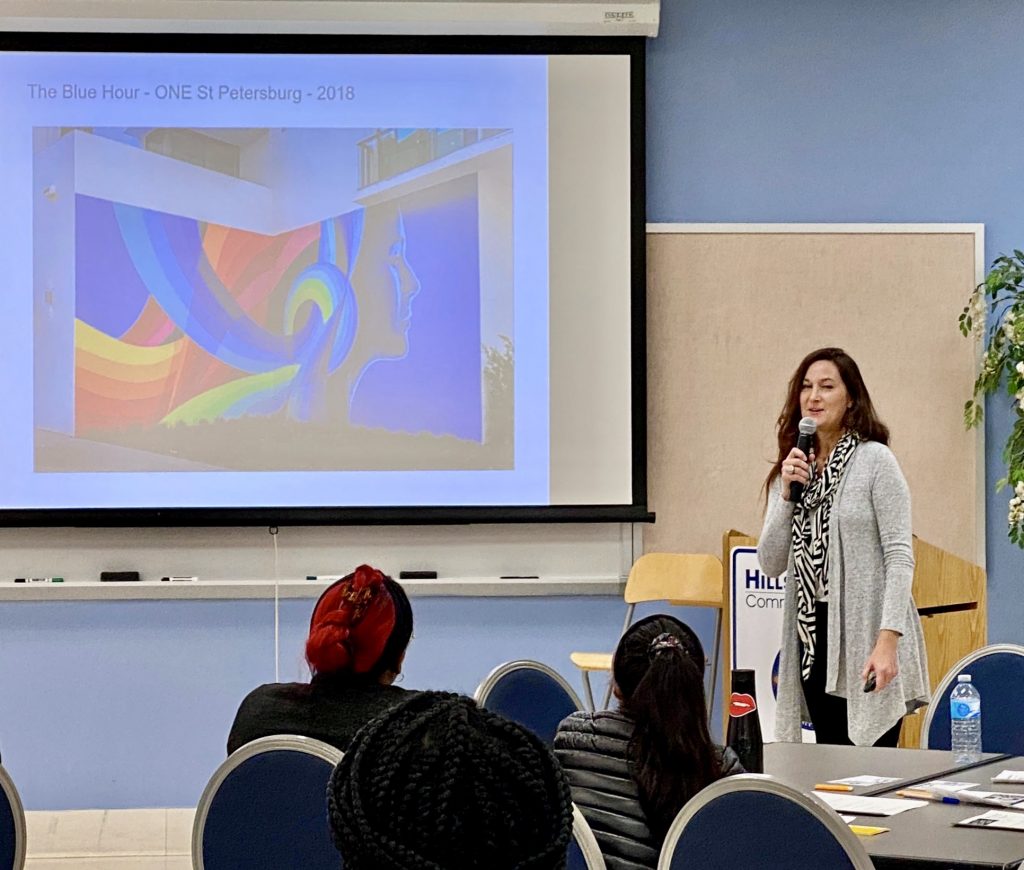
MD: The City of Tampa’s public art program started in 1985. Back then, there were trends in public art like ‘plop art,’ purchasing or commissioning sculptures [for buildings]. In the 90’s there were more traditional public art installations at community centers. Over the last 20 years, under Robin Nigh’s direction, the program has grown through innovative programming that has been recognized by the Americans for the Arts public art network. We had a photographer laureate program, which really grew the public portable works collection, that also documented Tampa throughout a 10 year period, and we also saw technology change within those 10 years pretty rapidly. Lights on Tampa has been running since 2006 and is still going strong. Since Mayor Castor has been in office, we have a new program called Art on the Block, which seeks to get art and artists into neighborhoods. We have a wordsmith that is under contract—which is sort of like a poet laureate. We also have artists Sheila Cowley and Matt Cowley who are husband and wife team. They’re writers based in St. Pete—Cecilia, you may know them…
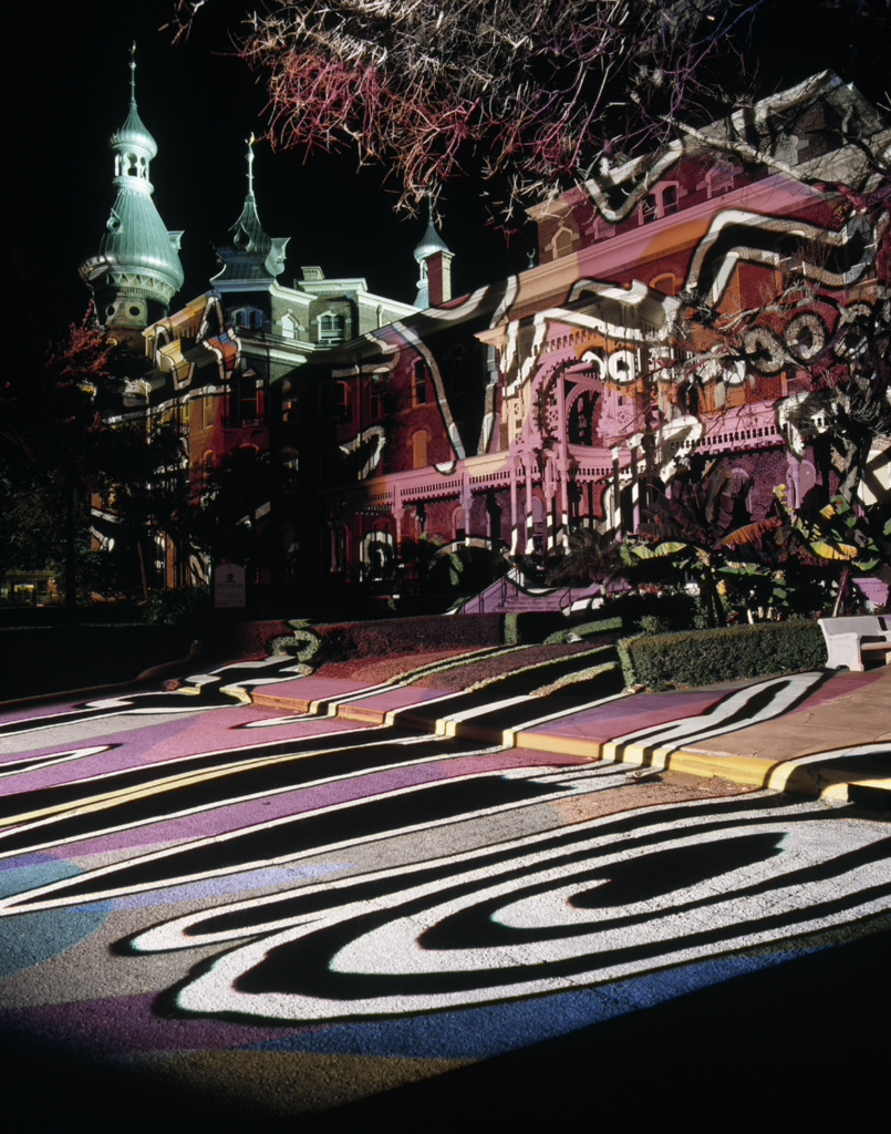
For the inaugural 2006 Lights on Tampa Paris-based artist and architect Jorge Orta created a projection on the University of Tampa’s Plant Hall, which transformed the iconic 1891 landmark and its surrounding environment for one night.Photo: Courtesy of the City of Tampa’s Art Programs Division.
CL: Yeah, I know them.
MD: He’s a Foley artist and sound engineer and she’s a writer… they’re working with Paul Wilborn and bringing in a team of actors, lyric authors, and literary artists to compile a sensory experience at Centennial Park… Public art can just come in different types of forms: it can be sculpture, sound, all sorts of different elements. Of course, we are still doing many traditional public art installations, but our primary goal is that it makes sense to the community and has context to the site.
AP: Cecilia, how about you? As someone who’s completed numerous artworks in the public realm for many years, what changes have you observed in the attitudes and culture surrounding public art?
CL: What I’m noticing is that people have more knowledge about public art now, I’m seeing public art agencies and committees doing a lot of research, talking with different artists, connecting with their communities and looking at collections in other cities, incorporating more community-based projects to their collections. So, I’m seeing a great, very positive, change.
AP: This is a conversation that parallels public art on a national scale with community-driven projects and programming. The idea of awareness is particularly important and transformative to how we approach public art, creating not just something that’s done to a community, but by, for, and with a community… So related to that point, I wanted to ask: what motivates and inspires both of you to continue working in the realm of public art?
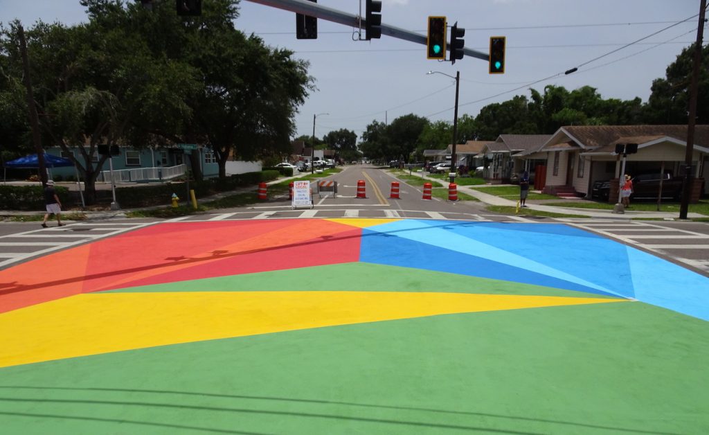
Lueza participated in the City of Tampa’s 2020 Art on the Block Mural Day. Located in West Tampa at the intersection of Habana Avenue & West Tampa Bay Boulevard, volunteers were provided by the Our Aim Foundation. Photo: Courtesy of the City of Tampa Art Programs Division.
CL: For me, public art is a way to communicate with others. I was very shy as a kid growing up, and I realized that art was both a way to express myself and to connect with others. What I love about art and public art in general is the connections you create with the viewer, with people from all walks of life, especially during the process of bringing the artwork to life. There’s also the challenge of transforming a public space and making the space better than it was… to see this radical transformation. That’s why I want to keep doing it.
MD: I feel the same way. I like the connection to people, not only the community, but also each team, like I mentioned before. Each team is different, each site is different… it’s constantly changing. My primary role is as Project Coordinator, so digging into the details of the logistics is my thing, it’s exciting and fun. Sometimes it can be stressful, but you problem-solve and work with the team… I’ve worked with artists on design teams that have worked through challenges and have just completely transformed the space. I just love seeing the projects come about—being able to work and get to know our artists both locally and from around the world.
AP: I completely agree. For me, managing a public art program wasn’t originally part of my job description when I started working at HCC, but… between community involvement and that moment of radical transformation, as you said, Cecilia, there’s just something magical about it every time it happens. The last question I want to ask is: what have each of you been working on since we completed the mural Exuberance at HCC? Are there any recently completed projects or events on the horizon that we should know about?
CL: Well, I’m working on two sculpture projects: one is for Jacksonville, Florida, and the other one is going to be installed in Tarpon Springs, Florida. Right now, I’m on my way to Kentucky to complete a mural project that’s been in the works for months and months due to coronavirus.
New Tampa Community Center’s new 2020 installation. Photo: Courtesy of Matt May Photography.
Lights on Tampa rendering courtesy of Erwin Redl.
MD: We actually just finished an installation a couple of weeks ago with a local sports photographer, Matt May. Matt worked with the kids (gymnasts) and took action shots and created a window installation. The kids were thrilled to be a part of this, to see their images in the windows, and to be photographed by someone who shoots professional athletes… We’re also about to do a community project with local artist Ya La’Ford… Then, of course, there are a couple of Lights on Tampa installations. One is Erwin Redl who’s based in Ohio and New York—we actually worked with him in 2006 for Lights on Tampa—and he is under contract to do an installation underneath the Channelside Drive tunnel. We’ve also commissioned artist Andrea Polli, who is based out of Santa Fe, to do a sort of canopy of LED lights to emulate bioluminescence that’s going to be programmed and triggered by sensors. This will be on the Riverwalk under the Harbour Island Bridge. I think it will shine a light, if you will, and bring some positive energy that we need these days.
To learn more about HCC’s public art program, visit: Grounds4Art@HCC. To learn more about Cecilia Lueza, visit her website. Learn all about the City of Tampa’s public art program on their website.
When this article was written, the Public Art Committee and I were full of enthusiasm and anticipation. Months of meetings, preparation, and planning were beginning to culminate in the realization of a new mural and in a series of community-driven programs that would accompany the mural’s unveiling. Students and volunteers from the community were gathered to assist with the fabrication. However, with the arrival of COVID-19 in March, it was no longer safe for communities to gather the way we were used to, and many plans were suspended. Despite all of this, creativity continued on. Cecilia Lueza safely worked alone to complete a vibrant mural, titled Exuberance, which exudes an uplifting message of well-being that feels all the more necessary in the midst of a pandemic. Once it is safe to gather together once again, we still plan on hosting events to celebrate the completion of Exuberance and to raise awareness of health and wellness resources for our community–and I, for one, am looking forward to that day! Amanda Poss, Gallery Director, Gallery221@HCC Dale Mabry Campus
The 2019/2020 Grounds4Art@HCC Health & Wellness Mural
by Jeffrey Rubinstein
Students, faculty, staff, and visitors to Hillsborough Community College’s Dale Mabry campus must be noticing a much higher presence of art, murals, and especially, student involvement in the college’s public art projects. Recently, HCC has also increased its footprint for health, wellness, and food security programs. With the ever-growing awareness of the connection between food security and academic performance, members of the HCC Public Arts Committee, Feeding Tampa Bay, Bay Art Files, and The City of Tampa Arts and Cultural Affairs joined forces and began meeting last year to design and create a large, visually engaging mural on the exterior of the Social Sciences building of the busy, urban Dale Mabry Campus in Tampa. The mural will be a permanent reminder that each of us must proactively sustain our well-being through health and wellness.
Under the direction of Gallery Director Amanda Poss, Gallery 221@HCC received a grant from the Arts Council of Hillsborough County for the 2019-2020 mural project. The project was conceived by the Grounds4Art@HCC initiative, HCC’s public art program, formed in 2018. Two other community-centric exterior mural projects have been completed to date, with more in the works as additional funding and sponsorships become available.
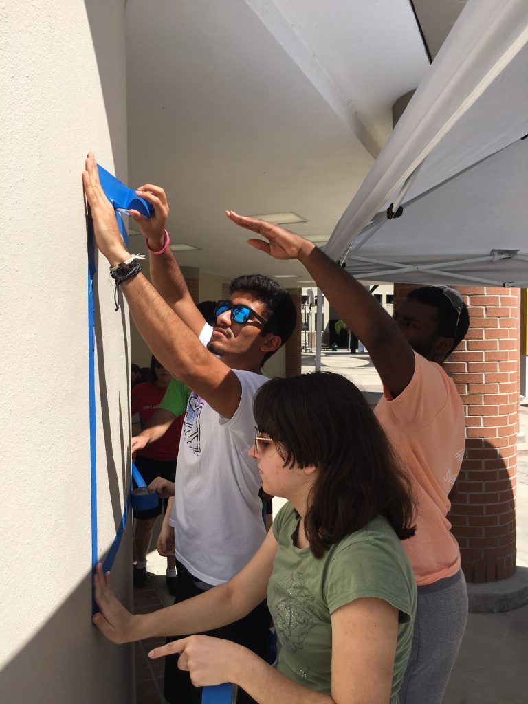
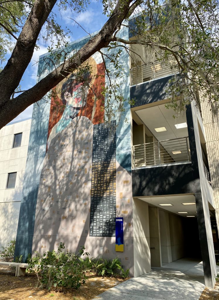
The first Grounds4Art@HCC Mural was created by Florida-based artist Michael Parker in collaboration with HCC students during the spring of 2019. Visible from the main courtyard of the campus, the 67-foot-long mural titled Infinite Transitions is located on the ground floor of the Learning Resources Center (DLRC) and is directly below Gallery221. Egyptian artist Aya Tarek’s large-scale mural was the second public art project to be completed on the HCC Dale Mabry Campus. Tarek, a prolific artist who has created murals in Cairo, Berlin, São Paolo, and Portland, worked on campus with HCC students and community members to fabricate the mural. Titled Painting Ourselves Visible, the mural project and related programming sought to celebrate and increase the visibility of Arab, Middle Eastern/North African (MENA) and Muslim communities in the Tampa area. Organized in conjunction with the community organization Art2Action, this project was made possible with the support of the Gobioff Foundation Treasure Tampa Grant and can be seen on the west side of the Humanities building (DHUM).
Poss explains and gives us insight into the process for such a large project involving so many various local entities: “Our newest Grounds4Art@HCC mural is envisioned as a creative placemaking project that sheds light on the theme of health and wellness. The mural will provide vibrancy and color to the heart of campus while at the same time highlighting the Social Sciences building as the home of our campus’ newly established food pantry. It will be a large canvas for the artist to work on–over 65 feet in length spanning the upper section near the building’s southwest entrance.“
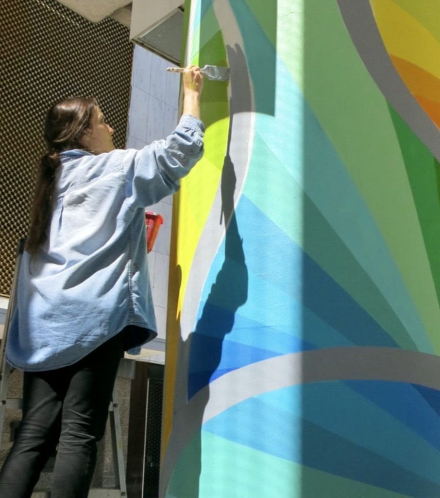
Artist Cecilia Lueza at work on one of her numerous public art projects located throughout Florida and the southeastern United States.
In early 2020, artist Cecilia Lueza participated in a comprehensive and interactive discussion about health and wellness with HCC Dale Mabry Campus students, faculty, staff, the campus Public Arts Committee, and members of the Tampa Bay community.
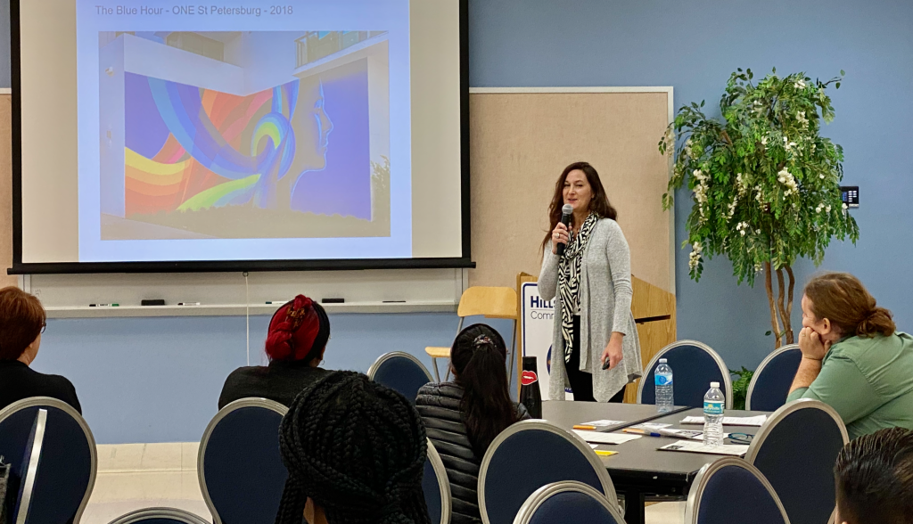
The focus of this exciting project is health and wellness, will culminate in a dynamic and visually engaging mural by Cecilia Lueza, an Argentinian-American artist-based in Tampa Bay. The mural will be the final step in a long process that involves HCC students from its inception. In early 2020 on the HCC Dale Mabry Campus, the public arts committee, the artist, staff, faculty, students, and members of the Tampa Bay community engaged in a comprehensive and interactive discussion that allowed the artist to hear directly from students about how they think about health and wellness, and how this can be interpreted visually. The artist will ultimately, create the mural, but the image is based on feedback suggested by HCC students. Lueza described the feedback she received, “The majority of the students suggested the mural should inspire, connect, beautify, stimulate thought, have a sense of motion, and be geometric, bright, energetic, lively and represent mental health in a positive way.” Lueza presented three design options on February 14th and voting commenced until the 17th.
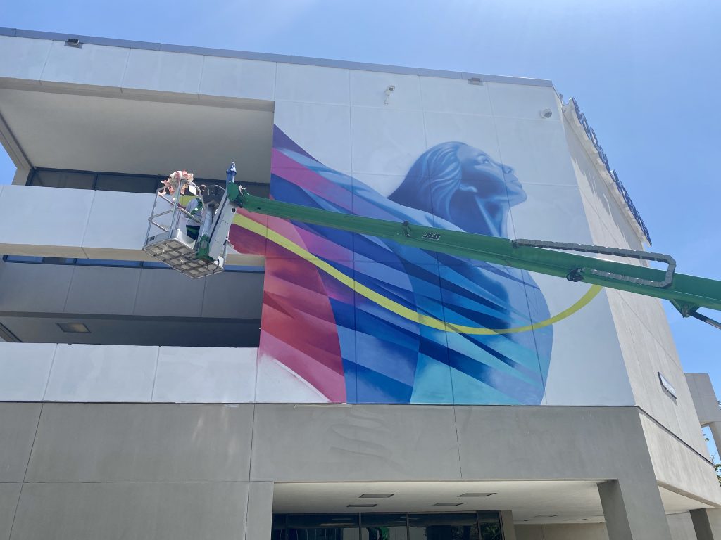
Based on the winning design, the mural will be an impressive composition of a fit and healthy young person, possibly a student, her head and eyes skyward, all in a palette of vibrant tones, at the prow of a flowing wave of energy that she creates. The image is provocative enough to allow viewers to contemplate the mural’s themes. Health and wellness are more than what we eat or how often we go to the gym. It is a mindset and lifestyle that includes our thoughts and attitude toward life and the energy we create and leave behind us.
Poss expands: “The majority of the mural’s fabrication took place in March and April and we are planning a free public unveiling party and related programming to occur in the Fall of 2020. Everyone who would like to participate in will be encouraged to attend, whether they are a part of the HCC community or a member of the Tampa Bay area community at large.”
Artist Cecilia Lueza high above the ground in a cherry picker during the Spring 2020 installation phase of Exuberance, the newest addition to HHC’s public art program on the Dale Mabry campus.Located on the exterior of the Social Sciences building, the mural takes its inspiration from issues related to food insecurity, mental and emotional health, and social and cultural inclusion.
To be officially dedicated and unveiled in the Fall of 2020, the mural Exhuberance will be on permanent display on the HCC Dale Mabry Campus in Tampa and will be a visual reminder to the entire community that health and wellness are part of a journey to be embraced that includes more than exercise and nutrition but exposure to the arts, as well.
About the author
Professor Jeffrey Rubinstein is the English Discipline Chair and the college-wide Tenure Committee Chair at Hillsborough Community College in Florida. Based on the Dale Mabry Campus in Tampa, he is a founding member of Grounds4Art@HCC.
About the artist
Argentine American artist and sculptor Cecilia Lueza, studied visual arts at the University of La Plata in Buenos Aires, Argentina. Today, she is well known for creating vibrant public art pieces in a range of mixed media. Since 2000 she has been working on a variety of public art projects in many cities throughout the United States. Her work has been exhibited at Art Miami, Arteamericas, and Scope Miami Beach, and in the last year she completed public art pieces in Washington DC, Jacksonville FL, West Palm Beach, and St Petersburg FL among others.
Additional reading
Maggie Duffy, Bright Spot and Art Reporter Tampa Bay Times April 28, 2020
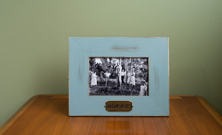
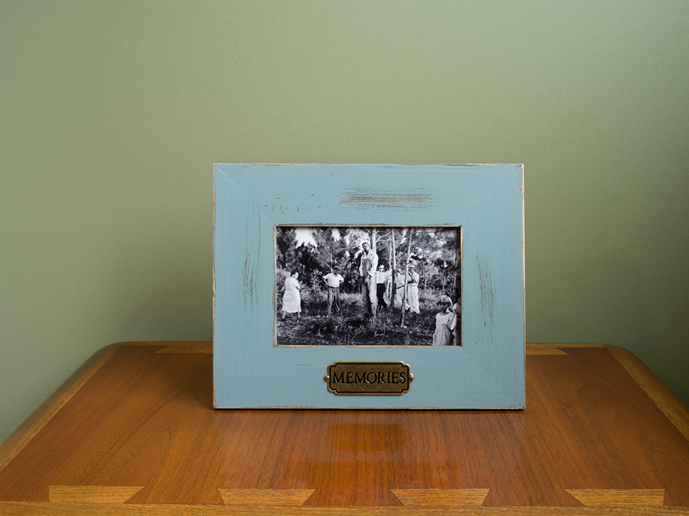
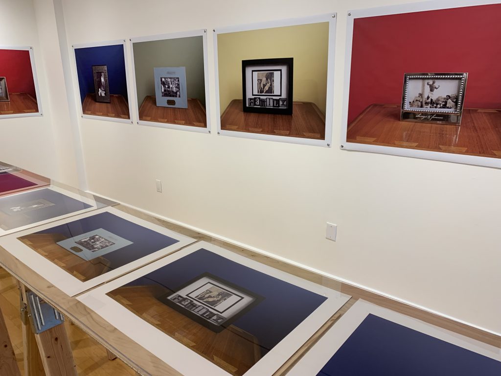
Untitled (Memories) from the series Family Pictures, 2016. Image courtesy of the artist and Samsøñ.
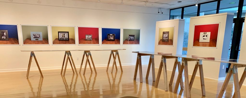
Walking into this exhibition, steve locke: the color of remembering, I was first drawn to the photos with the ornate picture frames. Looking at the frames, I was instantly reminded of the sort of objects in my mother’s home and the sticky vinyl inspirational messages written in cursive on the walls of her kitchen. But after looking closer at a pretty light blue frame that read “MEMORIES” [Untitled (Memories)] on a golden plaque, I had to look away. I was not saddened or shocked by the photo of a Black man strung up on a tree, surrounded by observing multigenerational white bodies. I’ve seen photos like this before. I have seen photos like this recently. I looked away as a reflex. As a coping mechanism. These kitschy picture frames, photographed on top of a smooth wooden surface and a vibrant colored backdrop, looked like television screens to me. These domestic, familiar picture frames look just like my newsfeed. Steve Locke’s Family Pictures series are mementos inside of the homes of America’s dominant culture. The work in this series brings into focus America’s continuing tradition of violence and subjugation of Black people. Locke does this in a clever way by bringing us into Somebody’s living room and having us come to accept that this tradition is as American as my own mother’s “ EAT DRINK AND BE MERRY” vinyl quote on the kitchen wall.
I had the privilege of attending Steve Locke’s artist talk at the opening of the show and hearing him talk about the subject of the work was helpful in understanding Family Pictures in today’s political and social climate. After the talk and we spent some time discussing the spectacle nature of “Black Death” in the media. Violence towards Black people often goes viral in a sensationalized way. It feels like the announcement of a new “Black Death” is like the release of the most current iPhone. The hype comes and goes like new technology and returns when replaced with the next one. Media outlets delight in providing the public with new and exciting footage for controversy’s sake. In his exhibition statement, Locke goes on to write: “You can see a video, repeatedly (or even as a background image) as two people discuss a man being strangled or shot. To death. The prohibition of showing the deaths of victims is waived when the victim is black. Their last words are broadcasts. Their bodies left in the street as a warning, or as a provocation. You cannot imagine seeing the victims of Columbine or hearing the tapes of Sandy Hook, but for some reason, you can see a black man killed on your television. You can sit in a pub, a waiting room, your well-appointed home with its flat screen tv and see someone killed. These images are public and private and downright quotidian.” The images that we see every day are not coincidental, but deliberate attacks. It is about power and dominance. Our ability to spread information quickly has resulted in a different kind of cultural consciousness.
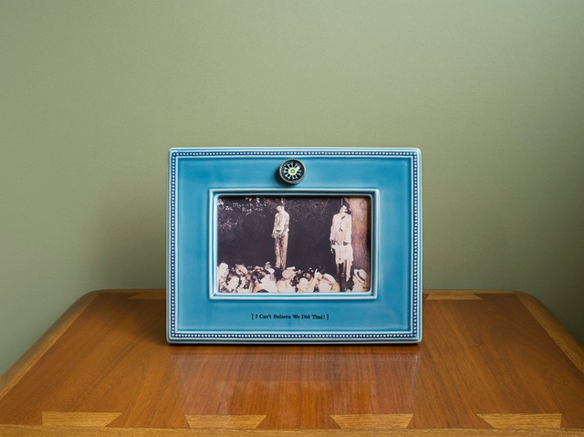
Untitled (I Can’t Believe We Did That!) from the series Family Pictures, 2016. Image courtesy of the artist and Samsøñ.
Two works in particular that have been stuck in my memory for weeks are Untitled(I Can’t Believe We Did That!) and Untitled (Mother). Both photographs involve something so uncomfortable literally reframed into something more pleasing, more palatable to look at. The frames resemble mass-produced picture frames with someones staged memory inside. Looking at Untitled (I can’t believe we did that) in all of its pretty blue glory seriously messed me up. The photo shows the lynching of two Black men (Thomas Shipp and Adam Smith) in Indiana in the year 1930. Below them, is a crowd of white spectators pointing at their bodies and looking at the camera. At the bottom of the frame, it reads “I Can’t Believe We Did That!” This historical picture was originally produced as a postcard, a keepsake, a pleasant memory. It is a funny statement. I’ve heard many variations of “I Can’t Believe We Did That!” From white people apologizing to me about slavery, Jim Crow, and police violence. I imagine the white people in this picture to have thought the same way. I imagine that they too could not believe that they were lucky enough to get such good seats at a hanging and be able to memorialize it.
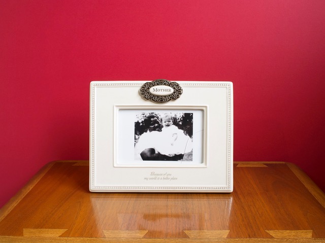
Untitled (Mother) from the series Family Pictures, 2016. Image courtesy of the artist and Samsøñ.
I am always drawn to images representing Black womanhood, especially ones that involve racial archetypes. I believe that it is important to remember and notice the roots of these inherently violent stereotypes. In Untitled (Mother) we immediately associate the woman in the picture as a caretaker or the “Mammy” archetype. According to a source, the woman is Mattie Lee Martin and the image is dated between 1950-1960. It is a beautiful portrait, with Mattie Lee Martin smiling while holding up a cheerful looking white baby. The text underneath the photo reads “Because of you, my world is a better place.” The narrative behind the Mammy character would claim that she would have loved the child as she would love her own and that she would have been content in her domestic role. The quote on the frame is a true statement. In this country, Black women have had to survive. As apart of her survival she has had to maintain the lives of white families, and raise them up through her mental, physical, and emotional labor. I think of this now in a contemporary context. I think of myself when navigating white spaces. I think of myself having to coddle white folk’s feelings when they’ve mistreated me. After reflecting on my own interpretations of the work, I thought about how non-black people were responding to the pictures. I ignored the weird, sympathetic, and disbelief that was coming from their mouths. I wanted to know how their insides felt.
I love how Locke’s work forces us to acknowledge the disconnect between the dominant culture and everybody else. I believe that the disconnect is both subconscious and conscious. The circulating of the past photos used in Family Pictures resemble the 24/7 unproductive and dehumanizing distribution of Black Trauma in the present. We want to remember these atrocities as atypical and that only the most evil people were complacent. We want to remember it all as a rarity. We want to believe in the “good ones.” As we refuse to recognize this as tradition and common practice, we continue to silence the oppressed and commit ourselves to misunderstand.
Tyra Mishell was born and raised in Bradenton, Florida in 1994. She is currently residing in Tampa where she will receive her BA in studio art from the University of South Florida in Spring 2019. She is a New Genres artist specializing in video, new media, sound, and performance. With a combined interest in media studies and the make believe, she produces IN SPACE TV, an experimental net-based television show.
steve locke: the color of remembering is on view at Hillsborough Community College’s Gallery 221@HCC on the Dale Mabry campus through March 7, 2019. In addition to the photographs from the 2016 Family Pictures series, there is an installation of Three Deliberate Grays for Freddie (A Memorial for Freddie Gray). Locke is an Associate Professor at the Massachusetts College of Art and Design in Boston, MA.
Tampa-based artist Omar Richardson exhibits large black and white woodblock prints and unique mono prints in Omar Richardson: My Story, My Truth on display in Gallery 3@HCC on the third floor. There is a public closing reception on Thursday, February 28 from 5 to 8 pm, with Richardson speaking at 6 pm.
On view through March 7th at Hillsborough Community College’s Gallery 221 as part of an annual exhibition celebrating African American heritage and presented in conjunction with the Tampa Bay Black Heritage Festival.
steve locke: the color of remembering is on view at HHC’s Gallery 221 though March 7th.
This exhibition examines how African Americans have been depicted in ways which betrays explicit and implicit cultural prejudices depending, in this case, the age of the memory. From schematic diagrams of slave ships, historical photographs of lynchings, to modern day video, brutality and racism – institutional or otherwise – images have been made and disseminated which tacitly imply values which we should, indeed, must find deplorable.
Not only by subject matter but, significantly, it is through the means of presentation that Locke employs in the photography series Family Pictures, 2016, that he addresses how different standards apply, in particular, that there isn’t an universal sense of respect and dignity when it comes to the memorialization of the atrocious. Locke himself memorializes images of the barbaric, setting them in unexceptional frames, engraved with the platitudinous and set against strong colored backdrops – notions of remembering and color are brought to the fore – the colors are strong but it is an overall sense of banality which is most provocative and the taint on remembering which Locke communicates most powerfully.
steve locke: the color of remembering is on view at HHC’s Gallery 221 though March 7th.
In Three Deliberate Grays for Freddie (A Memorial for Freddie Gray), Locke further confronts how there remains to this day a biased filter as to presentation of the African-American experience in the media. In this case, the tragic death of Freddie Gray on April 12th, 2015 whilst in the custody of the Baltimore Police Department. The intrusive and the demeaning combined with sensationalized reporting to ignore the dignity and suffering of this man. Validly, it might be asked had this not been a young African-American man whether the coverage would have taken on a different tone. By distilling the color palette of three commonly circulated photographs of Freddie Gray down to three hues of gray, Locke speaks to the debasement of this individual, his suffering and brutal death. Freddie Gray became a media-currency. His life and death had determined a value, that of a commodity. One that was exchanged between us and the news outlets. Locke shows us how we are complicit in this process, that the communication of outrage embraces complexities which have at their foundation the self same prejudices which they seek to make clear, here it is literally gray.
steven locke’s: the color of remembering at is a powerful exhibition. By bringing together the history of slavery, racism and subjugation through to the contemporaneous he threads a course of prejudices towards African Americans from the overt to the more hidden. It is instructive, in particular, how this exhibition focuses us on the modern day and practices which covertly but evidently seek to assuage the sensibilities of the mainstream at the expense of Black experience. The works themselves, are compelling and visually strong. The replication of composition in Family Pictures is one which has an unerring sense of imbalance. The images contained, framed with frames and repetitively composed powerfully suggest a diluting of content whilst, in fact, communicating the exact opposite. Steven Locke shows a consistent mastery of practice and sheer intellectual energy in working with the complexities of this difficult but very important subject matter. To be asked to re-think, indeed, re-remember and to give life and color to the challenging is the significant and worthy success of this exhibition.
At Bay Art Files, we have asked Tyra Mishell, who is pursuing a BA in Studio Art at the University of South Florida, to write about this powerful and timely exhibition. Her impressions of viewing the exhibition and meeting with the artist will post soon.
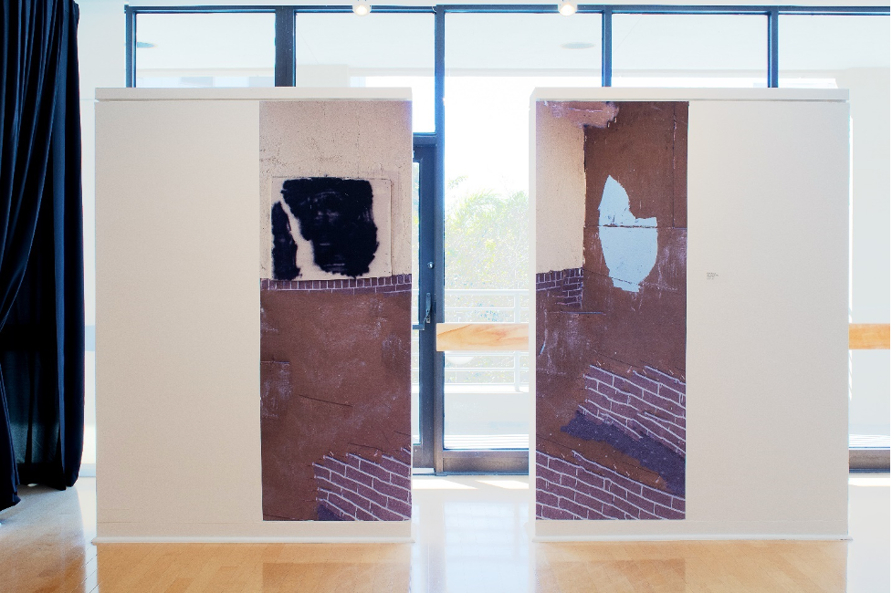
On view at the HCC Ybor City Art Gallery through Thursday, October 25, 2018. Photo: Courtesy of the artist.
Dormant
by Caitlin Albritton, 2018
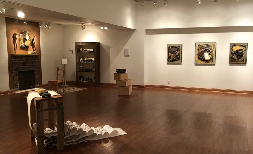
Suggesting something alive yet perhaps not actively developing, Edgar Sanchez Cumbas’s solo exhibition Dormant aims to question our internalized bigotry—the sleeping beasts within us—concerning colorism, racism, and identity.
Converting statements Cumbas has overheard people make about race or color and turning them into titles, these bits of poetic syntax add a touch of narrative to his abstract pieces. The verbal dismemberment in some of the names, like “Tan Neck” or “Skinned and Toned,” mirror the violence in the sharp, dangerous-looking forms in his “Neck” series, which reference the exoticism of hunter’s trophy heads placed on display.
Cumbas’ primary palette is limited to black, brown, yellow, tan, and white. From here, he adds his “secondary” colors—reds, greens, and blues—to create more multifaceted complexions. The added textures and forms are at once recognizable, yet unfamiliar: they create a push/pull situation where at one moment, the textures transform into a smear of luscious frosting, and at the next, they may look more akin to a mass of internal organs or a gaping wound.
Though his works are politically bent, Cumbas’ work refrains from the didactic; instead, his hand serves as a filter to distill information from the outside world to create something new that speaks to contemporary life. The tactility of his mark making in both his paintings and sculptures create a rough topography of built-up anger and resentment to the political climate, yet the soft, sensual surfaces also demonstrate Cumbas’ sensitivity to both his subjects and material. Overall, these works serve as an autobiographical statement of living through this current moment of transition.
This essay was commissioned by HHC’s Visual & Performing Arts Gallery and published as a gallery guide in conjunction with the exhibition.
Posted on Bay Art Files with permission by the author, artist and the gallery.
Detail of a work included in the exhibition.
Caitlin Albritton is an artist and freelance writer based in Tampa with a BFA from Savannah College of Art and Design and an MFA from Maryland Institute College of Art. When she’s not looking at art throughout town, she can be found making it. You can keep up with her visual art on Instagram @caitlinalbritton or on her website.
Edgar Sanchez Cumbas DORMANTis on view at the Hillsborough Community College’s Ybor City Campus School of Visual and Performing Arts Gallery through Thursday, October 25, 2018. The public is invited to a reception on Thursday, October 11, from 4:40 – 7:15 pm with the artist scheduled to speak at 5:30 pm. For additional information: www.hccfl.edu/yborgallery.


 Lueza’s mural titled