The Nellie Mae Rowe story via Cincinnati

The Nellie Mae Rowe story via Cincinnati
By Katherine Gibson

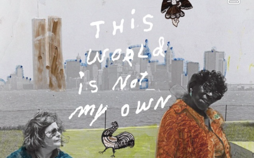
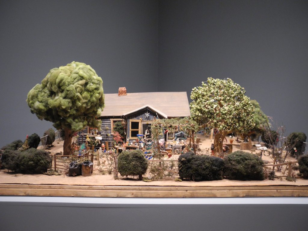
Ever since I saw the meticulous model of Nellie Mae Rowe’s Playhouse, which was created for the 2023 documentary about her life, titled This World Is Not My Own: The Limitless Story of Nellie Mae Rowe (TWINMO), I have wanted to see the film.

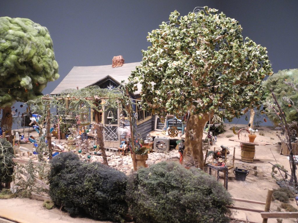
The Playhouse model as seen in the exhibition Really Free: The Radical Art of Nellie Mae Rowe.
High Museum of Art, Atlanta (September 3, 2021 – January 9, 2022) Photo: K. Gibson

I wrote about the model in a previous 2021 Bay Art Files article when I reviewed Really Free: The Radical Art of Nellie Mae Rowe exhibition at the High Museum of Art in Atlanta. The film is now out and a screening was scheduled in late August at the Cincinnati Art Museum. There happened to be a 21c Museum Hotel not far, so my decision was made. I would see the film, stay at the 21c, take in Cincinnati and write about all of it! I snapped out of my summer slump, rejuvenated to have plans and an assignment. (In case you didnt know, I am the official roving correspondent for Bay Art Files – Atlanta, Miami, Nashville, and now Cincinnati.)

The screening of This World Is Not My Own was part of the Cincinnati Art Museum’s programming during Creating Connections, Self-taught artists in the Rosenthal Collection, which included a Nellie Mae Rowe crayon-on-paper drawing, titled Pink Pig. The accompanying wall text read: “Her whimsical compositions feature animals and other motifs drawn in saturated, jewel-like colors. Here, the calm simplicity of the pig enclosed in a heart is in contrast to the rest of the drawing crowded with animals, a human figure, and a large flowering tree.” I think of Rowe’s actual Playhouse as like the image in Pink Pig, a centered, creative calm in the midst of encircling influences. (To understand the context of The Playhouse, see the previous Bay Art Files article The Important Work of Nellie Mae Rowe.)
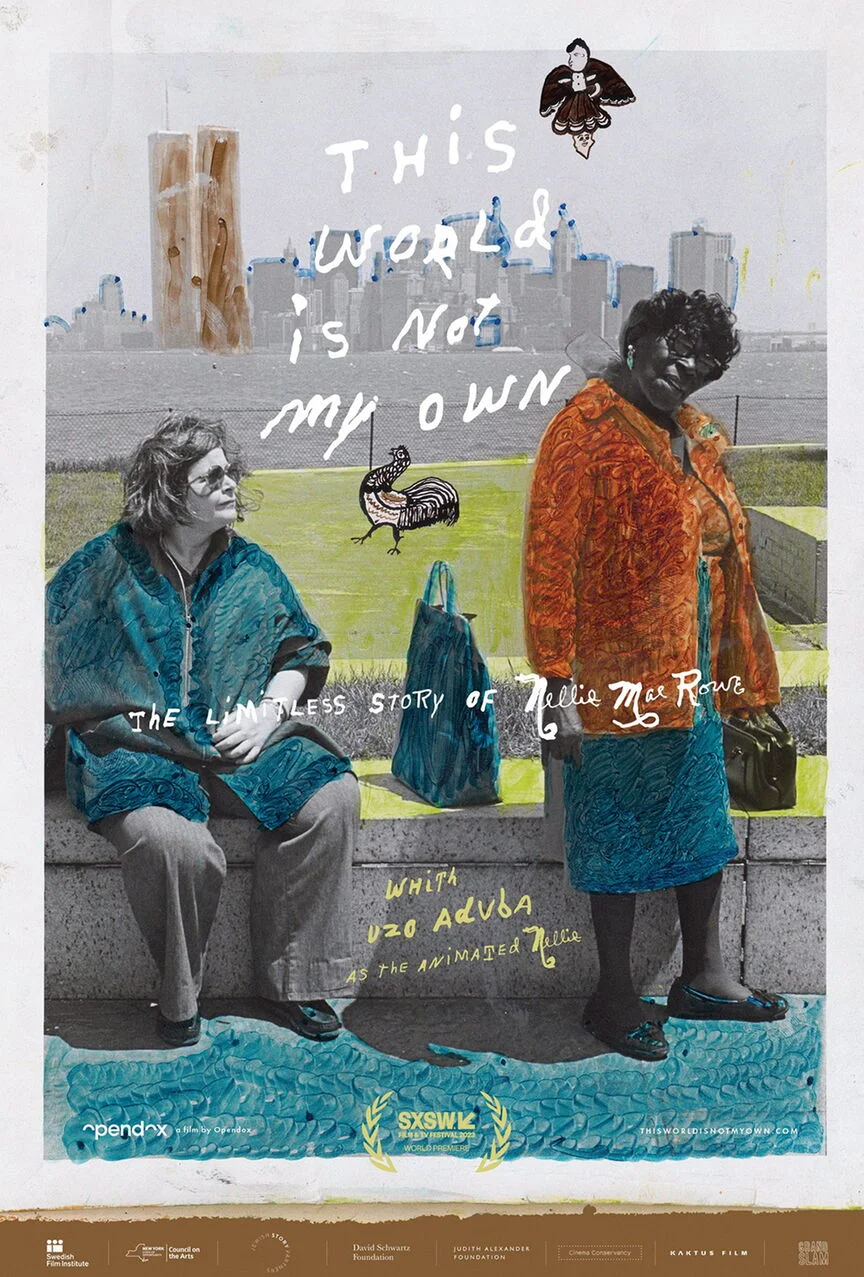
The World Is Not My Own was screened at several film festivals in the Spring and recognized for Best Cinematography at the 2023 Atlanta Film Festival and the film has received 100% on Rotten Tomato’s tomatometer (an amalgamation of film and television critics recommendations). Festival programming promoted TWINMO asa documentary film that traces the lifespan of artist Nellie Mae Rowe through motion capture technology to replicate human expressions and movement, performed by actor Uzo Aduba.” 

As a result, there are some well-written reviews, excerpts of which I will share.

Sheri Linden, of The Hollywood Reporter: “…Rowe took her independence seriously, as the captivating film portrait This World Is Not My Own makes vibrantly clear. After years of farm work and many more years as a domestic servant, the twice-widowed Georgian decided, in the powerful words of one of her great-great-nieces, ‘to design my life the way that I want it while I’m on this journey passing through.’ Linden goes on to describe the Playhouse: “Rowe turned her house — alas, no longer standing — into the Playhouse, filling it with her art, hanging the trees in the yard with her creations as well as found-object adornments, and inviting friends, neighbors and strangers to explore. There were drive-by harassers lobbing rocks and firecrackers at the ‘hoodoo witch,’ but there was also Judith Alexander, scion of a prominent Atlanta family who would become Rowe’s friend, gallerist and champion.”

Golden Globe entertainment journalist Brent Simon writes: “Stylistically, This World Is Not My Own challenges documentary conventions in its mixture of forms and, most especially, its editorial construction. Working with editor Princess Hairston, co-directors Petter Ringbom and Marquise Stillwell execute a narrative vision attached more to feeling than strictly linear storytelling.

The way the creatures of the film swirled in stories linking personal interviews with historical footage was masterful, magical really. Never moving too far away from Rowe’s artistic interpretations, fragments of her dream-like drawings would start to fill the screen as though Rowe was drawing in real-time. Because the film is not linear, it’s so much more “Nellie.” Rather than a consecutive storyline, the film is more a collection of stories woven together by elements of Rowe’s drawings, serving as a whimsical narrator, a colorful through-line, transitioning from one story to the next.

The many entertaining and insightful interviews with leaders of the time, museum curators, friends and family provided glimpses of Rowe’s personality and her generosity in sharing her Playhouse environment. One family member said – with a big smile and a chuckle, “She was a fun-going lady.” I especially enjoyed learning more about the unique and beautiful friendship between Rowe and her gallerist, Judith Alexander which is an important and relevant focus of the film.

At a gathering honoring Alexander’s life (shared on JA Foundation site), the artist’s great-grandnieces, Cheryl Mashack and Cathi Perry, described the unique relationship between Judith and Nellie Mae, using a quilt analogy: “The focal point consisted of two people Judith Alexander and Nellie Mae Rowe, although two different textures they were cut from the same cloth. Their business acquaintance grew into a relationship and from that into a wonderful friendship and from friendship into family that has spanned over two decades. Judith had a passion for art — especially Nellie Mae’s art — and together with their eccentric and often quirky ways they started to stitch the fabric of all our lives together. Judith with her big heart extended herself not only to Nellie but to Nellie’s family as well.….Judith had an unassuming manner but a very forthright way in getting her point across and letting you know exactly how she felt, and with this came her unyielding zeal to expose Nellie’s work to the world because of the joy it brought to her heart. She wanted this joy to become contagious to all those around her; however it was very difficult for her to part with any of her “Nellie’s” as she so affectionately called them.”

Marquise Stillwell, one of the film’s creators and directors, was present at the Cincinnati Art Museum and entertained questions after the screening. He described the making of the film taking 6 years and went on to say (paraphrasing), the film mixes traditional documentary techniques with 3-D animations and scripted scenes shot using the Playhouse models and created sets.

Following the film, I returned to 21c moments after the dining room closed, however, room service was available – score! The bartender made me a Basil Hayden Old Fashioned (big grin) to keep me company while waiting for a room delivery of seared sea scallops served with corn grits, rainbow chard and honshimeji mushrooms. It was damn good.

Morning coffee was set up in the restaurant hosted by one of the life-sized golden yellow penguins which is the 21c Museum Hotel designated color for Cincinnati. The penguins turn up around the property and play various roles in greeting, guarding and generally marking their territories. 21c Museum Hotel Cincinnati is a boutique hotel, contemporary art museum, and restaurant housed in downtown Cincinnati’s former Metropole Hotel, a 100-year-old landmark listed on the National Register of Historic Places. Among one of the largest private art museums in the United States, it is North America’s only collection dedicated solely to art of the 21st century.

There’s something about historic buildings that don’t always translate into welcoming, spacious lobbies – depending on previous configurations. I love a pronounced main entrance or a snappy foyer that properly greets you and peaks your curiosity at the same time. I found this particular 21c entrance confusing and oddly configured — wasn’t actually sure I had walked through the intended door. But then, my eye caught sight of a strange scultpural figure in the lobby, also a huge vivid purple photographic landscape, both part of 21c’s current exhibit, “The SuperNatural”. Short attention spans are not always a negative. Something I do love about 21c environments is their clever use of common areas and unexpected niches as exhibition space — often to my surprise and always to my delight. Given my short stay, I wasn’t able to take in the full exhibition like at other 21c locations I’ve visited (Durham and Nashville). The remaining five Museum Hotels are in my future. A colorful penguin punch card is underway.

Before hitting the road, I made a beeline for a recommended place to get a good Reuben – just a few blocks away. Downtown Cincinnati was bustling and I walked through an active town square — it was a perfect day — coolish and clear. Most of the people I saw or encountered were young — or at least younger than me — and I wondered if that was a city trait or just me feeling older. Later, I learned the diner I visited was an authentic old-school Cincinnati diner, Hathaways, there since 1957. One of those things you “stumble on” if you ask the right local. The Reuben sandwich was perfect, complete with ridged and broken Lay’s potato chips. 

A final serendipitous treat occurred en route to the airport. From the backseat of my taxi, I saw a spaceship — yes, a spaceship — midway up a distant hillside, across Kentucky’s border. An all too familiar tie to the Tampa Bay area.

The Cincinnati Art Museum, 21c Cincinnati Museum Hotel, This World Is Not My Own, downtown Cincinnati — a complete sensory overload — any one of these experiences begs for more time to properly absorb and enjoy. I’ll be back!

Note from the author: Arthouse3 and Bay Art Files are currently working on bringing the film to St. Petersburg, Florida. To do this, we will need movie ticket buyers, a few volunteers and sponsorship dollars to bring in one of the directors to speak about the film. If you have an interest in any of these roles, please let me know soon. The number of committed individuals could sway the schedule! (kg@arthouse3.com

Katherine Gibson, creator of ArtHouse3, works with clients to find and place regional art, objects and furniture. Gibson is an independent curator, art consultant and creative design maker-upper living in St. Petersburg, Florida. 
The Constant Curator: The Important Work of Nellie Mae Rowe

The Constant Curator: The Important Work of Nellie Mae Rowe

by Katherine Gibson

The exhibition REALLY FREE: THE RADICAL ART OF NELLIE MAE ROWE was on view at the High Museum of Art, in Atlanta, Georgia, from September 3, 2021 – January 9, 2022, and was organized by Katherine Jentleson, the Merrie and Dan Boone Curator of Folk and Self-Taught Art.


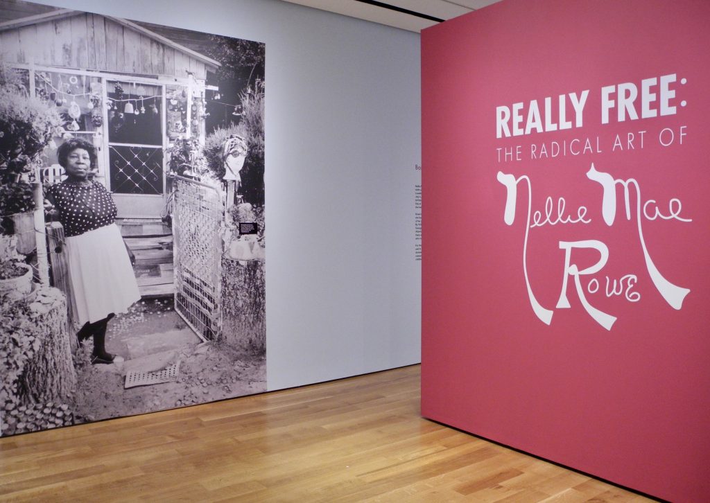
Entrance to “Really Free”; High Museum of Art, Atlanta.

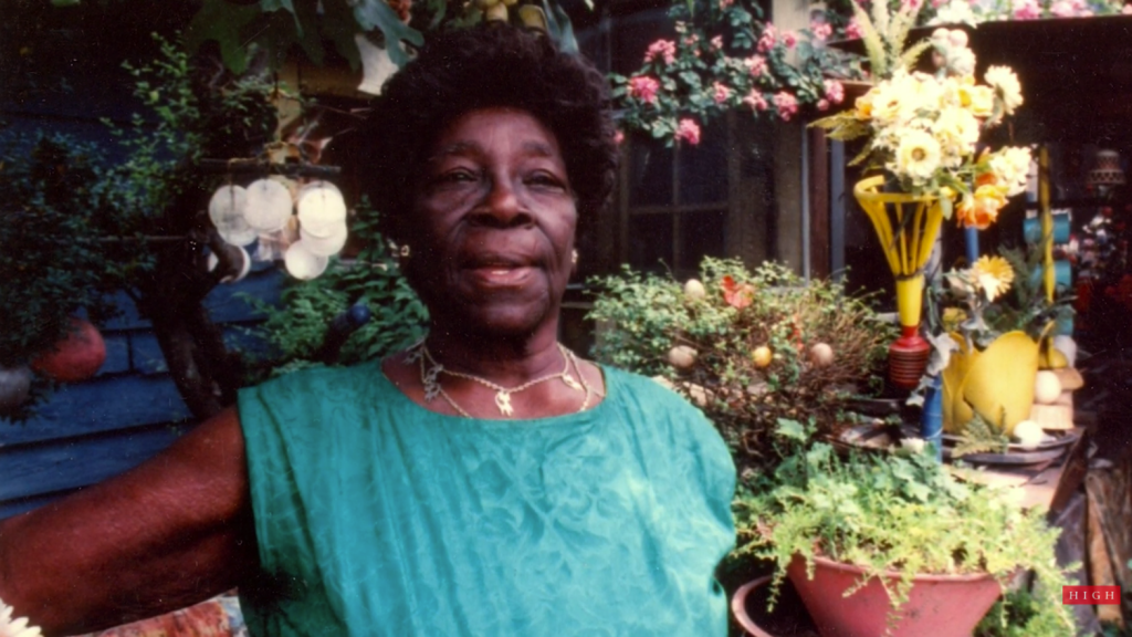
Nellie Mae Rowe greeted me at the gate to her home – at least her likeness did, in the blown-up, life-sized, black and white image of her at the entrance to what she called her Playhouse (referring to her house and yard area). The giant fuchsia wall to the right presented Nellie’s artistic signature as an essential part of the exhibit title, “Really Free: The Radical Art of Nellie Mae Rowe.”

It was the day after Christmas. My sister Jane and I, along with our niece Katie, took in the Nellie Mae Rowe (American, 1900-1982) exhibit at the High Museum of Art in Atlanta. Jane and Katie walked through the show, reading the text for each piece and following the gallery sequence. I’m envious of people who can do that. I don’t seem to be able to go in order, and as a result, I often miss important connections. What I’m always most interested in, is the overall feel of a show, the environment created, the mood and the flow of how someone may experience it. I amble around the space, in no organized way, absorbing visual impressions and relationships.

After a few times around in various directions, I found I wanted the exhibit to feel more connected. The spacing between pieces and groupings was generous, perhaps more than needed. Given that Nellie’s home was chock full of colorful things and objects inside and out – the galleries were spare in comparison, and somewhat static. I felt like the layout could have infused more of the vibrant energy, conviction and general playfulness that Nellie lived by.

That said though, how do you infuse a stagnant exhibit with Nellie’s kind of joyful flow? How do you translate her world into a world others can experience – and, do you need to?

In ruminating over the exhibit and these questions, I can understand what a challenge it was to come up with the best way to show Nellie Mae Rowe’s work. The environment she created throughout her home and property had the same traits as the images she created: layered and overlapping; full of rich color from end to end; animals, objects, plants, sculptures all existing together. One was not separate from the other. I don’t think I got this until later, when I was scrolling through my images, still feeling like something was missing, and then it dawned on me that it was near impossible to convey Nellie’s world without her masterpiece Playhouse.


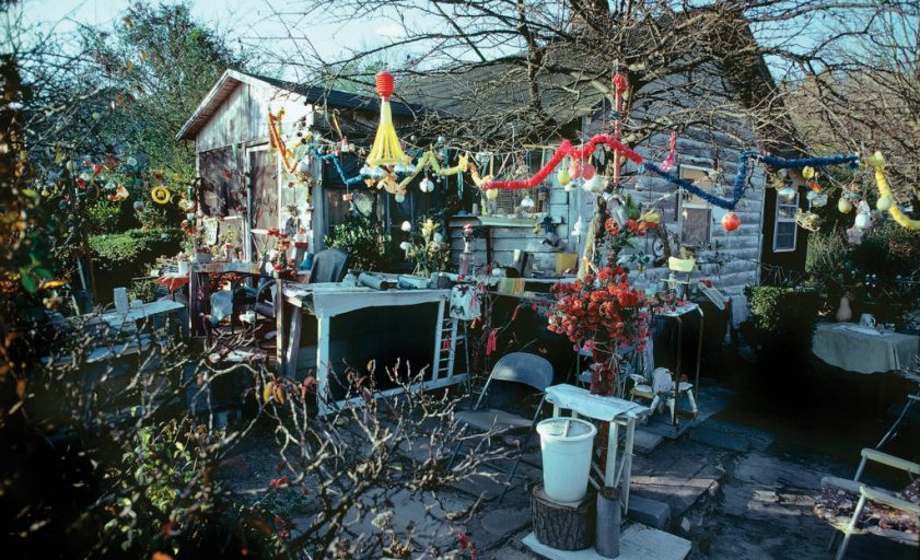
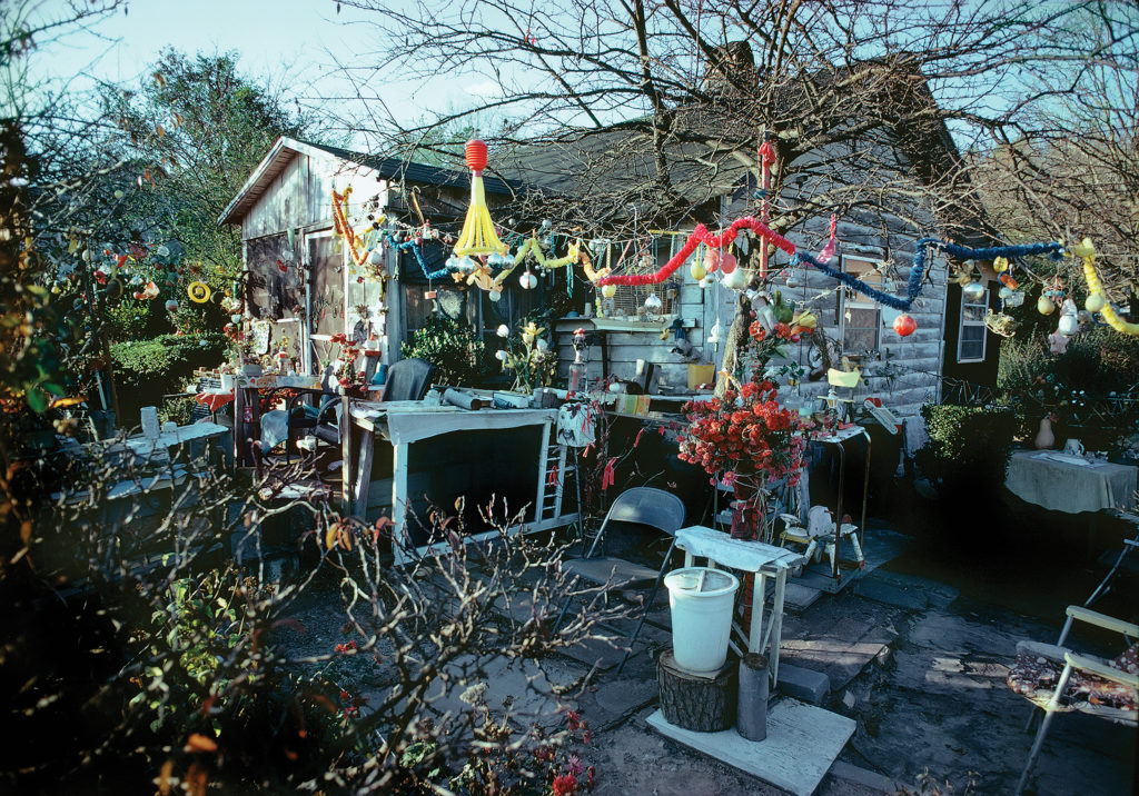
Lucinda Bunnen, Nellie Mae Rowe’s House (1971).
Photo ©Lucinda Bunnen, collection of the artist, courtesy of the High Museum of Art, Atlanta.

That’s where an unbelievable scale model of Nellie’s Playhouse comes in. Unique to this exhibit, Opendox, a New York documentary-making firm, created two scale models of the Playhouse – the first model was of the entire property presented on a large, flat, table-like surface akin to something a model train environment might sit on. The second model was larger, and was assembled in a corner area near the end of the exhibit, with created interior rooms the size of a child’s playroom.


Model of Nellie Mae Rowe’s Playhouse (detail). High Museum of Art, Atlanta.


Model of Nellie Mae Rowe’s Playhouse. High Museum of Art, Atlanta.

The miniature model of the entire property drew me in and completely blew my mind due to the amazing detail, down to the tiniest possible replica of the many objects scattered throughout Nellie’s environment. Same with the child-sized model of interior rooms of the Playhouse, created to use in filming the documentary about Nellie and her life. “This World is Not My Own” will be available later this year and will be fascinating to watch – not only to learn more about Nellie Mae Rowe and her unapologetic way of living her creative life, but also to see these astounding, meticulously created sets in context. (https://thisworldisnotmyown.com/)

My sister really loved the short film about the making of the documentary that was part of the exhibit, next to the scale house created for the filming.  Those components of the exhibit, she said, helped her get a palpable sense of Nellie’s world and gave context for how Nellie lived. Jane appreciated the tactile model combined with the sound in the film because it made the experience of Nellie’s garden come alive for her.

Strangers Welcomed

Nellie’s home was in a small town west of Atlanta.

“When passersby in sleepy Vinings saw Nellie Mae Rowe’s decorated yard packed with handmade dolls and chewing gum sculptures and beads and wigs hanging from trees, they didn’t know what to make of it,” wrote Bo Emerson in an article for The Atlanta-Journal-Constitution (May 18, 2021). “Some gawked. Some thought she was a “hoodoo” woman or a fortune teller. Some pitched bottles through her windows and broke her flower pots. She met all responses with poise. Those who threw missiles, she invited in to see her yard and her ‘playhouse.’ …Her guestbook was signed by more than 800 people who had toured her house and gardens just from May 1973 to March 1975.”


Still from High Museum of Art Curator Video Diary: Who Nellie Mae Rowe Was (Available on YouTube).

Chewing Gum Sculpture

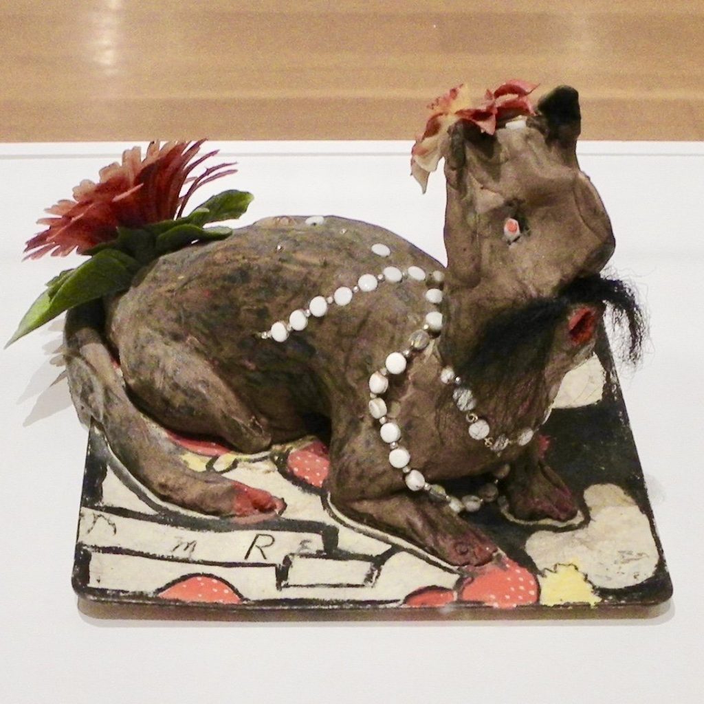
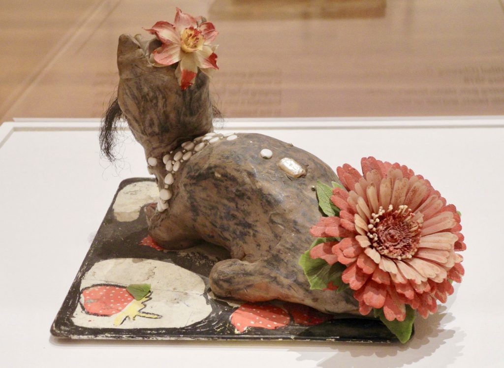
The idea of creating figures out of chewing gum initially repulsed me but in the context of Nellie’s clever resourcefulness, I found it humorous, especially when I saw the figure featured in the exhibit. “He” was an animal – possibly a cat – with a hair mustache and a large plastic flower on his backside (see image). As I took him in, I noticed how well he was formed and sculpted; a concentrated effort yet it still had the playful lightness Nellie brought to her creations.

“I chewed a lot of chewing gum because the doctor said chewing would help the jumping in my head. People began bringing me packages of chewing gum. And I said, now as much chewing gum as I chew, I’m going to make something. So I saved my chewing gum and when I saved a big ball, I started making things. I used to have chewing gum cats and dogs all up and down my fence. Now, I chew gum just to make things.” (https://www.soulsgrowndeep.org/artist/nellie- mae-rowe)

You can imagine the delight she must have felt in bringing this mustached character to life, adding white decorative beads and a smaller flower on his head casually cocked to one side, like a British fascinator.

He was a feature in the exhibition, singled out, and presented on a large pedestal, under a tall clear bonnet – all adding to his importance, which made him even more entertaining to me.

Judith & Nellie Mae

Nellie met gallerist Judith Alexander when she was in her late 70s. They knew each other only a few years, yet it seems like – from all accounts – they deeply trusted each other and formed a unique and solid friendship. On the Judith Alexander Foundation website is a section about Nellie with a description of their influences on each other:

“Of all the artists whose lives Judith Alexander touched, none was as strong an influence on her as Nellie Mae Rowe. It’s safe to surmise that Judith’s influence on Nellie was equally powerful. Theirs was a relationship that took the notion of synergy way beyond its boundaries.

“Judith saw to it that Nellie Mae Rowe’s legacy would endure with her major gift of works to the High Museum of Art in Atlanta. Judith also established The Nellie Mae Rowe Gallery at the museum, an area exclusively dedicated to a rotating display of the work.” (www.judithalexander.org/brief-biography)

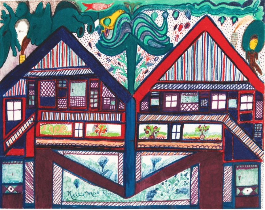
One of the pieces that resonated with me was a detailed, colored drawing of two, almost identical houses, side by side. The form of a tree is drawn rising up from the center where the houses are joined. On the top of each roof is a figure – one appears to be the figure most often associated with Judith (lighter skin tone and more formally dressed) and the other most likely representing Nellie. As I study the drawing, it clearly conveys to me that each figure has their own domain yet their intersection is strong, beautiful and growing.


Untitled (Nellie and Judith’s Houses), 1978-1982, crayon, marker, and pencil on paper. 

The exhibition wall text reads: “These conjoined houses signify how the destinies of Rowe and her gallerist Judith Alexander were mutually dependent. Alexander had been showing contemporary art for decades, but her close relationship with Rowe led her to become one of the South’s only gallerists dedicated to self-taught artists.”

Sense of Place

To look at pictures of the inside and outside of Nellie’s home, you may think things were strewn willy-nilly but Judith Alexander made a point of saying (in some of the referenced videos) that Nellie used the word “placed” when talking about arranging pieces in her home, and further explained that she purposely put things in a certain location because that’s how she wanted to see them. I think of Nellie as a constant curator, incorporating pieces she made or found, with pieces and things people gave her.

Nellie shares some of the things her visitors would bring her in this interview transcript available on the Souls Grown Deep Foundation site:

“The yard was decorated pretty. Because of the talent God gave me, many people started visiting and taking pictures. What is exciting and surprising and makes me feel good is to think about the people I would never have seen if I had not been doing things that were interesting to them. Folks brought me all kinds of things: dolls, stuffed animals, beads, bottles, and sometimes strangers would leave things at my gate. I would place them in my yard and some I would hang indoors against the walls. Everything else, other than what people gave me, I picked up. I like it when things keep on changing; keeps me busy.”

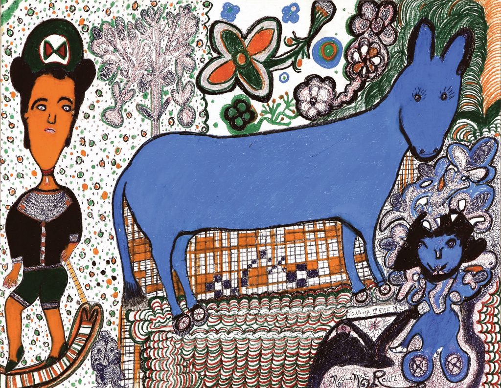
Rolling Tree Mule


 Rolling Tree Mule, 1981, crayon and ink on paper, gift of Martha and Jim Sweeny in memory of Judith Alexander.
Museum of Fine Arts, St. Petersburg, Florida.

Two works by Nellie Mae Rowe are included in the Museum of Fine Arts (MFA) St. Petersburg, Florida, collection. One is seen above. This image of Rolling Tree Mule is also included on their website, highlighting pieces from the permanent collection, and offers this brief summery of Rowe’s life:

Rowe faced racism and discrimination, was widowed twice, and worked as a domestic for roughly thirty years. Born in Fayetteville, Georgia, she spent most of her life in Vinings, outside of Atlanta. Her parents were farmers and also made handicrafts: her father, born into slavery in 1851, smithed and made baskets; her mother made quilts. As a girl, Rowe made dolls out of rags and figures from chewing gum. In 1948, after the death of her second husband, she began making art, “something out of nothing.” She saw her artistic life as a second childhood, terming her home “Nellie’s Playhouse.”

Play

Rowe was proud and happy about what she was creating. When creativity comes purely and directly through a person, it doesn’t need explanation, permission or approval. The result is the rawest and most authentic kind of expression.

In Nellie Mae Rowe 1 video (YouTube, 1976), Nellie is moving around her garden area, sweeping, planting, and fussing with various things as she meanders. Her voice can be heard over the footage, explaining “I do too many things, start sewing, next thing, I’m outdoors in my hole (garden), then uh, put that down, and then go to drawing a little, that’s just how it go… I never finish nothing at once. I just enjoy playing like that. I’m like a child. I wanna play in my Playhouse.”

Closing

At the start of this writing, I was seeking to share impressions of the High Museum’s exhibition of Nellie Mae Rowe’s work. While I have shared some impressions, I found Nellie herself to be more compelling to think about, and to write about, so I’ve taken liberties to include some of those impressions too.

There is so much to admire about her – especially the way she crafted her life in just the way she wanted to live it. And in doing so, the barriers that would have normally limited her success – being a woman, an artist, black, and older – she instead, moved right through them, inviting anyone and everyone into her home to experience her Playhouse. Imagine this kind of generous invitation now, much less in the 70s.

Nellie Mae Rowe was a constant curator living in her greatest work of art. The ever-evolving Playhouse environment was a major source of energy and motivation where she was able to express her thoughts to her own satisfaction, all the while sharing her creations with others, inviting them into her world where hundreds of curious strangers were moved and inspired.


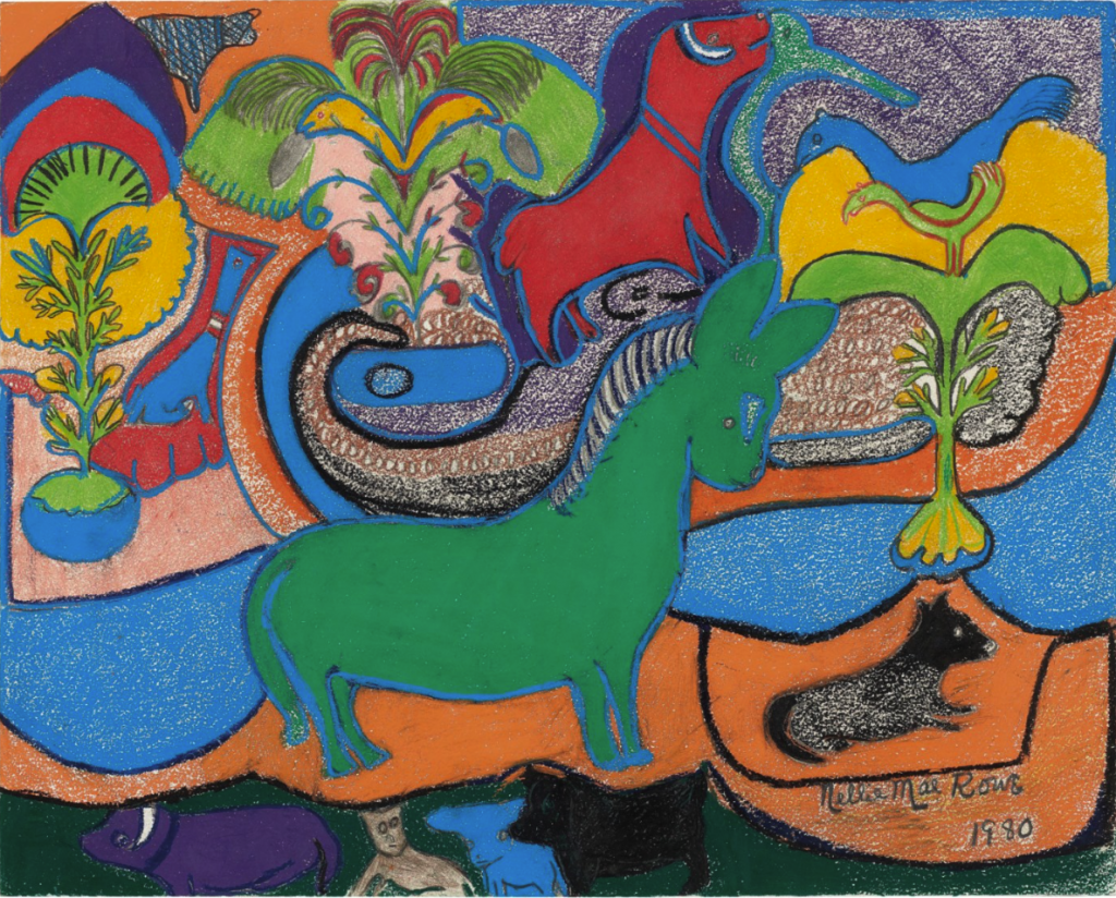
Green Horse, 1980, crayon, pastel, and graphite on paper. Recently sold at Christies from the property of the William Louis-Dreyfus Foundation, Mount Kisko, New York.
 
About the author

Katherine Gibson, creator of ArtHouse3, is an independent curator and regional art consultant living in St. Petersburg, Florida. Gibson received a 2018 Individual Artist Award from the St. Petersburg Arts Alliance for her Drive-by Window Project and was selected for an ArtsUp Grant by Creative Pinellas as creator and curator of the 2019 summer exhibition Tongue & Groove.
The Pandemic at Our Doorsteps – Portraits in the Time of COVID

By Selina Roman

In late February 2020, a colleague from the college where I teach asked me how I felt about the virus as it raged in China but had yet to get a foothold stateside. I shrugged my shoulders in response and indifferently said, “Hopefully it won’t come our way.” It seemed like something far off and abstract. “This is not our problem,” I thought.

Fast forward to now and a lot of us are fully vaccinated. We can go out, see family and friends, hug them, sit at a bar, or get on an airplane. It is hard to fathom that a year ago, we were in lockdown and unsure of what the future would bring in a pandemic. For many, our homes became our offices, movie theaters, coffee shops, and gyms. As we emerge from our collective Covid-19 fog, one photographer, Rania Matar, gives us the chance to look back and see lockdown through her lens.

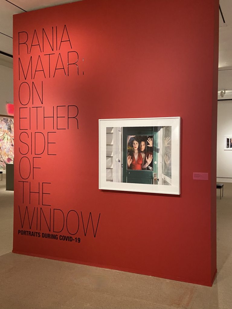
A mélange of faces fills a gallery at the Cornell Fine Arts Museum at Rollins College, located in Winter Park, Florida. Framed by windows and doors, the people in Rania Matar: On Either Side of the Window, Portraits During Covid-19, defiantly take up space and confront viewers.
Photographs are by the author unless otherwise stated.

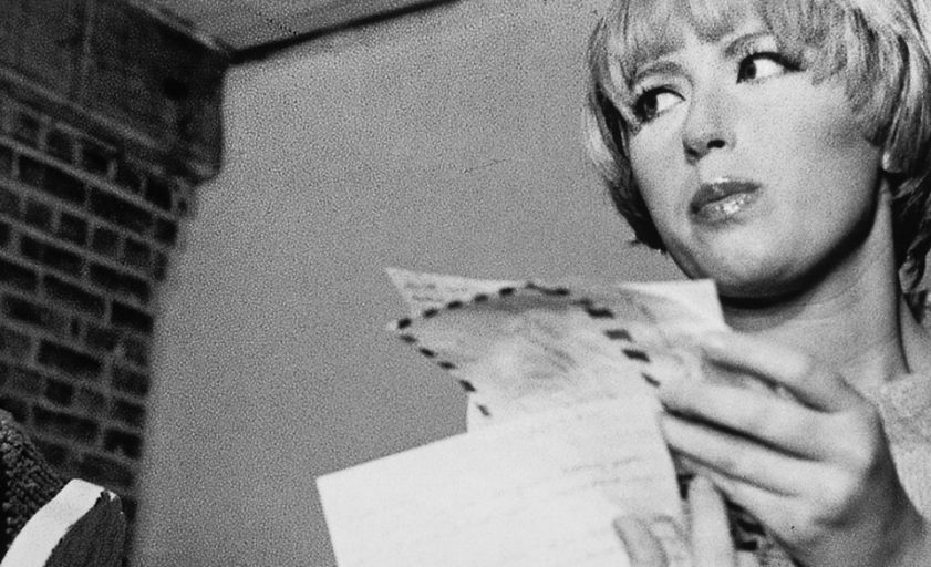
Like Diane Arbus and Alec Soth, Rania Matar’s portraits create a strong sense of intimacy not only between the artist and subject, but with the viewer as well. At the entrance to the show is an arresting image of a couple, Mia and Jun, Allston, Massachusetts.  The couple greets visitors as soon as they enter the gallery. They stand behind a green door, Mia wearing bright red lipstick and red halter dress, and Jun wearing a red shirt. They are framed by the door of their forest green home, their hands pressed against the glass as if they are trapped. In a recent artist talk at the museum, Matar said the couple are dancers. This detail adds meaning to the expressions on the couples’ faces – a desire to move, to perform. On the flip side, however, a universal yearning to resume the lives we once knew.

Matar began the project last year shortly after lockdown. When residents of the northeast were emerging from winter and then just as the flowers were coming into bloom, they were ordered to stay home. She asked people on social media if they wanted their portraits made. As word got around, interest swelled and she crisscrossed the Boston area, landing in people’s yards and pointing her camera into their homes. Matar’s lockdown photo sessions came as a welcome respite from the barrage of new infections and deaths. Matar gave subjects the chance to perform, play dress up and connect with someone who was not part of their household. Taking in each image, it’s difficult not to reflect on one’s own lockdown experience. 

Matar is known for her beautifully staged portraits. This body of work is no different. Every image in the show is loaded with beauty; however, the true excitement is the exhibition’s varying and undulating levels of intensity. Some images are serene and calming, while others are unsettling and tinged with anxiety.

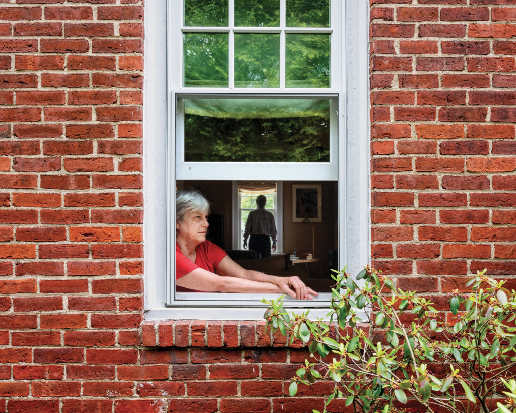
Wendy and Timmy, Newton, Massachusetts, 2020. Courtesy of the artist.

In the image Wendy and Timmy, Newton, Massachusetts, 2020, an older woman in a red shirt slightly leans outside the window of her red-brick home. She looks off-camera. In the shadows of her room stands what appears to be a masculine figure, his silhouette framed by a window opposite hers. Is the man her husband? Her son? A handyman? The shadows conceal any details. The composition reads like a scene from a thriller. According to Gisela Carbonell, Curator, the man’s appearance was not planned. However, his appearance adds the right amount of mysterious narrative to the image. Lockdown came in so many shapes and sizes – families, couples, people on their own. In Wendy and Timmy, the idea of being locked inside and how our limits might be tested, for better or for worse, comes into view.
Matar, as in her other bodies of work, possesses a keen sense of combining setting and figure and creating new layers of meaning, with each informing the other. In the Her series, she photographs young women around the world in not only picturesque places, but in heartbreaking ones, such as the rubble from last year’s devastating blast at the port in Beirut, Lebanon. In the pandemic series, the settings aren’t as dramatic but are still nonetheless captivating and compelling.

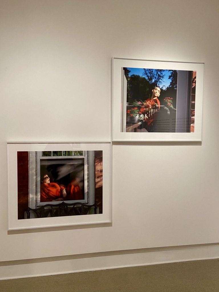
In a striking pair of photographs, proximity and the color red unite the subjects who look like they could be neighbors in the same building. In the first image, Cyrus, Brookline Massachusetts, 2020, a figure with closed eyes leans back, a smile on painted lips, the sunlight bathing their face and a sliver of the red blouse. The reflections of the trees and red flowers outside this window seem to exuberantly explode from the subject, framing them sublimely. In the second image, Marina, Brookline Massachusetts, 2020, a woman also in red, reclines in an open window, shadows dancing on the screen. She dons sunglasses, a short haircut and red lips, a la Liza Minelli. Her look screams Diva in the best way. The corners of each of the two images touch, seemingly connecting the subjects. Their proximity creates a dialogue, a human connection – of which so many of us needed at this time last year.

The color red permeates the exhibition, and I cannot help but think of all of the symbolic meanings this color has – love, passion, life, blood – and gives the exhibition its pulse.

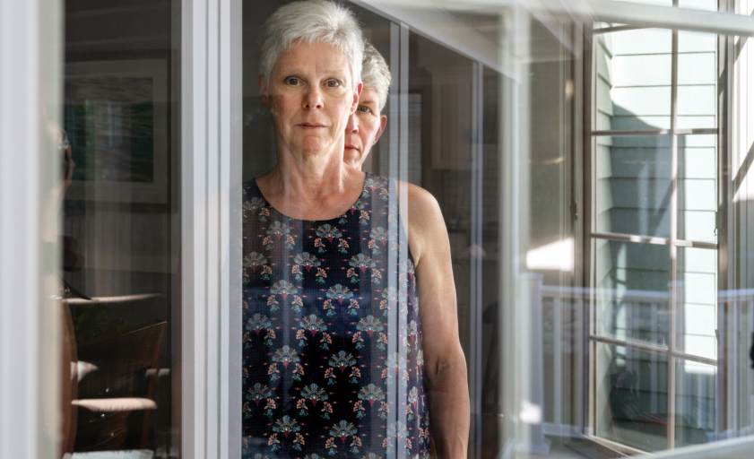
A year later, we navigate the world in masks and face shields and seeing a stranger’s face seems like a novelty. None of Matar’s subjects don a mask, and nearly each subject’s face is visible. In many of the images the glass or the screen becomes the barrier between photographer and subject. The duality of the windows and their reflections become one of the most compelling devices in the series. The reflections serve different purposes such as abstraction or a sense of place. In one photograph, Diana and Chris, Watertown Massachusetts, 2020, two women stand together. They look related, sisters perhaps, similar age, short haircuts, and silver hair. Reflections on the window frames create a rhythmic and infinite labyrinth of lines, intersections, and corners – a reminder of how our own human relationships and networks ground to a halt. 

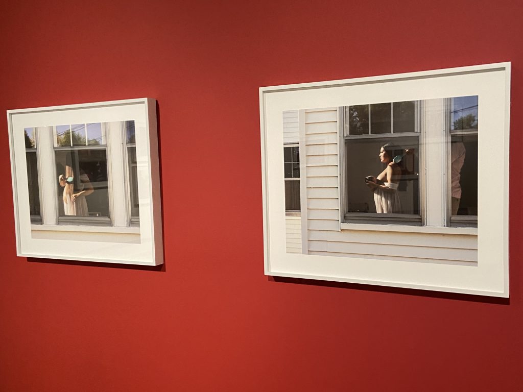
In Matar’s images life and time march on in the face of a pandemic and isolation. Nowhere is that more evident than in the two portraits of Susan. In the first photograph, Susan, Salem Massachusetts, 2020, a woman brushes her long brown hair alone as she looks off-camera. What looks like late afternoon light falls on the woman revealing a swollen belly peeking out from her dress. We immediately realize she isn’t alone after all. In the next photograph, Susan, Raffy and baby Violette, Salem, Massachusetts, 2020, the woman holds a small breastfeeding infant while a man brushes the mother’s hair. As before, beautiful light falls on the woman creating an almost sublimely religious tableau. The pandemic was, and might still be, at our doorsteps – it felt like time was at a standstill, yet it is photographs like these that offer hope of a better day. 

Matar reminds us that there is life and it’s worth the wait. The photographs are life-affirming and so is the exhibition.  Rania Matar: On Either Side of the Window, Portraits During Covid-19 is on view until May 9, 2021 and a virtual walkthrough of the entire exhibition can be found here.

The Cornell Fine Arts Museum, on the Winter Park campus of Rollins College, is the only teaching museum in the greater Orlando area. The collection ranges from antiquity through contemporary eras, including rare old master paintings and an in-depth collection of prints, drawings, and photographs. The museum displays temporary exhibitions on a rotating basis along with the permanent collection, and a satellite exhibition space for the Museum’s Alfond Collection of Contemporary Art is located at The Alfond Inn, which is within walking distance of the campus.

Tampa-based Selina Román received her Masters of Fine Arts degree from the University of South Florida in 2013. She has participated in residencies with the Visual Artists Network and Diaspora Vibe Cultural Arts Incubator. Her work is in the collection of the John and Mable Ringling Museum of Art in Sarasota; the Leepa-Rattner Museum of Art in Tarpon Springs; Hillsborough Community College, as well as numerous private collections. She teaches visual art and photography courses at the University of Tampa and Hillsborough Community College in Tampa.

Setting the Table with Separate Checks

by James Cartwright 

“The main appeal of the name is that it speaks to how an artist collective functions on exhibition night: one shared space with many distinct voices.” – Katelyn Montagna and Adam Mathieu

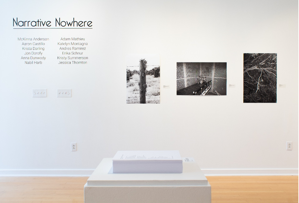
Separate Checks is an artist collective founded in the summer of 2018 by Katelyn Montagna and Adam Mathieu, who created the group to reconnect with friends and encourage each other to produce new work.  Additional members include McKinna Anderson, Aaron Castillo, Krista Darling, Jonathon Dorofy, Anna Dunwody, Nabil Harb, Andres Ramirez, Erika Schnur, Kristy Summerson, and Jessica Thornton. Many members are University of South Florida alumni who came through the School of Art and Art History’s photography program or the School of Advertising and Mass Communications. It is easy to imagine that assembling the group’s roster had a definite “getting the band back together” feeling.

While the USF connection forms the backbone of Separate Checks, other artists have joined by contacting Adam and Katelyn on social media. Adam amusingly recalls how member Aaron Castillo slid into his DMs on Instagram before meeting with him and Katelyn in person. They describe the encounter as feeling like they were on a blind date with a photographer, but thankfully everyone clicked and the date did not end in awkwardness and disappointment. 

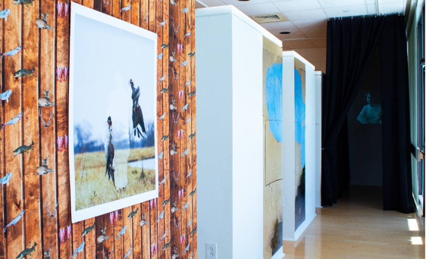
Installation view of Narrative Nowhere exhibition at Gallery221.
Photography credit: Emiliano Settecasi.

The many distinct voices of Separate Checks will be in conversation with each other in Narrative Nowhere, showing at Hillsborough Community College’s Gallery221@HCC Dale Mabry from November 2 – December 10.  Visitors are encouraged to view the show in person, by making an appointment on the Gallery221 website and following guidelines on social distancing.  Originally slated to debut this spring, it is yet another exhibition that was postponed because of the coronavirus. The show’s change in schedule also led to a change in content, as the extended timing allowed artists to respond to their experiences over the past eight months of this turbulent year. 

The initial concept of Narrative Nowhere was to invite other artists to collaborate and reflect on personal histories and the geographic spread of the group, but some members have refocused on addressing Covid-19, racial tension in the United States, and the U.S. Presidential Election. The collective has worked in concert with Gallery221 director Amanda Poss to adjust to these atypical conditions and deliver a show well-suited for this cultural moment.

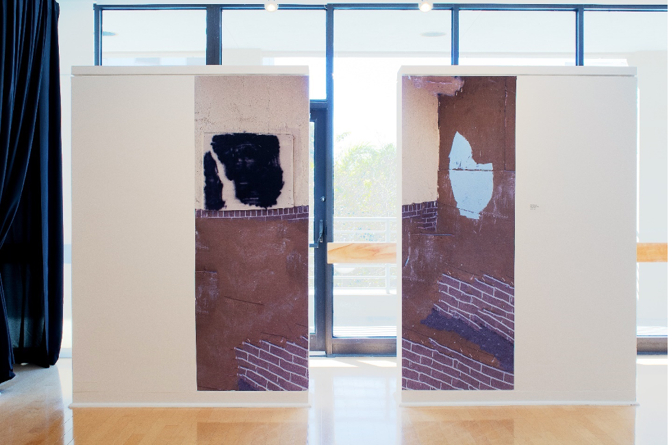
Andres Ramirez, Muro Falso 1, 2020, panoramic decal.
Photography credit: Emiliano Settecasi.

Andres Ramirez is one member whose work confronts the political, with the artist reacting to the Trump administration’s brutal border policies. His images in Narrative Nowhere are “about facades and what hides behind them; whether they’re digitally invented or not, these images are constructions much like the norms of our society.” This year he has been grappling with the concept of borders and their violently divisive nature, as he questions whether they should even exist. 

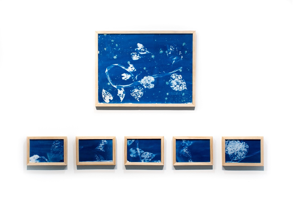
Anna Dunwody, Sempiternity I and Dioscorea bulbifera 1-5, 2020, cyanotypes.
Photography credit: Emiliano Settecasi.

Anna Dunwody’s recent works tangle with themes of loss, discovery, and regrowth. Here she displays a series of cyanotypes that she created while in quarantine. She draws connections between the unpredictability of this year and her chosen media, musing that with cyanotypes “you can do everything with such care and intention and each one always comes out a little different and maybe not how you wanted or expected, much like life.” She says that in her work she seeks to find the constantly surprising and occasionally beautiful.

Installation view of Narrative Nowhere exhibition at Gallery221.
Photography credit: Emiliano Settecasi. 

The current exhibition at HCC represents a major sign of growth for the young collective, who previously held one-night-only showings in venues like the Creative Loafing Space and Dojo Sounds recording studio in Ybor. Those events emitted a special “blink-and-you’ll-miss-it” energy, where it was exciting to see a show in an unfamiliar space and not already know everyone there. However, Adam is thankful for the opportunity to display work in a fixed space like Gallery221, where the group can reach a wider audience and their works are given ample time and room to breathe. 

Why join an artist collective in the first place? For McKinna Anderson, the group offers her friendship and a sense of accountability, without being restrictive or stifling her voice. Living in Nashville in 2018, she knew Adam and Katelyn from her time as an undergrad at USF and she found herself wandering through a similar post-graduate fog until she joined Separate Checks. She explains that the group has a tethering effect, acting as a lighthouse that always leads her back to the art community. 

Separate Checks logo designed by Jonathon Dorofy

The group’s identity is still in flux, but it adopts several traits from its founders. Adam’s Fine Art background blends with Katelyn’s graphic and advertising skillset to produce something with an art school sensibility and savvy self-promotion. The mixing of elements is persistent among the membership, with both Aaron Castillo and Kristy Summerson moving between the Fine Art and advertising worlds. Member Jonathon Dorofy is also heavily involved with the group’s branding, where he imbues quintessential Florida motifs with a sleek veneer and graceful simplicity. 

In a subtle way, the collective also has a quiet confidence that reflects Adam’s and Katelyn’s personalities, wherein his calm demeanor and her animated enthusiasm form a perfect partnership.  

Separate Checks is currently finding its place in the Tampa Bay art community alongside established collectives like QUAID and the photography-centered Fountain of Pythons. USF photography professor Wendy Babcox is a member of FOP, and Katelyn remembers being intrigued by the group when Babcox mentioned it in class. Babcox’s guidance has had a lasting impact on Adam and Katelyn, and they single her out as an important mentor from their undergraduate days. Additionally, FOP member Selina Roman also serves as a member of Gallery221’s Advisory Council, and she proposed the Narrative Nowhere show to HCC. She was one of the earliest and most ardent supporters of Separate Checks, and she continues to offer her encouragement on its ventures.

What is next on the menu for the young collective? The group plans to eventually host a juried show, and they have kicked around the idea of having their own permanent exhibition space. They are becoming friendly with other artists collectives such as Portland’s Small Talk Collective and are discussing a show exchange and curating each other’s work. For now, they seem content with taking things as they come and not looking too far ahead. 

When it comes to Separate Checks, part of the excitement is in not knowing what comes next. For many viewers, the Narrative Nowhere exhibition is likely their first exposure to the group. This show provides a rare chance to see numerous artists creating work together in the early stages of their careers. These separate voices are coalescing into something new right before our eyes. Don’t blink and miss the moment.   

Narrative Nowhere runs from November 2 to December 10 at Gallery221@HCC Dale Mabry campus. To learn more about the gallery and make an appointment to view the exhibition, follow these links:

https://www.hccfl.edu/campus-life/arts/galleries-hcc/gallery221

https://outlook.office365.com/owa/calendar/Gallery221HCC@hccfl.onmicrosoft.com/bookings/

To learn more about Separate Checks, visit their official website:

https://www.sepchecks.com/

James Cartwright earned his M.A. in Art History from USF in 2017. He focuses on cross-cultural exchanges in art production, while occasionally wandering into the realm of contemporary art criticism. He is an adjunct Art History instructor at USF and the University of Tampa, where he uses his liberal arts background to joyfully corrupt the impressionable youth of America. 

Our Country’s Family Pictures: Here and Now

Our Country’s Family Pictures: Here and Now

Tyra Mishell

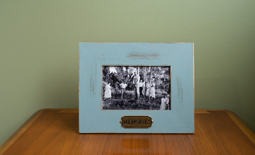
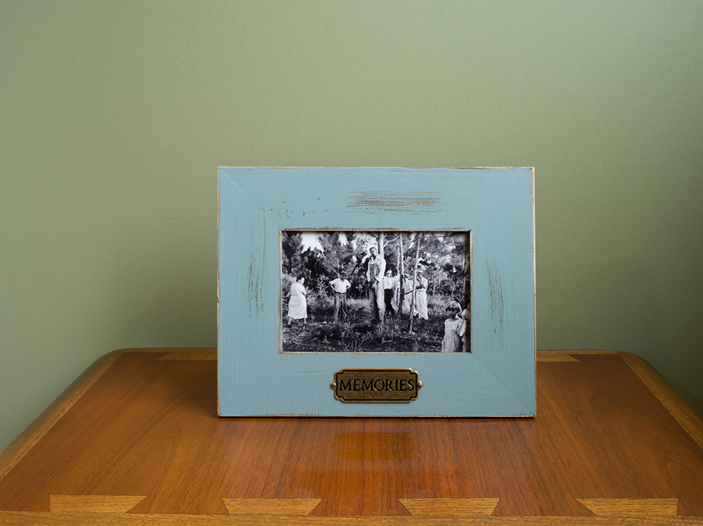
Untitled (Memories) from the series Family Pictures, 2016. Image courtesy of the artist and Samsøñ.

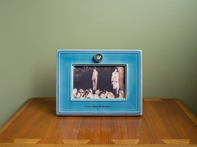
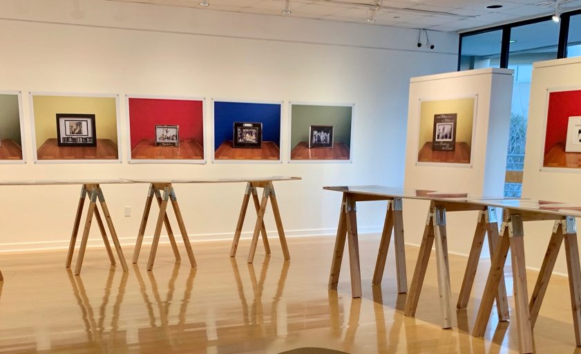
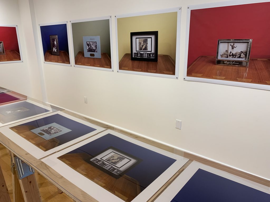
Walking into this exhibition, steve locke: the color of remembering, I was first drawn to the photos with the ornate picture frames. Looking at the frames, I was instantly reminded of the sort of objects in my mother’s home and the sticky vinyl inspirational messages written in cursive on the walls of her kitchen. But after looking closer at a pretty light blue frame that read “MEMORIES” [Untitled (Memories)] on a golden plaque, I had to look away. I was not saddened or shocked by the photo of a Black man strung up on a tree, surrounded by observing multigenerational white bodies. I’ve seen photos like this before. I have seen photos like this recently. I looked away as a reflex. As a coping mechanism. These kitschy picture frames, photographed on top of a smooth wooden surface and a vibrant colored backdrop, looked like television screens to me. These domestic, familiar picture frames look just like my newsfeed.  Steve Locke’s Family Pictures series are mementos inside of the homes of America’s dominant culture. The work in this series brings into focus America’s continuing tradition of violence and subjugation of Black people. Locke does this in a clever way by bringing us into Somebody’s living room and having us come to accept that this tradition is as American as my own mother’s “ EAT DRINK AND BE MERRY” vinyl quote on the kitchen wall.

I had the privilege of attending Steve Locke’s artist talk at the opening of the show and hearing him talk about the subject of the work was helpful in understanding Family Pictures in today’s political and social climate. After the talk and we spent some time discussing the spectacle nature of “Black Death” in the media. Violence towards Black people often goes viral in a sensationalized way. It feels like the announcement of a new “Black Death” is like the release of the most current iPhone. The hype comes and goes like new technology and returns when replaced with the next one. Media outlets delight in providing the public with new and exciting footage for controversy’s sake. In his exhibition statement, Locke goes on to write: “You can see a video, repeatedly (or even as a background image) as two people discuss a man being strangled or shot. To death. The prohibition of showing the deaths of victims is waived when the victim is black. Their last words are broadcasts. Their bodies left in the street as a warning, or as a provocation. You cannot imagine seeing the victims of Columbine or hearing the tapes of Sandy Hook, but for some reason, you can see a black man killed on your television. You can sit in a pub, a waiting room, your well-appointed home with its flat screen tv and see someone killed. These images are public and private and downright quotidian.” The images that we see every day are not coincidental, but deliberate attacks. It is about power and dominance. Our ability to spread information quickly has resulted in a different kind of cultural consciousness.

Untitled (I Can’t Believe We Did That!) from the series Family Pictures, 2016. Image courtesy of the artist and Samsøñ.

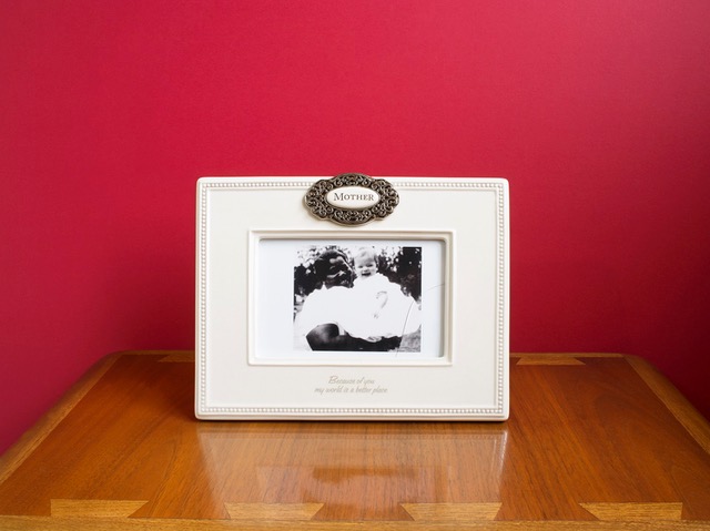
Two works in particular that have been stuck in my memory for weeks are Untitled (I Can’t Believe We Did That!) and Untitled (Mother). Both photographs involve something so uncomfortable literally reframed into something more pleasing, more palatable to look at.  The frames resemble mass-produced picture frames with someones staged memory inside. Looking at Untitled (I can’t believe we did that) in all of its pretty blue glory seriously messed me up. The photo shows the lynching of two Black men (Thomas Shipp and Adam Smith) in Indiana in the year 1930.  Below them, is a crowd of white spectators pointing at their bodies and looking at the camera. At the bottom of the frame, it reads “I Can’t Believe We Did That!” This historical picture was originally produced as a postcard, a keepsake, a pleasant memory. It is a funny statement. I’ve heard many variations of “I Can’t Believe We Did That!” From white people apologizing to me about slavery, Jim Crow, and police violence. I imagine the white people in this picture to have thought the same way. I imagine that they too could not believe that they were lucky enough to get such good seats at a hanging and be able to memorialize it.

Untitled (Mother) from the series Family Pictures, 2016. Image courtesy of the artist and Samsøñ.

I am always drawn to images representing Black womanhood, especially ones that involve racial archetypes. I believe that it is important to remember and notice the roots of these inherently violent stereotypes. In Untitled (Mother) we immediately associate the woman in the picture as a caretaker or the “Mammy” archetype. According to a source, the woman is Mattie Lee Martin and the image is dated between 1950-1960. It is a beautiful portrait, with Mattie Lee Martin smiling while holding up a cheerful looking white baby. The text underneath the photo reads “Because of you, my world is a better place.” The narrative behind the Mammy character would claim that she would have loved the child as she would love her own and that she would have been content in her domestic role. The quote on the frame is a true statement. In this country, Black women have had to survive. As apart of her survival she has had to maintain the lives of white families, and raise them up through her mental, physical, and emotional labor. I think of this now in a contemporary context. I think of myself when navigating white spaces. I think of myself having to coddle white folk’s feelings when they’ve mistreated me. After reflecting on my own interpretations of the work, I thought about how non-black people were responding to the pictures. I ignored the weird, sympathetic, and disbelief that was coming from their mouths. I wanted to know how their insides felt.

I love how Locke’s work forces us to acknowledge the disconnect between the dominant culture and everybody else. I believe that the disconnect is both subconscious and conscious. The circulating of the past photos used in Family Pictures resemble the 24/7 unproductive and dehumanizing distribution of Black Trauma in the present. We want to remember these atrocities as atypical and that only the most evil people were complacent. We want to remember it all as a rarity. We want to believe in the “good ones.” As we refuse to recognize this as tradition and common practice, we continue to silence the oppressed and commit ourselves to misunderstand.

Tyra Mishell was born and raised in Bradenton, Florida in 1994. She is currently residing in Tampa where she will receive her BA in studio art from the University of South Florida in Spring 2019. She is a New Genres artist specializing in video, new media, sound, and performance. With a combined interest in media studies and the make believe, she produces IN SPACE TV, an experimental net-based television show.

steve locke: the color of remembering is on view at Hillsborough Community College’s Gallery 221@HCC on the Dale Mabry campus through March 7, 2019. In addition to the photographs from the 2016 Family Pictures series, there is an installation of Three Deliberate Grays for Freddie (A Memorial for Freddie Gray). Locke is an Associate Professor at the Massachusetts College of Art and Design in Boston, MA.

Tampa-based artist Omar Richardson exhibits large black and white woodblock prints and unique mono prints in Omar Richardson: My Story, My Truth on display in Gallery 3@HCC on the third floor. There is a public closing reception on Thursday, February 28 from 5 to 8 pm, with Richardson speaking at 6 pm.


steven locke: the color of remembering

steven locke: the color of remembering

On view through March 7th at Hillsborough Community College’s Gallery 221 as part of an annual exhibition celebrating African American heritage and presented in conjunction with the Tampa Bay Black Heritage Festival.

This exhibition examines how African Americans have been depicted in ways which betrays explicit and implicit cultural prejudices depending, in this case, the age of the memory. From schematic diagrams of slave ships, historical photographs of lynchings, to modern day video, brutality and racism – institutional or otherwise – images have been made and disseminated which tacitly imply values which we should, indeed, must find deplorable.

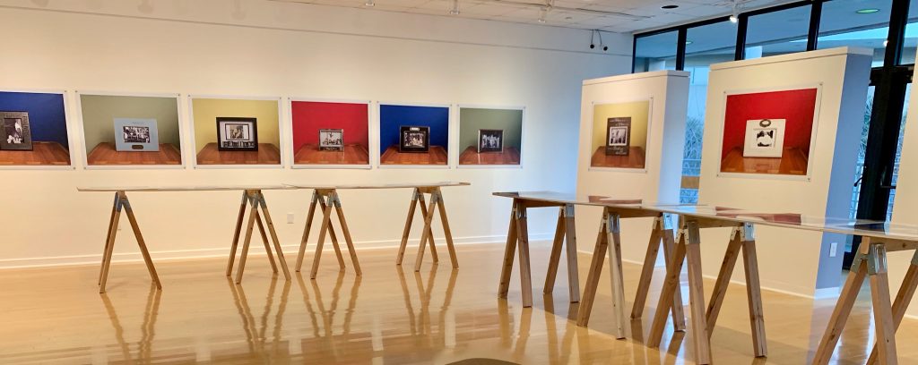
Not only by subject matter but, significantly, it is through the means of presentation that Locke employs in the photography series Family Pictures, 2016, that he addresses how different standards apply, in particular, that there isn’t an universal sense of respect and dignity when it comes to the memorialization of the atrocious. Locke himself memorializes images of the barbaric, setting them in unexceptional frames, engraved with the platitudinous and set against strong colored backdrops – notions of remembering and color are brought to the fore – the colors are strong but it is an overall sense of banality which is most provocative and the taint on remembering which Locke communicates most powerfully.

steve locke: the color of remembering is on view at HHC’s Gallery 221 though March 7th.

In Three Deliberate Grays for Freddie (A Memorial for Freddie Gray), Locke further confronts how there remains to this day a biased filter as to presentation of the African-American experience in the media. In this case, the tragic death of Freddie Gray on April 12th, 2015 whilst in the custody of the Baltimore Police Department. The intrusive and the demeaning combined with sensationalized reporting to ignore the dignity and suffering of this man. Validly, it might be asked had this not been a young African-American man whether the coverage would have taken on a different tone. By distilling the color palette of three commonly circulated photographs of Freddie Gray down to three hues of gray, Locke speaks to the debasement of this individual, his suffering and brutal death. Freddie Gray became a media-currency. His life and death had determined a value, that of a commodity. One that was exchanged between us and the news outlets. Locke shows us how we are complicit in this process, that the communication of outrage embraces complexities which have at their foundation the self same prejudices which they seek to make clear, here it is literally gray.

steven locke’s: the color of remembering at is a powerful exhibition. By bringing together the history of slavery, racism and subjugation through to the contemporaneous he threads a course of prejudices towards African Americans from the overt to the more hidden. It is instructive, in particular, how this exhibition focuses us on the modern day and practices which covertly but evidently seek to assuage the sensibilities of the mainstream at the expense of Black experience. The works themselves, are compelling and visually strong. The replication of composition in Family Pictures is one which has an unerring sense of imbalance. The images contained, framed with frames and repetitively composed powerfully suggest a diluting of content whilst, in fact, communicating the exact opposite. Steven Locke shows a consistent mastery of practice and sheer intellectual energy in working with the complexities of this difficult but very important subject matter. To be asked to re-think, indeed, re-remember and to give life and color to the challenging is the significant and worthy success of this exhibition.

At Bay Art Files, we have asked Tyra Mishell, who is pursuing a BA in Studio Art at the University of South Florida, to write about this powerful and timely exhibition. Her impressions of viewing the exhibition and meeting with the artist will post soon.

A Wall for Today

Bosco Sodi, Muro. Installation view in Washington Square Park, New York. September 2017. Photo: Diego Flores and Chris Stach. Courtesy of the USF Contemporary Art Museum, Tampa, FL.
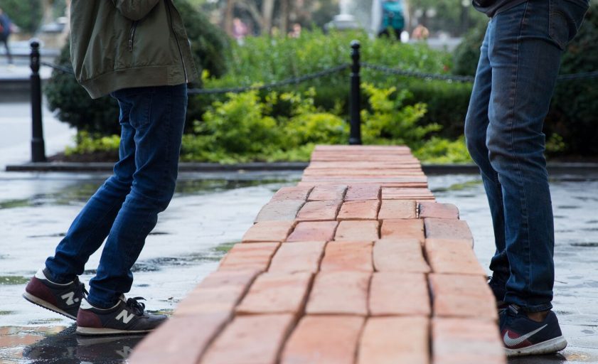
Bosco Sodi’s MURO (WALL) A one-day public installation and performance in conjunction with USF Contemporary Art Museum’s current exhibition Visible Turn: Contemporary Artists Confront Political Invisibility. Over some 10 hours on Thursday, January 24th, from 10am onwards at the USF Contemporary Art Museum artist Bosco Sodi’s Muro will be installed and then dismantled. Literally, at 20 feet long and 6 feet tall and composed of 1080 clay brick timbers, a wall be will be constructed. The public is invited to experience the wall’s construction and participate in the wall’s deconstruction and walk away with one of the timbers in a customized tote bag along with a certificate of authenticity. This will be the third iteration of Muro after similar installations in New York’s Washington Square Park in 2017 and in London’s South Bank in 2018. Bosco Sodi’s Muro is one component of USFCAM’s Visible Turn: Contemporary Artists Confront Political Invisibility curated by Christian Viveros-Faune, who is the Museum’s Curator-at-large and the Kennedy Family Visiting Scholar at the USF School of Art and History. During his tenure at USF, Viveros-Faune has curated a series of challenging and thought-provoking exhibitions which concentrate on politically based artistic practice.   In the sense that art can engage, be part of a society’s political dialogue, and bring to bear witness, this exhibition seeks to reveal the concealed and acknowledge that art has the potential to redress the imbalances of representation that are all-to-often defined by prevalent political and cultural hegemonies. Perhaps, it is in the nexus of the questions “How we see ourselves?” and then “What we don’t see?” that Viveros-Faune is elucidating issues which are important but have been marginalized and unnoticed. With respect to Bosco Sodi’s Muro, a wall will be made visible, but only ever so briefly,  before it will be taken apart and distributed to this community. In this way, it speaks to what might be considered the precarious nature of visibility and also to our ownership of that “visibility” or specifically, the lack thereof. The timbers are handcrafted in the artist’s studio in  Mexico by craftsmen, many of whom have had the experience of being migrant workers in the United States of America. Without a doubt, there is a poignant irony attached in using a material made by a specific constituency to build a wall which by implication can be potentially seen as a barrier to that exact same constituency. In this case, to read a wall as a barrier can be interpreted as to what we want to keep out and make invisible: what we want to exclude. Importantly, a wall determined by such factors directly reflects back upon ourselves. It refers to our insecurities as to what we may fear and out of such emotions the hubris of a wall is made explicit. Superiority, control, authority, and making invisible the visible are all provocatively questioned by Sodi’s Muro. That there is also a present controversy about what is largely considered a futile wall only adds further power to this. As an installation, questions are raised through the process of building a wall as to how we might isolate, insulate and conceal. The response to dismantle and so diminish such exclusionary tendencies presents the possibilities of a politically-based art practice. Engagement and participation are critical factors in an open and free society and Viveros-Faune has cogently and powerfully asserted through this exhibition and installation that art has a significant role to play in understanding ourselves as political beings: that art, in such instances, does have a peculiar and particular power to convey. Art Thursday, January 24, 2019 Bosco Sodi, Muro Public installation and performance. USF Contemporary Art Museum, Tampa, FL 10am-3pm: Viewing of Muro installation 3-8pm: Dismantling of Muro by the public 6-8pm: Public Reception; remarks by Bosco Sodi at 6:30pm All events are free and open to the public. The Stanton Storer Embrace the Arts Foundation is the major supporter of The Visible Turn: Contemporary Artists Confront Political Invisibility. Bosco Sodi, Muro is sponsored by The Gobioff Foundation and USF World. For additional information visit about this event or the exhibtion visit: www.usfcam.usf.edu Photography credit: Bosco Sodi, Muro. Installation view in Washington Square Park, New York. September 2017. Photo: Diego Flores and Chris Stach. Courtesy of USF Contemporary Art Museum, Tampa, FL.

We can selfie if we want to

Snapchat photo by Sabrina Hughes, the author of the upcoming post titled: My Camera, My Sel(fie) using Alfred Stieglitz, Self-Portrait, Cortina, 1890, gelatin silver print, Los Angeles County Museum of Art, The Audrey and Sydney Irmas Collection.

The upcoming essay by St. Petersburg photo historian Sabrina Hughes, My Camera My Self(ie), which will post on Bay Art Files next week, examines the complex relationship between photographic self-portraiture and the selfie. That such a relationship might exist and be scrutinized is explicitly suggested by the title of the current traveling exhibition at the MFA, St Petersburg, This Is Not a Selfie: Photographic Self- Portraits from the Audrey and Sydney Irmas Collection. The title asserts that a clear distinction can be drawn between the two.

The Irmas Collection, on display at the MFA through November 25th, is a deep and rich survey of photographic self-portraiture by considerable artists and is, as such, definitely worthy of one’s time and attention and a visit. In conjunction with the exhibition there are also selfie stations situated in the galleries where one can photograph oneself with various backdrops; projected, optical and otherwise. To take the exhibition’s title at face value, as it were, we are being asked to make a comparison between the art on the walls and the selfie one might take whilst at the exhibition.

Undoubtedly, this is a complex and involved question. The fact that a comparison is being asked to be drawn, in itself, entertains the notion that there is a spectrum on which both can be assessed. There are commonalities between museum-quality photographic self-portraiture and the selfie, and that these two distinct practices should be fairly judged and reviewed one and together, at the same time, and in the same place is surely a provocative question.

It is one that Hughes insightfully and deftly examines in her Essay, My Camera, My Self(ie).  Alone, the artists and their works on display definitely deserve one’s time and attention. The issues raised in the essay, it is hoped, will add a further perspective that provokes thought and encourages discourse. And indeed, in addition, add to one’s overall enjoyment of this exhibition. That is our intention.


Disturbed by Delight – Caitlin Albritton

Disturbed by Delight

by Caitlin Albritton

“Woman dressed as a turkey arrested for shoplifting,” “Someone donated a loaded grenade launcher to Goodwill,” “Man claims wife was kidnapped by holograms”—please, don’t let this be a headline from Florida, a local might plead. I can’t begin to imagine how non-Floridians make sense of the Sunshine State: how can so many bizarre stories come out of a place so seemingly utopic? While this handle of land has been distilled into a variety of assumptions, Florida native Selina Román uses photography to usurp these presumptions by reveling in its beauty and strangeness in her solo exhibition A Liminal State at the Leepa-Rattner Museum of Art. While her exhibition encompasses five bodies of work, most of her solo show revolves around the Please Disturb series and the related Please Disturb: LRMA Edition.

Travel has always been a way to understand a place. In the heyday of road trips in the first few decades of the 20thcentury, the popularity of the automobile lifted the boundaries of economic status and permitted an escape from the everyday. What a better way to welcome Florida-bound tourists than with family-run motels that offer dreams of relaxing seas and palm tree paradise. Yet with contemporary travel, it’s no longer about the journey but getting to the destination as quickly as possible. Travel has lost its spark, while forgotten motels now serve as an embodied representation of Florida—with its own fantasies and unfulfilled dreams. Swaddled in a potentially unwashed comforter, this state encapsulates everything weird, sexy, funny, and mysterious about this peninsula.

So, let’s linger in these transient spaces a bit longer.

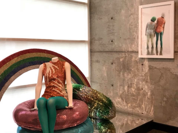
“What would happen if I brought a readymade to a motel?” I’d like to think this is how Román decided to turn dated Florida motel rooms into her temporary studio space for her Please Disturb series, inviting her friends and other guests in for intimate photoshoots full of vintage props and 80s beauty products: tasseled majorette uniforms, frilly swimming caps adorned with silk rosettes, and facial treatment masks, all haloed by a barrage of sequins that glitz like fish scales in the sultry lighting. The commissioned LRMA Edition is just as bedazzled, but instead of photographing people she knew, this was the first-time strangers—museum docents and members— had been invited to her room at the Tarpon Shores Inn.

Alter egos arise under the cover of costume.

There’s a bit of improvisation and performance on Román’s part in setting up these rooms, from the careful arrangement of costumes in open-plan closets to the posing of her models; there may be some ideas in mind, but for-the-most-part, all parties involved allow fluidity in the process. Instead of chastising our inherent interest in gazing at others, Roman’s admission of our society’s voyeuristic tendencies whispers to us: don’t mind if you do.

While motels are often the sites of her photographs, other innately Floridaesque locations insinuate the condition of transformation: beaches, fresh-water springs, or abandoned public pools as evidenced in the other series on display.

Ebb Tide, 2016. Archival inkjet print, 24 x 36 inches. Courtesy of the artist

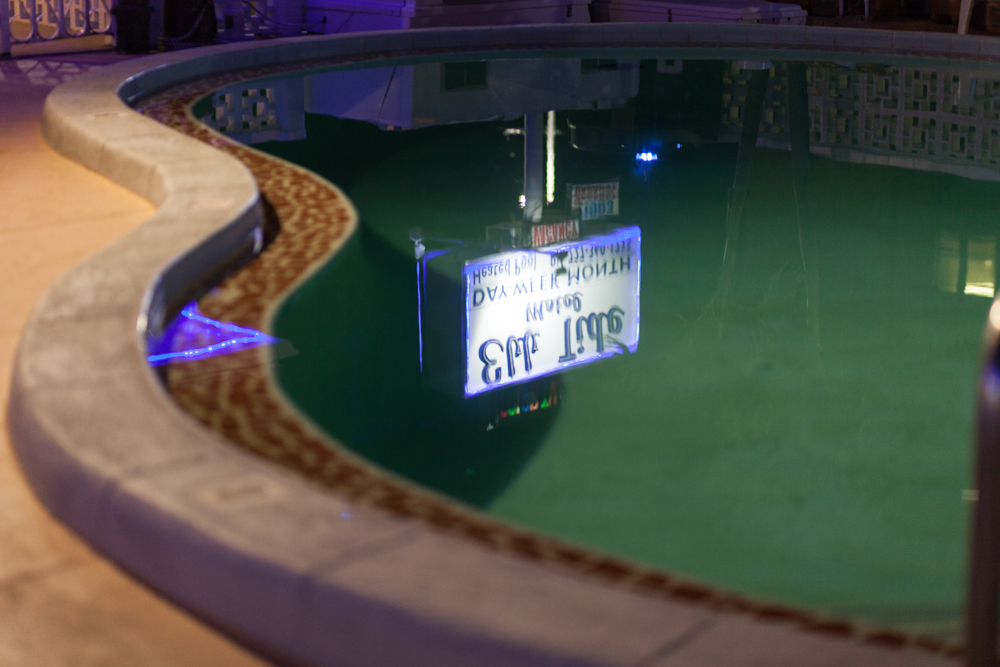
What makes her photographs alluring is the fact that they resist direct eye contact; if our eyes are windows to the soul, most of Román’s are coyly shuttered (even the motel’s street-front signage is bashful, its watery reflection mirrored via pool in Ebb Tide). In 15thcentury Italian paintings, many painters would rely on the viewer’s disposition to read into relationships within the work. In a poetic treatise on painting by the artist-philosopher Leon Battista Alberti, he says, “Movements of the soul are recognized in movements of the body.” Searching for emotional keys in body language and relationships between the figures and their flirtatious props (as well as cheeky titles), Román mixes the familiar with the foreign to create moments of captivating uncanny.

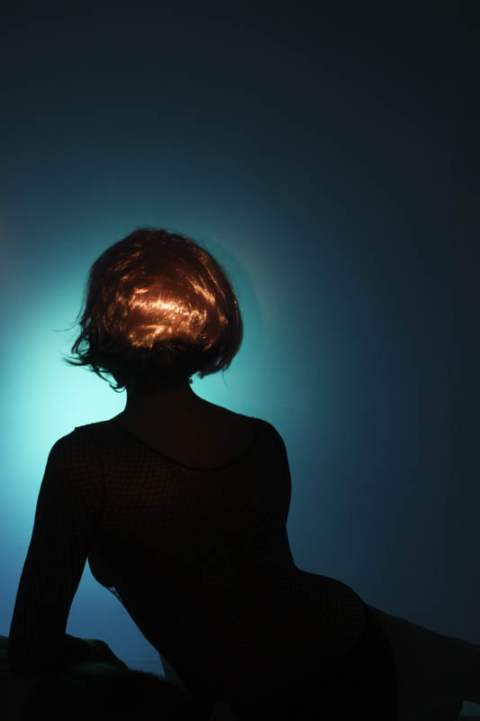
Is the Fantasy Better than the Reality? 2012. Archival transparency print in a lightbox, 36 x 24 inches. Courtesy of the artist.

In looking for what questions Román’s work asks of us, I found one in the title of one of her pieces: Is the Fantasy Better than the Reality? an inkjet transparency lit from behind to create a soft blue glow in the background. A woman’s curvaceous silhouette lounges in waiting: a fishnet shirt is stretched over the morsel of breast we can fathom from our view behind her. Her short red wig glows from another light source, and we can make out the porous plastic material that makes up the wig’s artificial lining, not even trying to create a perfect camouflage of her natural hair that peeks out beneath it. After a while, you’ll notice it: the sliver of hairy chest she is leaning upon.

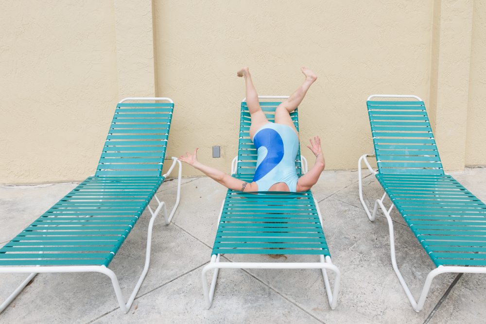
Low-Grade Euphoria, 2013. Archival inkjet print, 24 x 36 inches. Courtesy of the artist.

It feels too easy to say that, “Fantasy is better!” since each figure is wrapped up in their own alternate universe that escapes the dregs of real life. Either way, Román seems unwilling to show her cards on which she believes is “better,” equally considering both sides. Hints to this lie in how the perfect image of fantasy is disrupted in her iconic photos, from the awkwardness of a bathing-suit-clad body stuffed through a pool chair like in Low-Grade Euphoria, to the absurdity of wearing silicone lips that promise to make your jawline slenderer and more appealing, seen in Maybe She’s Born With It.

Maybe She’s Born With It, 2017. Archival inkjet print, 16 x 20 inches. Courtesy of the artist

 Glitter is good at hiding disheveled, grubby spaces, is it not?

So, perhaps the answer Román is getting at is that reality impedes imagination. Another rift in the fantasy comes from the prop vignettes throughout the exhibition. The solidity of these props grounds the viewer—Oh, this is what it really is! —slightly shattering the ephemerality of the images by gently steeping them in reality.

In a contemporary art scene where “meaning” feels prized over aesthetics, it seems that Román is also asking how uncanny or unconsidered beauty can be used purposefully to balance the weighted scales of daily burdens. How does the old Hollywood glamour in her LRMA Edition of Please Disturb empathetically portray the sensuality of an aging woman? How can we simmer in the magnificence of nostalgia without agonizing over the past? How can we celebrate and create an identity for transience by shedding a new light on all of the stuff we didn’t know we should be considering as instigators of awe and wonder?

For those who have yet to put their finger on the pulse of what makes this state tick, Roman’s provocative works are like being baptized in the heavily chlorinated waters of Floridian mythology: there’s an element of folklore that reaches towards the fantastic, yet is firmly rooted in reality. Deeply mysterious, it’s the kind of artwork that quivers the stillness of the imagination in an age of excessive data that tries to stifle it.

I am content in being a voyeur in these calm, intimate moments, where I am disturbed by delight.


Caitlin Albritton is an artist and freelance writer based in Tampa with a BFA from Savannah College of Art and Design and an MFA from Maryland Institute College of Art. When she’s not looking at art throughout town, she can be found making it. You can keep up with her visual art on Instagram @caitlinalbritton or on her website.

In partnership with Smithsonian Museum Day where participating museums (such as the Leepa-Rattner) will have free admission, the Leepa-Rattner Museum of Art will be hosting the event Concealed: A Photoshoot with Selina Románfrom 11 a.m.-1 p.m. on September 22, 2018,  for the last weekend of A Liminal State, which will be up through September 23rd. Visitors are encouraged to bring their own props and will have the opportunity to have a Polaroid of themselves to bring back home.